Community & Forum Reviews Website Template
ForumHub is a single-page comparison landing page template built for async product community forums. It opens with a live API terminal snippet, moves through two side-by-side comparison tables, and closes with social proof and a sticky call to action bar. The Slate and Sky color system keeps every comparison page section clean, data-forward, and instantly readable.
by Rocket studio
Quick Summary
ForumHub is a Stats-First Impact comparison landing page template for product community forums. It leads with a live-data code snippet in the viewport, stacks two structured comparison tables down the page, and earns the click before asking for anything. The Slate and Sky color system keeps the community forum experience visually clean, confident, and built for people who trust evidence over persuasion.
Who This Template Is For
This template is designed for community builders, SaaS companies, and startup teams who need a high-signal landing page for their product community forum. It speaks directly to the people sitting in the room where product decisions actually happen.
- Solo founders and product managers at early-to-growth stage startups who have lost time in dead Slack groups and want to show their own community is different
- Design leads and engineers who need a comparison page that proves async value without requiring a live demo or sales call
- Community management teams at Series B companies who want to present their community forum as a structured, searchable, expert-driven alternative to noisy other platforms
What Problem This Template Solves
Most community forum landing pages try to persuade with copy alone. They describe the community experience without showing it. Visitors arrive skeptical, scroll past generic claims, and leave without clicking anything. The pain points are real: no signal, no proof, no urgency.
This comparison landing page template solves that by putting live data in the first viewport and letting the comparison tables do the persuading. It is built to convert the visitor who has already been burned by other platforms and needs a direct comparison before they trust a new community forum.
- It removes the trust gap by showing real forum activity data before asking for any registration, so the community forum feels alive from the very beginning
- It uses structured comparison tables to answer the decision-making questions that hold potential customers back, comparing this community forum against Slack, Reddit, and Twitter/X on metrics that actually matter
- It replaces vague value claims with foregrounded numbers, turning the landing page into an evidence stack that guide visitors naturally toward the primary call to action
What You Get With This Template
You get a fully structured, single-page comparison landing page with six distinct sections that flow from proof to conversion. Every section is designed to increase engagement as users scroll, not just fill space. The template is static-first with client-side animation, which keeps the page feeling responsive and alive without backend complexity.
- A hero section with a styled live API terminal snippet, a monospace headline, and a primary call to action button, all above the fold
- Two side-by-side comparison tables: one placing this community forum against competitor platforms, and one comparing free plan features against Pro membership tier by tier
- A member social proof section with participation stats, member avatars, and quoted testimonials, followed by a sticky call to action bar that appears after the second table on scroll
Feature List
This template comes with a focused set of purposeful, prompt-backed capabilities. Each one is built to serve the community forum's core conversion goal: show the product running before asking for a signup.
Live API Terminal Hero
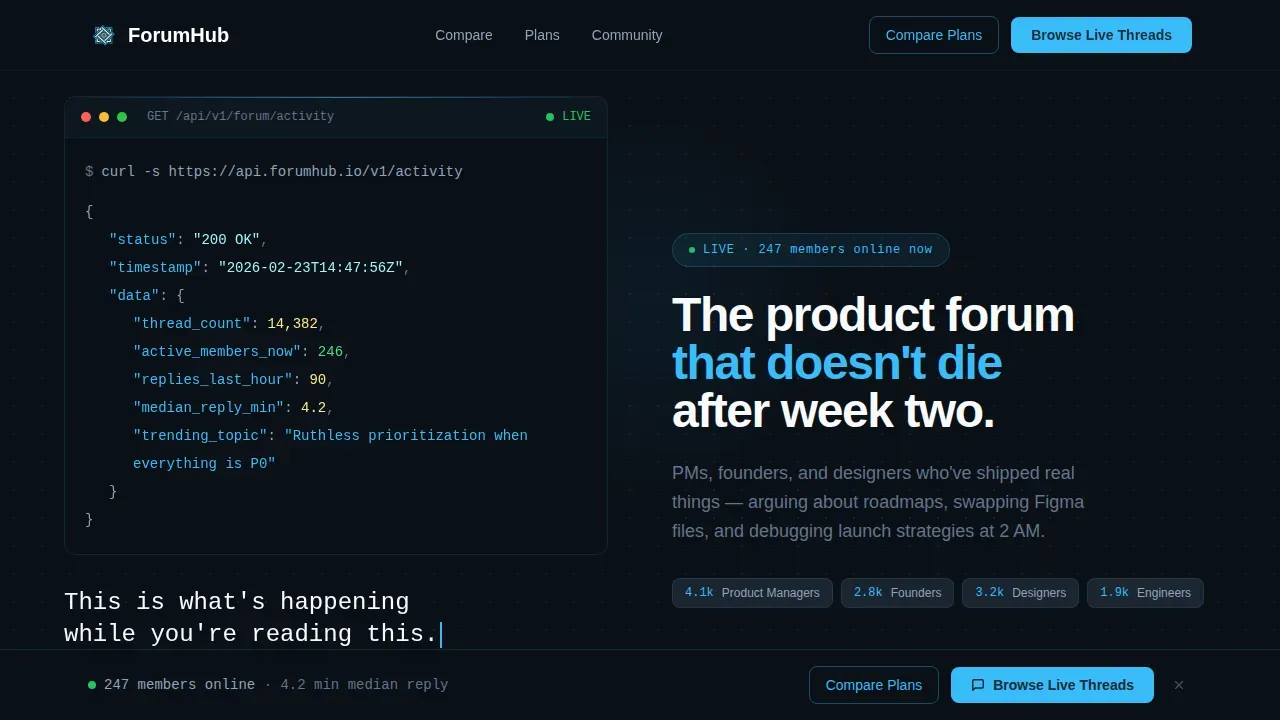
The header drops a styled code snippet directly into the viewport. It displays a real API call to a forum activity endpoint, returning live JSON values: thread count, active members online, replies in the last hour, and the top trending topic. The numbers animate on load using client-side counter logic, creating a first impression that is functional rather than decorative. No hero image, no illustration. Just data presented with the confidence of a community forum that does not need to oversell itself.
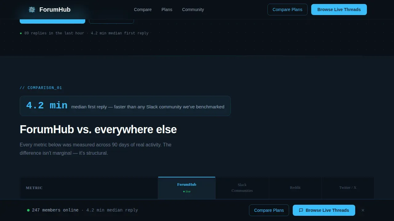
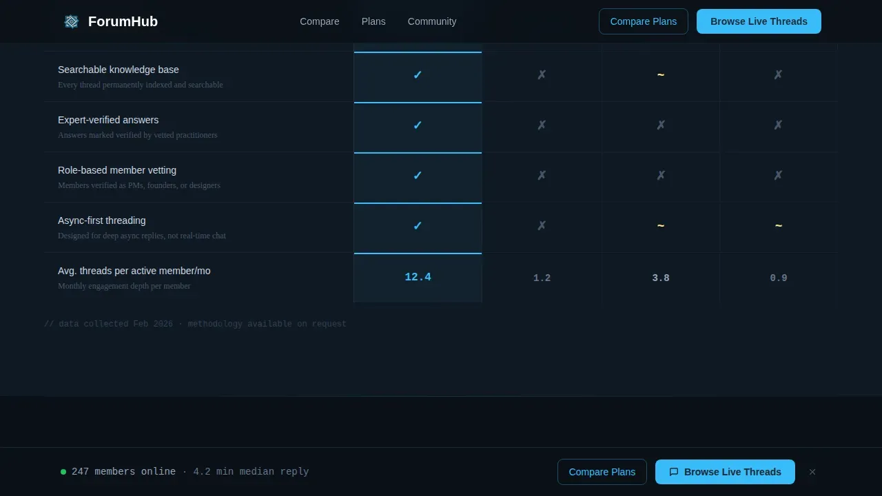
Community versus. Competitor Comparison Table
The first comparison table places this community forum side by side against Slack communities, Reddit, and Twitter/X. Columns measure average reply time, signal-to-noise ratio, searchable knowledge base depth, and expert-verified answers. Each row opens with a single foregrounded stat, such as "4.2 min median first reply," before the comparison table contextualizes it. This direct comparison approach gives potential customers the clarity they need to make a confident decision without requiring a separate competitor comparison page or sales conversation. A well-structured comparison table is essential for helping users quickly grasp the differences between products, and this one delivers that clearly.
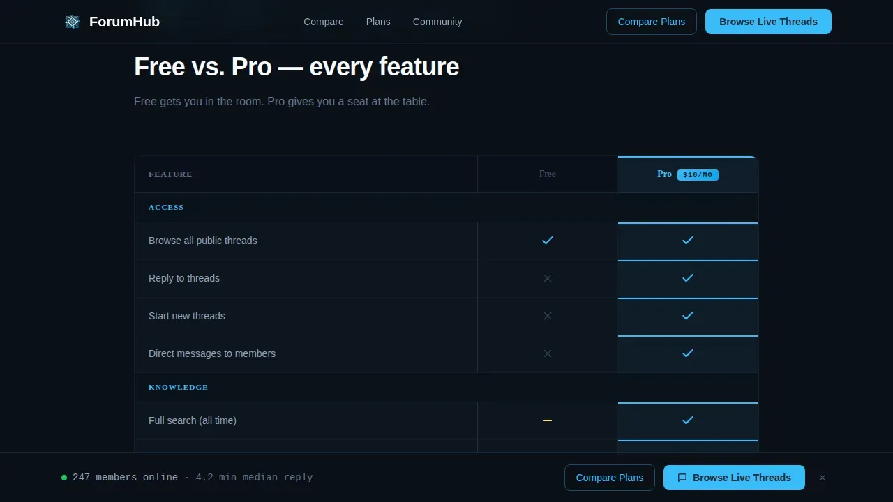
Free versus. Pro Membership Table
The second comparison table breaks down the difference between the free plan and Pro membership, feature by feature. Numbers appear in 32-pixel sky blue, labels recede in slate gray. The visual hierarchy makes scanning fast and effortless. This membership comparison page section is highly customizable, so community management teams can update tier labels and feature rows to match their actual offering. Including this table on the landing page helps potential customers move from consideration to decision without leaving the page, improving the overall conversion rate.
Scroll-Triggered Sticky Call to Action Bar
After the second comparison table, a sticky call to action bar locks to the bottom of the viewport. It persists as users continue scrolling through the social proof section. The primary call to action reads "Browse Live Threads" in sky blue on slate. A secondary call to action, "Compare Plans," anchors back up to the membership table. This layout drives engagement by keeping decision-ready users connected to a conversion point at all times, even late in the scroll journey.
Member Social Proof Section
The social proof section combines participation metrics, member avatars, and named quotes from community members. Each customer testimonial includes a customer name and role, such as PM, founder, or designer. This grounds the community forum in real voices. Including customer testimonials and social proof on a comparison page enhances credibility and trust with potential customers, and this section is designed to do exactly that without feeling like a generic testimonial carousel.
Intersection Observer Scroll Reveals
Each major section animates into view using Intersection Observer scroll reveals. Counter animations fire when comparison table rows enter the viewport. The terminal typing effect runs in the hero on page load. These interactive elements enhance user engagement and participation as visitors scroll, making the landing page feel like a living community forum rather than a static web page.
Page Sections Overview
| Section | Purpose |
|---|---|
| Hero Terminal Snippet | Displays live forum activity data via a styled API code block with a monospace headline and primary call to action |
| Community Comparison Table | Side-by-side competitor comparison of this forum versus Slack, Reddit, and Twitter/X across four key metrics |
| Membership Tier Table | Feature-by-feature free plan versus Pro comparison with sky blue number accents and slate gray labels |
| Member Social Proof | Participation stats, member avatars, and named customer testimonials to build trust and community credibility |
| Sticky Call to Action Bar | Persistent bottom bar with primary and secondary calls to action, appearing after the second comparison table on scroll |
| Footer | Horizontal flow footer layout with community links and navigation |
Design & Branding System
The Slate and Sky color system gives this community forum landing page its distinct visual identity. Deep charcoal slate (#1E2A38) dominates backgrounds and text blocks. Open sky blue (#38BDF8) marks every interactive surface, live data accent, and call to action. Cloud white (#F8FAFC) opens up card interiors and comparison table cells so information never feels stacked. The result is a visually appealing, clean layout that feels like a terminal window on a clear morning: functional, calm, and sharp where it counts.
- Typography uses JetBrains Mono for all code blocks, numbers, and terminal-style elements, paired with DM Sans for body text and labels, creating a clear visual hierarchy between data and prose
- Numbers are foregrounded at 32 pixels in sky blue, pushing key stats forward so users absorb them before reading context; this visual system makes the comparison page feel data-dense without feeling cluttered
- Brand logos and avatar images in the social proof section use the same cloud white card interior treatment, keeping engaging visuals consistent and the overall community experience cohesive across every scroll depth
Mobile & Speed Optimization
The template is designed desktop-first, reflecting the reality that product people, PMs, founders, and designers typically work at desk setups. Desktop is treated as the primary canvas for the comparison tables, terminal hero, and sticky call to action bar. At the same time, mobile optimization is built in as a solid fallback, ensuring the community forum landing page remains functional and readable on mobile devices without degrading the comparison page experience.
- Mobile devices receive a fully responsive layout where comparison tables reflow into scrollable card stacks, preserving the clean layout and user-friendly interface that desktop users see in a two-column grid
- The static-first architecture with client-side animation means the page loads quickly on both desktop and mobile apps or browser environments, with counter animations and scroll reveals activating only after content is painted
- Mobile optimization choices, including fluid typography scaling and tap-friendly call to action buttons, ensure that users on mobile devices can still interact with the sticky call to action bar and comparison tables without friction
How This Template Helps You Convert
This comparison landing page is built around a single conversion strategy: show the community forum running before asking for anything. The scroll journey is structured so that every section adds another layer of evidence, making the final call to action feel like an obvious next step rather than a request.
-
The live API terminal snippet in the hero creates an immediate first impression of a real, active community forum. Visitors see thread counts, active members, and reply rates before they read a single line of marketing copy. This data-first approach builds trust with skeptical users from the very beginning, turning the landing page into proof rather than a pitch. Using a clear call to action placed directly below the terminal snippet gives users who are already convinced a fast path to conversion without requiring further scrolling.
-
The two comparison tables stack evidence progressively as users scroll. The competitor comparison table answers the question every community forum visitor is silently asking: how does this compare to other platforms I already know? The membership table then answers the follow-up: what do I actually get, and is the Pro tier worth it? A clear call to action placed at the sticky bar level catches users who reach a decision point mid-scroll, improving conversion rate without interrupting the reading flow. This evidence-stacking approach means the conclusion feels inevitable rather than forced, and the community forum earns the click by letting data guide visitors toward the registration flow.
Other Information About This Template
This section covers additional context about the template's broader fit within the community forum and comparison landing page landscape, including forum software context and platform comparisons relevant to buyers researching their options.
- A competitor comparison landing page helps potential customers understand how a product stacks up against others. Comparison landing pages are particularly effective in saturated markets where buyers need clarity to make confident decisions, and this template is built precisely for that environment. An effective comparison page will help drive decision-making in your favor by showcasing strengths in a clean layout that is user friendly and easy to scan. The ultimate goal of a comparison landing page is to gain new customers by persuading them of the product's advantages, and this template achieves that through evidence stacking rather than narrative.
- Competitor comparison landing pages work best when they are regularly updated. Regularly updating the content of the comparison page is necessary to ensure it remains relevant and accurate. This template makes that easy because the comparison tables and tier rows are structured modularly. Each row can be revised independently without reworking the full layout, keeping the competitor comparison landing content current as the market evolves.
- This template is a great example of a landing page that blends community features with conversion-focused design elements. Landing page templates for product communities foster engagement, drive user-generated content, and build brand loyalty by focusing on interaction rather than just sales. Key elements for a landing page template include a clear value proposition, mobile responsiveness, and strong social proof, all of which this template delivers in its six-section structure.
- Online community platforms serve as digital spaces where individuals with shared interests gather to interact and collaborate. Online communities provide valuable networking opportunities, connecting individuals with potential mentors, collaborators, or job opportunities. Branded online communities help humanize and strengthen a brand by allowing deeper connections with customers and prospects. The design and functionality of an online community platform can significantly impact user experience and engagement levels, which is why this template invests so heavily in visual hierarchy and data-forward community management design.
- Community forums should emphasize user participation statistics to encourage engagement. This template does that from the first viewport by placing live stats, active member counts, and reply-time metrics at the top of the page. A well-designed community forum page fosters engagement and enhances the overall user experience. Intuitive navigation is crucial for effective community forum page design, and the clean layout of this template ensures that users can move through the comparison sections without confusion or unnecessary friction.
- Several well-known forum software options exist in the broader community management ecosystem. WordPress is a popular content management system that offers forum software through plugins like bbPress. Discourse is an open-source forum software that provides dynamic notifications, badges, and a built-in moderation system. Higher Logic Vanilla offers an intuitive dashboard for managing community forums and allows users to submit and vote on ideas. PhpBB is a customizable forum platform that supports multiple languages and allows for password-protected forums. vBulletin is a widely used forum software that includes built-in SEO and security features and is used by over 100,000 websites. Flarum is a free forum software known for its streamlined design and ease of navigation. MyBB is an open-source forum software with hundreds of plugins and themes available for customization. Gainsight is a community platform that integrates with tools like Zendesk and Salesforce to enhance customer engagement. Codoforum is a free forum software that offers a modern design and is built with PHP. The best forum software options allow users to build and manage online communities effectively, enhancing engagement and brand affinity. This template is agnostic to the backend forum software behind it and can be adapted to work alongside any of these options as the front-facing comparison landing page.
- This template is best suited for community managers, SaaS companies, and startups needing to launch a community forum comparison page quickly without coding. ForumHub Live is a top-tier template choice for community builders, offering a structured, interactive, and user-friendly experience. ForumHub Live excels in live aspects such as notifications and live updates. ForumHub Live allows users to build communities without upfront costs or complex technical skills. The ForumHub Live product community comparison landing page template is identified in this category as a purpose-built solution for async product communities targeting PMs, founders, designers, and engineers. Community templates can help reduce support costs through peer-to-peer assistance, decreasing the load on customer success teams. Real-time engagement features such as live notifications and Ajax search allow users to see updates instantly. Docy and ForumHub Live are recognized for structured, nested conversations suited to feedback and support use cases.
- Selecting an online community platform should involve assessing the specific needs and goals of the community you want to build. Choosing the right platform can be overwhelming due to the many options available, and a well-structured competitor comparison page built on this template helps cut through that noise for potential customers. Online community platforms can include features such as discussion forums, private messaging, chat rooms, and multimedia sharing capabilities. Video content is important for community engagement, as it can increase interaction and make the community feel more authentic. Online communities can foster a sense of belonging among members, helping them find like-minded peers. Online community platforms can enhance user engagement by providing a space for community members to share insights and support each other.
- This template uses a user friendly layout and intuitive layout to organize content across six sections without overwhelming the visitor. The seamless experience from hero to sticky call to action bar is the result of deliberate visual hierarchy decisions, not default styling. Encouraging users to click through to the live thread feed before gating anything is the core conversion mechanic, and it reflects a broader principle: show value before asking for it. Fostering connections between community members starts with making the community forum feel real and active from the very first scroll, and this template is purpose-built to deliver exactly that community experience.
Theme
Directory & Discovery
Creative direction
Stats-First Impact
Color system
Slate & Sky
Direction
Click-Through
Page Sections
Live API Terminal Hero Section
Two Structured Comparison Tables
Sticky Call to Action Bar on Scroll
Member Social Proof Section
Intersection Observer Scroll Animations
Slate and Sky Visual Design System
Related questions
How do you create a community forum landing page?
What are some examples of discussion forums?
Is ReHub a WordPress theme?
Is ReHub SEO friendly?
What makes a competitor comparison landing page convert well?


