Networking Event Professional Website Template
Connect is a gallery-style networking event landing page template built for platforms that curate high-end professional events. It combines a Photo Grid Mosaic header, a scroll-through Gallery Walk layout, and a Plum Executive color system to draw visitors into the event catalog. The page drives click-through with two well-placed calls to action and no on-page form.
by Rocket studio
Quick summary
Connect is a single-page networking event registration landing page template designed for platforms that fill rooms with the right people. It uses a mosaic photo header, a gallery-scroll layout, and a deep plum and gold color palette to create an atmosphere of curated exclusivity. Every design decision points visitors toward one action: browsing upcoming events.
Who this template is for
This template is built for anyone running or promoting high-end professional networking events. It speaks directly to organizers who understand that the room itself is the product.
- Event organizers running investor mixers, corporate dinners, and hotel ballroom receptions
- Conference directors programming multi-day summits who need a polished digital front door
- Corporate development teams hosting private seated events where every attendee is intentional
What problem this template solves
Generic event pages look like registration forms, not invitations. They fail to communicate atmosphere, prestige, or the quality of the room. Connect solves that mismatch.
- Most event landing pages feel transactional, not aspirational, which undermines premium positioning
- Visitors leave without a sense of who else will be in the room or what the experience actually feels like
- Organizers have no clean way to show scale and range, from an intimate dinner for forty to a summit for a thousand
What you get with this template
You get a fully designed, single-page landing page that functions as an atmospheric introduction to your event catalog. It is built around editorial pacing and deliberate visual hierarchy.
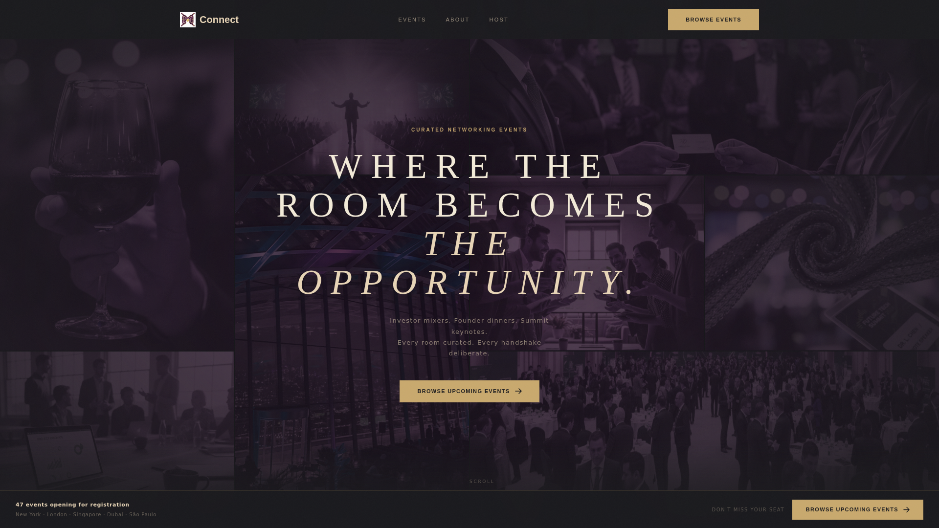
- A twelve-tile Photo Grid Mosaic header with cursor-reactive color brightening and a centered headline
- A scroll-driven Gallery Walk layout presenting each past event as an oversized photo with a sliding detail panel
- Two primary calls to action and one secondary call to action placed at conversion-critical scroll points
Feature list
This template delivers a cohesive set of purpose-built design features. Each one serves the core goal of moving a visitor from curious arrival to confident click-through.
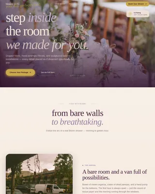
Interactive Photo Grid Mosaic Header
Twelve cropped, candid photographs fill the viewport in an asymmetric grid. Images are desaturated with a plum wash by default. As the cursor moves across tiles, each one brightens to full color individually, creating the feeling of a room coming alive on arrival. A single tracked-out uppercase headline fades in at center.
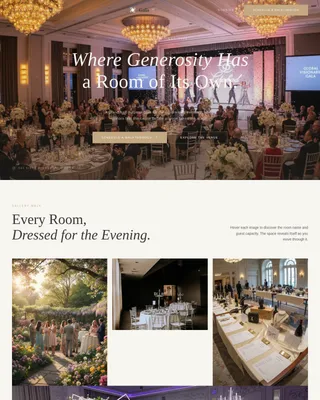
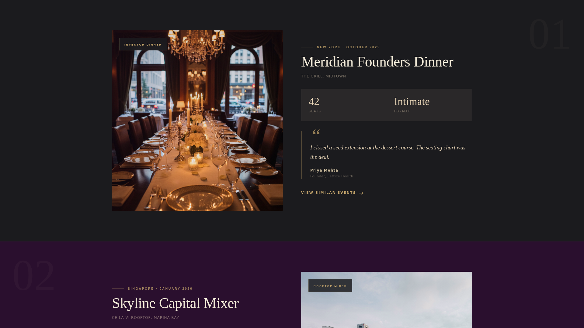
Scroll-Driven Gallery Walk Layout
Scrolling through the page feels like moving through a curated exhibition. Each section presents one past event as an oversized full-bleed photograph. A detail panel slides in from the right on scroll, revealing the event name, city, attendance count, and one attendee pull-quote.
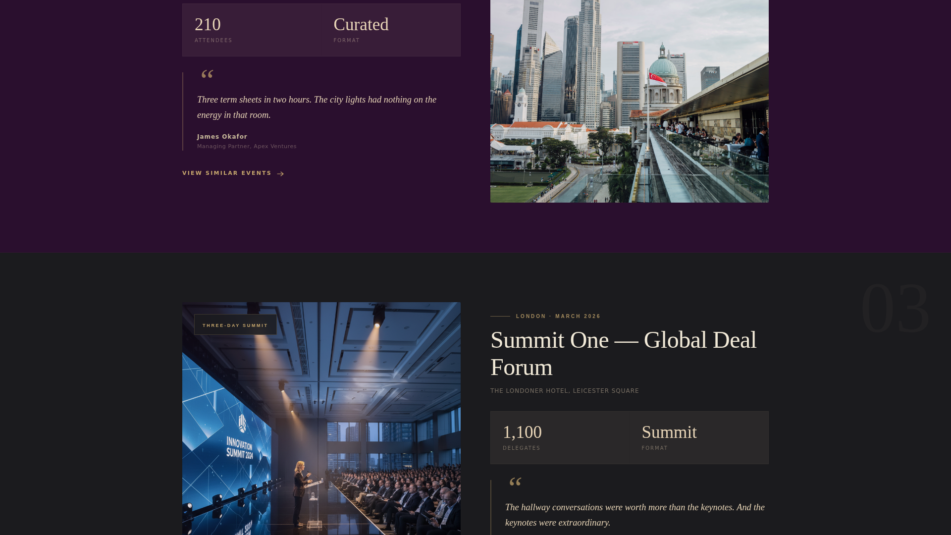
Escalating Event Scale Narrative
The gallery sections are sequenced intentionally. An intimate dinner for forty appears first, followed by a rooftop mixer for two hundred, then a three-day summit for a thousand. This progression builds the visitor's understanding that the platform operates at every level of professional networking.
Persistent Bottom Bar Call to Action
After the third scroll section, a fixed bottom bar appears with the primary call to action. It stays visible as the visitor continues scrolling, keeping the path to the event catalog one tap or click away at all times.
Dual Call-to-Action Architecture
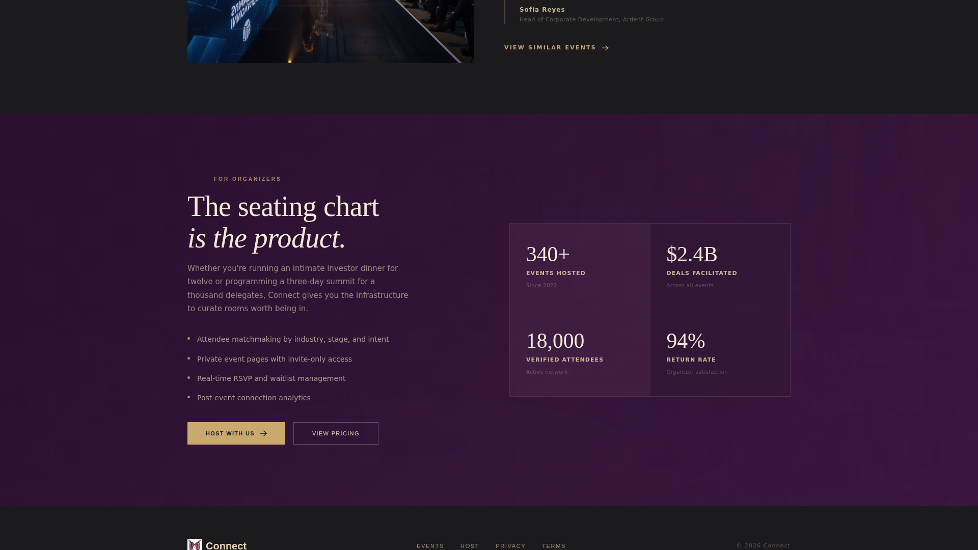
The primary call to action, "Browse Upcoming Events," appears first beneath the header mosaic and again in the persistent bottom bar. A secondary call to action, "Host With Us," appears once in the final section for event organizers. No form exists on the page itself.
Plum Executive Color System
The palette uses deep plum for section backgrounds, muted champagne for body text and card surfaces, near-black charcoal for typography, and restrained gold strictly for buttons and hover states. Color is used as a behavioral signal: gold only appears where the visitor is meant to act.
Page sections overview
| Section | Purpose |
|---|---|
| Photo Grid Mosaic Header | Sets atmosphere with twelve cursor-reactive candid photographs and a centered headline |
| Primary call to action Block | Places "Browse Upcoming Events" button immediately below the header |
| Gallery Event One | Introduces an intimate dinner for forty with photo and sliding detail panel |
| Gallery Event Two | Escalates to a rooftop mixer for two hundred with attendee pull-quote |
| Gallery Event Three | Peaks with a three-day summit for a thousand, showing platform range |
| Persistent Bottom Bar | Keeps the primary call to action visible after the third scroll section |
| Host With Us Section | Targets event organizers with a secondary call to action |
Design & branding system
The visual identity is built around a Luxe Minimal theme. Every element earns its place, and restraint is the defining design principle throughout.
- Deep plum (#3C1642) dominates section backgrounds; muted champagne (#E8D5B7) handles body text and card surfaces; near-black charcoal (#1B1B1E) grounds all typography
- Restrained gold (#C9A96E) is reserved exclusively for buttons and hover states, functioning as a visual signal that guides the visitor toward action
- Typography uses tracked-out uppercase for headlines; the overall effect is reminiscent of a velvet-lined printed invitation, warm and deliberate rather than digital and urgent
Mobile & speed optimization
The template is designed so that its atmospheric qualities translate to smaller screens without losing the sense of occasion. Visual weight is managed carefully so the page remains engaging at every viewport size.
- The Photo Grid Mosaic adapts to mobile viewports while preserving the asymmetric, editorial feel of the composition
- Sliding detail panels and gallery sections reflow cleanly for touch-based scrolling on phones and tablets
- The persistent bottom bar remains accessible on mobile, keeping the primary call to action within thumb reach throughout the scroll experience
How this template helps you convert
This landing page is engineered for click-through, not on-page form completion. Every design and copy decision exists to make the visitor feel they are already late to something extraordinary.
- The cursor-reactive mosaic header creates immediate emotional investment before a single word is read, lowering resistance and raising curiosity at the same time.
- The gallery scroll builds desire progressively, showing attendee social proof through pull-quotes and attendance figures that grow in scale with each section.
- Gold-colored calls to action appear at precisely timed scroll points, making the next step feel natural rather than forced, so the visitor arrives at the event catalog already primed to register.
Other information about this template
This template sits within the Wedding and Events category, specifically targeting the networking event registration platform niche. It is a strong fit for any organizer seeking a landing page that communicates prestige before a visitor reads a single line of body copy.
- The template style is Gallery plus Detail, meaning rich visual content and contextual information appear together rather than separated across multiple pages
- The creative direction is a Gallery Walk, a scroll pacing approach that gives each event room to breathe and builds narrative momentum across the page
- The header concept is a Photo Grid Mosaic, a format well suited to event photography because candid, in-the-moment images communicate authenticity and atmosphere better than posed shots
- The landing page direction is Click-Through, meaning conversion is measured by catalog visits, not on-page form submissions
Theme
Luxe Minimal
Creative direction
Gallery Walk
Color system
Plum Executive
Style
Gallery + Detail
Direction
Click-Through
Page Sections
Interactive Photo Grid Mosaic Header
Scroll-driven Gallery Walk Layout
Escalating Event Scale Narrative
Persistent Bottom Bar Call to Action
Dual Call-to-action Architecture
Plum Executive Color System
Related questions
Does this template include a registration form?
Can this template showcase events of different sizes?
Who is the secondary 'Host With Us' call to action for?
How does the gold color guide visitor behavior?
Is this template suitable for corporate event teams, not just startup communities?