Industrial Fabrication Services Landing Page Template
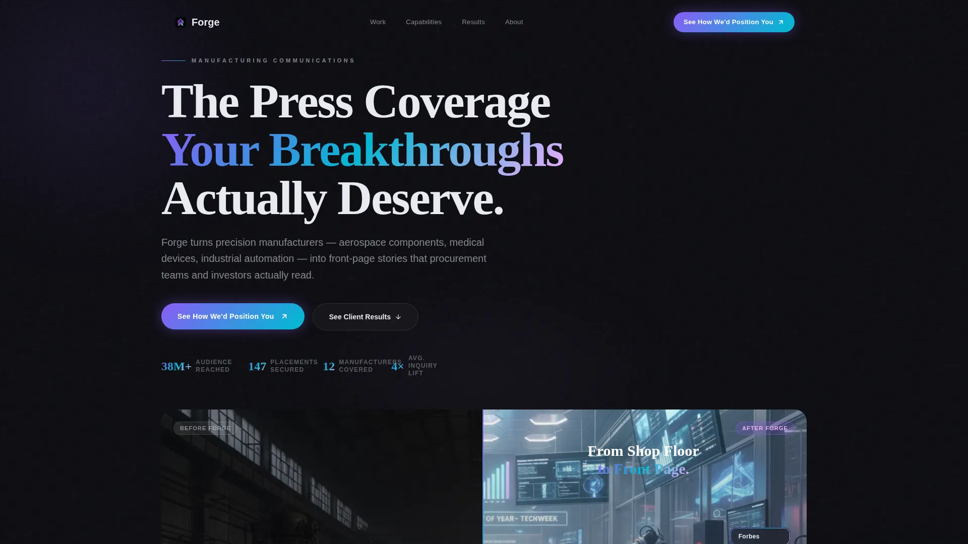
Forge is a precision-built landing page template for manufacturing PR agencies. It uses an overlap/layered scroll structure, a dramatic before/after slider header, and a Tech Glass visual identity to stack proof of media coverage and awards. The design guides VP-level marketing directors toward a single click-through action, no forms, just compounding conviction.
by Rocket studio
Quick summary
Forge is a single-page, click-through landing page template built for manufacturing communications firms. It opens with a before/after slider that dramatizes the gap between media obscurity and front-page coverage. Layered glass cards stack proof as visitors scroll. One primary call to action appears three times, each time earning more trust than the last.
Who this template is for
This template is built for communications and PR firms that serve mid-market manufacturers. If your clients make precision aerospace components, medical devices, or industrial automation systems, this page speaks their language directly.
- VP-level marketing directors at manufacturers who feel overlooked by mainstream innovation coverage
- Manufacturing PR agencies positioning themselves as specialists, not generalists
- Agency principals who want a high-impact landing page that earns the click before asking for anything
What problem this template solves
Manufacturers consistently struggle to earn press coverage despite genuine breakthroughs. Their communications partners face the same credibility gap: how do you prove results before a prospect trusts you enough to have a conversation?
- Generic agency portfolios fail to show the specific proof that procurement-focused buyers need
- Most landing pages for communications firms lead with services rather than outcomes
- Without visible recognition stacked in one place, the case for hiring a specialist PR agency feels abstract
What you get with this template
Forge delivers a complete, production-ready landing page structure designed around one goal: turning a skeptical VP-level visitor into a qualified click-through. Every section earns its place.
- A before/after slider header that works as a visual sales pitch before a single word is read
- Three layered glass proof cards that overlap as visitors scroll, each adding a new layer of evidence
- Three strategically placed calls to action that guide visitors without pressuring them
Feature list
The template is built around a focused set of components that work together as a single persuasion sequence.
Before/After Slider Header
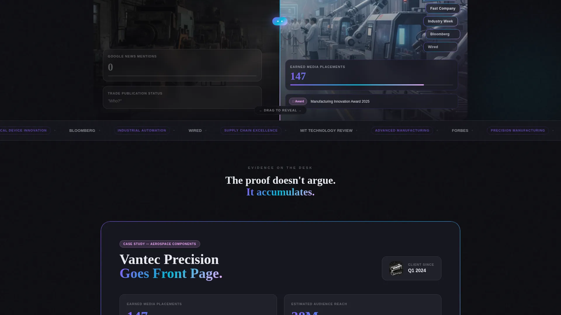
The header splits a single manufacturer's story into two realities. Drag the glowing iridescent pill handle left to see zero press mentions and trade publication obscurity. Drag right to see stacked media logos, an award trophy shelf, and a headline reading "From Shop Floor to Front Page." The entire sales pitch lives in one interaction.
Overlap/Layered Scroll Cards
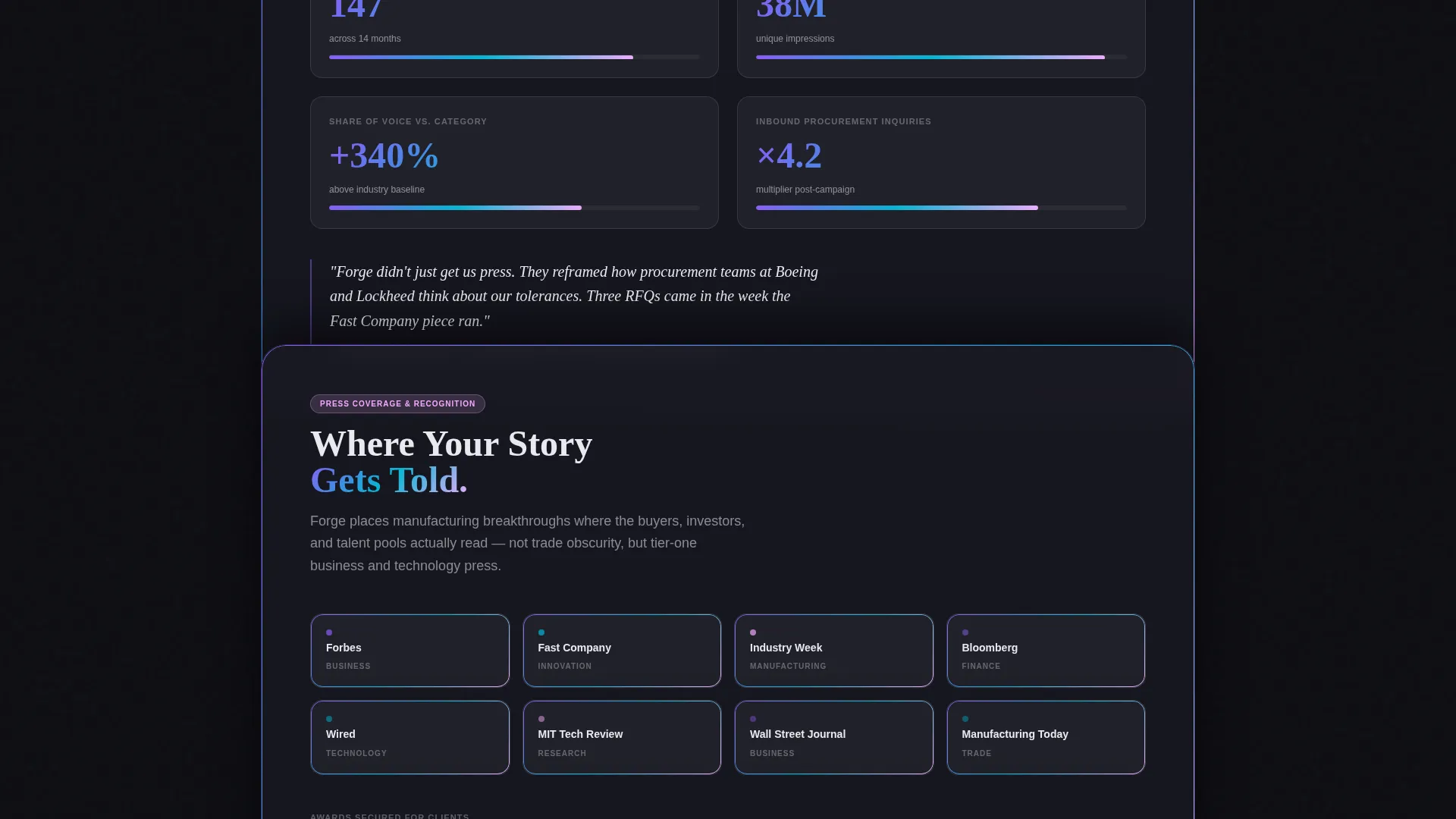
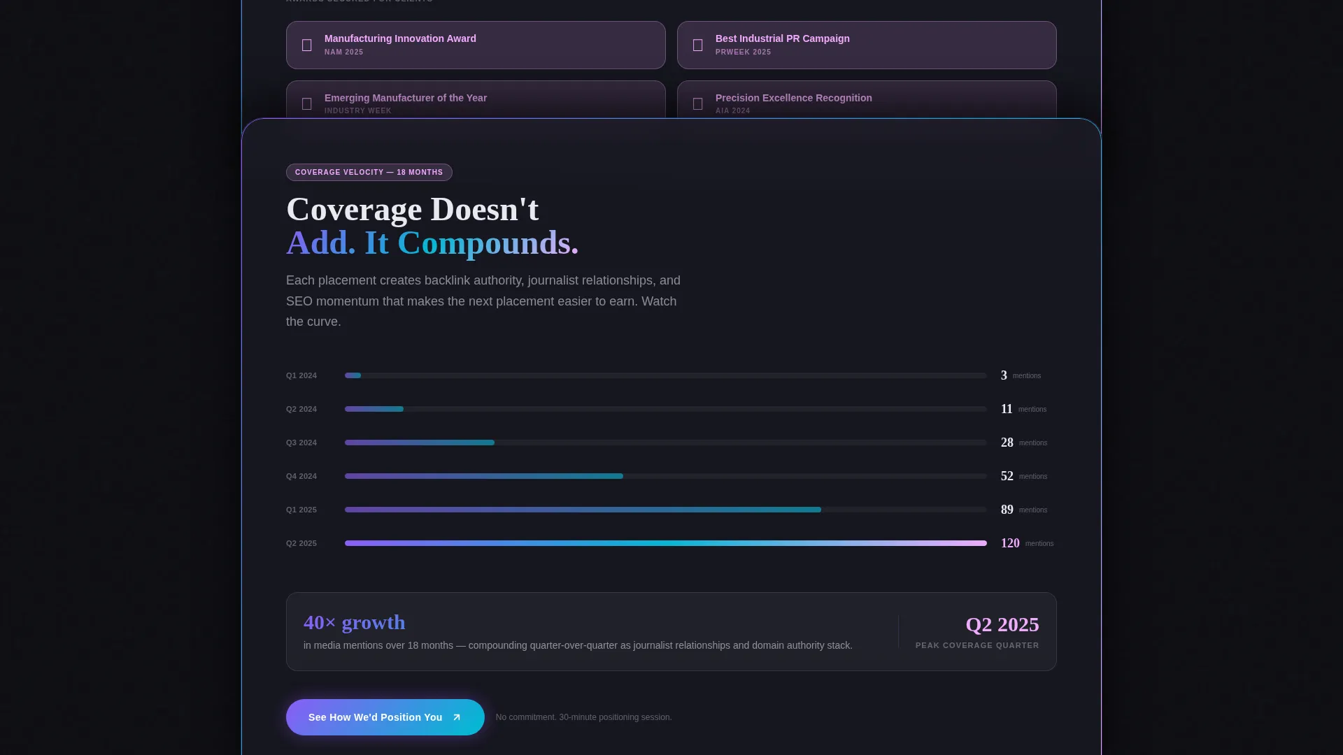
Three glass cards form a rising stack as the visitor scrolls. Each card overlaps the previous one by 15%, creating a visual sense of evidence accumulating. The structure is intentional: client media placement counts, specific awards won, and a coverage velocity timeline each get their own card, layered in the order that builds the strongest case.
Three-Point Call to Action Placement
The primary call to action, "See How We'd Position You," appears as a frosted-glass floating button after the header, then again embedded inside the third proof card, and finally as a full-width iridescent band at the page bottom. No form is used anywhere on the page.
Parallax Press Logo Spread
The second proof card fans out press logos in a parallax spread as the visitor scrolls past. The motion draws the eye and gives recognizable media names visual weight without requiring a separate section.
Award and Recognition Callouts
Molten highlight accents mark award badges and recognition moments throughout the page. These callouts are styled to read like dashboard metrics at a glance, making proof scannable rather than buried in paragraph text.
Coverage Velocity Timeline
The third proof card includes a timeline showing how media mentions compound quarter over quarter. The visualization communicates momentum rather than a single data point, reinforcing that results build over time.
Page sections overview
| Section | Purpose |
|---|---|
| Before/After Header | Opens with the transformation slider as the primary emotional hook |
| Floating call to action Button | First click-through prompt, appearing after the header interaction resolves |
| First Proof Card | Highlights a recognized client with media placement count as a glowing metric |
| Second Proof Card | Displays specific awards and a parallax press logo fan |
| Third Proof Card | Shows a coverage velocity timeline with the second embedded call to action |
| Full-Width call to action Band | Closes the page with an iridescent click-through prompt |
Design & branding system
The visual identity follows a Tech Glass theme built on an AI Iridescent color system. Every surface is layered, translucent, and calibrated to feel clinical yet magnetic.
- Base palette: deep obsidian (#0D0D12) background, translucent panel white (#E8EAF0) at 85% opacity for card surfaces, iridescent violet (#8B5CF6) to teal (#06B6D4) gradients on hover states and accent borders, and molten highlight (#F0ABFC) for award badges and recognition callouts
- Card surfaces shift between transparency and reflection depending on scroll position, mimicking the look of a cleanroom observation window
- The overall aesthetic mirrors a CNC machine at precision speed: controlled, luminous, and impossible to look away from
Mobile & speed optimization
The overlap/layered structure and iridescent effects are designed to translate cleanly across screen sizes without losing visual impact.
- Layered card overlaps and parallax effects are structured to maintain hierarchy on smaller viewports
- The before/after slider interaction is built for touch-drag as well as mouse-drag input
- The floating call to action button repositions responsively to stay visible without blocking key content on mobile screens
How this template helps you convert
Every design choice in Forge points toward a single outcome: a visitor who clicks through to the capabilities page because they genuinely want to know what your firm would do for their company specifically.
- The before/after slider creates emotional contrast before any copy is read, reducing the cognitive load needed to understand the value proposition
- The layered proof cards accumulate evidence in a sequence that mirrors how a buyer actually builds trust, moving from client recognition to specific awards to compounding momentum
- Three call to action placements ensure the click opportunity appears at every moment of peak conviction without interrupting the proof-building scroll
Other information about this template
Forge is part of a broader template library designed for agency and portfolio use cases. A few additional details worth knowing before you build with it.
- The template is single-page in structure, making it ideal as a click-through gateway to a more detailed capabilities or case study page
- The no-form approach is intentional: the page qualifies intent through the scroll experience rather than a gated form, reducing friction for high-value prospects
- Forge is categorized under Portfolio and Agency templates, specifically designed for the manufacturing marketing and PR agency niche
Theme
Tech Glass
Creative direction
Award & Recognition
Color system
AI Iridescent
Style
Overlap/Layered
Direction
Click-Through
Page Sections
Before/after Transformation Slider
Overlap/layered Proof Cards
Three-point Call to Action Architecture
Parallax Press Logo Spread
Award Badge Callouts
Coverage Velocity Timeline
Related questions
Does this template include a contact form?
Is this template only for PR agencies, or can manufacturers use it too?
How does the before/after slider work on mobile devices?
What is the coverage velocity timeline inside the template?
Do I need to write code to customize Forge?



