Manufacturing Marketing & Agency Portfolio Website Template
Forge is a dark, immersive landing page template built for manufacturing branding agencies. It uses an asymmetric 60/40 grid, an Electric Indigo color system, and an interactive scroll experience to showcase brand transformation case studies. The layout is designed to generate leads through a focused rebrand brief form and a gated brand audit download.
by Rocket studio
Quick summary
Forge is a single-page template for manufacturing branding agencies. It combines a dramatic dark aesthetic with a functional lead generation layout. The 60/40 asymmetric grid separates case study content from a persistent navigation rail, giving visitors a structured way to explore your work while being guided toward a clear conversion action.
Who this template is for
This template is built for agencies that position, name, and rebrand industrial and manufacturing companies. It speaks directly to the people running those agencies and pitching to senior marketing decision-makers at manufacturers.
- Brand agencies specializing in industrial or manufacturing clients
- Creative studios pitching to VP-level marketing leads at mid-market manufacturers
- Agency teams helping family-owned industrial firms prepare for acquisition or market repositioning
What problem this template solves
Most agency websites feel generic. A manufacturing branding agency needs a page that signals industry fluency and creative authority at the same time. Forge closes that gap.
- Generic portfolio templates do not communicate industrial expertise or strategic depth
- Manufacturers visiting a branding agency site need to see relevant transformations, not decorative case studies
- Standard lead forms feel like sales gates; Forge replaces that friction with a conversational brief intake
What you get with this template
Forge delivers a complete single-page layout structured around case study exploration and lead capture. Every section serves a purpose, from the opening headline to the final conversion block.
- A full asymmetric 60/40 grid layout with a persistent navigation rail and scrollable case study column
- A dark modal lead form with three sequential questions and a secondary gated PDF download path
- A cohesive Electric Indigo visual system with scroll-triggered interactions and violet accent states
Feature list
This template is built around deliberate design decisions, not decorative ones. Each feature listed below is drawn directly from the template brief.
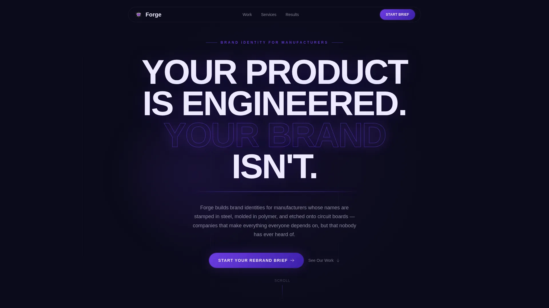
Giant Headline Header
The page opens with an architectural, full-viewport headline in white sans-serif type set against pure void black. The letters carry a faint indigo glow on their edges, and a thin violet line pulses once beneath the headline to draw the eye downward.
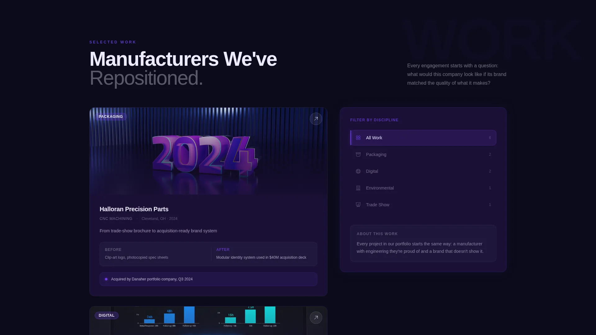
Asymmetric 60/40 Grid Layout
The 60-column side displays large-format case studies that shift and parallax as the visitor scrolls. The 40-column side holds a persistent dark navigation rail where project categories illuminate on hover and reorder the main content in real time.
Interactive Scroll Explorer
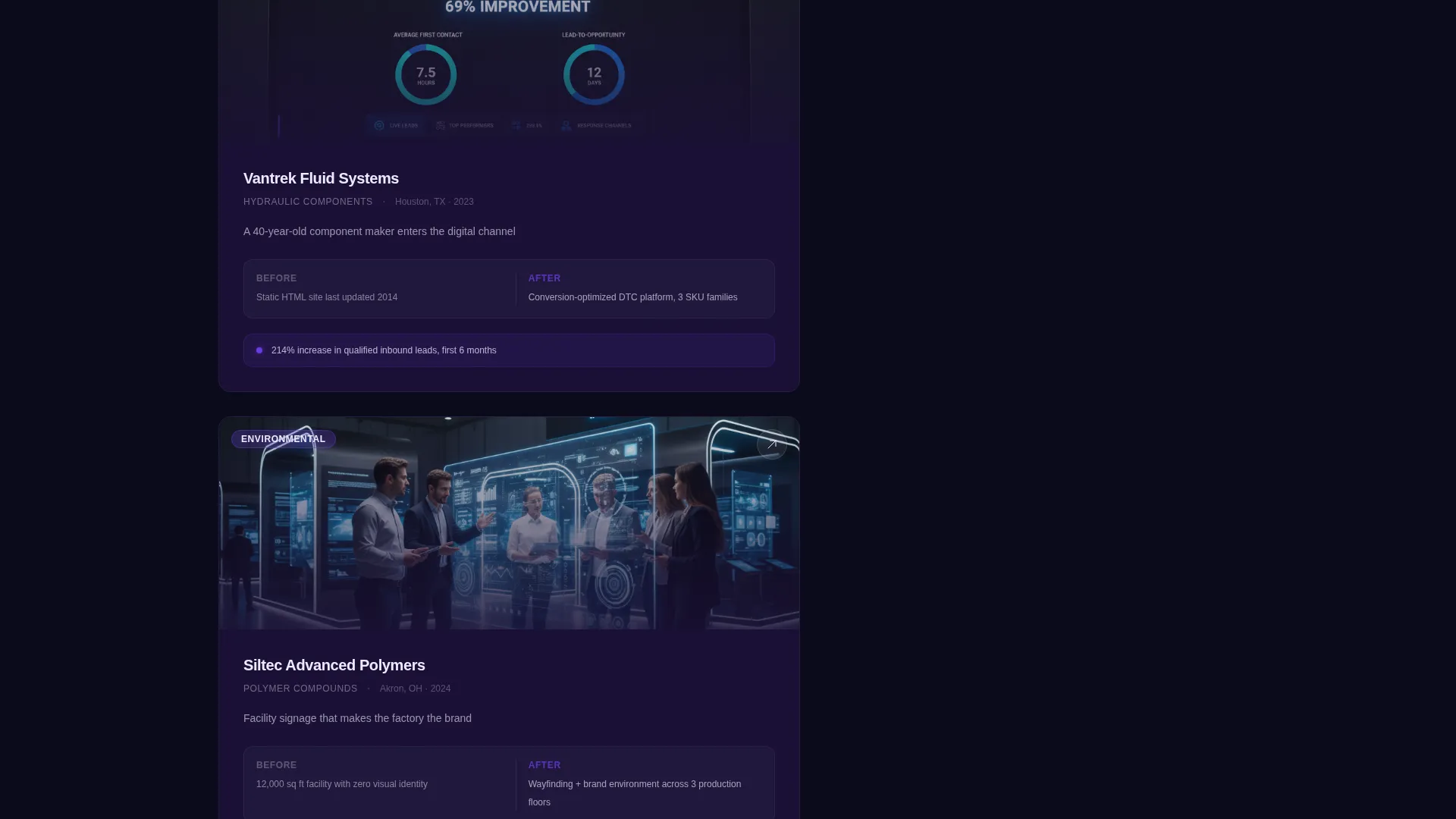
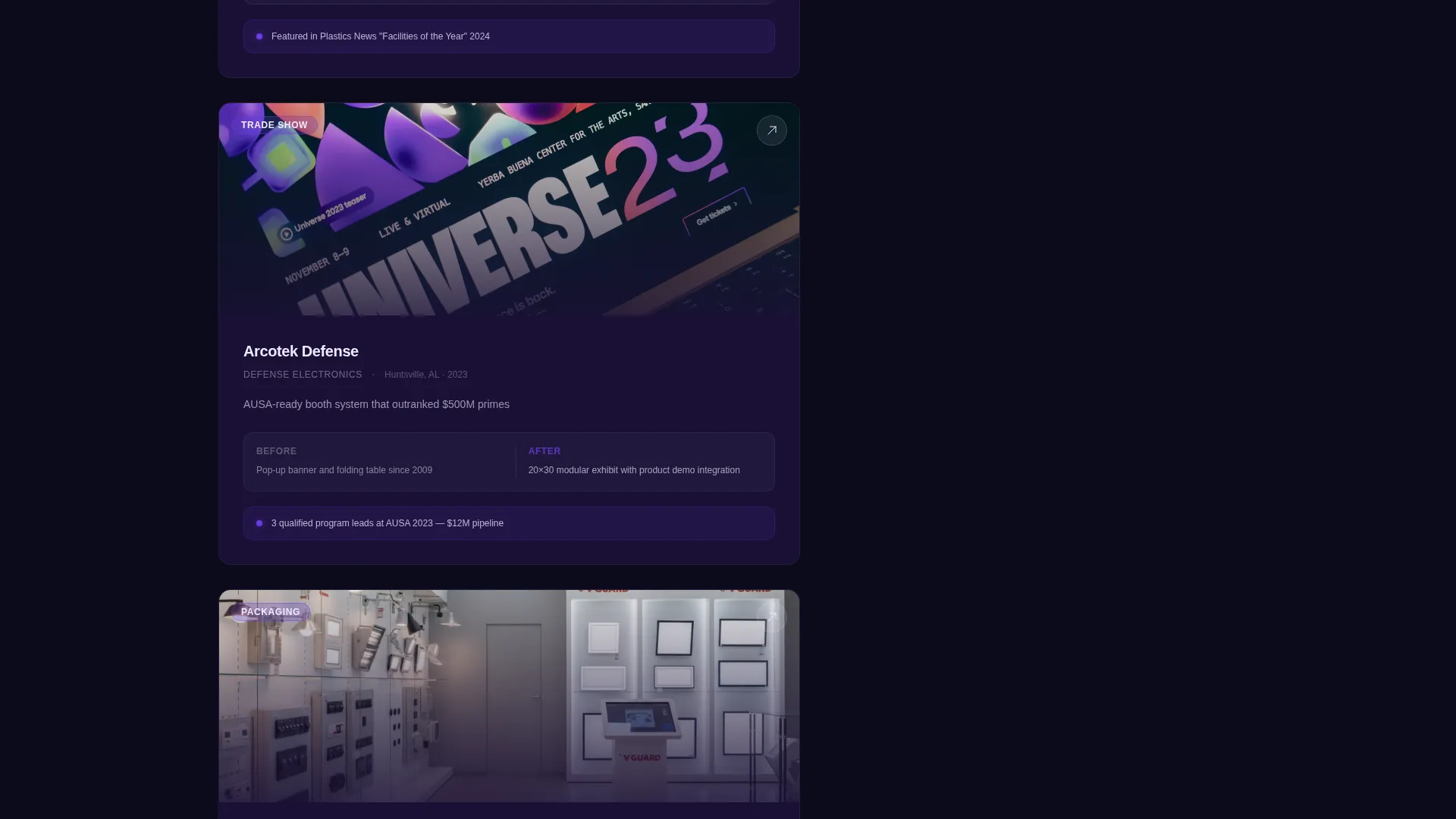
Scrolling moves the visitor through a dimensional content space rather than a flat page. Case study depth increases with each scroll section, escalating from logo systems to full facility signage mockups to investor deck redesigns.
Sequential Lead Capture Form
The primary call to action opens a dark modal form with three questions asked in sequence: company name and website, a dropdown for what triggered the rebrand, and a free-text field asking what the visitor manufactures. No phone number field and no budget question.
Gated Brand Audit Download
A secondary conversion path offers a downloadable manufacturing brand audit as a portable document format file. This path captures email and industry vertical only, giving non-ready visitors a lower-commitment way to engage.
Violet Pulse Interaction System
Charged violet appears throughout as an interactive signal: scroll-triggered borders, active navigation states, and call-to-action buttons all use the same accent color. The result is a consistent visual language that makes interactive elements feel alive.
Page sections overview
| Section | Purpose |
|---|---|
| Full-Viewport Headline | Sets tone and authority with architectural type and an indigo glow effect |
| Persistent Navigation Rail | Lets visitors filter and reorder case studies by project category |
| Case Study Column | Showcases brand transformation work with parallax scroll behavior |
| Before-and-After Studies | Illustrates identity evolution from trade-show aesthetics to full visual systems |
| Facility Signage Mockups | Demonstrates environmental branding depth and real-world application |
| Investor Deck Section | Elevates the agency's positioning from decoration to strategic repositioning |
| Primary call to action Block | Full-width conversion section after the final case study |
| Rebrand Brief Modal | Three-question sequential form in a dark overlay |
| Brand Audit Download | Secondary gated path for email capture with low commitment |
Design & branding system
The visual identity follows a Dark Immersive theme powered by the Electric Indigo color system. Every palette decision reinforces the feeling of concentrated industrial energy in a dark, precise environment.
- Void black (#0B0B1A) as the dominant background, deep indigo (#1A1035) for card surfaces, charged violet (#6C3CE1) for accents and interactive states, and arc-flash white (#EDEAFF) for headlines and body text
- Violet pulses through scroll-triggered borders, hover states, and call-to-action buttons to create a unified interaction language
- Dark layers build depth like anodized aluminum, with each surface appearing slightly distinct from the one beneath it
Mobile & speed optimization
The template is designed with a responsive structure that adapts the asymmetric grid for smaller screens. The persistent rail and scrollable content column adjust to a stacked layout on mobile without losing the visual hierarchy.
- The 60/40 grid collapses cleanly on smaller viewports so case studies and navigation remain accessible
- Scroll-triggered interactions are scoped to their sections so they do not create layout conflicts on touch devices
How this template helps you convert
Forge is built around two parallel conversion paths. Neither one feels aggressive, and both are structured to reduce friction for different types of visitors.
- The primary path uses a fixed call-to-action button in the navigation rail and a full-width conversion block at the end of the page. Clicking either one opens the dark modal form, which asks only three questions to lower the barrier to starting a conversation.
- The secondary path offers the brand audit download for visitors who are not yet ready to commit. It captures email and industry vertical with minimal ask, keeping those leads in the pipeline.
Other information about this template
Forge is a purpose-built template for a specific type of agency work. A few additional details help clarify who it fits and how it can be used.
- The template is categorized under Portfolio and Agency, with a subcategory focus on manufacturing marketing and agency use cases
- The niche focus is manufacturing branding, making it a strong fit for studios whose client roster is heavy with industrial, fabrication, packaging, and facility-based companies
- The before-and-after case study format is built into the layout structure, so agencies with strong transformation work will find the content slots ready to fill
- Project category filters cover packaging, digital, environmental, and trade show work, matching the common service lines of an industrial branding agency
Theme
Dark Immersive
Creative direction
Interactive Explorer
Color system
Electric Indigo
Style
Asymmetric Grid (60/40)
Direction
Lead Generation
Page Sections
Giant Headline Centered Header
Asymmetric 60/40 Grid Layout
Interactive Scroll Explorer
Sequential Three-question Lead Form
Gated Brand Audit Download
Violet Pulse Interaction System
Related questions
Who is this landing page template designed for?
What conversion tools are built into this template?
What does the lead capture form ask visitors?
Can I customize the project categories in the navigation rail?
Does the dark visual style work for agencies outside of manufacturing?


