Healthcare Consulting Landing Page Template
Consult is a single-column healthcare consulting landing page built around an editorial magazine aesthetic. It leads with a press mentions wall, layers client testimonials into a scrolling evidence mosaic, and closes with a focused "Request a Growth Diagnostic" form. Designed for healthcare growth consultants targeting private practices, specialty groups, and hospital systems.
by Rocket studio
Quick summary
Consult is a bold, editorial-style landing page for a healthcare growth consultant. It opens with curated press mentions instead of a headshot, then builds credibility through a scrolling testimonial mosaic paired with data cards. The page guides two types of prospects toward conversion: those ready to book a diagnostic call and earlier-stage leads who want a case study first.
Who this template is for
This template is built for consultants who work at the intersection of healthcare operations and business growth. It suits professionals who need their page to do serious qualification work before a prospect ever hits send.
- Healthcare growth consultants serving private practices, specialty groups, and hospital systems
- Independent strategists whose authority comes from results, not brand name recognition
- Consulting practices targeting partnership and business-to-business outreach rather than direct consumer traffic
What problem this template solves
Most consulting pages either look like a personal blog or a corporate brochure. Neither earns trust fast enough for a busy clinic director or a hospital VP. This template solves the credibility gap that costs consultants qualified leads every week.
- Prospects arrive skeptical and leave without contacting you because the page lacks proof
- Generic hero layouts bury the evidence that actually closes high-value B2B conversations
- Single-path forms push away early-stage leads who need more context before committing
What you get with this template
You get a fully structured single-column landing page with a clear editorial identity and two distinct conversion paths baked in. Every section is purposefully sequenced to move a cautious healthcare executive from doubt to action.
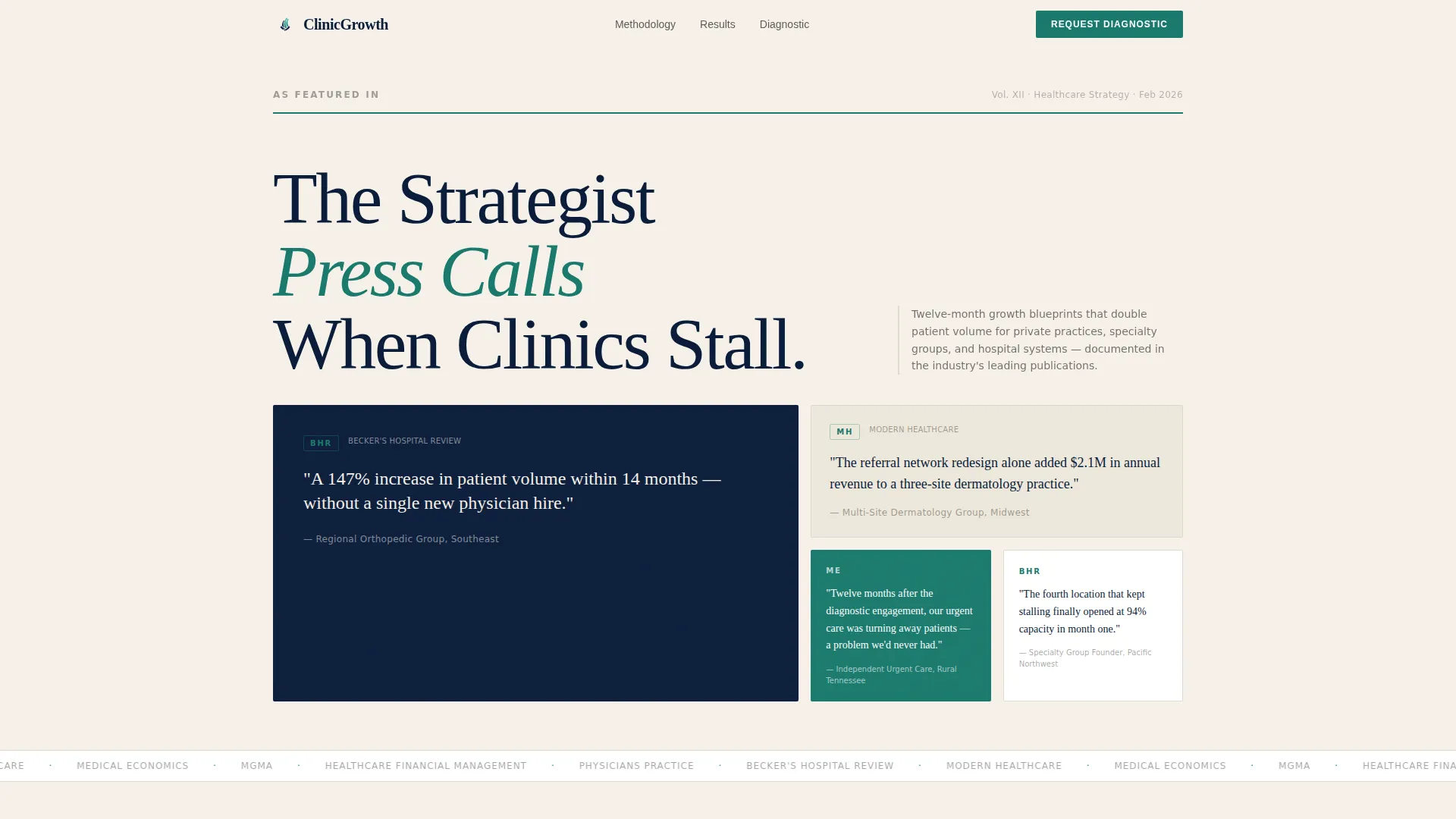
- A press mentions header block with publication logo grid and attributed result quotes
- A scrolling testimonial mosaic with three distinct client voices and interspersed data cards
- A dual conversion setup: a "Request a Growth Diagnostic" form and a gated PDF case study download
Feature list
This template packs deliberate structure into every scroll position. Each feature below comes directly from the brief.
Press Mentions Header Wall
The page opens with a curated grid of publication logos and headline snippets from recognized healthcare trade outlets. Each quote attributes a specific, measurable result to a named practice type, so authority is established before a visitor reads a single line of your own copy.
Testimonial Mosaic Layout
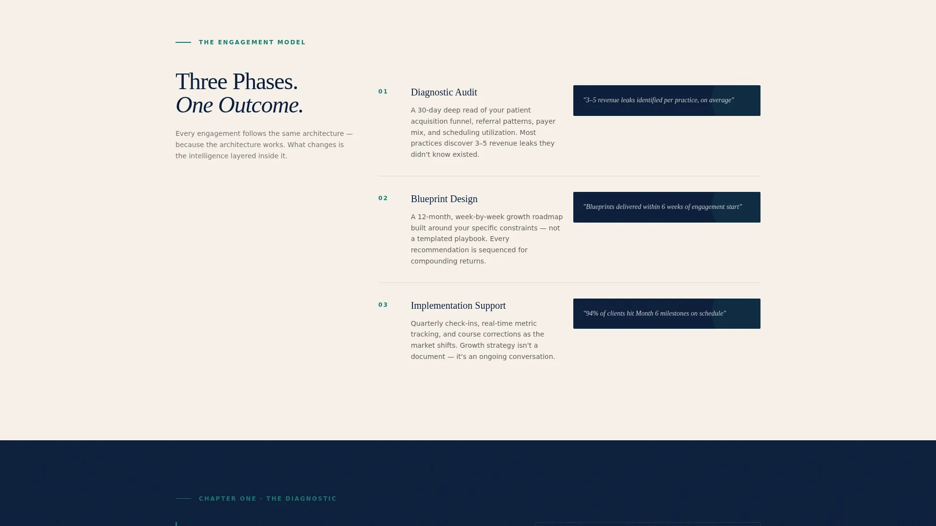
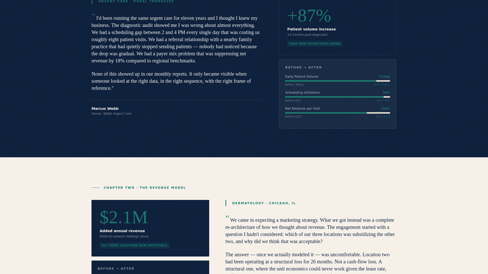
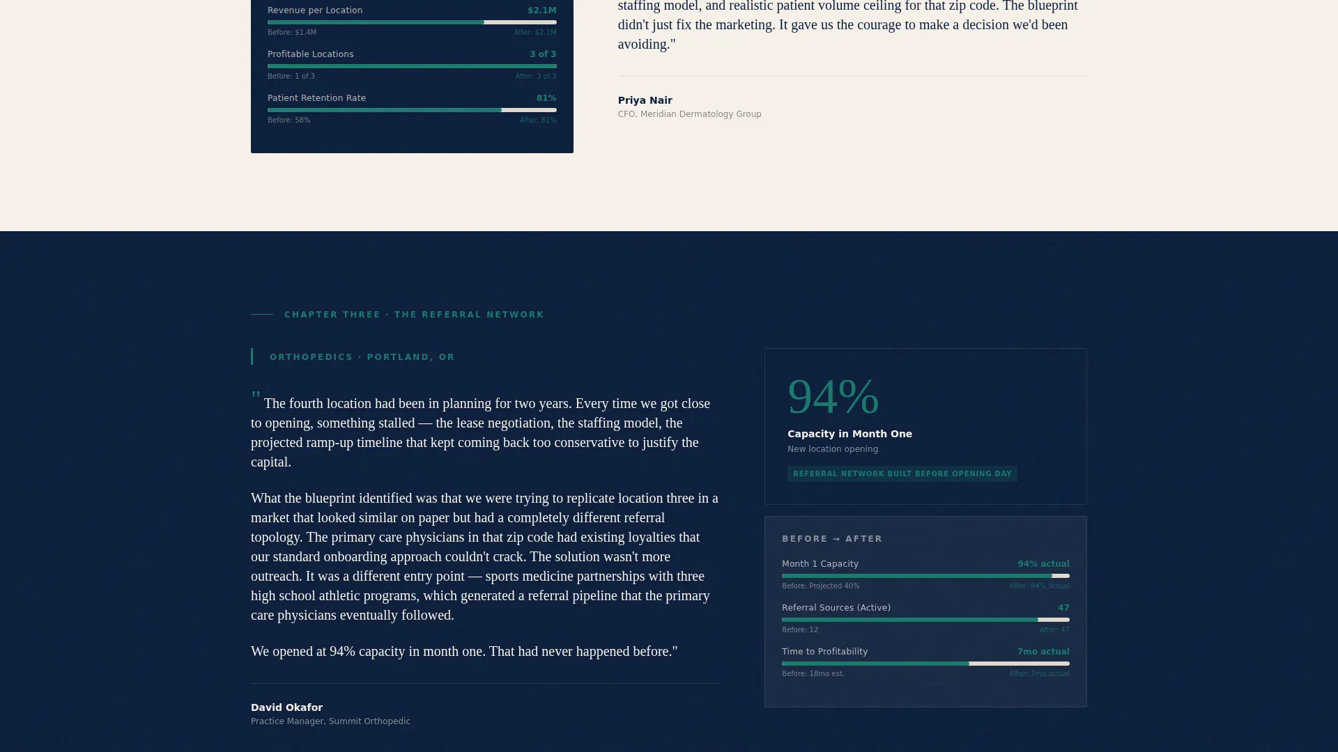
Three distinct client voices anchor the scroll flow. A rural urgent care owner, a dermatology group CFO, and an orthopedic practice manager each tell a different chapter of the growth story. The sequence builds a layered evidence wall that compounds with every section.
Editorial Data Cards
Between testimonials, data cards surface specific metrics styled like magazine infographics. Percentage increases, timeline bars, and before-and-after revenue figures appear as visual callouts rather than dashboard widgets, reinforcing proof without breaking the editorial rhythm.
Dual Conversion Path Design
The primary call to action, "Request a Growth Diagnostic," appears after the third testimonial block and again in the closing section. A secondary path offers a gated PDF case study download, capturing earlier-stage leads with name and email only.
Qualified Lead Form
The diagnostic request form collects practice type via dropdown, current monthly patient volume via a range selector, primary growth challenge in a free-text field capped at 200 characters, and a business email address. Personal email domains are not accepted, which keeps the lead quality high.
Navy Authority Branding System
The full color palette, typography pairing, and layout spacing are pre-configured. Deep editorial navy, warm newsprint cream, sharp masthead black, and a confident teal accent are applied consistently across headers, pull quotes, body sections, and interactive elements.
Page sections overview
| Section | Purpose |
|---|---|
| Press Mentions Header | Opens with publication logos and attributed result quotes to establish authority immediately |
| Testimonial Block One | Rural urgent care owner describes the diagnostic audit process |
| Data Card One | Surfaces specific growth metrics in an editorial infographic style |
| Testimonial Block Two | Dermatology group CFO walks through the revenue model redesign |
| Data Card Two | Before-and-after revenue figures styled as a magazine callout |
| Testimonial Block Three | Orthopedic practice manager recounts the referral network buildout |
| Data Card Three | Timeline bar and percentage increase from the orthopedic engagement |
| Primary call to action Form | "Request a Growth Diagnostic" form with practice type, volume, challenge, and business email |
| PDF Case Study Gate | Secondary conversion: gated orthopedic case study download behind name and email |
| Closing call to action Section | Repeat of primary call to action anchoring the bottom of the page |
Design & branding system
The visual identity is built on an Editorial Magazine theme using the Navy Authority color system. The palette references the look and feel of a prestigious business publication, authoritative without being cold, intellectual without being stiff.
- Color palette: deep editorial navy (#0B1D3A) for section headers and pull-quote backgrounds, warm newsprint cream (#F5F0E8) for body sections, sharp masthead black (#1A1A1A) for typography anchors, and confident teal (#1A7A6D) for links, data callouts, and interactive elements
- Typography: oversized serif for headlines with tight sans-serif for source attributions, arranged with the deliberate asymmetry of a magazine cover layout
- A thin teal rule separates the masthead line from the press quotes below, and navy dominates the dominant visual weight throughout the scroll
Mobile & speed optimization
The single-column flow is naturally suited to mobile viewports. The layout stacks cleanly without requiring horizontal scanning or pinch-zooming to read key proof points.
- Single-column structure means every section reads in a natural top-to-bottom flow on any screen size
- Typography scale and spacing are set to remain readable at mobile viewport widths without manual adjustment
- Data cards and testimonial blocks are designed as self-contained units that reflow without breaking the editorial visual hierarchy
How this template helps you convert
This template is engineered around the psychology of a skeptical healthcare executive. Every layout decision reduces friction and builds confidence before asking for commitment.
- The press mentions header removes the need for a personal pitch by leading with third-party validation, so the visitor is already convinced before they meet the consultant's own voice.
- The stacked testimonial mosaic creates a compounding evidence effect: each client story builds on the last, making it progressively harder for a prospect to dismiss the results as a one-off.
- The dual conversion path means you capture both ready-to-talk prospects and research-phase leads in the same scroll, without forcing every visitor into a form they are not yet ready to complete.
Other information about this template
This template is purpose-built for the healthcare consulting niche and reflects the specific expectations of B2B healthcare buyers. A few additional details worth noting:
- The page type is a single-column flow landing page, not a multi-page website, so all content lives in one continuous scroll
- The "Request a Growth Diagnostic" call to action language is baked into the layout and reflects a B2B partnership outreach orientation rather than a consumer sign-up flow
- The gated PDF case study specifically references an orthopedic practice engagement, giving the secondary conversion path a concrete, niche-specific hook
- The business email validation on the diagnostic form is a structural design choice that signals professionalism and helps filter non-qualified contacts
- This template is well suited for a solo strategist or small consulting firm that needs a high-authority first impression without a large content production investment
Theme
Editorial Magazine
Creative direction
Testimonial Mosaic
Color system
Navy Authority
Style
Single Column Flow
Direction
Partnership/B2B
Page Sections
Press Mentions Header Wall
Scrolling Testimonial Mosaic
Editorial-style Data Cards
Dual Conversion Path
Qualified Diagnostic Request Form
Navy Authority Color System
Related questions
Who is this landing page template designed for?
Can I adapt the testimonials if my client base is different?
What does the dual conversion path include?
Why does the form reject personal email addresses?
Is this a single page or a multi-page website template?



