Technology Consulting Landing Page Template
Consult is a single-column landing page template built for technology consulting firms that serve mid-market executives. It leads with a case study narrative flow, a dark full-bleed header, and a two-path conversion system. The design feels boardroom-ready: minimal, authoritative, and structured to earn trust before asking for contact details.
by Rocket studio
Quick summary
Consult is a single-column landing page template for technology consulting firms targeting senior decision-makers. It uses a case study narrative scroll, a dark immersive header with a frost blue glow, and a staged conversion system. The design is deliberate and minimal, built to communicate expertise before it ever asks for a name.
Who this template is for
This template is for technology consulting firms that sell transformation engagements to senior executives at mid-market companies. It works best when the firm has real client outcomes to showcase and a deal cycle that starts with a discovery conversation.
- Technology consultants advising CTOs on legacy modernization and technical debt reduction
- Consulting teams working with COOs on platform integration and operational margin improvement
- Independent advisors or boutique firms serving private equity operating partners before fund-cycle deadlines
What problem this template solves
Most consulting landing pages read like brochures. They list services, name credentials, and end with a contact form. That approach fails with executives who are already skeptical and short on time. This template solves the trust gap by letting the work speak before the ask ever appears.
- Visitors leave generic consulting pages unconvinced because there is no evidence of domain fluency
- Senior buyers do not respond to soft calls to action that appear before the firm has demonstrated relevance
- A single contact form treats all visitors the same, losing the ones who are close but not yet ready
What you get with this template
You get a fully structured single-column landing page with a clear visual hierarchy and a built-in two-path conversion flow. Every section is designed to move a skeptical executive from awareness to a scheduled conversation or a downloaded resource.
- A dark full-bleed header section with frost blue glow and a fade-in headline
- A scrollable case study narrative with number callouts, a minimal architectural diagram, flip cards, and animated outcome metrics
- Two conversion paths: a multi-step diagnostic call form and a gated PDF download for earlier-stage visitors
Feature list
This template is built around a small number of carefully considered components, each earning its place on the page.
Dark Full-Bleed Header with Glow Effect
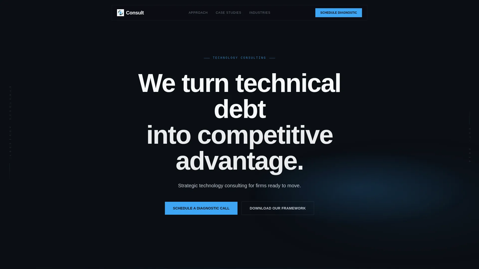
The header fills the viewport with near-black and a diffused frost blue luminous arc at center. A single glacial white headline fades in at large scale, followed by a silver subline. The glow pulses once, subtly, creating a sense of presence without any imagery or stock photography.
Case Study Narrative Scroll
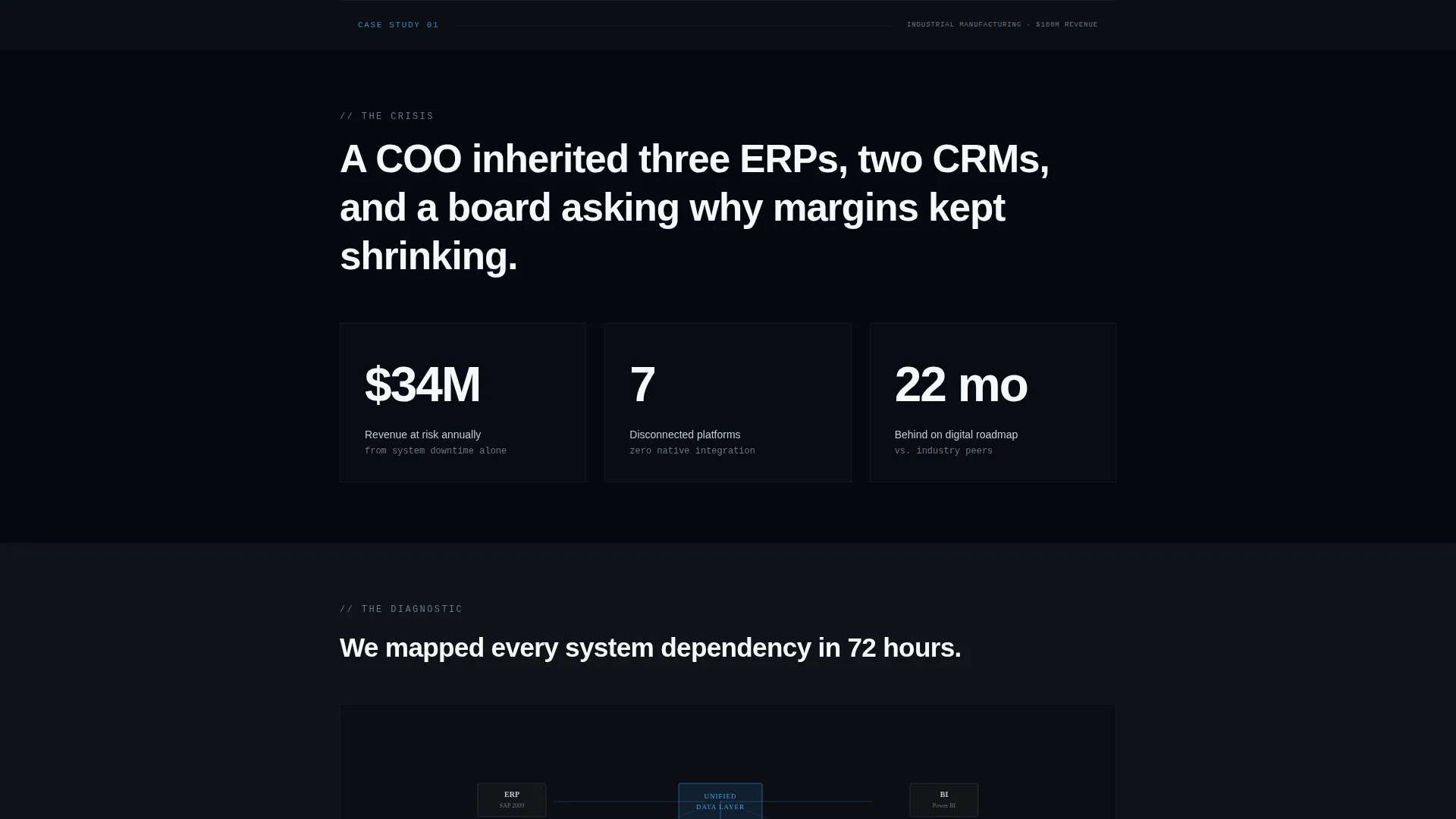
Scrolling past the header drops the visitor into a real client engagement told in sequence. Each case study moves through crisis, diagnostic, solution, and outcome phases. Multiple case studies follow one after another, each in a different industry and escalating in complexity.
Flip Card Problem-to-Resolution Layout
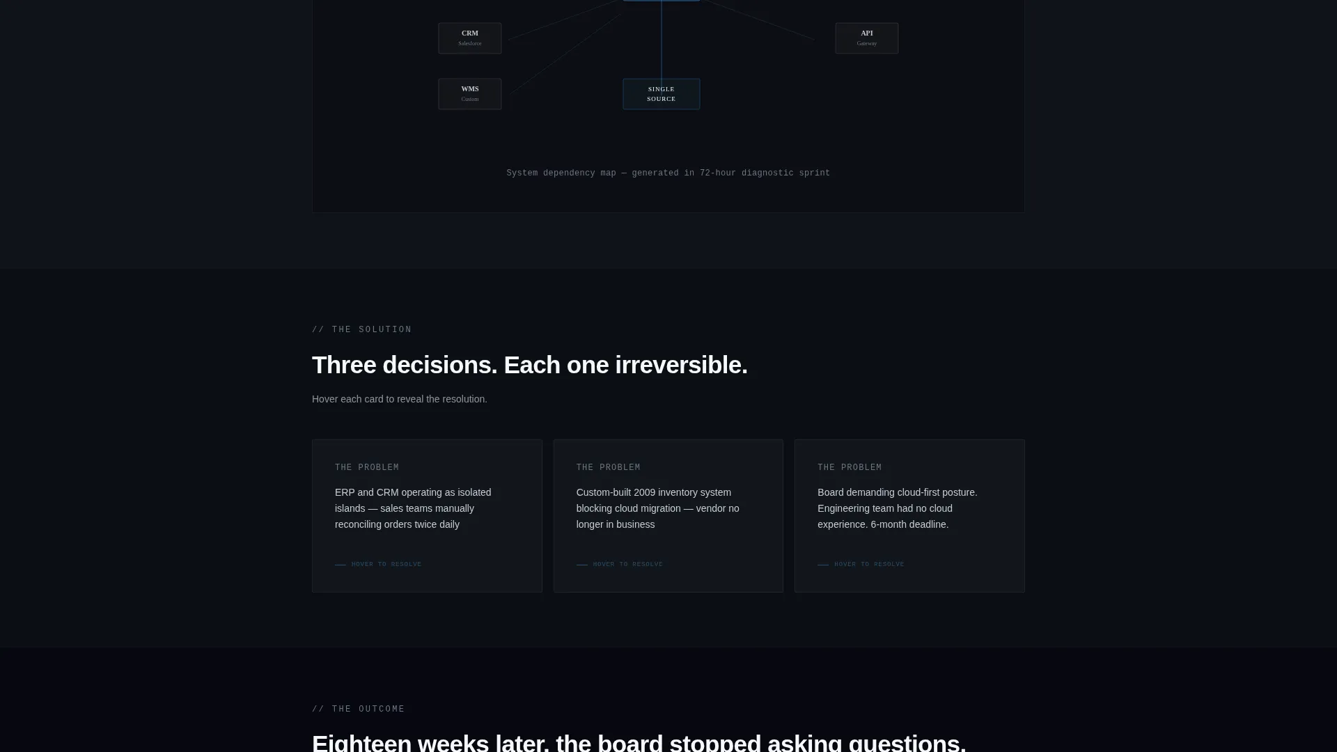
During the solution phase of each case study, strategic decisions are presented as cards. Each card flips from the identified problem on one side to the resolution on the other. This format keeps the narrative tight and the decision logic visible.
Animated Outcome Metrics
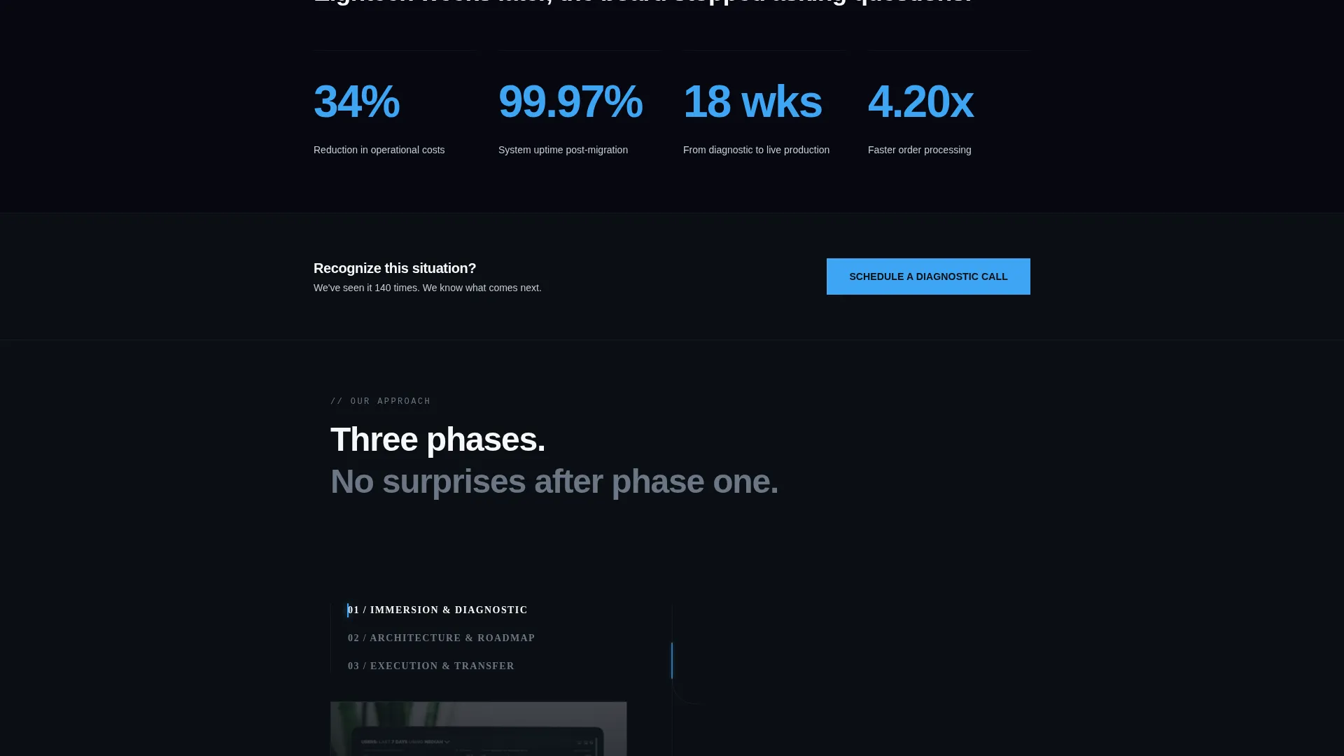
Hard results from each engagement animate upward in frost blue as the visitor scrolls into the outcome section. This gives the proof a visual weight that static text cannot match and reinforces the firm's track record at exactly the right moment.
Staged Multi-Step Conversion Form
The primary call to action is "Schedule a Diagnostic Call." The form collects company name first, then annual revenue range via dropdown, then an open field for the visitor's technology challenge. The email field appears only at the final step, after the page has already demonstrated fluency.
Gated PDF Secondary Path
Visitors not yet ready to talk can access a downloadable transformation framework. The gate asks only for name and business email. This secondary path captures earlier-stage leads without pressuring them into a call before they are ready.
Page sections overview
| Section | Purpose |
|---|---|
| Dark bleed header | Opens with headline, subline, and frost blue glow |
| Case study crisis | Presents client problem in stark numbers on black |
| Diagnostic diagram | Assembles a minimal architectural diagram on scroll |
| Solution flip cards | Flips each problem card to its resolution |
| Outcome metrics | Animates hard results upward in frost blue |
| Second case study | Repeats narrative arc in a different industry |
| Diagnostic call call to action | Collects company name, revenue range, and challenge |
| PDF download gate | Captures name and email for framework download |
| Sticky navigation call to action | Keeps "Schedule a Diagnostic Call" pinned in the nav |
Design & branding system
The visual identity follows an Executive Suite theme built around an Arctic White color system. Every color choice is intentional, and the palette as a whole reads like a corner office at dawn: restrained, confident, and high-contrast.
- Core palette: deep boardroom black (#0B0E13) for backgrounds, glacial white (#F7F8FA) for primary type, and cool silver (#C5CCD6) for secondary text and supporting elements
- Accent usage: electric frost blue (#3DA5F4) is reserved strictly for interactive elements, data highlights, and animated metrics, keeping it meaningful every time it appears
- No stock photography or decorative imagery anywhere on the page; visual weight comes entirely from typography, data, and structured whitespace
Mobile & speed optimization
The single-column layout adapts naturally to smaller screens. Every section in the scroll narrative is designed to read clearly at mobile widths without losing the visual rhythm of the case study flow.
- Single-column structure means no complex grid reflows or broken multi-column layouts on mobile devices
- Scroll-triggered animations and flip card interactions are designed to work within the linear flow of a touch-based session
- The sticky navigation call to action remains accessible at the top of the screen throughout the entire scroll on all device sizes
How this template helps you convert
The conversion strategy is built on a simple premise: prove expertise first, then ask for something. The page earns trust incrementally before any form appears.
- The case study narrative builds credibility across multiple industries before the first call to action surfaces, so the visitor already believes in the firm's fluency when they reach the form
- The staged diagnostic form lowers the initial commitment barrier by asking about the visitor's challenge before asking for contact details, making the first step feel like a consultation rather than a lead capture
- The secondary PDF download path ensures that visitors at an earlier stage of consideration are captured with a lighter ask, keeping them in the firm's orbit for a future conversation
Other information about this template
This template is listed under the Professional Services category with a Management Consulting subcategory focus. It is designed for B2B lead generation and partnership-driven engagement rather than direct transactional conversion.
- The template style follows an editorial and magazine-influenced layout, with a strong narrative structure that carries the reader through a story rather than a feature list
- The creative direction draws on an educational guide theme, using real engagement data and structured diagnostic logic to position the consulting firm as a trusted authority
- The landing page direction is built explicitly for lead generation, with both conversion paths designed to qualify visitors before passing them to a sales conversation
- The intersection context aligns with change management consulting, where the buyer journey involves significant internal deliberation and multiple stakeholder sign-offs before a firm is selected
Theme
Educational Guide
Creative direction
Team & People
Color system
Navy Authority
Style
Editorial/Magazine
Direction
Lead Generation
Page Sections
Dark Full-bleed Header with Glow
Case Study Narrative Scroll
Flip Card Solution Layout
Animated Outcome Metrics
Staged Diagnostic Call Form
Gated PDF Download Path
Related questions
Who is this landing page template designed for?
Can I use this template if I only have one case study?
What are the two conversion paths in this template?
Does this template use stock photography or background images?
Is this template suitable for a firm that works across multiple industries?



