Oncology Medicine FAQ Website Template
Consult is a zigzag oncology telemedicine landing page template built for services that connect newly diagnosed cancer patients with board-certified specialists via secure video within 48 hours. It pairs a stats-driven hero wall with frequently asked question-led alternating panels, coral call-to-action buttons, and a calm educational aesthetic that earns patient trust before asking for a single click.
by Rocket studio
Quick summary
Consult is a single-page telemedicine landing page template designed for oncology services that connect patients to board-certified doctors fast. The layout opens with three animated proof metrics, then guides visitors through a series of zigzag frequently asked question panels that answer real patient fears in plain language. Every section flows toward one clear desired action: checking eligibility for a specialist video consult.
Who this template is for
This doctor landing page template serves healthcare teams and clinic operators who need a compelling, patient-first web presence without building from scratch. It is equally useful for solo oncology practices, multi-specialist telemedicine platforms, and rural health networks helping patients access distant expert care.
- Oncology telemedicine providers launching a new patient-facing landing page
- Healthcare organizations offering second-opinion services across state lines
- Rural primary care physicians or clinic coordinators who refer patients to remote specialists
What problem this template solves
Newly diagnosed cancer patients arrive at a medical website scared, overwhelmed, and unsure what to ask. A generic doctor landing page does not answer those fears. This template solves that problem by making the page itself feel like a consultation, not a brochure.
- Patients cannot quickly find clear answers about services, eligibility, or insurance on standard medical pages
- Visitors leave before converting because the page does not address emotional barriers early enough
- Medical professionals waste time on pages that fail to convert visitors into qualified leads
What you get with this template
This landing page template gives healthcare providers a fully structured, ready-to-customize page that communicates expertise, builds confidence, and drives conversions from the first scroll. Every section is purposeful, and every element aligns with one primary conversion action.
- A stats-driven hero section displaying three animated trust metrics with coral call-to-action placement
- Six alternating zigzag frequently asked question panels that answer patient questions in escalating emotional order
- A mid-page coral call to action repeat block, a secondary downloadable patient guide link, and a linear single-row footer
Feature list
This landing page template ships with purpose-built components designed specifically for oncology telemedicine services. Each feature below is grounded in the template structure described in the source brief.
Animated Stats Hero Wall
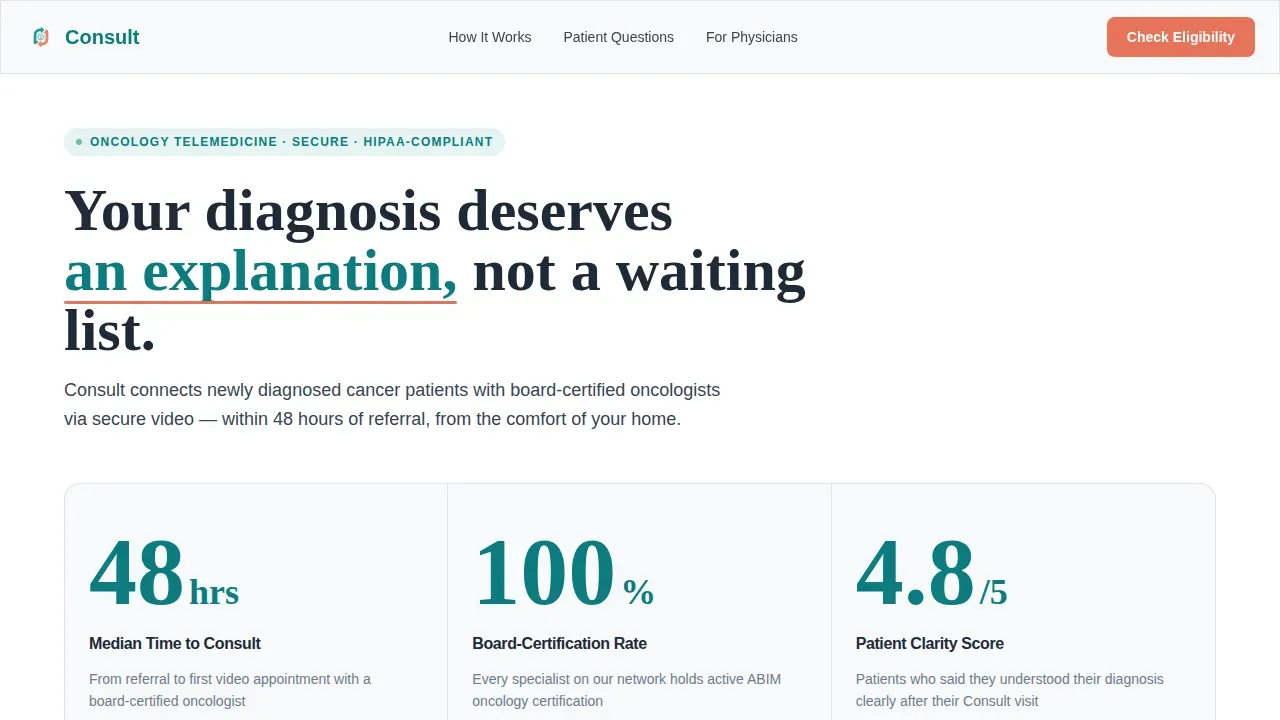
The header section displays three oversized animated figures: median time-to-consult at 48 hours, a 100 percent board-certification rate, and a patient-reported clarity score of 4.8 out of 5. Each number counts up on load in bold teal against deep charcoal. This compelling opening replaces stock imagery with immediate, credible evidence that patients and caregivers can trust at a glance.
Zigzag frequently asked question Panel Layout
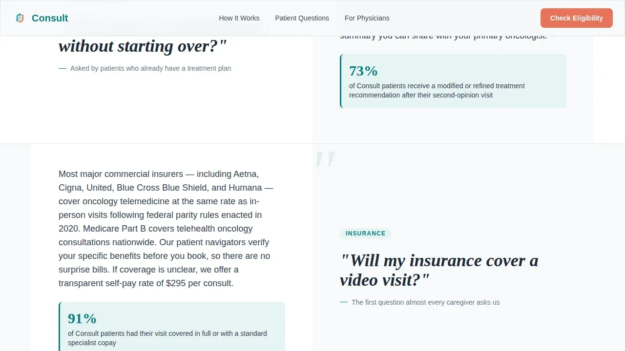
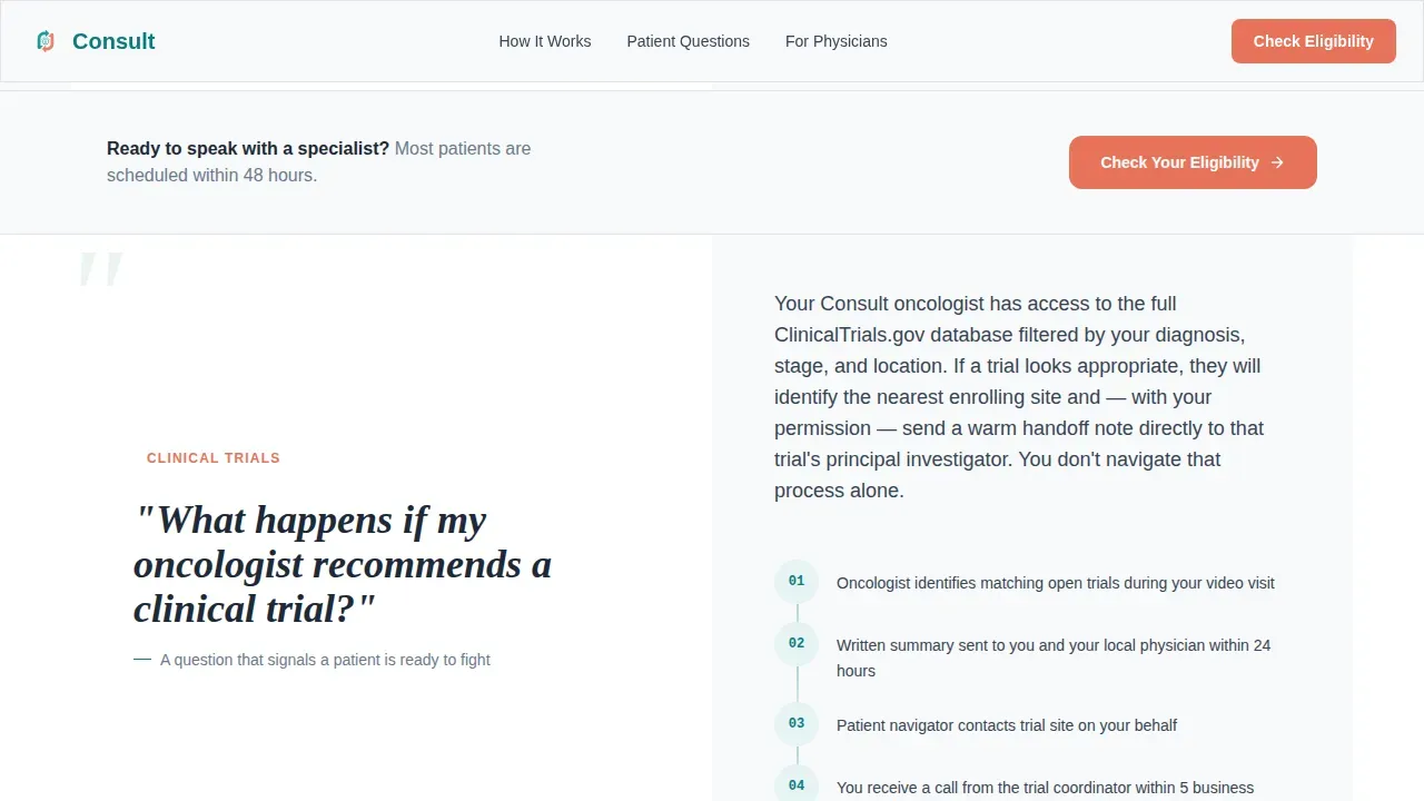
Six frequently asked question panels alternate left and right across the page, each opening with a real patient question set in large Fraunces serif type. The opposing panel delivers a jargon-free answer enriched with a supporting metric or a short process diagram. Questions escalate in emotional weight from logistics to treatment to prognosis, mimicking the natural rhythm of an actual doctor consultation.
Coral call to action System
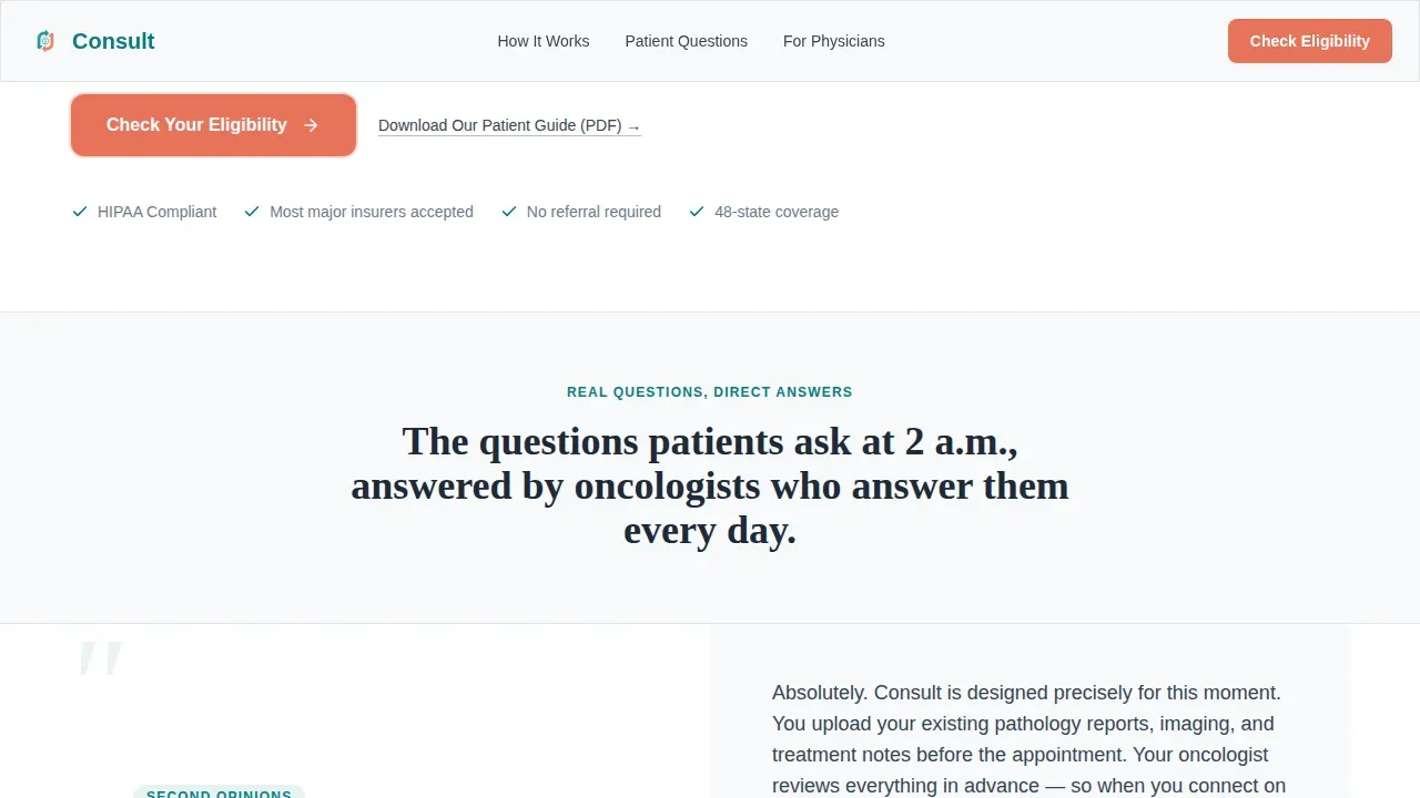
The primary call-to-action button, labeled "Check Your Eligibility," appears first beneath the hero stats and repeats after every third frequently asked question pair. Each instance uses warm coral on cloud white to draw the eye without crowding the page. A secondary text link, "Download Our Patient Guide (PDF)," captures earlier-stage visitors who need more resources before they schedule.
Intake Form Path
Clicking the primary coral button leads visitors to a short intake form on the following page. The form captures diagnosis type, insurance carrier, and preferred consult window, keeping fields minimal to avoid overwhelming patients. This streamlined approach reflects best practices for medical landing pages: simple forms produce more leads than long ones.
Teal Catalyst Trust Signals
Clinical teal section anchors and trust signal blocks display doctor credentials and key proof points throughout the page. These elements are positioned to build trust progressively as users scroll, so that by the time the call to action reappears, it feels like the natural next step rather than a hard sell.
Scroll-Triggered Reveal Animations
Staggered section reveals and scroll-triggered frequently asked question entries use Intersection Observer behavior so content appears at the right moment as visitors move down the page. Number count-up animations on the metrics wall and hover states on frequently asked question panels add motion without heavy JavaScript, keeping the experience smooth across device types.
Page sections overview
| Section | Purpose |
|---|---|
| Hero Stats Wall | Display three animated trust metrics and primary coral call to action |
| frequently asked question Zigzag Pair 1 | Answer logistics questions on second opinions and insurance |
| frequently asked question Zigzag Pair 2 | Address treatment questions on clinical trials and care coordination |
| Mid-Page call to action Block | Repeat coral eligibility call to action after first two frequently asked question pairs |
| frequently asked question Zigzag Pair 3 | Cover prognosis and hope questions with a process diagram |
| Linear Footer | Single-row footer closing the page with navigation links |
Design & branding system
The visual identity follows an Educational Guide theme that feels like a teaching hospital corridor: clinical authority with enough warmth to feel human. The palette and typography choices work together to reduce anxiety and display information with clarity.
- Clinical teal (#0D7C7F) for section anchors and trust signals; deep charcoal (#1E2A38) for body text; soft cloud white (#F7F9FA) on alternating background panels; warm coral (#E8735A) reserved exclusively for calls to action and urgent data points
- Fraunces serif for patient questions and headlines; DM Sans for body copy and frequently asked question answers, creating a clear typographic contrast between question and response
- A polished design with no stock photography in the hero, relying instead on bold evidence-led website design that communicates authority before any image is needed
Mobile & speed optimization
This telemedicine landing page is built desktop-first with full mobile responsiveness, recognizing that many patients research their diagnosis from mobile devices while sitting in waiting rooms. Every section reflows cleanly for smaller screens.
- Buttons and text remain easily tappable and readable on smartphones, making the page genuinely mobile friendly without sacrificing the desktop visual hierarchy
- Server Components handle static content and minimal JavaScript powers the animations, keeping the interactive experience light and functional across any device size
- The zigzag layout collapses into a clean vertical stack on small screens so the frequently asked question conversation flow stays readable and patients can follow the question-and-answer rhythm without horizontal scrolling
How this template helps you convert
This telemedicine landing page is engineered to convert anxious visitors into qualified patients by answering their real fears before asking for anything in return. The layout logically flows from evidence to education to action.
- The animated metrics wall immediately establishes credibility, so visitors know within seconds what services are offered and what they can expect from the provider before reading a single paragraph.
- Each frequently asked question zigzag pair reduces a specific fear and moves the visitor one step closer to the coral call to action, so that clicking "Check Your Eligibility" feels like the obvious continuation of a conversation rather than a commitment.
- The secondary PDF guide link captures visitors who are not ready to schedule yet, turning early-stage interest into a return visit and giving the page two conversion paths instead of one.
Other information about this template
This template is a strong fit for any modern healthcare business that needs to establish an online presence quickly and professionally. Pre-designed landing page templates like Consult reduce the time and cost required to launch a polished medical website. Medical professionals can customize colors, copy, testimonials, and doctor credential blocks to match their clinic's branding and specific services, whether those services extend to genetic counseling, clinical trial navigation, pharmacy coordination, or weight loss and wellness programs alongside oncology offerings.
- The page template is built with search engine optimization in mind: clear heading hierarchy, descriptive section copy, and guidance on meta description and image alt text fields help search engines index the page effectively and attract the right audience
- Adding patient testimonials and displaying board-certification credentials are proven practices that build trust and improve conversions; this template reserves dedicated space for both, making it straightforward to incorporate social proof without custom web design work
- Because every image, button, and line of messaging aligns with the single desired action, the template's effectiveness comes from focus: visitors are not distracted by menus or unrelated pages, and the site is structured to protect that focus from the first pixel to the footer
- The template also supports a secondary audience path: caregivers and rural doctors who land on the page will find the frequently asked question panels and downloadable patient guide beneficial as standalone resources that explain the telemedicine process clearly, even before they are ready to book a consult
Theme
Educational Guide
Creative direction
FAQ-Driven
Color system
Teal Catalyst
Style
Zigzag/Alternating
Direction
Click-Through
Page Sections
Animated Metrics Hero Wall
Faq-driven Zigzag Panels
Coral Call to Action Repeat System
Streamlined Intake Form Page
Teal Catalyst Trust Signal Blocks
Scroll-triggered Reveal Animations
Related questions
Can I customize this template to match my clinic's existing branding?
Does this template include a working intake form?
Is this template suitable for telemedicine services beyond oncology?
How does this template support search engine visibility?
Who is this doctor landing page template built for?



