Internal Medicine Medicine Education Website Template
Consult is a comparison table landing page built for an internal medicine patient education platform. It translates complex diagnoses like diabetes management, blood pressure staging, and medication comparisons into plain-language guides authored by board-certified physicians. A multi-step intake form, scroll-driven expert panels, and downloadable condition guides give anxious patients and caregivers real clinical clarity, day or night.
by Rocket studio
Quick summary
Consult is a warm, clinically grounded landing page that brings board-certified physician voices directly to patients who are confused, newly diagnosed, or caring for someone else. Each scroll section pairs a physician portrait with a fully readable comparison table. The page earns trust by giving value first, then inviting visitors to save what they have already read.
Who this template is for
This template is built for health educators, medical content teams, and patient-facing platforms that need to make clinical information genuinely accessible. It suits anyone publishing structured, physician-authored health content for a consumer audience.
- Newly diagnosed adults researching their condition late at night, seeking reassurance alongside accuracy
- Caregivers managing a parent's medication schedule who need practical, plain-language breakdowns
- Chronic disease patients trying to understand why their treatment plan just changed
What problem this template solves
Most health information online is either dangerously oversimplified or written for a clinician audience. Patients land on a page at 2 a.m. and leave more anxious than when they arrived. This template closes that gap by structuring complex clinical comparisons in a format that is warm, unhurried, and readable without a medical degree.
- Dense diagnostic language goes unread because patients do not feel the page was made for them
- Comparison tables buried behind paywalls or email gates train visitors to distrust health content sites
- Condition guides scattered across multiple pages force users to piece together their own understanding
What you get with this template
The template delivers a fully structured, single-page content destination with five distinct scroll sections, a multi-step intake form, three physician-authored comparison tables, and a sticky conversion bar. Every component is described in the source brief and built to work together.
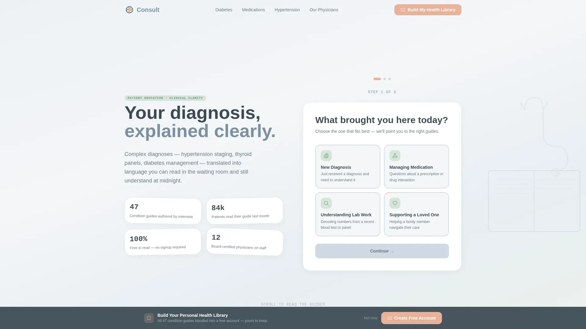
- A multi-step health compass form with illustrated intent tiles, a condition dropdown, and an email capture step
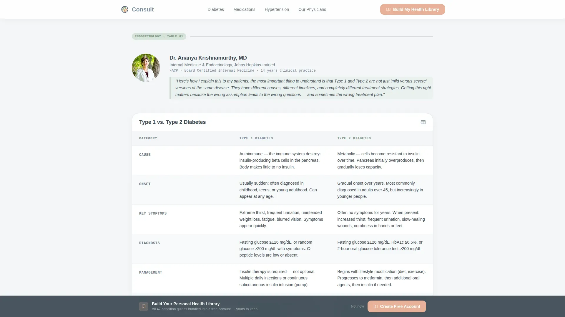
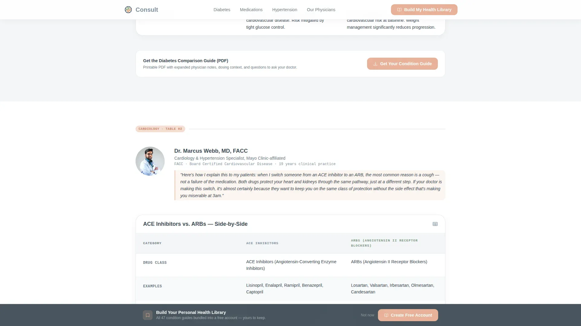
- Three expert panel sections, each featuring a physician portrait, a personal introductory note, a full comparison table, and a condition guide call to action
- A social proof section with patient testimonials, board certification indicators, and physician attribution, plus a linear single-row footer
Feature list
This template includes the following built-in components and interaction patterns.
Multi-Step Health Compass Form
The header form guides visitors through three steps: selecting their reason for visiting, narrowing their condition category, and capturing their email. Each step transitions with a page-turn animation. The form sits on a full-width mist-gradient background beside a stethoscope-and-open-book illustration.
Physician-Authored Comparison Tables
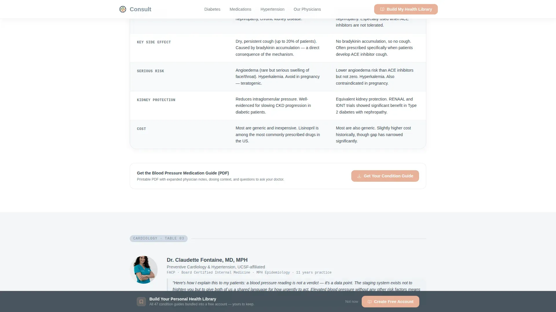
Each of the three expert panel sections introduces one board-certified internist by name and candid portrait. That physician presents a comparison table they personally authored, introduced by a first-person note written in their voice. Tables cover Type 1 versus Type 2 diabetes, ACE inhibitors versus ARBs, and blood pressure staging.
Downloadable Condition Guide calls to action
After each comparison table, a primary call to action reads "Get Your Condition Guide." Clicking it delivers a downloadable PDF version of that specific table plus expanded physician notes. The table is fully readable before any sign-up, so the download feels like saving something already owned.
Sticky Bottom Conversion Bar
A persistent bottom bar stays visible as the visitor scrolls the full page. It invites users to "Build Your Personal Health Library" by bundling all available guides into a free account. This secondary conversion path captures visitors who want more than a single guide.
Scroll-Reveal Expert Panel Layout
Each physician section reveals on scroll, creating a rhythm that feels like rotating through specialist consultations. The layout uses tab switching inside comparison tables for compact mobile display and scroll-triggered section reveals for desktop engagement.
Social Proof and Trust Section
A dedicated trust section follows the three expert panels. It includes patient testimonials with candid photos, board certification badges, and a methodology note explaining how the guides are authored and reviewed. This section reinforces accumulated expertise rather than relying on a single authority.
Page sections overview
| Section | Purpose |
|---|---|
| Hero Form | Multi-step health compass with illustrated intent tiles and page-turn animation |
| Diabetes Table | Type 1 versus. Type 2 comparison with physician portrait and PDF call to action |
| Medications Table | ACE inhibitors versus. ARBs comparison with physician portrait and PDF call to action |
| Hypertension Table | Blood pressure staging comparison with physician portrait and PDF call to action |
| Trust and Social Proof | Patient testimonials, board certification badges, and methodology note |
| Footer | Linear single-row footer pattern |
Design & branding system
The visual identity follows an Educational Guide theme using a Soft Mist color palette. The combination of fog white, calming slate, reassuring sage, and gentle charcoal creates a consultation-room softness without sterile clinical coldness. Muted apricot provides warmth on interactive elements and progress indicators only.
- Color palette: fog white (#F4F6F8) backgrounds, calming slate (#7B8FA1) primary tones, reassuring sage (#A3B9A8) supporting accents, gentle charcoal (#3D4A54) body text, and muted apricot (#E8B298) for interactive highlights
- Typography: DM Sans is used for all body copy and headings; JetBrains Mono is reserved for table data and label text to give clinical data a clear, readable rhythm
- Illustration style: warm and casual, not sterile, with a stethoscope draped over an open book as the hero visual anchor
Mobile & speed optimization
This template is designed mobile-first. The target user is often on a phone at night, in bed, mid-worry. Every interaction is built to work cleanly on a small screen without requiring pinch-zoom or horizontal scrolling.
- Comparison tables use tab switching for mobile display, keeping all data accessible without side-scrolling
- The multi-step form is thumb-friendly, with large illustrated tile targets and single-question-per-screen pacing
- Server components handle the static comparison table content, while client-side components manage the interactive form and sticky bar
How this template helps you convert
The conversion strategy is built on a content-first trust model. Visitors read the full tables without any gate, which builds genuine confidence in the platform before any ask is made.
- Each comparison table section ends with a "Get Your Condition Guide" call to action that offers the PDF as a save-what-you-already-read moment, reducing friction and increasing download intent
- The sticky bottom bar maintains a secondary "Build Your Personal Health Library" offer throughout the entire scroll, capturing visitors at any point in their reading journey
- The multi-step form at the top personalizes the experience from the first interaction, making users feel understood before they reach the first comparison table
Other information about this template
This template is well suited for teams publishing content across internal medicine topics including hypertension staging, thyroid panel interpretation, polypharmacy guidance, and diabetes management. The page is localized for English (United States) audiences with US-format dates and no currency display.
- Animation level is set to medium: page-turn transitions on the form, scroll reveals on expert panel sections, and tab switching inside tables
- The footer uses a linear single-row pattern for a clean, minimal close to the page
- Physician attribution appears on every table as an "authored by" label, reinforcing that each guide comes from a named, credentialed source
- The template supports an FAQ accordion component as part of the interactivity suite built into the page
Theme
Educational Guide
Creative direction
Expert Panel
Color system
Soft Mist
Style
Comparison Table
Direction
Content/Resource
Page Sections
Multi-step Health Compass Form
Physician-authored Comparison Tables
Downloadable Condition Guide Ctas
Sticky Bottom Conversion Bar
Scroll-reveal Expert Panel Layout
Social Proof and Trust Section
Related questions
Do visitors need to sign up to read the comparison tables?
Can this template support multiple medical condition topics?
What information does the multi-step form collect?
Is this template designed for mobile users?
How does the sticky bottom bar work?



