Pediatric Virtual Consultation Landing Page Template
The Consult trusted pediatric virtual consultation landing page template is a single-page, hub-and-spoke layout built for pediatric telehealth practices. It leads with arresting stats, guides visitors through a clear how-it-works flow, and closes with a resource download form. Every section is designed to earn patient trust before asking for anything in return.
by Rocket studio
Quick summary
This landing page is built for pediatric clinics that want to move virtual consult bookings online without sacrificing warmth or credibility. It pairs a stats-first design with a resource download conversion goal, using a Forest Trust color system and a hub-and-spoke anchor navigation to keep users oriented at every scroll point.
Who this template is for
This template is a strong fit for any pediatric practice ready to launch or improve its online consultation presence. The layout and conversion flow are tailored to the specific pressures parents face when seeking care after hours.
- Pediatric clinics and solo doctors offering virtual consult services to families across wide geographic areas
- Healthcare professionals who want a polished, content-rich landing page that builds patient trust before the first appointment
- Practice managers looking to capture qualified leads through a free downloadable resource rather than a hard-sell booking push
What problem this template solves
Finding a doctor at 11 PM on a phone screen is genuinely stressful. Most clinic websites bury their virtual consult option, overwhelm visitors with navigation, and offer no reassurance before asking for an appointment. This landing page solves that directly.
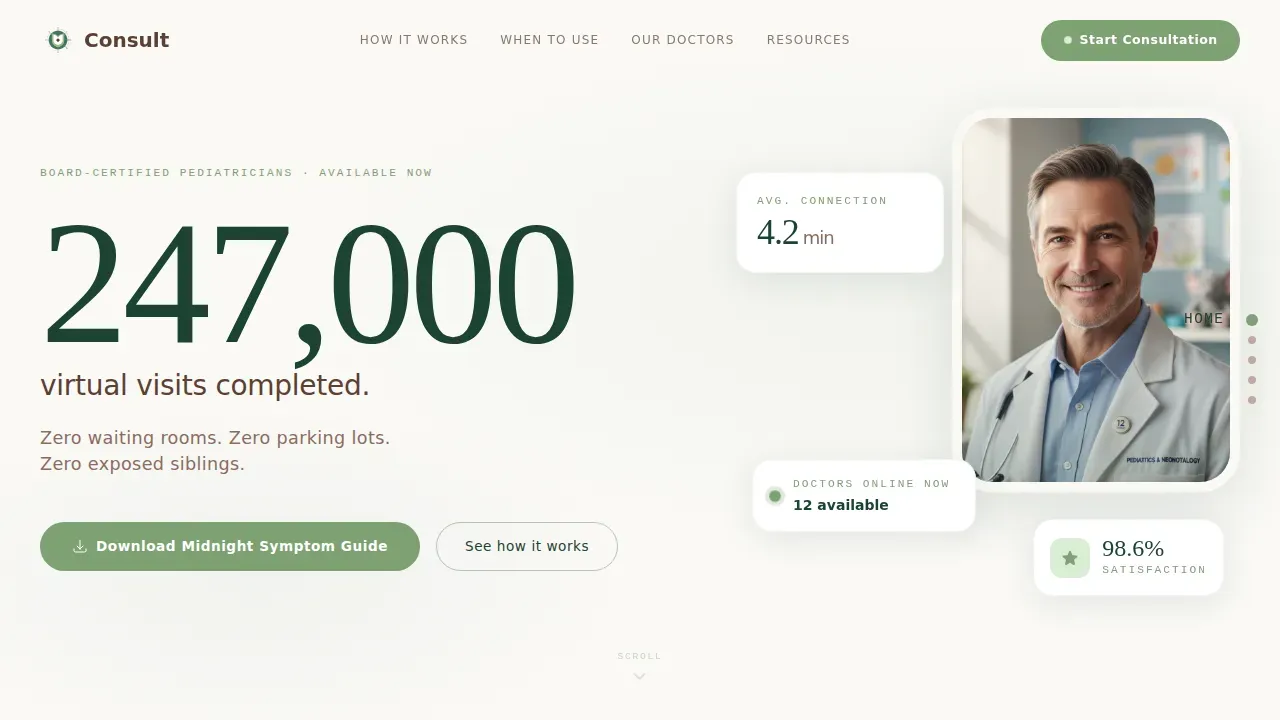
- Parents land on a page that leads with confidence-building metrics before any explanation, reducing the anxiety of an online doctor consultation at odd hours
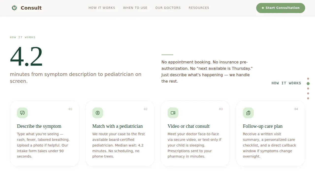
- Rural families and working parents who need convenient care understand the process immediately through a visual how-it-works flow
- The site captures qualified leads through a minimal, pre-filled form attached to a downloadable symptom guide, so patients arrive ready
What you get with this template
You get a fully structured, single-page landing layout with five core spoke sections, an anchor navigation spine, and a complete set of content blocks designed for pediatric telehealth. Every section ships with purposeful copy placeholders and design components.
- A hero section with a stacked typographic tower, anchor nav dots, and a stat-first headline block that hits visitors before any body text
- Four additional spoke sections covering how it works, when to use the service, trust and proof, and a resources download hub with a primary call-to-action form
- A linear single-row footer with contact details, keeping the page lean and the booking flow uninterrupted
Feature list
This landing page ships with six focused design and content features, each grounded in what pediatric virtual consultations actually need.
Stats-First Scroll Architecture
Each spoke section opens with a single arresting number before any paragraph text loads. The scroll-linked stat reveals use medium animation to pull visitors through the page in a clear, confident sequence. This design approach means doctors let their metrics speak first and explain second.
Anchor Navigation Dot Rail
A vertical dot rail runs along the right edge of the viewport, letting users jump between spoke sections instantly. The layout keeps the consultation flow visible at all times, so visitors on any device never feel lost inside a long-scroll page.
Resource Download Hub with Pre-Fill Form
The primary call-to-action is a downloadable Midnight Symptom Guide, gated by a single email field and a child-age dropdown. After first submission the form pre-fills across every spoke section's secondary download, reducing friction for repeat engagement. This approach generates warm leads already familiar with the healthcare platform.
Provider Trust Block with Doctor Bios
A dedicated trust and proof section displays parent testimonials alongside doctor biography cards. Detailed provider biographies highlight board certifications and expertise, which matters because 92 percent of patients read doctor bios before booking. Patient testimonials sit alongside credentials to reinforce credibility at the moment visitors are deciding whether to proceed.
Symptom Scenario Content Library
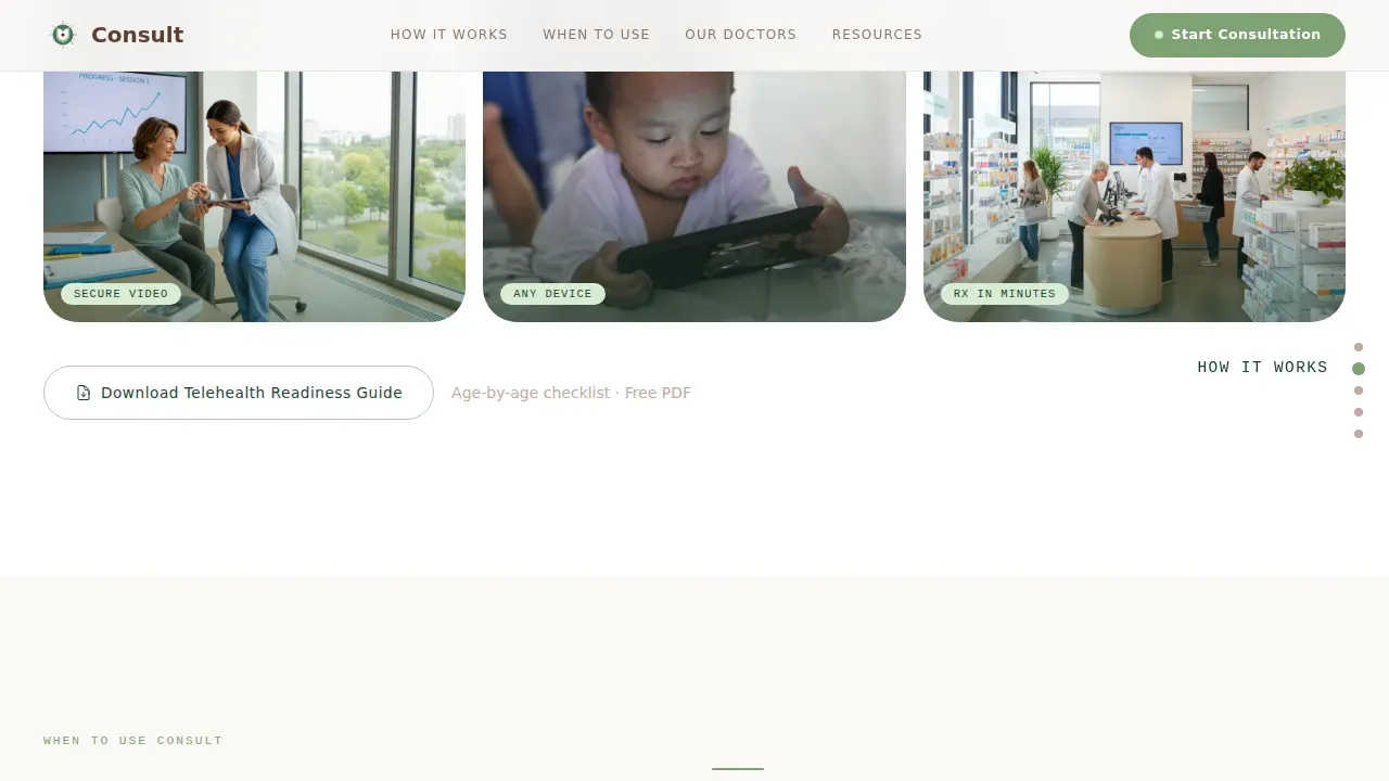
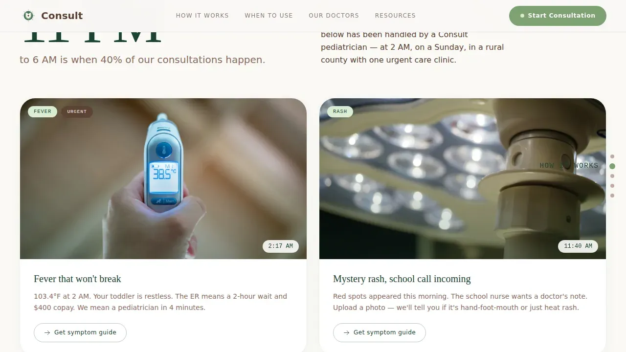
The "When to Use" section presents symptom scenarios with a photo-upload tutorial and downloadable age-by-age telehealth readiness guide. This educational content library helps parents prepare for a virtual consult before the appointment, improving the overall patient experience and reducing no-show rates.
Mobile-First Typographic Layout
The page uses DM Serif Display for editorial headlines and IBM Plex Sans for body text, creating a hierarchy that reads cleanly on phones. Typography scale and icons are sized for thumb interaction, and the stacked layout means the most important visuals and clear calls to action appear above the fold on small screens.
Page sections overview
| Section | Purpose |
|---|---|
| Hero Stat Tower | Leads with 247,000 visits stat and anchor nav dots |
| How It Works | Shows 4.2-minute connection flow step by step |
| When to Use | Covers symptom scenarios and photo guide |
| Trust and Proof | Displays 98.6% satisfaction, testimonials, doctor bios |
| Resources Download Hub | Primary call to action with Midnight Symptom Guide form |
| Linear Footer Row | Holds contact links and practice details |
Design & branding system
The visual identity follows a Corporate Precision theme softened by Scandinavian warmth. The Forest Trust color system creates a palette that feels clinical enough for insurance paperwork and approachable enough for a three-year-old's waiting room.
- Evergreen (#1B4332) anchors navigation, section headers, and the oversized stat numerals; linen white (#FAF9F6) provides generous breathing room between content blocks; bark brown (#5C4033) grounds all body text
- Sage (#7EA172) highlights every button, booking link, and interactive indicator, drawing the eye to clear calls to action without competing with the primary content
- DM Serif Display sets editorial headlines while IBM Plex Sans handles body copy; together they deliver a typography pairing with warmth and medical authority in equal measure
Mobile & speed optimization
Over 60 percent of virtual consult sessions happen on a phone, so the landing page is built mobile-first from the ground up. The layout stacks and reflows gracefully for phones, tablets, and desktop screens.
- Staggered card entries and floating elements use medium animation settings that keep the page feel lively without slowing the scroll experience on lower-powered devices
- Server components handle static sections so the heaviest design elements load efficiently; mobile-first images ensure visuals stay sharp without unnecessary file weight
- The anchor nav dot rail collapses cleanly on small screens, keeping the booking flow accessible on any device without cluttering the viewport
How this template helps you convert
This landing page is structured around a content-led conversion process rather than a hard push. Visitors gain value before they are ever asked to submit a contact detail.
- The stats-first hero section builds immediate confidence, so visitors trust the practice within seconds of landing; the anchor nav keeps them oriented so they do not bounce before reaching the form
- Each spoke section deepens engagement with a downloadable resource, and the pre-fill form means patients only enter their details once, lowering drop-off across all five download points
- The patient testimonials and provider credential block sit just above the primary call-to-action, converting undecided visitors into warm leads at exactly the right moment in the flow
Other information about this template
This template is a practical fit for a wide range of healthcare website use cases beyond its core pediatrics focus. Any specialist or clinic that offers virtual consultations can adapt the layout to their own services and community.
- The design system suits dentists, general practitioners, and other medical professionals who want a landing page that blends clinical credibility with approachable visuals
- The resource library model works well for practices in growth mode, because gated downloads generate leads with context, making every captured date and email more valuable than a cold contact form
- The page structure supports SEO through clean heading hierarchy, readable typography, and high-contrast visuals; adding a blog or expanding to additional pages is straightforward given the modular section plan
- Analytics tags can be placed on the form submission and each download event to track metrics and measure the booking funnel across desktop, tablets, and phone visits
- Pricing, plan details, and appointment scheduling copy can be updated freely; the layout accommodates both free introductory offers and paid consultation tiers without restructuring the design
- The template is relevant to online platforms targeting weight loss coaching, wellness services, and other health adjacent communities that want a polished, confident landing page with clear credibility signals
Theme
Corporate Precision
Creative direction
Stats-First Impact
Color system
Forest Trust
Style
Hub & Spoke (Anchor Nav)
Direction
Content/Resource
Page Sections
Stats-first Scroll Architecture
Anchor Navigation Dot Rail
Resource Download Hub with Pre-fill
Provider Trust and Testimonials Block
Symptom Scenario Content Library
Mobile-first Typographic Design
Related questions
Can I use this template for a general medicine or specialist clinic?
How does the resource download conversion work?
Does the template include patient testimonials and doctor bio sections?
Is the page designed to work on phones and tablets?
Can I adjust the pricing and appointment booking copy?



