Medical Tourism Landing Page Template
Consult is a medical tourism landing page template built for agencies that match patients with vetted surgical facilities abroad. It opens with a multi-step quote form, walks visitors through procedure and destination choices, then earns trust through alternating comparison tables and patient testimonial mosaics. Hard savings figures and credentialing proof appear side by side at every scroll point.
by Rocket studio
Quick summary
Consult is a lead-generation landing page template for medical tourism agencies. It skips the hero image and opens straight into a three-step quote form. Comparison tables show domestic versus destination prices in clear dollar figures. Testimonial mosaics, credentialing badges, and a sticky call-to-action bar reinforce confidence all the way to the final conversion point.
Who this template is for
This template is built for agencies that connect patients with surgical facilities, dental clinics, and specialist hospitals in international destinations. It suits teams that need to convert research-mode visitors into booked consultations without relying on a sales call first.
- Medical tourism agencies serving patients from the United States, United Kingdom, and Canada
- Healthcare concierge operators offering orthopedic, dental, cardiac, cosmetic, bariatric, or fertility procedures
- Agencies working with Joint Commission International (JCI) accredited hospitals across multiple destinations
What problem this template solves
Patients considering surgery abroad carry two fears at once: cost uncertainty and quality uncertainty. Most agency websites address one or the other. This template addresses both on the same scroll, in the same moment, so the visitor never has to choose between trusting the price and trusting the provider.
- Visitors arrive without knowing what their procedure should cost abroad, so the comparison tables answer that before they leave
- Patients feel anonymous and unguided on generic lead-generation forms, so the multi-step format creates a structured, consultation-style experience
- Trust signals scattered across separate pages lose their impact, so credentialing badges and patient stories are woven directly into the same sections as the pricing data
What you get with this template
You get a complete, single-page layout that handles the full patient journey from first question to quote submission. Every section is built to reduce hesitation and raise confidence in parallel.
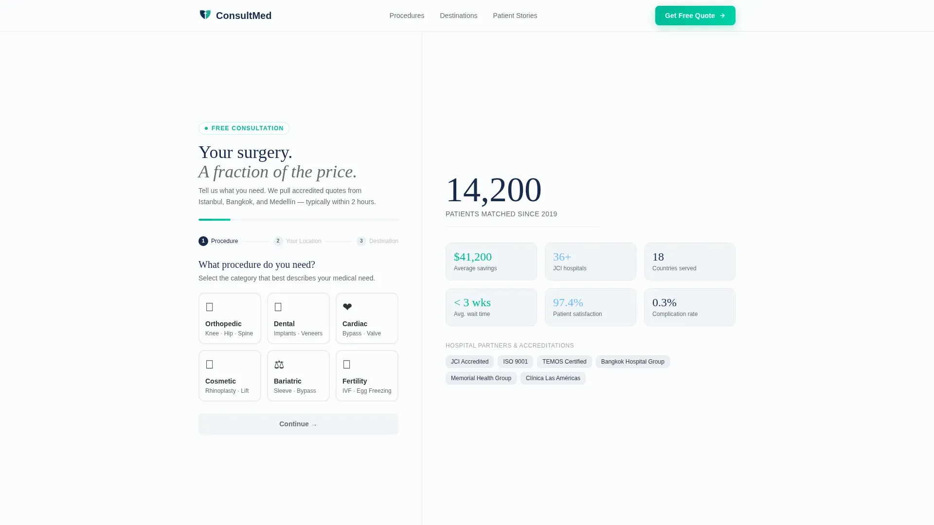
- A three-step quote form that loads above the fold with no distracting hero imagery
- Alternating comparison table and testimonial mosaic sections covering multiple procedure categories
- A sticky bottom bar with a persistent call-to-action and a WhatsApp coordinator chat icon
Feature list
This template is built around five core capabilities that work together to move a cautious, high-stakes visitor toward action.
Three-Step Quote Form with Progress Bar
The form opens immediately on page load. Step one presents six illustrated procedure icons covering orthopedic, dental, cardiac, cosmetic, bariatric, and fertility categories. Step two offers a country dropdown with automatic locale detection. Step three lets the visitor choose a preferred destination or request a guided recommendation. A progress bar in vitality teal fills across the top of the form as each step completes.
Alternating Comparison Table Layout
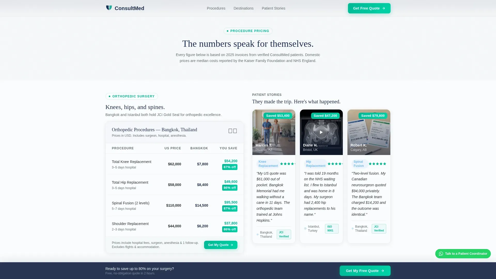
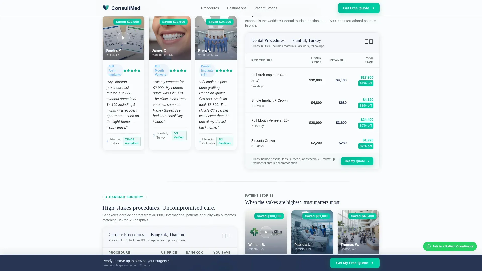
Each procedure section displays a side-by-side price comparison: domestic cost versus destination cost, with savings highlighted in teal. Tables are not grouped at the bottom. They alternate with testimonial mosaic sections so pricing data and human proof never drift apart during the scroll.
Testimonial Mosaic with Embedded Credentialing
Patient testimonials appear as a mosaic grid flanking every comparison table. Each card can include a short video thumbnail, a pull quote with first name and procedure, and before-and-after imaging where relevant. JCI accreditation badges and surgeon credential cards are embedded directly inside these mosaic cards, keeping proof and story unified.
Sticky Bar and WhatsApp Coordinator Path
A sticky bottom bar repeats the primary call-to-action at every scroll position. A secondary conversion path runs alongside it: a pulsing WhatsApp chat icon labeled "Talk to a Patient Coordinator Now" gives visitors who are not ready to submit medical details a lower-friction first step toward contact.
Destinations Bento Section
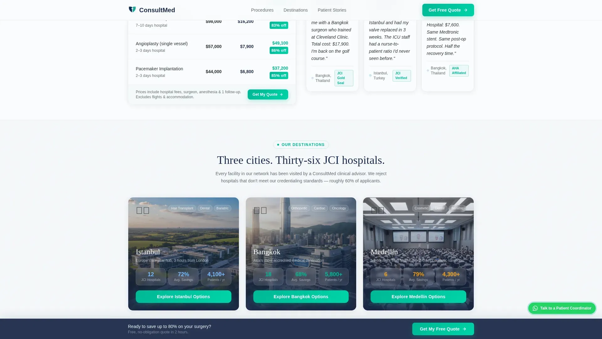
A dedicated section presents Istanbul, Bangkok, and Medellín as individual destination cards. Each card surfaces JCI statistics and hospital partnership details relevant to that city, giving visitors a concrete sense of where their procedure would take place before they complete the form.
Page sections overview
| Section | Purpose |
|---|---|
| Multi-Step Quote Form | Captures procedure, origin country, and destination preference above the fold |
| Comparison Table: Common Procedures | Shows domestic versus destination pricing for high-volume procedures |
| Testimonial Mosaic: Common Procedures | Pairs patient stories and credentialing proof with the first table |
| Comparison Table: Complex Procedures | Extends pricing comparison to higher-stakes surgical categories |
| Testimonial Mosaic: Complex Procedures | Builds deeper trust with video, pull quotes, and before-and-after imaging |
| Destinations Bento | Profiles Istanbul, Bangkok, and Medellín with JCI stats and hospital data |
| Social Proof Mosaic | Consolidates patient video thumbnails, quotes, and credential cards |
| Final Call-to-Action | Repeats the quote form with a sticky bar and WhatsApp coordinator icon |
| Footer | Single-row linear layout with navigation and contact essentials |
Design & branding system
The visual language follows a Corporate Precision theme. Every color choice signals clinical authority rather than consumer warmth. The palette feels like a private hospital lobby where surfaces are deliberate and nothing is decorative.
- Core colors: clinical charcoal (#2D3436), surgical steel gray (#636E72), open-sky blue (#74B9FF), sterile white (#FAFBFC) for backgrounds; trust-anchor navy (#1B2A4A) on headers; vitality teal (#00B894) reserved for calls-to-action, savings figures, and the progress bar
- Typography: DM Sans for body text, Fraunces as an authoritative serif for headings
- Visual approach: no hero imagery above the fold; absence of decoration signals medical seriousness; spotlight card animations and scroll reveals add motion without distraction
Mobile & speed optimization
The template is built mobile-first because the target patient is typically researching on a phone during a commute or a waiting room visit. Every layout decision prioritizes thumb-friendly interaction and fast, readable rendering on small screens.
- The multi-step form is designed for single-column mobile flow with large tap targets on procedure icons and the country dropdown
- Comparison tables use toggleable views so mobile visitors are not forced to scroll horizontally through dense pricing grids
- Static sections use server-side rendering (SSR) while the interactive form loads as a client component, keeping the initial page fast
How this template helps you convert
The page is structured so that trust and savings evidence accumulate with every scroll, making the quote form submission feel like the natural next step rather than a leap of faith.
- Hard dollar figures appear in the very first comparison table, answering the cost question before the visitor has to ask it; teal-highlighted savings create an immediate visual anchor that keeps the visitor reading
- The alternating table-mosaic rhythm means rational price data and emotional patient proof are never more than one section apart, reducing the gap between "this looks affordable" and "this looks safe"
- The sticky bar and WhatsApp path together eliminate the dead end for hesitant visitors, offering both a self-service form submission and a human conversation as parallel routes to conversion
Other information about this template
This template is a strong fit for medical tourism concierge services that need to communicate complex, high-trust information without overwhelming or alarming a nervous visitor. It was designed with localization in mind: pricing tables display figures in United States dollars (USD) with British pound (GBP) and Canadian dollar (CAD) conversions shown alongside, so visitors from all three primary markets see immediately relevant numbers.
- The page references 14,200 patient matches since 2019 as a social proof anchor in the form section
- Animation is set to a medium intensity: spotlight card effects, progress bar fill, and scroll reveals add polish without feeling like a consumer app
- The footer follows a linear single-row pattern, keeping the page clean and uncluttered at the bottom
- The template supports a before-and-after imaging layout inside testimonial mosaic cards for procedures where visual results are part of the buying decision
Theme
Corporate Precision
Creative direction
Testimonial Mosaic
Color system
Slate & Sky
Style
Comparison Table
Direction
Lead Generation
Page Sections
Three-step Quote Form with Progress Bar
Alternating Comparison Table Layout
Testimonial Mosaic with Embedded Credentialing
Sticky Bar and Whatsapp Coordinator Path
Destinations Bento Section
Related questions
What kind of agency is this template designed for?
Does the template include the comparison tables, or do I fill them in?
Can I add more procedure categories beyond the six shown in the form?
Is the WhatsApp chat icon functional out of the box?
How does the page handle visitors from different countries?



