Dietitian Specialist Booking Website Template
The Consult precision nutrition booking landing page template is built for dietitians who want to turn hesitant visitors into booked clients. A single-column frequently asked question-driven scroll dismantles objections one question at a time. The design is clean, surgical, and authoritative. No forms on this page. Just three well-placed calls to action and a layout that makes booking feel like the obvious next step.
by Rocket studio
Quick summary
This template is a single-column, click-through landing page designed for dietitian practices. It guides nutrition-seekers from confusion to confidence using a metronomic frequently asked question scroll. The headline does the heavy lifting. The layout stays spotless. By the final call to action, visitors have had every objection quietly answered and every reason to book firmly in place.
Who this template is for
This template is built for registered dietitians and nutrition professionals who want a polished, conversion-focused online presence without writing a single line of code. It works for solo practitioners, small clinics, and anyone offering precision nutrition consultations as a core service.
- Post-partum mothers, office workers managing a pre-diabetes diagnosis, and endurance athletes who need real nutrition guidance, not generic advice
- Dietitians and nutritionist professionals who want to attract new clients through a professional website that projects trust before the first session
- Health practitioners who work with clients dealing with shift work schedules, body composition goals, exercise performance, or specific food allergies
What problem this template solves
Most dietitian websites bury the booking button under paragraphs of credentials. Visitors leave before they ever feel ready to act. This template flips that structure. Every section is a question the visitor is already asking in their head, followed by a specific, trustworthy answer that removes doubt and builds confidence.
- Potential clients spend too long searching for pricing, session details, and process information before they feel safe enough to book
- A cluttered or generic website design signals low professionalism, causing visitors to leave for a competitor
- Without a clear, above-the-fold call to action and frequently asked question-driven structure, nutrition practices lose leads they already earned through search
What you get with this template
This template delivers a complete, ready-to-launch landing page structured for a single goal: getting the visitor to click "Book Your First Session." Every section has a defined role. Nothing is decorative.
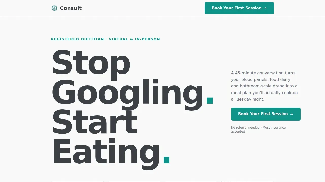
- A hero section with a giant left-pinned headline and a single teal call to action button, followed by an frequently asked question-structured scroll covering client portraits, session details, nutrition myth dismantling, and pricing transparency
- A mid-scroll call to action placed precisely after the session description, and a fixed bottom bar on mobile to follow the visitor through the entire page
- A full-width final booking prompt and a clean linear single-row footer to close the page with authority
Feature list
This template is built around a focused set of features that serve one purpose: converting visitors into booked clients.
frequently asked question-Driven Scroll Layout
Each section opens with a large, bold question the visitor is already thinking. A direct two-to-three sentence answer follows. The rhythm is consistent and calming, moving from emotional fears to logistical details to pricing transparency. By the end, every hesitation has been addressed without a single promotional claim.
Three Strategic Call to Action Placements
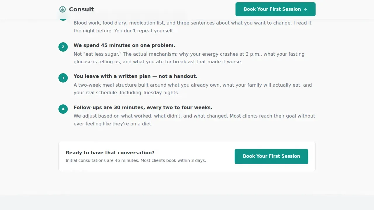
The primary call to action appears in the hero, at mid-scroll after the session description, and as a fixed bottom bar on mobile. Each instance passes the visitor to the scheduling tool with the initial consultation pre-selected. No form is required on this page.
Client Portrait Section
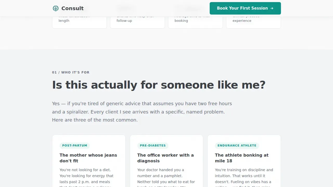
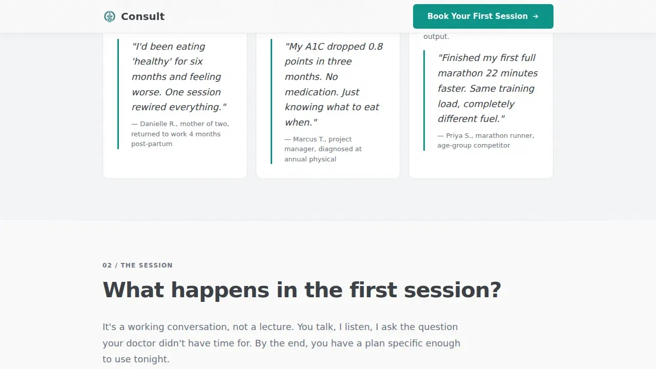
A dedicated section answers "Is this actually for someone like me?" with three specific client portraits. This helps visitors self-identify quickly. Embedded testimonials within frequently asked question answers provide social proof through specificity rather than generic praise.
Pricing Transparency Block
A dedicated logistics section covers cost, session format, and insurance questions directly. Clear pricing information builds trust. Visitors who know what they will spend are far more likely to follow through and book.
Mobile-First Fixed Call to Action Bar
The template is built mobile-first. A fixed bottom bar stays visible as the visitor scrolls on any mobile device. This ensures the booking prompt is always one tap away, which is critical since most clients book on their phones.
Typography-Led Hero Design
No hero image. No illustration. The authority comes entirely from a giant, tight-tracked sans-serif headline pinned to the left margin. White space on the right holds a single teal call to action button. The design communicates expertise through restraint, not decoration.
Page sections overview
| Section | Purpose |
|---|---|
| Hero Headline | Anchor attention with transformation-focused headline and primary call to action |
| Who It's For | Help visitors self-identify through three named client portraits |
| First Session frequently asked question | Describe exactly what the 45-minute consultation entails, then prompt booking |
| Food Fears frequently asked question | Dismantle common nutrition myths including carb fears and food allergies concerns |
| Logistics and Pricing | Answer insurance, cost, format, and session information questions directly |
| Final Booking Prompt | Full-width closing call to action to convert the fully informed visitor |
| Linear Footer | Single-row footer with contact details and navigation links |
Design & branding system
The visual identity follows a Service Utility theme. The palette is Monochrome Steel: cold, precise, and built to project professionalism. Every color choice serves a function. Nothing is chosen for warmth or decoration.
- Background uses surgical white (#FAFAFA) with a faint cool gray (#F3F4F6) on alternating frequently asked question blocks to create scroll rhythm; body text and dividers use brushed graphite (#3B3F45); secondary copy uses cold-rolled steel (#6B7280)
- Clinical teal (#0D9488) is reserved exclusively for buttons and active-state links, making every call to action unmissable without shouting
- Typography is set in DM Sans at a large scale with tight tracking, giving the layout an authoritative structure that needs no supporting imagery to perform
Mobile & speed optimization
The template is built mobile-first. Static server components handle all content sections, keeping the page fast without relying on third-party libraries. Staggered fade-up animations on scroll use the Intersection Observer method, which avoids heavy dependencies.
- A fixed bottom call to action bar on mobile keeps the booking prompt visible at all times during the scroll, eliminating friction for visitors on small screens
- Alternating frequently asked question block backgrounds provide visual rhythm without adding images, keeping page weight low across all devices
- Hover states on frequently asked question items provide subtle interactivity that rewards desktop users without adding unnecessary complexity
How this template helps you convert
This template is engineered so that every scroll interaction builds trust and reduces friction. The structure follows the visitor's natural decision-making path, from curiosity to confidence to commitment.
- The outcome-driven headline delivers a clear transformation promise above the fold. The teal call to action button appears immediately. Visitors who are ready to book can act within seconds of arriving on the page.
- The frequently asked question scroll guides undecided visitors through every objection in logical order. Emotional concerns come first, then session details, then pricing. By the time the final call to action appears, the visitor has been given every piece of information they need to choose to book.
Other information about this template
This template supports a range of customization and professional setup needs. Whether you are creating your first dietitian website or refreshing an existing practice, the structure is flexible enough to adapt. It is also compatible with export workflows for teams who work in a figma file environment before handing off to development.
- The template is built without coding requirements, so dietitians can set up and launch their pages without technical skills
- It can support a blog section to share nutrition tips and engage visitors between sessions, which also helps with seo optimized pages for long-term visibility
- Pricing blocks and contact details are clearly structured so clients always have the information they need without hunting through the site
- The template suits personal trainers and gym professionals who also offer nutrition services alongside their exercise and training programs
- Teams can use the template to display credentials, list services, send visitors to an intake form, and connect to a scheduling tool in a logical order
- The consult precision nutrition booking landing page template is ready to use and built to attract and convert health-focused clients from the first day it goes live
Theme
Service Utility
Creative direction
FAQ-Driven
Color system
Monochrome Steel
Style
Single Column Flow
Direction
Click-Through
Page Sections
Faq-driven Scroll That Removes Objections
Three Precision Call to Action Placements
Client Portrait and Testimonials Section
Transparent Pricing and Logistics Block
Mobile-first Fixed Booking Bar
Typography-led Hero with Zero Imagery
Related questions
Does this template include a client intake form?
Can I customize the pricing and session details shown on this page?
Is this template suitable for practitioners beyond registered dietitians?
How does the mobile fixed call to action bar work?
Can this template connect to a blog or additional service pages?



