Rheumatologist Booking Website Template
The Consult landing page template is built for private rheumatology practices that offer virtual specialist appointments within 48 hours. It leads with a credentials ribbon, hard-number statistics, and a three-column comparison table to eliminate patient hesitation before asking for a single click. The primary call to action drives visitors straight to a booking calendar.
by Rocket studio
Quick summary
Consult is a single-page landing page template designed for a private rheumatology practice offering direct virtual consultations. It opens with engraved-style credential badges, moves into an evidence-first statistics section, and builds its case through a structured comparison table. Every section is arranged to answer objections before they form, ending in a clear booking call to action.
Who this template is for
This template is built for board-certified rheumatologists who offer telehealth appointments directly to patients, without requiring a referral. It is especially well-suited for specialists who want to communicate their credentials and speed advantage over the traditional care path.
- Private rheumatology practices offering virtual consultations to new patients
- Telehealth specialists serving patients who face long wait times for in-person care
- Rheumatologists targeting rural patients, working professionals, or women managing new joint symptoms
What problem this template solves
Getting a rheumatology appointment through a traditional referral chain can take six months or longer. Patients in genuine pain lose time, lose productivity, and sometimes lose confidence that help is available. This template gives a practice a single focused page that answers every rational objection a hesitant patient might raise before asking them to book.
- Patients cannot find a specialist appointment for months and need a credible faster alternative
- Prospective patients are unsure whether a virtual visit can match the diagnostic quality of an in-person one
- Rural patients and busy professionals need proof that remote specialist care is legitimate before they commit
What you get with this template
The template delivers a complete, single-page layout structured around proof and conversion. Each section is purpose-built and sequenced to guide a skeptical visitor from first impression to a confident booking click.
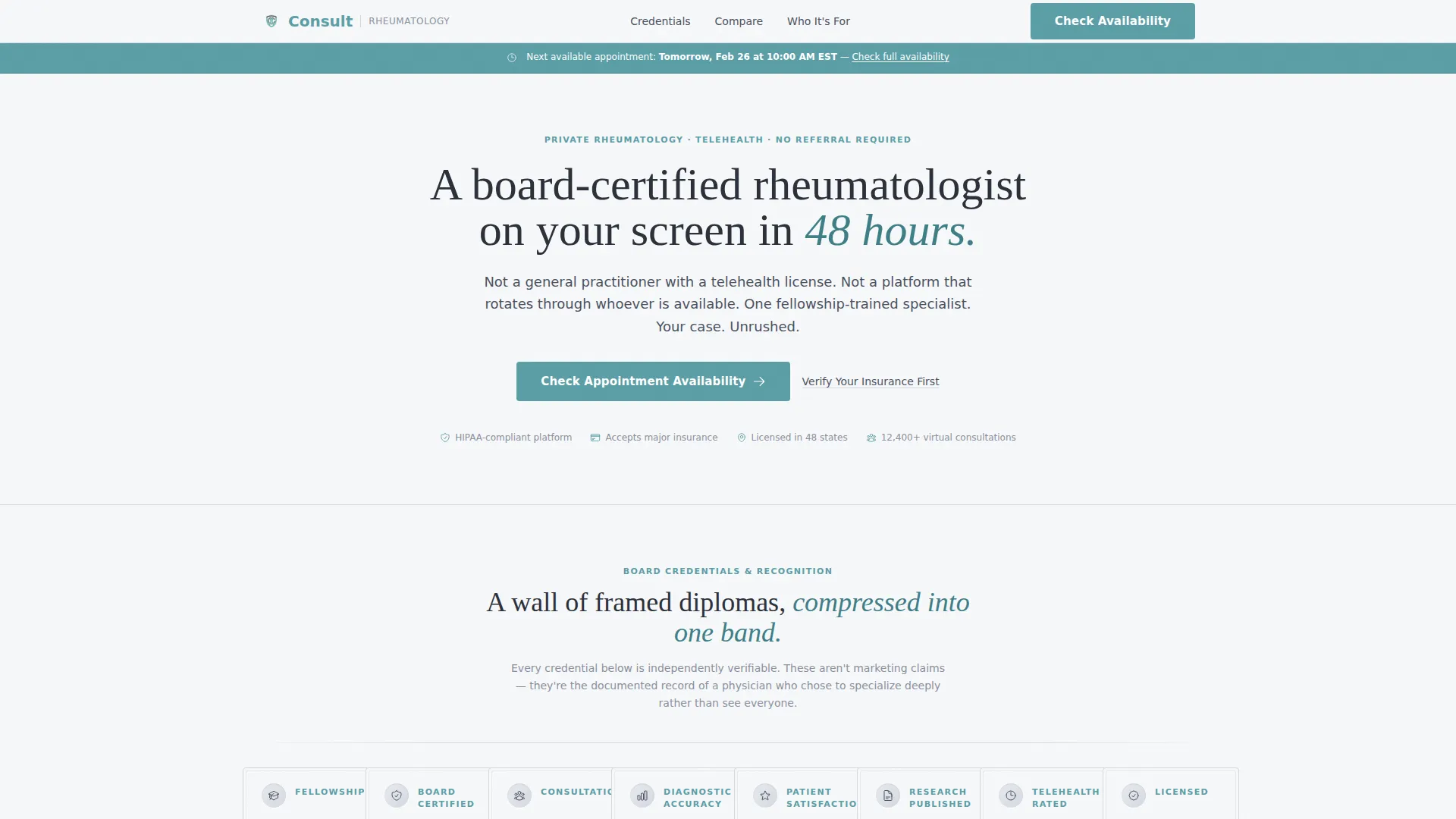
- A credential ribbon header with engraved-style badge medallions displaying board certifications, consultation counts, and satisfaction scores
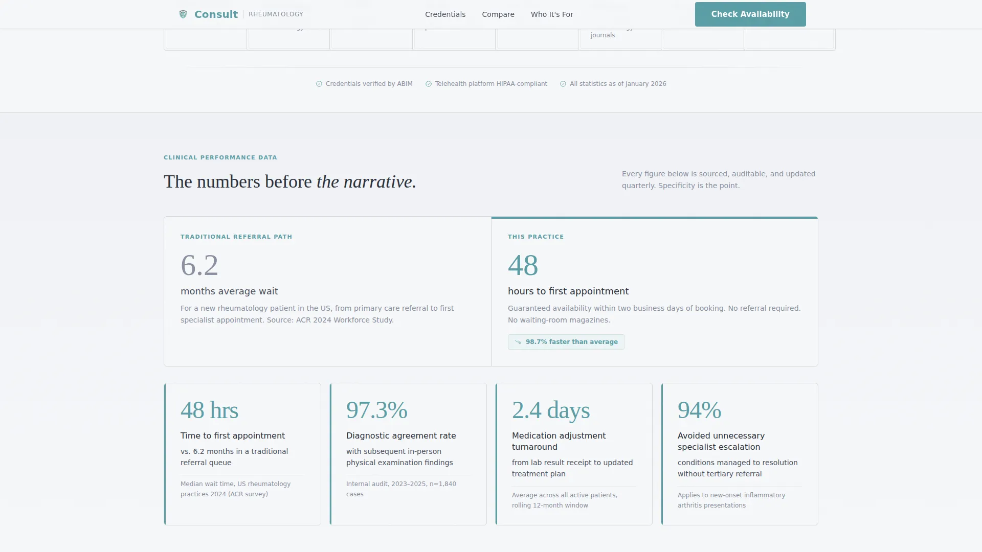
- A statistics impact section with animated counters showing key numbers such as average wait time comparisons and diagnostic agreement rates
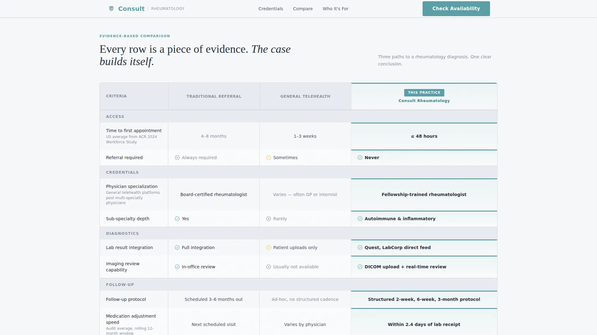
- A three-column comparison table contrasting Traditional Referral, General Telehealth, and this practice across rows covering wait time, credentials, follow-up protocol, and more
Feature list
This template is built around six tightly integrated components. Each one is designed to carry a specific weight in the patient's decision process.
Credential Ribbon Header
A horizontal band of engraved-style badge medallions replaces a traditional hero image. Each medallion displays a specific credential or micro-stat, such as fellowship training, consultation volume, or diagnostic accuracy rate. The effect communicates authority within the first two seconds of page load.
Animated Statistics Section
Hard numbers appear on scroll using counter animations. The section contrasts figures such as a 6.2-month traditional wait time against a 48-hour virtual appointment window. Staggered reveals give each statistic space to land before the next one appears.
Three-Column Comparison Table
The architectural spine of the page compares Traditional Referral, General Telehealth, and this practice side by side. Rows cover criteria like wait time, specialist credentials, lab integration, follow-up protocol, and insurance acceptance. Each row is interactive with a hover-highlight effect on desktop.
Ideal Patient Scenario Cards
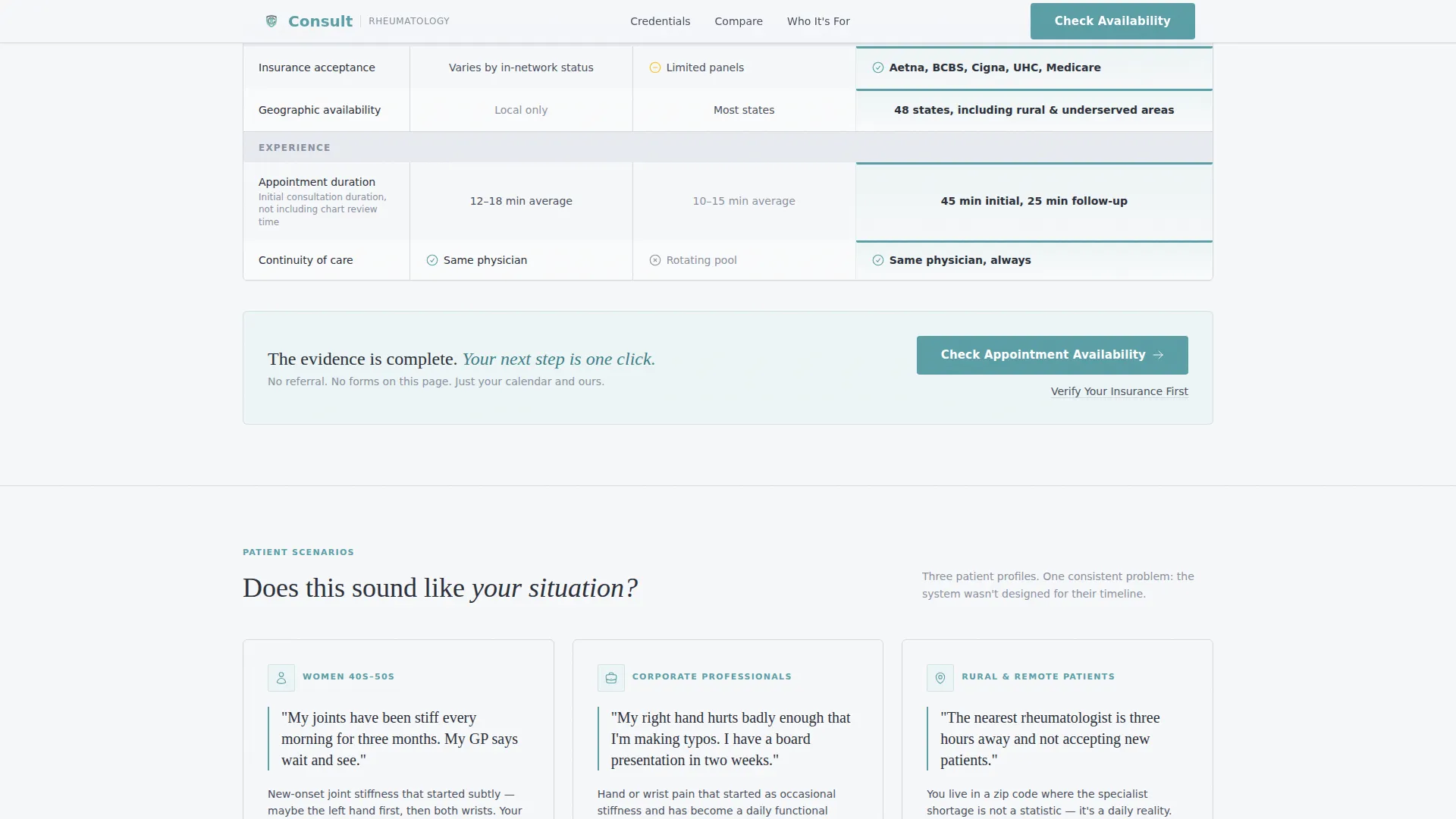
Three distinct cards describe the specific patients this practice serves: women in their 40s and 50s with new joint stiffness, corporate professionals dealing with hand pain that affects daily work, and rural patients hours away from the nearest in-person specialist. Each card makes a segment of the audience feel directly seen.
Primary and Secondary Call to Action
The primary call to action reads "Check Appointment Availability" and appears first beneath the comparison table. It also appears as a persistent bottom bar on mobile. A secondary text link labeled "Verify Your Insurance First" catches visitors who need one more reassurance before they click.
Linear Single-Row Footer
A minimal single-row footer keeps the page clean and focused. It avoids adding visual noise after the call to action and maintains the clinical, unhurried tone of the overall design.
Page sections overview
| Section | Purpose |
|---|---|
| Credentials Ribbon Header | Displays badge medallions with board certifications, micro-stats, and consultation counts |
| Stats Impact Block | Presents hard comparison numbers with scroll-triggered counter animations |
| Comparison Table | Contrasts three care options across key patient decision criteria |
| Who This Is For | Three scenario cards matching the primary patient profiles |
| Call to Action Block | Primary booking link and secondary insurance verification link |
| Single-Row Footer | Closes the page cleanly without distraction |
Design & branding system
The visual identity follows a Corporate Precision theme using a Soft Mist color palette. The result is a page that feels sterile without being cold and authoritative without being intimidating. Typography pairs DM Sans for body and interface text with Fraunces, a serif display typeface, for credential names and headlines.
- Background colors stay within the clinical white (#F7F8FA) to morning-fog gray (#D4D8E0) range, with deep charcoal (#2B303A) for all body text
- Teal (#5B9EA6) is reserved exclusively for interactive elements, data highlights, and call-to-action buttons, so every teal element draws the eye exactly where it should land
- Borders and dividers use the morning-fog gray to separate sections cleanly without adding visual weight
Mobile & speed optimization
The template is built mobile-first, with equal priority given to desktop layout. The persistent bottom call-to-action bar on mobile ensures the booking action is always one tap away regardless of scroll position.
- Server Components handle all static content sections, keeping JavaScript minimal and focused only on counter animations and scroll behavior
- The comparison table and credential ribbon are structured to reflow gracefully on smaller screens without losing their visual hierarchy
- Staggered animation reveals are timed to feel smooth and intentional on both mobile and desktop viewports
How this template helps you convert
Every section in this template is sequenced to eliminate doubt before asking for a click. The page does not persuade with emotion. It builds a cumulative, evidence-based case that makes booking the obvious next step.
- The credential ribbon earns immediate trust by front-loading board certifications and diagnostic accuracy stats before any narrative copy appears, removing the "but is this practice credible?" objection at first glance.
- The comparison table gives hesitant visitors a structured, side-by-side answer to the question "why not just use my regular doctor or a general telehealth service?" making this practice the clear specialist choice.
- The dual call-to-action layout captures both ready-to-book visitors and those who need one more step, using the insurance verification link to keep hesitant visitors moving forward rather than leaving the page.
Other information about this template
This template is part of the Consult series, designed for direct-to-patient specialty telehealth practices. It is localized for the United States market, using English copy, USD pricing references, and MM/DD/YYYY date formatting. The template style is classified as a Comparison Table landing page under the Health and Medical category, specifically targeting the rheumatologist virtual consultation niche.
- The template uses medium-intensity animation including staggered credential reveals, scroll-triggered counter animations, and comparison row reveals on desktop
- Credential medallion micro-interactions add subtle hover behavior to the header ribbon, reinforcing the engraved-diploma aesthetic without distracting from the content
- No form is present on this page; all conversion paths lead to an external scheduling interface or insurance verification step, keeping the page focused and friction-free
Theme
Corporate Precision
Creative direction
Stats-First Impact
Color system
Soft Mist
Style
Comparison Table
Direction
Click-Through
Page Sections
Credential Ribbon with Badge Medallions
Scroll-triggered Statistics Counter
Interactive Three-column Comparison Table
Ideal Patient Scenario Cards
Persistent Mobile Booking Bar
Dual Call-to-action Layout
Related questions
Can I edit the statistics and credentials shown in the medallion ribbon?
Does the comparison table support additional rows or columns?
Is there a contact form on this landing page?
Who is the ideal practice to use this template?
Can this template be adapted for other medical specialties?



