Dental Consulting Booking Website Template
Consult is a single-column dental operations consulting landing page built for the Executive Suite aesthetic. It uses a bold flush-left headline, a staggered testimonial mosaic, and two focused conversion paths to turn overwhelmed practice owners and DSO founders into booked assessment calls. The layout is clinical, deliberate, and structured entirely around cumulative social proof.
by Rocket studio
Quick summary
Consult is a single-column landing page template for a dental operations consultant. It opens with a massive flush-left headline, builds credibility through staggered problem-and-proof sections, and drives visitors toward a primary assessment request or a gated PDF download. The design is Executive Suite: arctic white, charcoal type, and one cold sapphire accent.
Who this template is for
This template is built for dental operations consultants who serve serious, growth-oriented clients. If your practice clients measure success in revenue recovery and chair utilization, this layout speaks their language from the first scroll.
- Solo practitioners drowning in admin while hygiene chairs sit empty
- Multi-location DSO founders scaling past five offices and hitting operational ceilings
- Private equity groups needing operational due diligence before acquiring dental portfolios
What problem this template solves
Most consulting pages look like every other professional services site: a hero image, a short bio, and a contact form. They fail to build the kind of trust that B2B dental clients need before agreeing to an assessment call.
- Dental practice owners and DSO founders arrive with specific, urgent operational problems that a generic page never names
- Without visible proof from peers at comparable practices, visitors leave before ever reaching the call to action
- A single conversion path forces ready buyers and early-stage researchers onto the same track, losing both
What you get with this template
This template delivers a complete single-column landing page structured around proof-first persuasion. Every section has a defined purpose: name the problem, then immediately answer it with client evidence.
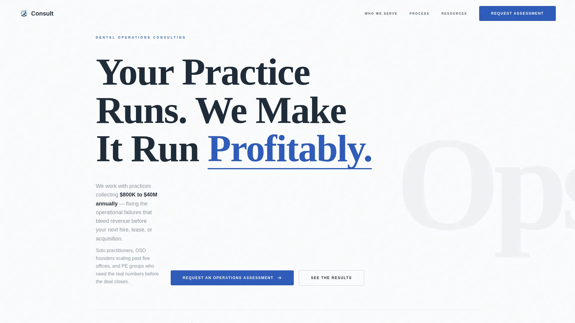
- A hero section with a giant flush-left headline, a sapphire accent underline, and a two-sentence subhead naming the revenue range served
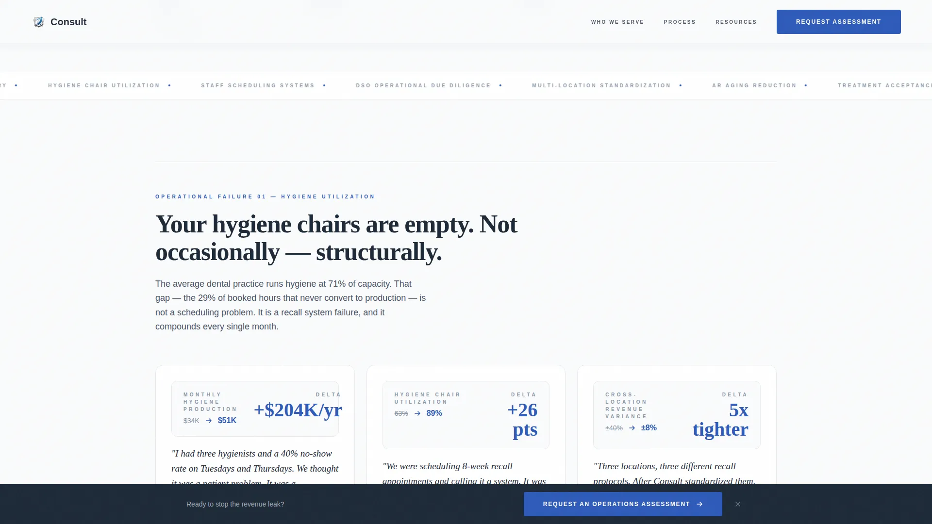
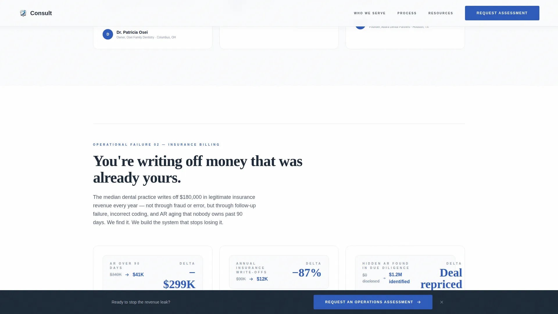
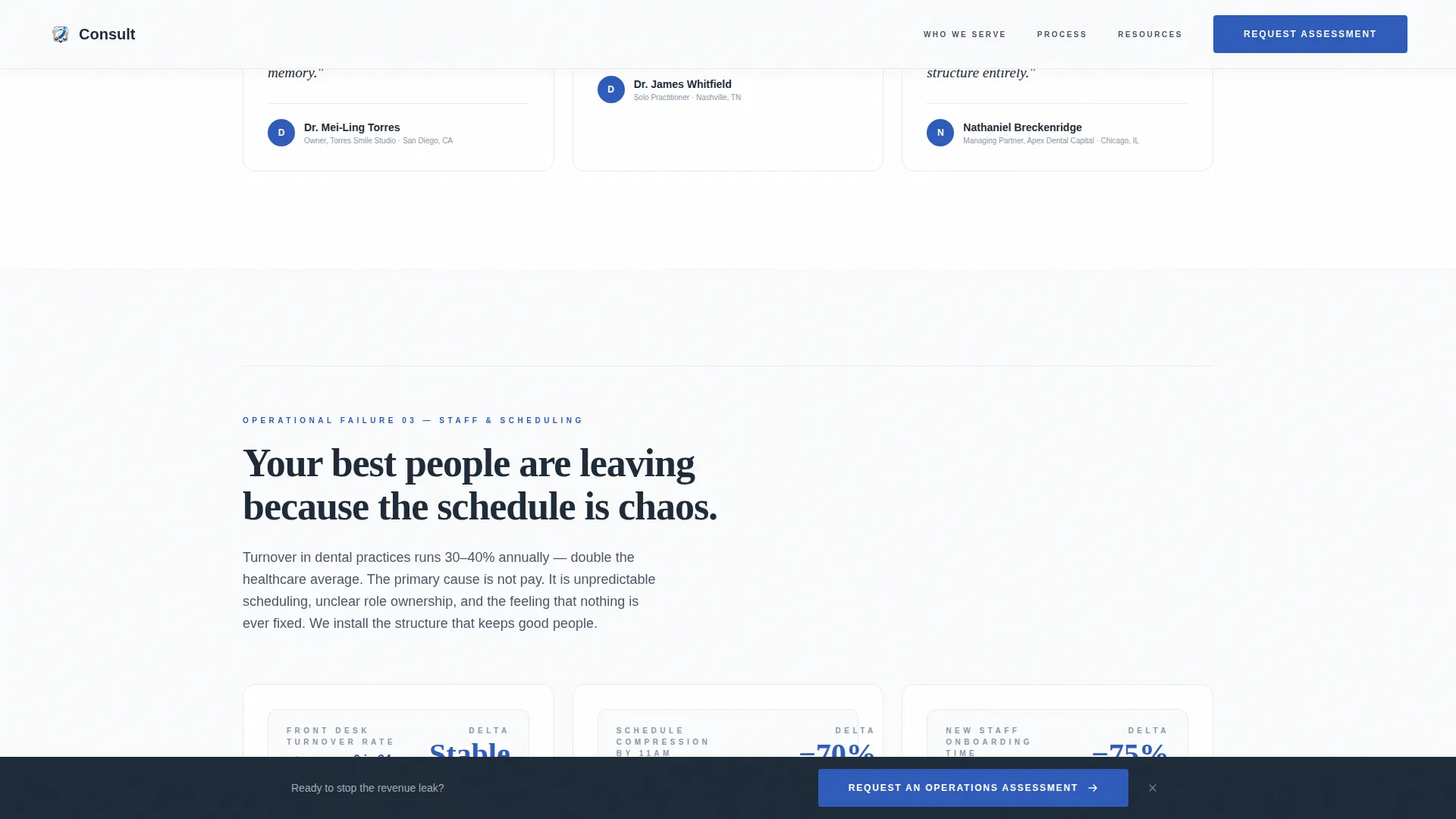
- Three problem cluster sections covering empty chairs, staff scheduling, and insurance billing, each followed by a staggered testimonial mosaic with revenue delta numbers and before-and-after key performance indicator snapshots
- An ideal client profile section with three cards covering solo practitioners, DSO founders, and private equity groups
- An engagement process section explaining how an assessment works, built in an asymmetric layout
- Two conversion paths: a primary assessment request form and a secondary gated PDF download called the DSO Scaling Playbook
- A persistent bottom call-to-action bar that stays visible as the visitor scrolls
- A footer using the Pattern 1 Linear layout
Feature list
This section covers the core capabilities built into the Consult template.
Giant Flush-Left Headline Section
The hero uses massive, weighted charcoal serif typography set flush-left. The headline "Your Practice Runs. We Make It Run Profitably." occupies close to sixty percent of the viewport. A single sapphire underline sits beneath the word "Profitably," and a two-sentence silver subhead follows below to establish the revenue scope this consultant serves.
Staggered Testimonial Mosaic
After each named problem, the page presents a mosaic of client proof. Short-form quotes, revenue delta numbers, and before-and-after key performance indicator snapshots are arranged in staggered blocks. The rhythm between tension and relief builds cumulative credibility across the full scroll.
Dual Conversion Path System
The template includes two distinct conversion paths. The primary path is a form titled "Request an Operations Assessment" that captures practice name, number of locations, monthly collections range, and the visitor's biggest operational frustration. The secondary path offers a gated PDF download called the DSO Scaling Playbook, requiring only name, email, and portfolio size.
Persistent Call-to-Action Bar
A fixed bottom bar repeats the primary call to action as the visitor scrolls. It appears after the first testimonial cluster and stays visible throughout the rest of the page, reducing the friction of hunting for a form.
Ideal Client Profile Cards
A dedicated "Who This Serves" section presents three cards, one for each target client type: solo practitioner, DSO founder, and private equity group. Each card frames the specific operational situation that brings that client to the page.
Engagement Process Section
A step-by-step section explains how the operations assessment works. It uses an asymmetric layout to separate the consultant's process from standard service-listing formats, giving the page a boardroom-briefing feel rather than a brochure feel.
Page sections overview
| Section | Purpose |
|---|---|
| Hero Headline | Opens with flush-left authority headline and sapphire accent |
| Problem Clusters | Names three core operational failures facing dental practices |
| Testimonial Mosaic | Delivers staggered proof with revenue deltas and KPI snapshots |
| Who This Serves | Presents three ideal client profile cards |
| Engagement Process | Explains the assessment workflow in an asymmetric layout |
| DSO Playbook call to action | Offers gated PDF secondary conversion path |
| Assessment Form | Captures primary lead with practice-specific form fields |
| Footer | Closes with Pattern 1 Linear layout |
Design & branding system
The design follows an Executive Suite theme built on the Arctic White color system. White space does the structural work. Nothing competes for attention; every element earns its placement.
- Color palette: clinical white (#FAFBFC) as the canvas, charcoal authority (#1E2A38) for headlines and body text, surgical silver (#C5CDD6) for dividers and secondary elements, and cold sapphire (#2E5BBA) reserved for calls to action and data highlights only
- Typography: Fraunces serif for headlines to project authority, DM Sans for body copy to keep reading comfortable and efficient
- Visual style: no hero images or illustrations; the design relies on typography confidence, generous leading, and deliberate white space to communicate that every detail has already been considered
Mobile & speed optimization
The template is designed desktop-first to match how B2B dental decision-makers typically research consulting services. It is fully responsive across all screen sizes.
- GSAP ScrollTrigger animations handle section reveals, stagger effects, and clip-path transitions on scroll for a polished, unhurried presentation
- Interactive elements including the persistent call-to-action bar, form dropdowns, and card hover states are handled as client components, while static sections use server components to keep load behavior efficient
How this template helps you convert
The conversion strategy is built on a single insight: by the time the call to action appears, the visitor has already read multiple peers describing their exact operational situation. The page does not ask for trust; it earns it progressively.
- The headline and problem clusters name specific, recognizable failures (empty chairs, billing leaks, scheduling chaos) so the visitor immediately feels understood, lowering resistance before any offer is made.
- The staggered testimonial mosaic places revenue delta numbers and real before-and-after key performance indicator snapshots directly after each problem statement, turning peer proof into the primary selling mechanism.
- Two conversion paths accommodate visitors at different decision stages: the assessment form captures ready buyers, while the DSO Scaling Playbook PDF captures researchers who need more proof before committing to a conversation.
Other information about this template
This template is classified under Professional Services, specifically the Dental Consulting subcategory with a niche focus on dental operations consulting. A few additional details are worth noting for anyone evaluating this template.
- The template style is Single Column Flow, meaning all content reads top to bottom without sidebar distractions or tab-based navigation
- The landing page direction is Partnership/B2B, so every design and copy decision prioritizes building credibility with sophisticated business decision-makers rather than consumer audiences
- The header concept is Giant Headline Left, a specific typographic choice that signals authority without relying on photography or illustration
- The creative direction is Testimonial Mosaic, which is a structural choice as much as a visual one; it dictates the alternating rhythm of problem naming and proof delivery across the full page
- Animation interactions use medium intensity, meaning transitions feel purposeful and executive without being distracting or slow
- English, USD, and US dental industry terminology are the localization defaults throughout the template
Theme
Executive Suite
Creative direction
Testimonial Mosaic
Color system
Arctic White
Style
Single Column Flow
Direction
Partnership/B2B
Page Sections
Giant Flush-left Headline Hero
Staggered Testimonial Mosaic Layout
Dual Conversion Path Forms
Persistent Scroll Call-to-action Bar
Ideal Client Profile Cards
Asymmetric Engagement Process Section
Related questions
Who is this landing page template designed for?
What are the two conversion paths included in this template?
Does the template include placeholder testimonial content?
Is the persistent call-to-action bar built into the template?
Can this template be adapted for a DSO group's own practice website?



