Orthopedic Surgeon Booking Website Template
Consult is a hub and spoke landing page built for orthopedic surgeons who rely on patient stories to convert cautious researchers into booked consultations. It organizes verified testimonials by procedure, pairs each review with a surgeon's note and recovery timeline, and guides visitors toward a low-friction diagnostic qualifier with a single confident call to action.
by Rocket studio
Quick summary
Consult is a procedure-organized testimonial landing page for orthopedic surgeons. It groups 1,247 verified patient reviews by surgery type, pairs every story with educational context, and uses a sticky anchor nav to guide visitors from research mode into a diagnostic qualifier. The design feels like a radiology suite: calm, precise, and built entirely around earning trust.
Who this template is for
This template is built for orthopedic surgeons and their practice teams who need to convert research-stage patients into consultation requests. It works especially well when the practice handles multiple procedure types and relies on social proof to move hesitant patients forward.
- Orthopedic surgeons offering knee replacement, rotator cuff, spinal fusion, or sports injury procedures
- Practice managers building a patient-facing review hub that goes beyond a basic testimonials page
- Caregivers and patients researching elective surgery who need procedure-specific evidence before committing
What problem this template solves
Patients researching orthopedic surgery spend weeks reading generic reviews that do not match their specific procedure. A construction foreman weighing a shoulder replacement has completely different questions than a grandmother comparing hip surgery options. A single undifferentiated testimonials page fails both of them.
- Scattered reviews without procedure context force visitors to dig and often leave without booking
- Generic call-to-action buttons appear before trust is established, increasing drop-off
- There is no clear path from reading a review to taking the next step toward a consultation
What you get with this template
This template delivers a fully structured single-page layout with four procedure-specific spoke sections, a sticky anchor navigation bar, and a floating call-to-action element. Every component is ready to populate with real patient stories and clinical context.
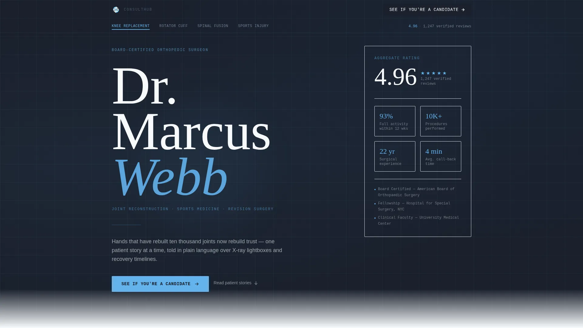
- A hero section with a stacked typographic header, floating aggregate rating display, and a primary "See If You're a Candidate" call to action
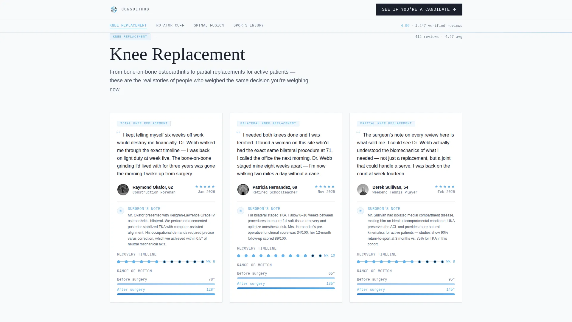
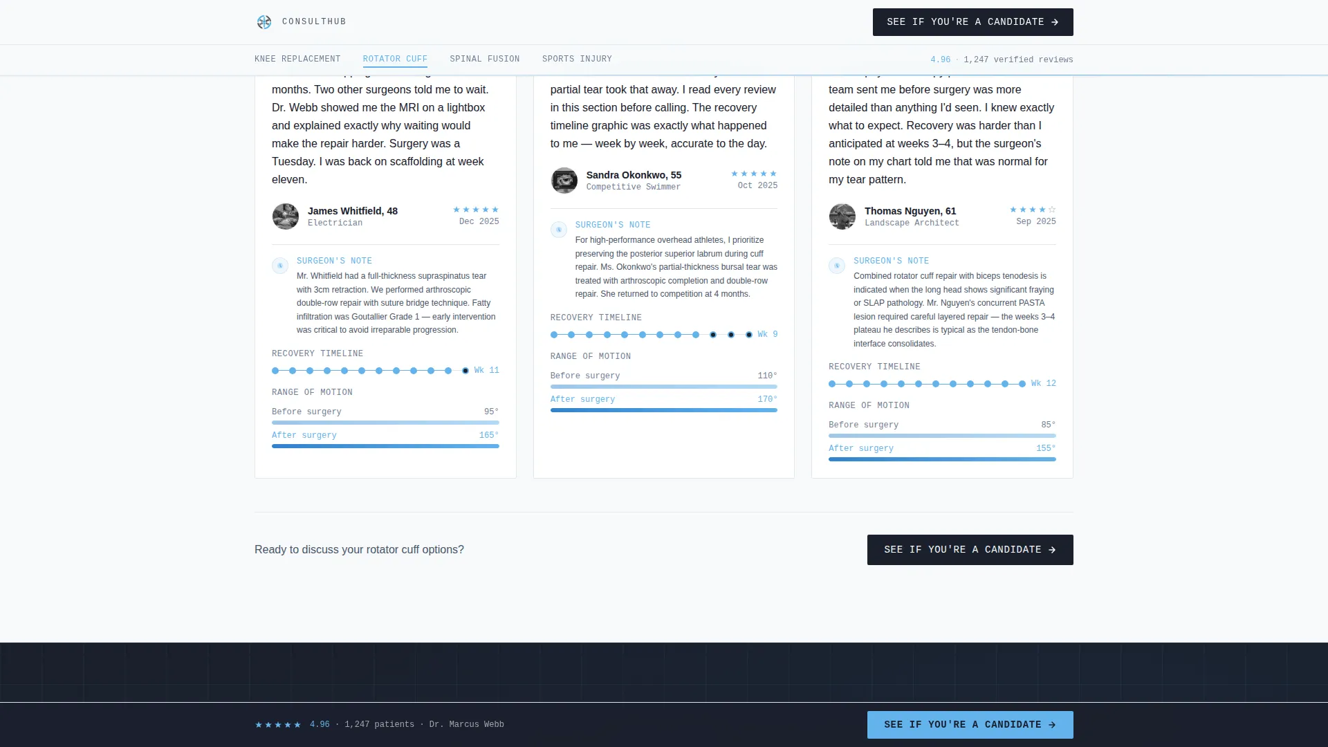
- Four procedure spoke sections, each containing patient quotes, surgeon notes, recovery timeline graphics, and range-of-motion comparisons
- A diagnostic qualifier modal with an illustrated body map, pain level slider, and imaging toggle, ending with a confirmation screen
Feature list
This template brings together several carefully designed components that work together to move visitors from curiosity to confidence.
Stacked Type Tower Header
The hero sets authority through typography alone. The surgeon's name is displayed in an ultra-light serif at large scale, stacked so each word occupies its own line. The specialty line appears in sky blue monospace lettering beneath it. A floating aggregate rating sits beside the stack like a vital sign, with no competing hero image.
Procedure-Labeled Sticky Anchor Nav
A navigation bar pins to the top of the page and labels each spoke by procedure: Knee Replacement, Rotator Cuff, Spinal Fusion, and Sports Injury. Visitors self-select into the review cluster that matches their diagnosis. The nav uses scroll tracking and beam-border highlights to show which section is active.
Layered Testimonial Spoke Sections
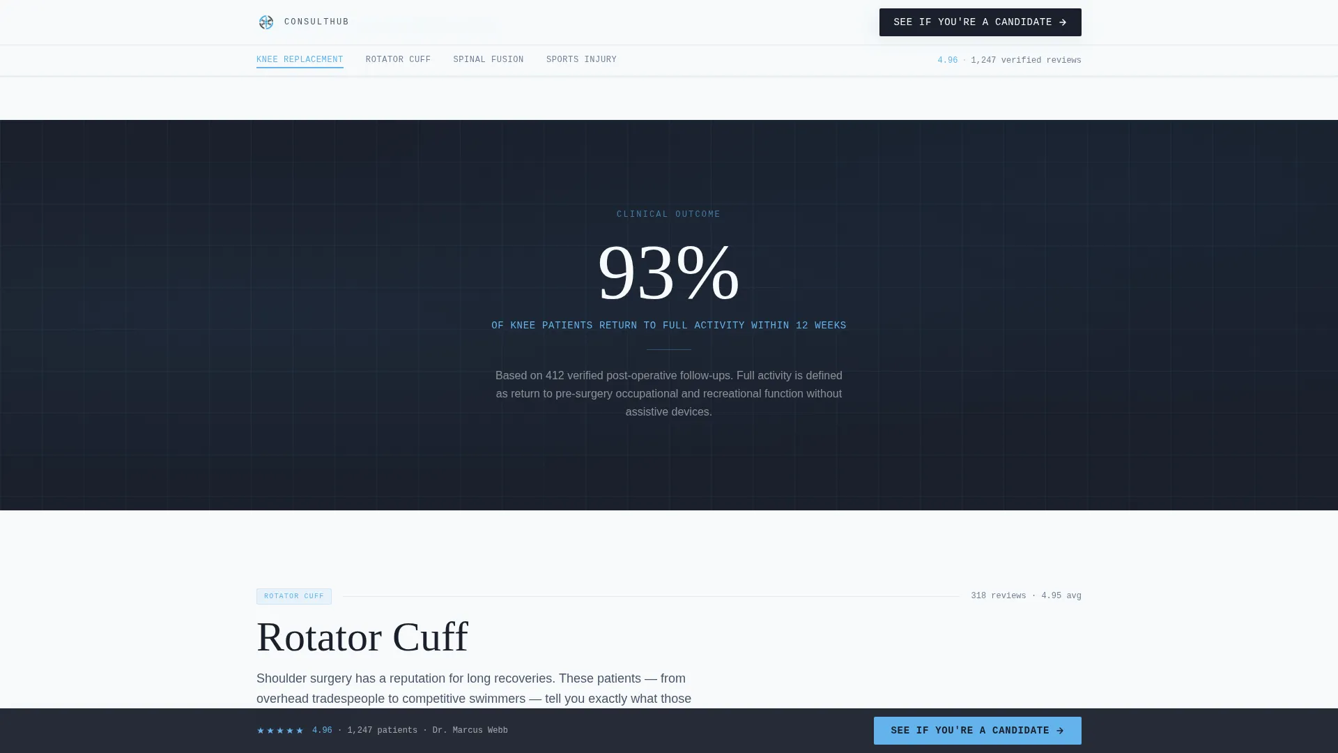
Each of the four procedure spokes combines a patient quote with a brief surgeon's note, a recovery timeline graphic, and a before-and-after range-of-motion comparison. Stat interstitials appear between spokes to reset attention. One example reads: "93% of patients return to full activity within 12 weeks."
Diagnostic Qualifier Modal
The call-to-action opens a short qualifier rather than a calendar or full intake form. Visitors tap an illustrated body map to select their injury location, adjust a pain level slider from 1 to 10, and toggle whether they have imaging on file. The modal closes with a confirmation screen telling them the team will call within one business day.
Floating Call-to-Action Bar
After the second scroll, a bottom bar locks into place and keeps the primary call to action visible at all times. This ensures the booking prompt is never more than a glance away, regardless of how deep a visitor has read into the testimonial sections.
Stat Interstitial Blocks
Single-stat panels appear between procedure spokes to punctuate the scroll and reinforce confidence. These blocks display one number at a time in large type, keeping the reading pace varied and the credibility signals distributed across the full page rather than clustered at the top.
Page sections overview
| Section | Purpose |
|---|---|
| Hero Header Stack | Establish authority and surface the aggregate rating and primary call to action |
| Sticky Anchor Nav | Let visitors jump directly to the procedure spoke matching their diagnosis |
| Knee Replacement Spoke | Surface knee patient stories with surgeon notes and recovery timelines |
| Rotator Cuff Spoke | Present shoulder procedure reviews with educational clinical context |
| Spinal Fusion Spoke | Show spinal patient outcomes alongside technique notes and motion comparisons |
| Sports Injury Spoke | Cover sports-related case reviews with activity-return statistics |
| Stat Interstitials | Reset scroll attention and reinforce outcome confidence between spokes |
| Qualifier Modal | Collect injury location, pain level, and imaging status before sending to the team |
| Floating call to action Bar | Keep the booking prompt visible after the second scroll on any section |
| Footer Row | Provide a clean single-row close to the page |
Design & branding system
The visual identity follows an Educational Guide theme built around a Slate and Sky color system. The overall feeling is a freshly cleaned radiology suite: cool, uncluttered, and precise in a way that reads as medical authority rather than marketing noise.
- Surgical steel gray (#4A5568) for body text and dividers, deep charcoal slate (#1A202C) for section backgrounds that echo radiology viewing panels, clinical sky blue (#63B3ED) for anchor nav highlights and star ratings, and sterile white (#F7FAFC) across card surfaces and open space
- Typography uses Fraunces in an ultra-light serif weight for display headings and JetBrains Mono for monospace labels and specialty lines
- Animations include fadeSlideIn on scroll, beam borders on the nav, and a stagger effect on review cards to keep the reveal feeling clinical rather than flashy
Mobile & speed optimization
The template is built desktop-first but carries full mobile responsiveness. Patients frequently research orthopedic procedures on their phones while sitting in waiting rooms, so the layout adapts without losing the hierarchy that makes the desktop version persuasive.
- Static page sections use server-side rendering while interactive elements such as the qualifier modal, scroll tracking, and floating bar are handled client-side
- The qualifier modal is tap-friendly on mobile, with the illustrated body map and pain slider both designed for touch input
- The stacked typographic header and procedure nav reflow cleanly on smaller screens without collapsing the visual structure
How this template helps you convert
The page is designed as a Click-Through that moves a visitor from passive research into an active booking step. Every design and content decision is ordered to reduce hesitation before the qualifier modal appears.
- The stacked header surfaces the aggregate rating immediately, so first-time visitors see "4.96 across 1,247 verified reviews" before reading a single story, establishing credibility before trust needs to be earned section by section.
- Procedure-specific spoke sections let each visitor find their own surgery type and read patient stories that mirror their exact situation, making the testimonials feel personally relevant rather than generic.
- The qualifier modal replaces a full intake form with three quick inputs, ending in a confirmation screen rather than a calendar, which removes scheduling friction and hands the next step to the practice team.
Other information about this template
This template is suited to practices that already have a volume of verified patient reviews and want to present them in a structured, educational format rather than a flat list. It is particularly effective when the practice can supply procedure-specific patient counts and outcome statistics to populate the interstitial blocks.
- The footer follows a linear single-row pattern, keeping the page close clean and minimal
- The design language draws from medical journal and radiology suite aesthetics, which can support a positioning shift away from typical healthcare marketing visuals
- The template is built for English (United States) audiences, using imperial measurements and the standard United States date format throughout
Theme
Educational Guide
Creative direction
Expert Panel
Color system
Slate & Sky
Style
Hub & Spoke (Anchor Nav)
Direction
Click-Through
Page Sections
Stacked Type Tower Hero
Procedure Anchor Navigation
Layered Testimonial Spokes
Diagnostic Qualifier Modal
Floating Bottom Call to Action Bar
Stat Interstitial Panels
Related questions
What procedures does the anchor nav cover?
Does the qualifier modal book an appointment directly?
How many patient reviews does this template support visually?
Who is the primary audience for this landing page?
Can this template work for a single-procedure practice?



