Virtual Family Doctor Consultation Landing Page
The Consult landing page is built for family medicine virtual consultation services. It combines a credential badge header, a three-tier comparison table with embedded patient testimonials, and a five-step symptom quiz that recommends a care tier and auto-populates a booking form. The design is calm, clinical, and mobile-first, made for patients who need answers at any hour.
by Rocket studio
Quick summary
Consult is a single-page virtual family doctor landing page that earns trust through real credential numbers, guides visitors through a tiered comparison table, and moves them toward a booking through a five-step quiz funnel. It is designed for patients who are anxious, time-pressed, or reaching for their phone at midnight and need a calm, competent first impression.
Who this template is for
This template is built for telehealth and family medicine practices that offer virtual consultations. It works best when your service covers more than one care tier and you want to help patients choose the right option without calling anyone first.
- Independent family physicians offering remote appointments
- Telehealth platforms serving uninsured, underinsured, or geographically isolated patients
- Practices targeting new parents, remote workers, retirees, and frequent travelers
What problem this template solves
Patients who arrive on a virtual care page often feel uncertain. They do not know which tier of service they need, whether they can trust the provider, or how quickly they can actually be seen. Most landing pages force them to scroll through dense text or call a number just to book. That friction loses patients before they ever convert.
- Visitors leave when they cannot quickly understand cost, wait time, or service scope
- Anxiety-driven patients need immediate credibility signals before they will enter personal health details
- A generic booking form does not account for varying urgency levels across a patient population
What you get with this template
This template delivers a complete, conversion-focused landing page with every section pre-built and ready to customize. You get a structured layout that moves visitors from trust to decision to booking in a single scroll.
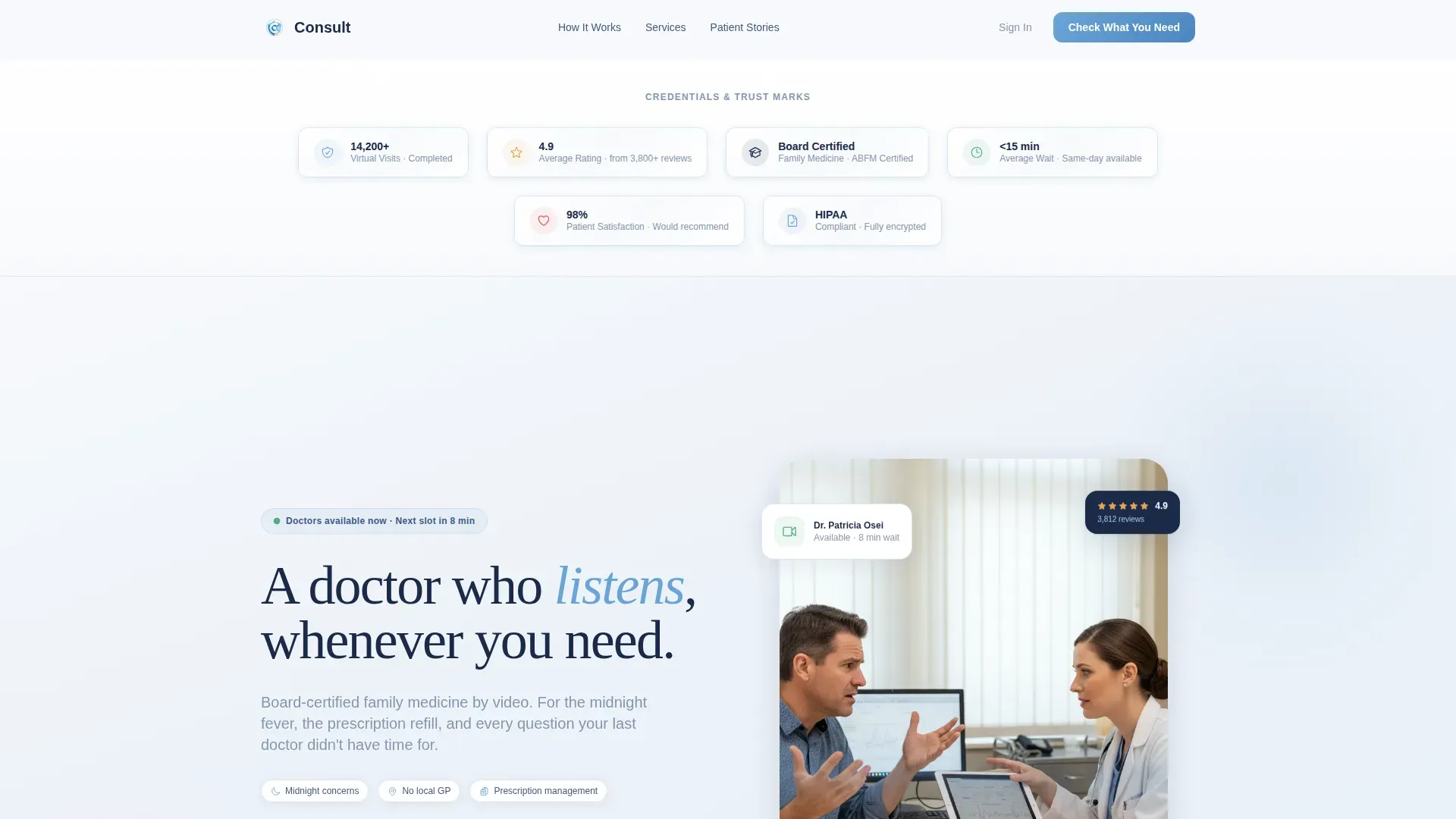
- A credential badge header band with real social proof numbers and trust marks
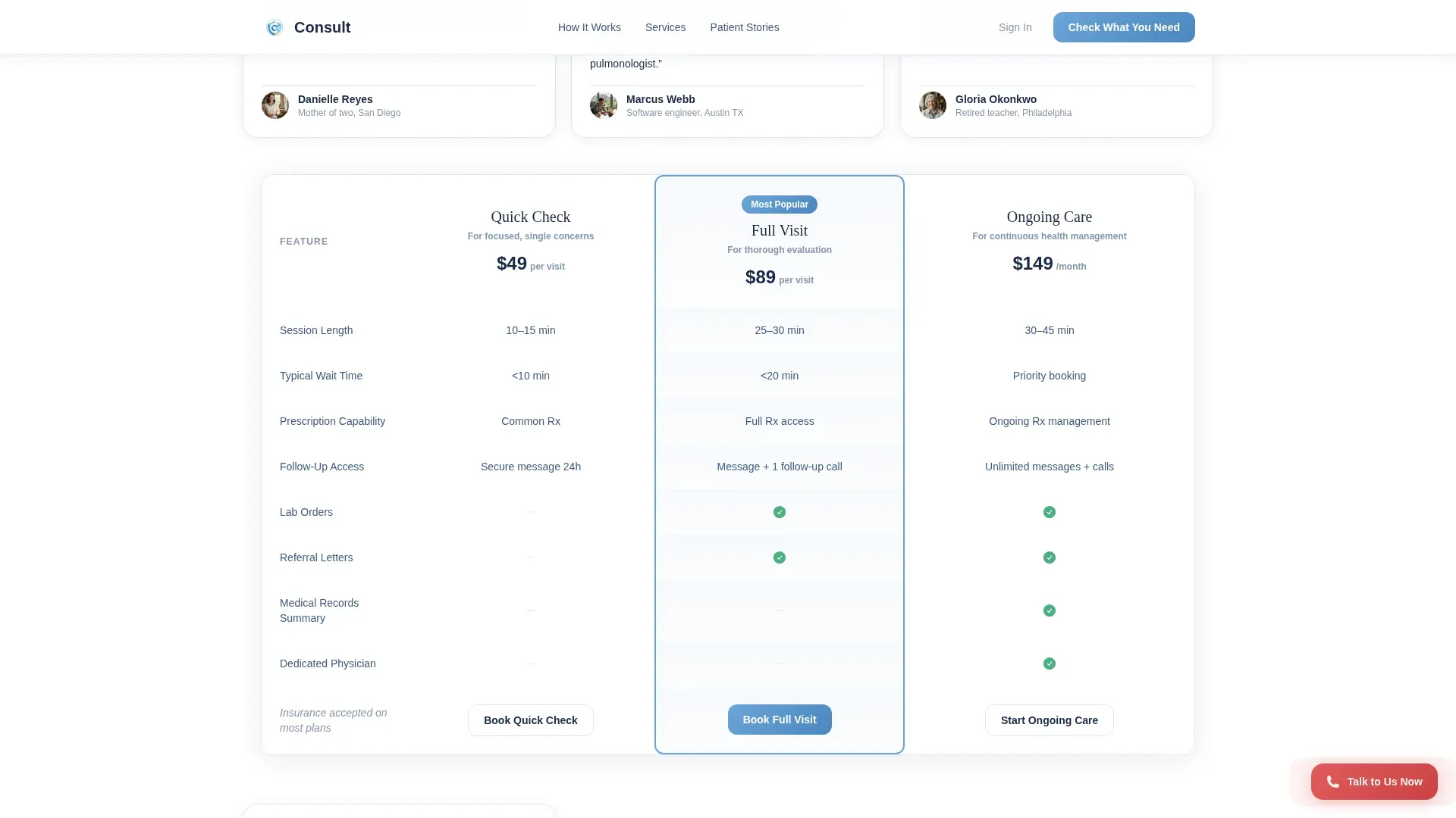
- A three-tier comparison table with embedded patient testimonial tiles
- A five-step quiz funnel with tier recommendation logic and auto-populated booking form
Feature list
This template includes several purposefully designed features. Each one addresses a specific moment in the patient's decision journey.
Award Badge Header Band
The header opens with a horizontal band of embossed credential shields. Each badge carries a real number, such as 14,200 virtual visits completed, a 4.9 average rating, and board-certified family medicine credentials. This section builds authority before any body copy is read.
Three-Tier Comparison Table
The comparison table contrasts three consultation tiers: Quick Check, Full Visit, and Ongoing Care. Columns cover wait time, session length, follow-up access, and prescription capability. Patients can evaluate their options at a glance without needing to speak to anyone.
Testimonial Mosaic Rows
Between each table row, real patient testimonials tile in an asymmetric mosaic layout. Each quote represents a different life moment, a midnight ear infection, a medication review, a hotel-room visit. The alternating pattern of clinical data and personal story creates a human rhythm as you scroll.
Five-Step Quiz Funnel
The primary call to action, labeled "Check What You Need," opens a five-step assessment. Steps cover current concern, symptom duration, existing medications, insurance type, and preferred appointment window. Results recommend a consultation tier and auto-populate a booking form.
Fixed Urgent-Care Button
A secondary call to action, "Talk to Us Now," stays fixed in the bottom corner of the page. It gives visitors who already know what they need a direct path to immediate help without completing the quiz.
Scroll-Triggered Animations
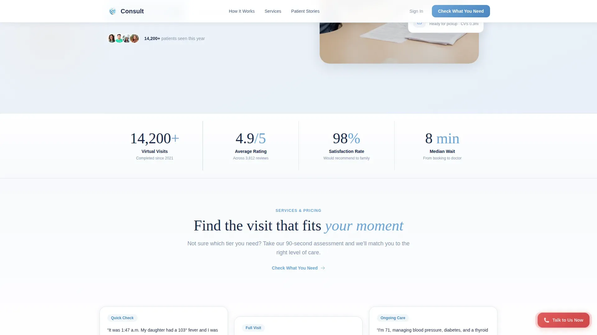
The template uses medium-weight scroll-triggered reveal animations, badge shimmer effects, quiz step transitions, and counter animations on the trust stats. These motion elements add life to the page without distracting from the clinical calm of the overall design.
Page sections overview
| Section | Purpose |
|---|---|
| Header Badge Band | Display credential trust marks and real performance numbers |
| Comparison Table | Compare Quick Check, Full Visit, and Ongoing Care tiers |
| Testimonial Mosaic | Tile patient quotes between table rows for human context |
| Quiz Funnel | Guide visitors through a five-step symptom and lifestyle assessment |
| Trust Anchors Bar | Reinforce key stats and board certifications in a stats strip |
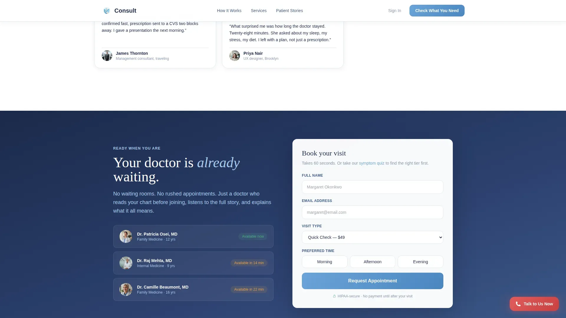
| Booking Call to Action | Show auto-populated form from quiz results for final conversion |
| Fixed Urgent Button | Provide instant access to immediate care for high-urgency visitors |
| Footer | Single-row linear footer with essential links and contact info |
Design & branding system
The visual identity follows a Medical Clarity theme built on the Cloud Canvas color system. The palette is designed to feel like a freshly laundered lab coat in a naturally lit room, nothing hidden, nothing harsh.
- Colors: soft clinical white (#F7F9FC) background, reassuring sky blue (#6BA4D9) for primary actions, warm skin tone (#E8C4A0) as a human accent, and deep trust navy (#1B2A4A) for text and anchoring elements
- Typography: DM Sans for body text and user interface elements, paired with Fraunces serif for display headings to balance clinical clarity with warmth
- Visual style: Medical Clarity aesthetic with crisp surfaces, natural light references, no stock photography of smiling doctors, and embossed dimensional badge treatments
Mobile & speed optimization
This template is built mobile-first, because most of its target users are reaching for their phone in a stressful moment. The layout prioritizes fast readability at small screen sizes before scaling up to desktop.
- Static sections use server-side rendering for fast initial paint, while the interactive quiz and booking form run as client-side components
- The five-step quiz is designed for thumb-friendly tap interactions, with dropdown selectors, a duration slider, and morning, afternoon, and evening time selectors that work cleanly on small screens
How this template helps you convert
The conversion path in this template is intentional at every step. Visitors are never left without a clear next action.
- The credential badge band establishes trust in the first three seconds, so visitors feel safe enough to engage with the rest of the page.
- The comparison table removes decision paralysis by laying out tier differences clearly, while embedded testimonials make each tier feel real and human rather than abstract.
- The quiz funnel captures intent, recommends the right tier, and hands off a pre-filled booking form, reducing the mental effort required to complete a booking to nearly zero.
Other information about this template
This template is suitable for any family medicine or telehealth provider that wants to replace a generic contact form with a guided patient experience. It is especially effective for practices that serve multiple patient segments with different urgency levels and care needs.
- The template uses DM Sans and Fraunces typefaces, both of which are clean and screen-optimized for medical contexts
- The footer follows a Pattern 1 linear single-row layout, keeping the bottom of the page clean and uncluttered
- Localization defaults are set for English language, United States dollar pricing, US date format, and US insurance terminology
- The asymmetric testimonial mosaic layout is designed so that each patient voice feels distinct, reducing the visual monotony common to standard review grids
Theme
Medical Clarity
Creative direction
Testimonial Mosaic
Color system
Cloud Canvas
Style
Comparison Table
Direction
Quiz/Assessment
Page Sections
Award Badge Credential Header
Three-tier Comparison Table
Testimonial Mosaic Layout
Five-step Quiz Funnel
Fixed Urgent-care Button
Scroll-triggered Motion Design
Related questions
Can I change the consultation tier names and pricing in the comparison table?
How does the quiz funnel connect to the booking form?
Is this template suitable for a solo family doctor or only larger practices?
What kind of social proof does this template support?
Do visitors have to complete the quiz to book an appointment?



