Business Continuity Planning Landing Page Template
Continuity is a card grid landing page template built for business continuity planning consultancies. It uses a charcoal and amber color system, a certified-seal header badge, and a case study narrative layout to build trust with operations directors, compliance officers, and IT leaders at mid-market organizations. The page guides serious B2B buyers toward a readiness audit request.
by Rocket studio
Quick summary
Continuity is a modular card grid landing page template designed for business continuity planning consultancies. It opens with an engineered guarantee badge, moves through anonymized case study cards that accumulate evidence of operational recovery, and closes with a focused B2B conversion form. The charcoal and amber palette gives the page the visual authority of an industrial control panel.
Who this template is for
This template is built for consultancies that sell preparedness to organizations where failure is not an option. It speaks directly to the buyers those consultancies need to convince.
- Operations directors at mid-market manufacturers who own site-level resilience decisions
- Compliance officers at regional banks who need documented continuity frameworks for auditors
- IT heads at hospital networks who are responsible for recovery time when systems go down
What problem this template solves
Most consultancies in this space struggle to communicate readiness in a way that feels concrete rather than theoretical. A generic services page does not convert a compliance officer who has seen three vendors this quarter.
- Visitors leave without trusting the firm because the page shows credentials instead of outcomes
- Serious buyers cannot find a clear next step that matches where they are in the decision process
- Earlier-stage prospects who need methodology first have no low-friction path to engage
What you get with this template
This template gives you a fully structured single-page layout that builds credibility through narrative before asking for a meeting. Every section has a clear job to do.
- A centered guarantee badge header with radial amber glow and a stat line that fades in on load
- A modular case study card grid where each card tells a real disaster scenario with a recovery outcome
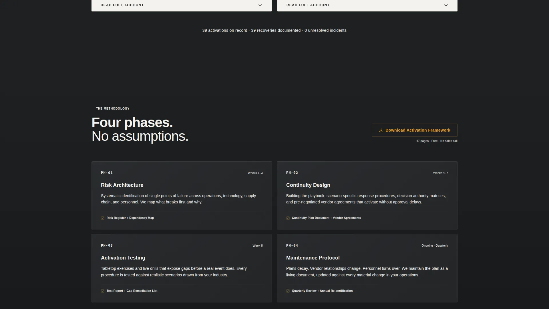
- A dual-path conversion section with a primary audit request form and a gated framework download
Feature list
This template is built around a specific persuasion sequence. Each feature plays a defined role in moving a skeptical B2B buyer from curiosity to contact.
Guarantee Badge Header
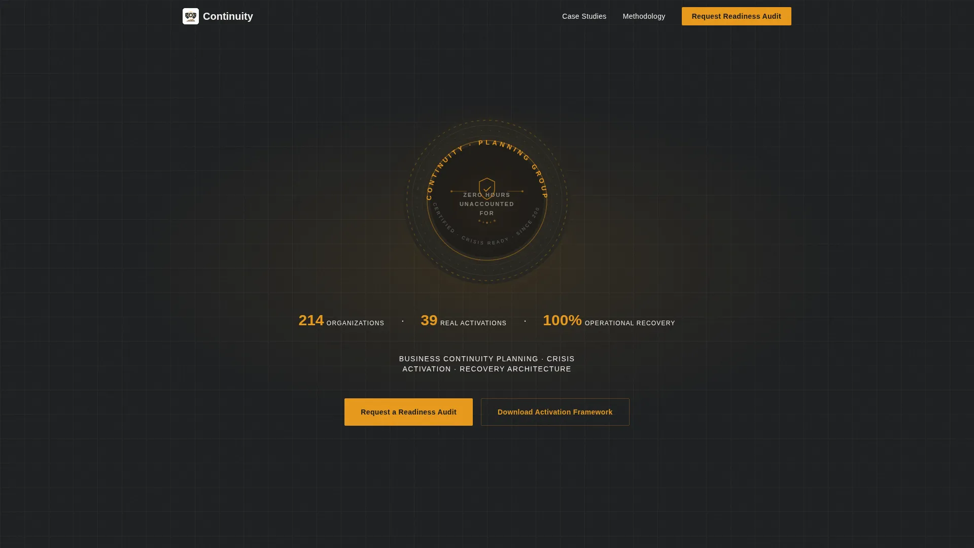
The header centers an engineered emblem styled like a certified seal with concentric rings. The company name arcs across the top, and a core promise sits stamped in the center. A subtle radial amber glow backlights the badge against deep charcoal, and a single stat line fades in beneath it: 214 organizations, 39 real activations, 100 percent operational recovery.
Case Study Card Grid
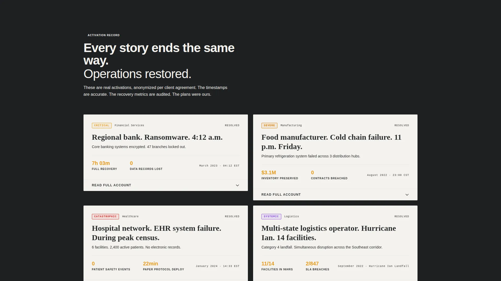
Each card in the modular grid leads with a disaster headline: industry, incident type, and time of event. Clicking or scrolling expands the narrative to show what the plan said, what the team did, and how many minutes recovery took. The cards escalate in severity from a single-site power failure to a multi-facility supply chain collapse, building an undeniable pattern of restored operations.
Dual-Path Conversion Section
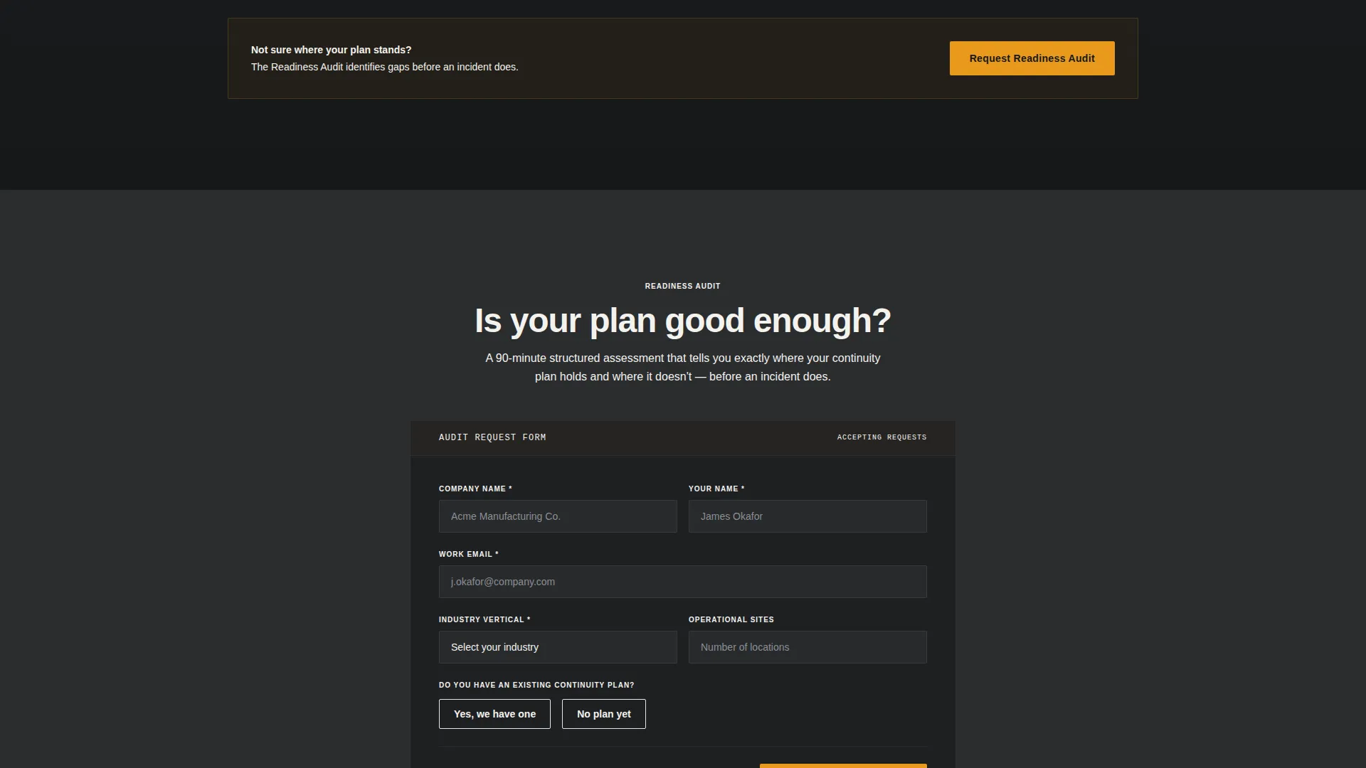
The primary call to action is a "Request a Readiness Audit" form that collects company name, industry vertical via dropdown, number of operational sites, and a yes/no toggle for whether an existing continuity plan is in place. A secondary path offers "Download the Activation Framework" behind an email gate, capturing prospects who want to evaluate methodology before committing to a conversation.
Persistent Amber Navigation Button
The "Request a Readiness Audit" button appears both beneath the header badge and as a fixed amber button in the navigation bar. This means the primary conversion action is always visible regardless of scroll position, reducing friction for a buyer who decides mid-page.
Service Utility Visual Theme
The layout uses a matte dark charcoal background with warm gunmetal card housings and archive white card surfaces. Caution amber appears on every interactive element, badge border, and metric highlight. The overall effect feels like a well-maintained industrial control panel, which reinforces the consultancy's positioning as operationally rigorous.
Page sections overview
| Section | Purpose |
|---|---|
| Guarantee Badge Header | Establishes authority and presents the core recovery promise with supporting stats |
| Stat Fade-In Line | Quantifies track record immediately below the badge to anchor credibility |
| Case Study Card 1 | Opens the narrative sequence with a ransomware incident at a regional bank |
| Case Study Card 2 | Escalates to a single-site power failure and documented recovery steps |
| Case Study Card 3 | Raises complexity with a multi-facility supply chain collapse scenario |
| Case Study Card 4 | Closes the grid with the highest-severity scenario and full recovery outcome |
| Audit Request Form | Collects qualified B2B lead data through a structured four-field form |
| Framework Download Gate | Captures earlier-stage email leads behind a methodology document offer |
| Persistent Nav Button | Keeps the primary call to action accessible throughout the entire scroll journey |
Design & branding system
The design follows a Service Utility theme built around an industrial control panel aesthetic. Every color choice has a functional logic behind it.
- Deep foundry charcoal (#2B2D2F) dominates backgrounds and body typography for maximum authority
- Caution amber (#E8991C) is used sparingly on buttons, badge borders, and metric highlights so every interactive element draws the eye immediately
- Archive white (#F4F2EE) surfaces each modular card like a laminated procedure sheet, keeping content clean and scannable inside the darker layout
Mobile & speed optimization
The card grid layout is designed to restack cleanly across screen sizes so the narrative sequence reads correctly on any device. Key structural decisions support this.
- Modular card components collapse into a single-column scroll on smaller screens without breaking the escalation order
- The persistent amber navigation button remains accessible on mobile so the primary conversion path is never buried
- Archive white card surfaces maintain readability against the charcoal background at all viewport widths
How this template helps you convert
The page earns the conversion before it asks for it. By the time a visitor reaches the form, they have read four stories of disasters survived and are no longer asking whether they need a plan.
- The guarantee badge and stat line establish immediate credibility so a skeptical buyer keeps reading instead of bouncing
- The escalating case study grid replaces abstract service claims with specific, anonymized outcomes that a compliance officer or operations director can recognize as relevant to their own risk profile
- The dual-path conversion section meets buyers wherever they are: ready to talk now, or still evaluating methodology before committing
Other information about this template
This template is suited to firms that operate in the business continuity planning and emergency preparedness space. It is particularly relevant when targeting mid-market organizations across manufacturing, financial services, and healthcare verticals.
- The template style is Card Grid (Modular), which means individual case study cards can be updated or reordered without restructuring the full layout
- The landing page direction is Partnership/B2B, so all copy, form fields, and calls to action are oriented toward organizational buyers rather than individual consumers
- The header concept (Guarantee Badge) and creative direction (Case Study Narrative) are intentional design decisions that differentiate this template from generic professional services layouts
Theme
Service Utility
Creative direction
Case Study Narrative
Color system
Charcoal & Amber
Style
Card Grid (Modular)
Direction
Partnership/B2B
Page Sections
Guarantee Badge Header with Stat Line
Escalating Case Study Card Grid
Dual-path B2B Conversion Section
Persistent Amber Navigation Button
Service Utility Design Theme
Related questions
Who is this landing page template designed for?
What conversion paths does this template include?
Can I update the case study cards with my own client stories?
What does the Guarantee Badge header communicate to visitors?
What information does the audit request form collect?