SaaS Builders Community Specialist Blog Website Template
Convene is a hero-dominant landing page template built for a vetted peer advisory board serving SaaS founders between $1M and $10M in annual recurring revenue. It uses a warm botanical color system, editorial photography, and a single intentional application form to build conviction through belonging rather than urgency. The page earns the click before asking for the apply.
by Rocket studio
Quick summary
Convene is a single-page template designed to attract SaaS founders who are scaling between $1M and $10M in annual recurring revenue and feel isolated doing it. The page builds belonging through honest copy, anonymized member quotes, and a warm botanical visual identity. It drives one conversion action: an application to join a curated roundtable of peers.
Who this template is for
This template is built for operators running a peer advisory board, founder community, or curated mastermind alternative in the SaaS space. It speaks directly to founders who are past early traction but not yet at enterprise scale, and who feel the weight of scaling alone.
- Technical co-founders who transitioned into the chief executive role and carry leadership decisions without a peer sounding board
- Bootstrapped operators weighing growth trade-offs, such as hiring a sales leader versus self-funding the next stage
- Second-time founders who want to protect personal and family time but find their calendar filling up anyway
What problem this template solves
Founders at the $1M to $10M annual recurring revenue stage often outgrow generic startup communities but have not yet reached the circles where real peer accountability happens. Standard landing page templates sell features and urgency. This one is built to create the feeling of belonging before asking for a commitment.
- It replaces the cold, conversion-optimized tone of most community pages with warm editorial copy that names the specific loneliness of scaling a SaaS company
- It filters for the right applicants by including an open-text question that surfaces vulnerability and self-awareness rather than just company metrics
- It builds conviction through scroll depth, not a discount or a countdown timer
What you get with this template
You get a fully structured, hero-dominant landing page with five distinct content sections and a minimal footer. Every element from layout to typography to color is purpose-built for a peer advisory community in the SaaS founder niche.
- A full-bleed hero section with a fade-in linen headline, floating glass badge, and a primary gold call-to-action button beneath the image
- An intentional four-field application form including a company name field, an annual recurring revenue range dropdown, a years-founding input, and an open-text vulnerability question
- A fixed bottom call-to-action bar that appears after the page midpoint, keeping the apply action accessible without interrupting the reading flow
Feature list
This section covers the core built-in capabilities that make Convene work as a conviction-building landing page for a SaaS founders peer advisory board.
Full-Bleed Editorial Hero
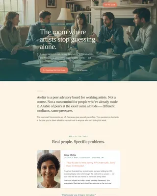
The hero fills ninety percent of the viewport with a candid, editorially lit photo of founders mid-conversation. The headline fades in over the image in linen white using a medium animation. A floating glass badge and a gold "Apply for a Seat" button anchor the primary call to action directly below the visual.
Scroll-Reveal Member Quote Section
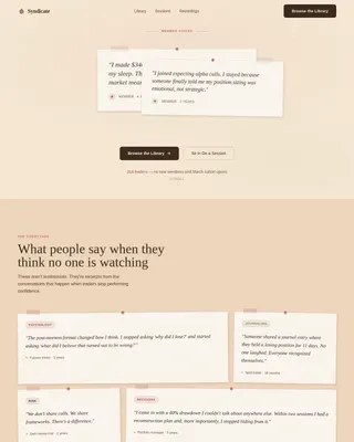
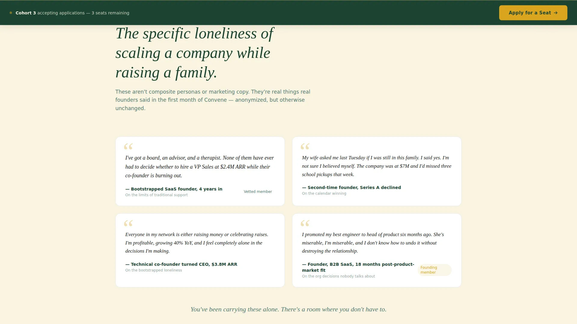
The loneliness section uses anonymized real-feeling member quotes that reveal on scroll. Each quote names a specific moment of isolation familiar to founders at this growth stage. Hover states on each quote block add a subtle interactive layer that reinforces the human texture of the section.
Peer Structure Commitment Blocks
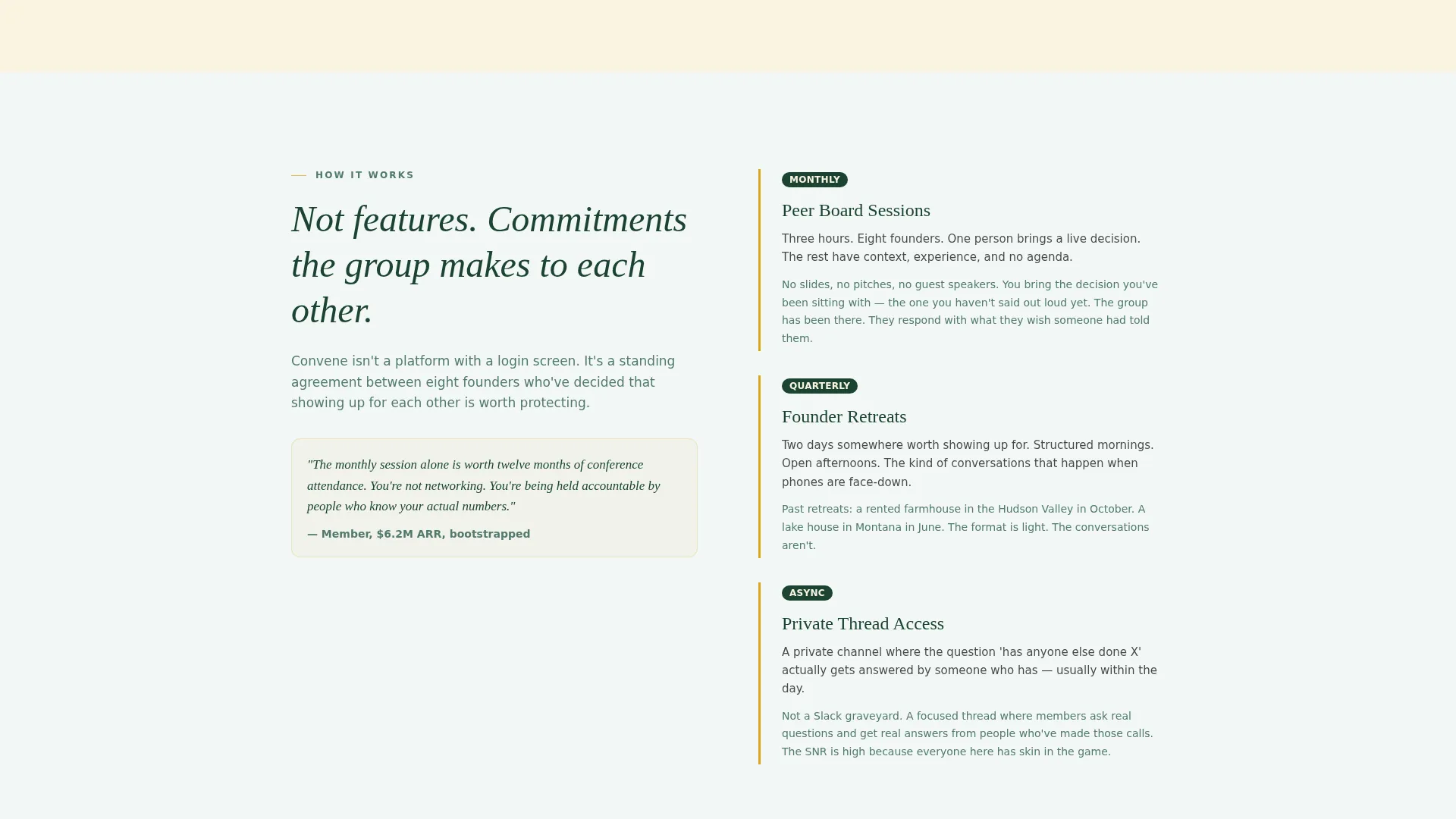
The structure section presents monthly peer boards, quarterly retreats, and async discussion threads not as a feature list but as commitments the group makes to each other. The framing shifts the reader from evaluating a product to considering a responsibility, which builds deeper intent to apply.
Vetting Philosophy Section
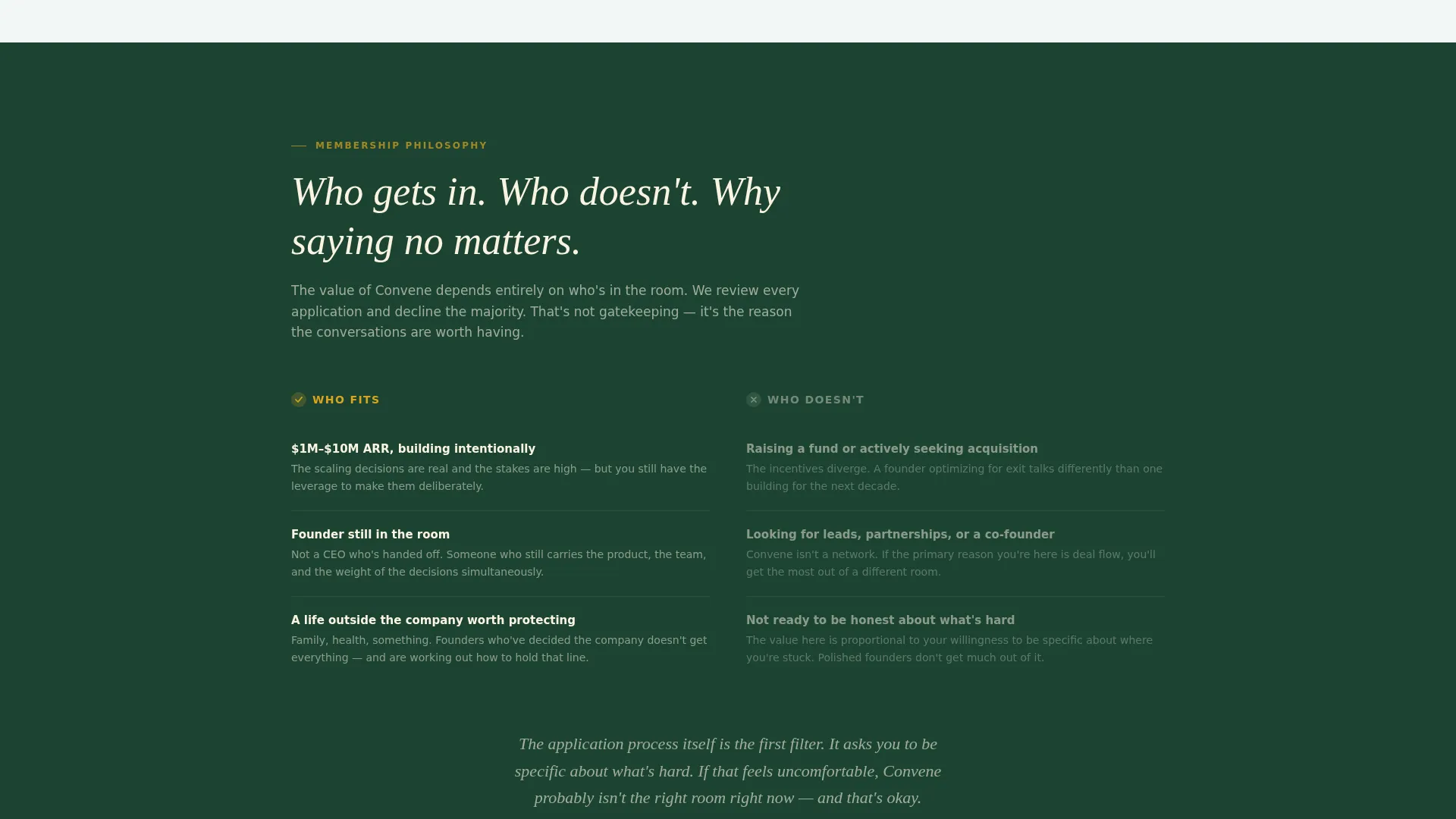
The vetting section explains who gets accepted, who does not, and why the selection process matters to the value of the room. It builds social proof through exclusivity rather than logos or metrics, making the application feel worth pursuing.
Intentional Four-Field Application Form
The application form is deliberately short and specific. It collects company name, current annual recurring revenue range via dropdown, number of years founding, and one open-text response to the question "What's the hardest decision you're sitting with right now?" This question filters for self-awareness and authentic fit.
Fixed Bottom Call-to-Action Bar
A persistent bottom bar appears after the page midpoint on scroll. It carries the same gold-on-evergreen "Apply for a Seat" treatment as the hero call to action. It stays visible without blocking the reading experience, ensuring the conversion point is always within reach.
Page sections overview
| Section | Purpose |
|---|---|
| Hero full-bleed | Opens with editorial photo and faded linen headline to establish emotional tone |
| Member loneliness quotes | Names the specific isolation of scaling SaaS while raising a family |
| Peer structure commitments | Frames monthly boards, retreats, and async threads as group commitments |
| Vetting philosophy | Explains who gets in and why saying no protects the room's value |
| Application form | Collects four intentional fields including an open-text vulnerability question |
| Minimal footer | Single-row linear footer keeping the page clean and focused |
Design & branding system
The visual identity follows a Botanical palette rooted in natural, unhurried warmth. The design feels like a well-kept garden behind a farmhouse: alive and reaching, but never rushed or corporate. Typography pairs Fraunces for editorial serif headlines with DM Sans for clean, readable body copy.
- Deep evergreen (#1B4332) anchors headlines and navigation; warm fern (#52796F) softens section backgrounds; sun-through-leaves gold (#DAA520) marks every interactive element and call-to-action button; soft linen white (#FAF3E0) breathes across margins to prevent visual crowding
- Fraunces brings editorial warmth to hero and section headlines, while DM Sans keeps body text clear and legible across devices
- The overall style is warm editorial: candid photography, visible wood grain, natural imperfection, and human texture over polished stock imagery
Mobile & speed optimization
The template is built desktop-first to match the primary behavior of founders browsing late at night on a laptop. It also maintains a strong mobile layout so the page works for any device a founder picks up.
- Server Components handle static sections to keep JavaScript footprint minimal, which supports a lean and responsive page load
- The fixed bottom call-to-action bar is designed to display cleanly on both desktop and mobile viewports without overlapping critical content
- Medium-level animations, including the hero headline fade-in and scroll-reveal quotes, are designed to enhance the reading experience without adding unnecessary rendering weight
How this template helps you convert
This template earns its conversion by making the founder feel understood before asking them to act. Every section deepens the sense that this is a room worth entering.
- The hero creates an immediate emotional anchor through candid photography and a headline that rejects the typical mastermind pitch, which positions Convene as something different from the first second
- The scroll journey from loneliness section through vetting philosophy builds layered conviction, so by the time the reader reaches the form, they are motivated by belonging rather than a promotional offer
- The four-field application form, with its open vulnerability question, signals that this community selects for character and self-awareness, which makes the act of applying feel meaningful rather than transactional
Other information about this template
Convene fits within the broader category of community and nonprofit landing page templates that prioritize emotional resonance over hard-sell tactics. It is particularly well-suited for operators in the SaaS builders community space who want a template that reflects the seriousness and warmth of a real peer advisory board.
- The template ships as a Hero-Dominant (90/10) layout, meaning the hero section commands the visual weight and the remaining sections support a single conversion goal
- The Family First theme is expressed through the botanical color system and the tone of the copy, which acknowledges the tension between ambitious scaling and personal life
- The Movement and Cause creative direction means the page builds momentum through conviction rather than urgency, making it a strong fit for high-trust, low-volume application flows
- The single call-to-action approach, "Apply for a Seat," keeps the page free of competing conversion paths, which suits a curated community model where applicant quality matters more than applicant volume

Theme
Family First
Creative direction
Movement & Cause
Color system
Botanical
Style
Hero-Dominant (90/10)
Direction
Lead Generation
Page Sections
Full-bleed Editorial Hero Section
Scroll-reveal Member Quote Blocks
Peer Structure Commitment Framing
Vetting Philosophy Section
Intentional Four-field Application Form
Fixed Scroll-triggered Bottom Bar
Related questions
What kind of community is this template designed for?
Does the template include a pricing table or calendar booking section?
Can I adapt this template for a community outside the SaaS niche?
How does the fixed bottom call-to-action bar behave?
What fields does the application form include?