Product Managers Mastermind Group Landing Page
Convene is a modular card-grid landing page template built for a senior product manager mastermind group. It pairs a manifesto-driven hero with a member portrait grid, a three-field application form, and a secondary email capture. The botanical color system and generous serif typography create a warm, unhurried feel that earns trust before it asks for anything.
by Rocket studio
Quick summary
Convene is a single-page lead generation template for a curated product manager mastermind group. It opens with a full-width manifesto header, flows into a member card grid where vulnerable quotes lead over job titles, and closes with a sequential application form. The design feels like a greenhouse: warm, earthy, and quietly alive.
Who this template is for
This template is built for operators running high-trust peer communities in the product management space. It speaks directly to the people who already know what they need and just need a door to walk through.
- Senior or staff product managers at Series B to D startups with five or more years in the role
- Product managers at mid-market tech companies who have outgrown newsletter comments and peer forums
- Community builders or cohort organizers who want a landing page that signals selectivity and emotional safety
What problem this template solves
Most community landing pages sell features: session counts, frameworks, speaker bios. This template solves a different problem. It earns the trust of people who are already skeptical of polished promises and over-produced sales copy.
- Senior product managers hesitate to join communities that feel performative or status-driven
- Generic lead forms feel transactional and fail to pre-qualify applicants emotionally
- Standard hero sections with stock photography do not match the tone a high-trust mastermind group needs to project
What you get with this template
You get a complete, structured single-page layout that moves a visitor from first impression to completed application without friction or noise. Every section has a specific job, and nothing is decorative without purpose.
- A full-width manifesto hero with generous serif typography and a single coral call-to-action button
- A modular card grid where member portrait cards lead with a vulnerable quote and place name and role below
- A three-field sequential application form covering role, tenure, and a one-sentence struggle prompt
- A secondary email capture section offering a reading list for visitors not yet ready to apply
- A botanical color system using parchment, loam, fern, and coral with strict roles for each tone
Feature list
This section walks through the core built-in components and design decisions that make Convene work as a lead generation landing page for a product manager mastermind group.
Manifesto Hero Section
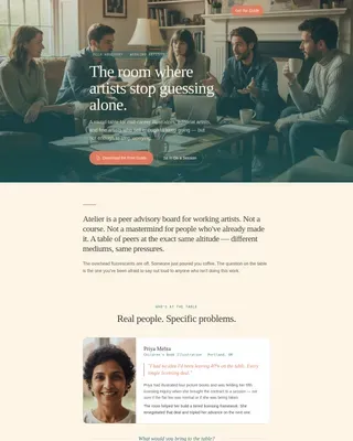
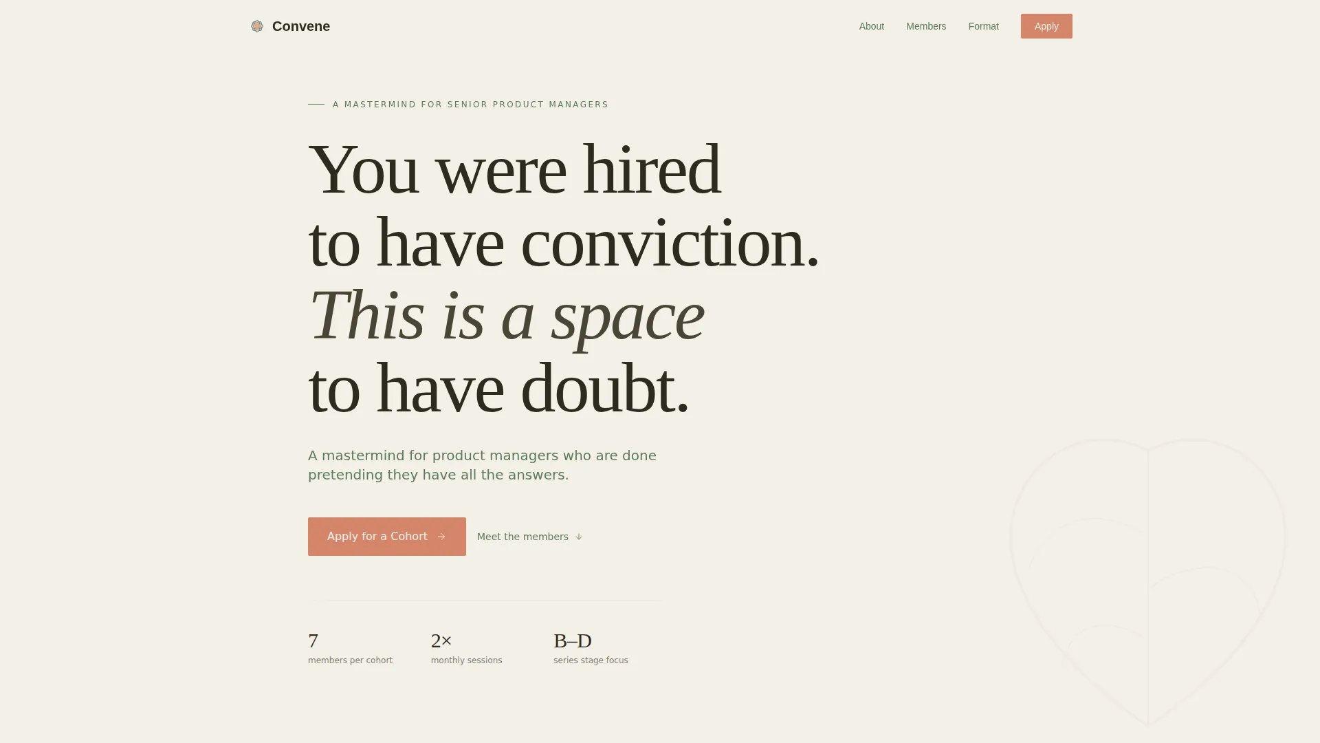
The hero spans the full page width and uses oversized Fraunces serif type set against soft parchment. The headline and subline breathe in generous negative space, giving the visitor time to read slowly. A single bloom-coral button sits beneath the text as the only interactive element in view.
Member Portrait Card Grid
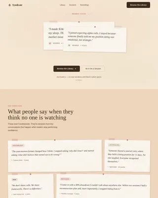
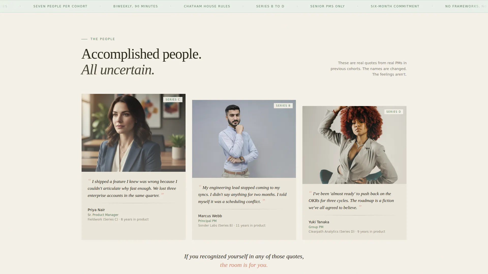
Each card in the modular grid leads with a vulnerable first-person quote. The member name, company, and role appear below the quote, reversing the usual hierarchy. Cards enter the viewport with staggered scroll reveals, and each card has a hover state. A bloom-coral call-to-action button reappears after every third row of cards.
Sequential Application Form
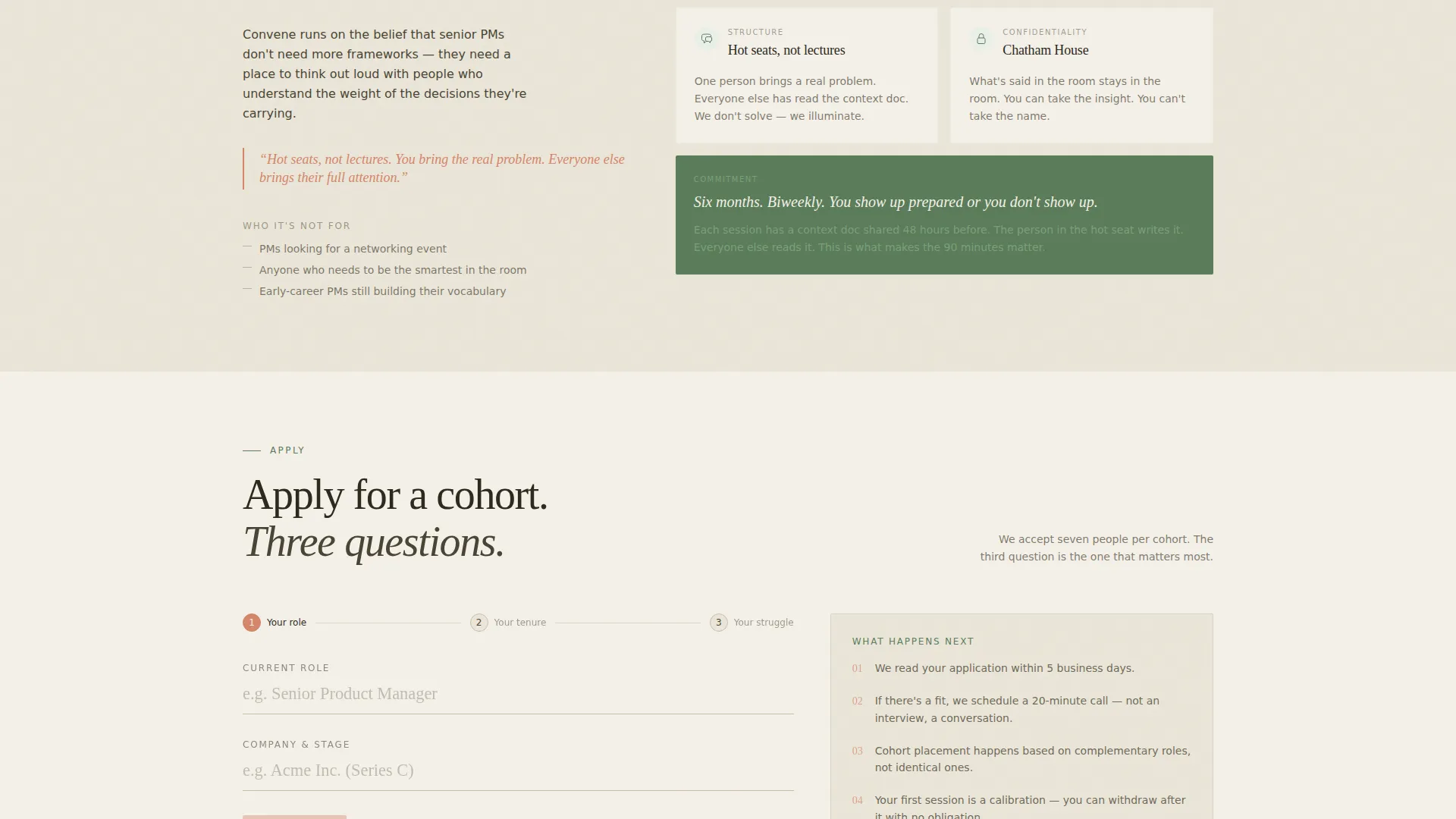
The three-field form asks questions in order: current role and company, time in product, and one sentence describing what the visitor is currently struggling with. The third field is both a qualifying filter and an emotional commitment device. Form validation is built in.
Secondary Reading List Capture
A dedicated section below the application form offers a reading list as a softer entry point. Visitors who are not ready to apply can leave their email here, keeping them in the funnel without pressure.
Botanical Branding System
The color system assigns a specific role to each tone. Parchment dominates all backgrounds. Loam anchors body text. Fern appears in card borders, section dividers, and iconography. Coral is reserved strictly for calls to action, making every interactive element feel distinct and intentional.
Editorial Format Details Block
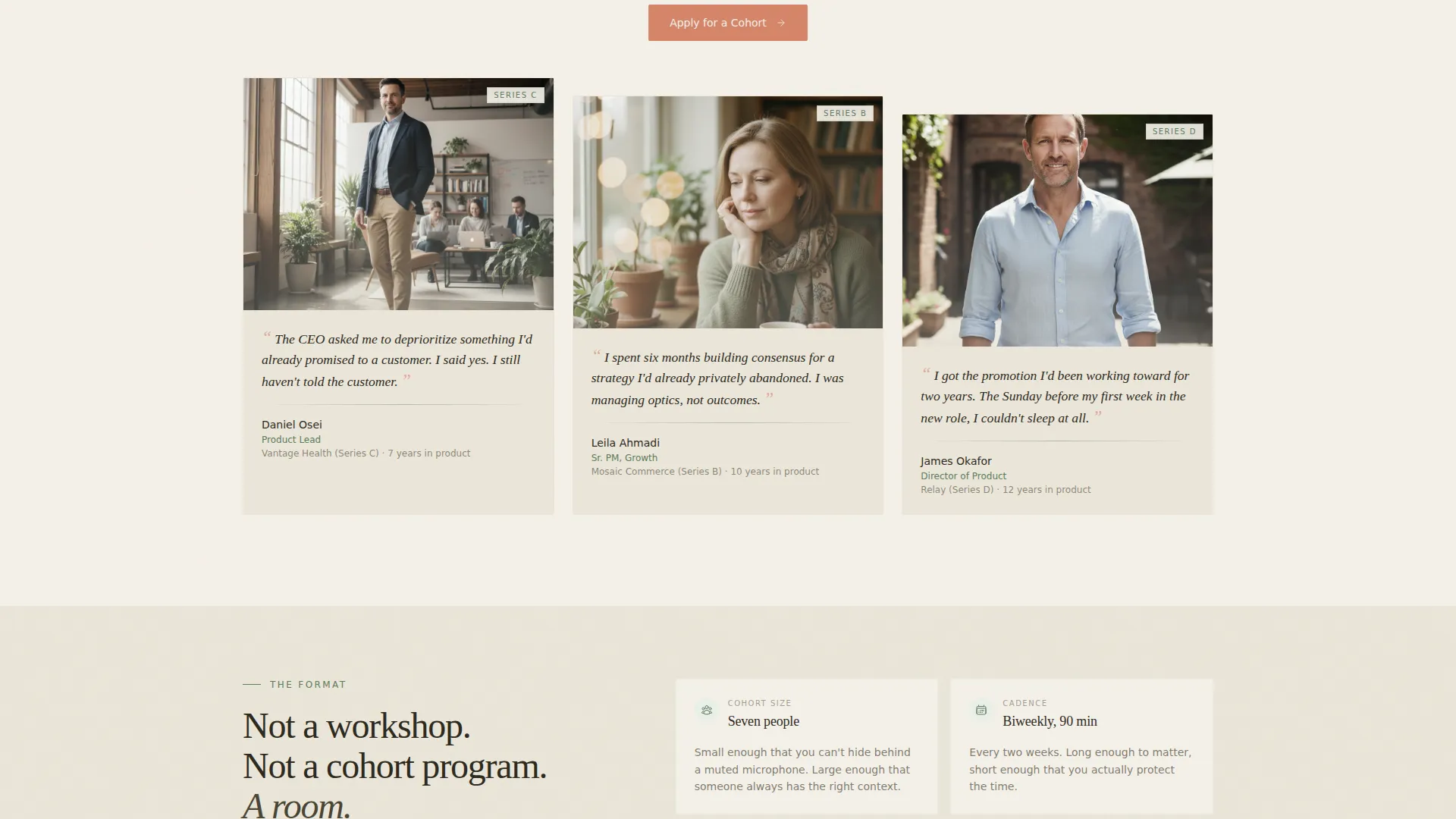
Between card rows, an asymmetric editorial layout describes the cohort format in plain terms: seven members per cohort, biweekly meetings, and a hot-seat structure rather than lectures. This section answers the practical questions a serious applicant will have before committing.
Page sections overview
| Section | Purpose |
|---|---|
| Manifesto Hero | Establish tone and invite conviction with a serif headline and single coral call to action |
| Member Card Grid | Build trust through vulnerable peer quotes with name and role shown below each quote |
| Format Details Block | Explain cohort size, meeting cadence, and hot-seat structure in an editorial layout |
| Application Form | Capture qualified leads through a three-field sequential form with built-in validation |
| Reading List Capture | Offer a secondary email opt-in for visitors not yet ready to submit a full application |
| Footer | Close the page with a horizontal flow pattern that completes the layout cleanly |
Design & branding system
The visual identity follows a Healing Space theme grounded in a botanical color palette. Typography is the primary design element, not photography or illustration. The combination of Fraunces for display text and DM Sans for body copy and interface elements keeps the page readable and warm at every size.
- Parchment (#F4F0E8) dominates all backgrounds; loam (#2D2A1E) anchors all body text; fern (#5B7C5A) appears in card borders, dividers, and icons
- Coral (#D4856A) is reserved exclusively for calls to action, ensuring every button and interactive prompt stands out as the only flower in the room
- Scroll-reveal animations with spring easing and staggered card entrances create a low-to-medium motion experience that feels alive without being distracting
Mobile & speed optimization
The template is built desktop-first to match the reading habits of senior product managers working at a desk, with a solid responsive layout for mobile visitors. The technical approach keeps the page light and fast by design.
- Server Components handle all static content, keeping the JavaScript payload minimal
- Card grid and form sections reflow cleanly for smaller screens without losing the botanical hierarchy
- Low-to-medium animation intensity ensures the scroll-reveal and magnetic hover effects do not slow down the experience on any device
How this template helps you convert
The entire page is structured as a trust-building sequence. Each section earns the next click rather than demanding it.
- The manifesto hero filters for self-aware product managers immediately. Visitors who recognize themselves in the headline are already pre-qualified before they scroll.
- The member card grid builds a cumulative social proof argument. Each quote normalizes doubt and signals that accomplished peers are already in the room, making the application feel safe rather than risky.
- The three-field form turns the act of applying into the first moment of value. Writing out a current struggle makes the visitor realize they need the community, completing the emotional commitment before they hit submit.
Other information about this template
This template is purpose-built for community organizers, cohort facilitators, and independent operators who run small, selective peer groups for product professionals. It is not a course page, a coaching sales page, or a SaaS product page. The design language and copy architecture are both designed for an audience that reads carefully and responds to honesty over polish.
- The template style is Card Grid (Modular), making it straightforward to add, remove, or reorder member cards as cohorts change
- The intersection of a Community and Nonprofit category with a Product Managers Mastermind Group niche means the tone prioritizes emotional resonance over feature enumeration
- The footer uses a horizontal flow pattern that closes the page without adding noise or competing calls to action
- The template is suitable for operators running a product managers mastermind group at any stage, from first cohort to a well-established program
Theme
Healing Space
Creative direction
Team & People
Color system
Botanical
Style
Card Grid (Modular)
Direction
Lead Generation
Page Sections
Manifesto Hero with Serif Typography
Quote-first Member Card Grid
Sequential Three-field Application Form
Secondary Reading List Email Capture
Botanical Four-tone Color System
Scroll-reveal Card Animations
Related questions
Who is this landing page template designed for?
Can I update the member cards without rebuilding the layout?
Why does the application form only include three fields?
What is the purpose of the reading list section?
What makes this template different from a standard community page?