Nonprofit Leader Career Professional Website Template
Convene is a masonry-layout personal landing page built for nonprofit leaders who need to earn trust before asking for anything. The Ink & Paper visual identity, parchment tones, fountain pen black, dried red ink accents, feels like a well-traveled field journal. Interactive tiles expand into layered impact stories, and a warm sticky contact form invites conversation without pressure.
by Rocket studio
Quick summary
Convene is a single-page masonry landing page designed for senior non profit leaders who communicate with foundation program officers, conference organizers, and peer executive directors. The Ink & Paper color system and collage-style hero create an immediate emotional connection with visitors who value depth over polish. Every tile is a doorway, and every scroll reveals more of a life's work organized by passion.
Who this template is for
A non profit organization leader carries credibility that a generic résumé page cannot express. Convene was designed for exactly that kind of professional, someone whose work spans field deployments, policy tables, and published thought leadership. This template suits any mission driven organizations executive who needs their personal non profit website to do serious persuasive work before a single word is exchanged.
- Foundation program officers evaluating a non profit leader as a potential grantee partner
- Conference organizers searching for a credible keynote voice with documented impact
- Peer executive directors and advocacy organizations seeking a collaborator with real policy experience
What problem this template solves
Most non profit websites built for individual leaders fall into one of two traps. They either read like a dry curriculum vitae that overwhelms visitors with chronological lists, or they rely on striking imagery alone without the substance that a discerning program officer needs. Neither approach builds the emotional connection that converts a curious visitor into a genuine collaborator or funder.
Convene solves this by presenting a career as a curated collection of impact stories rather than a timeline. The masonry layout removes the pressure of linear scrolling and lets each visitor follow their own curiosity, Field Work, Published Writing, Board Service, Speaking, without overwhelming visitors with too much structure too soon.
- Replaces cold, flat bio pages with a warm, textured exploration experience
- Removes the friction between a visitor's question and the relevant proof of impact
- Positions the leader as someone worth writing to, not just browsing past
What you get with this template
Convene delivers a complete personal landing page structured around six distinct sections. The design, interaction model, and calls to action are all pre-built and ready to be filled with real content. The page earns its conversion by proving depth first and asking for contact second.
- A scrapbook-style hero with overlapping collage fragments and a serif name anchor
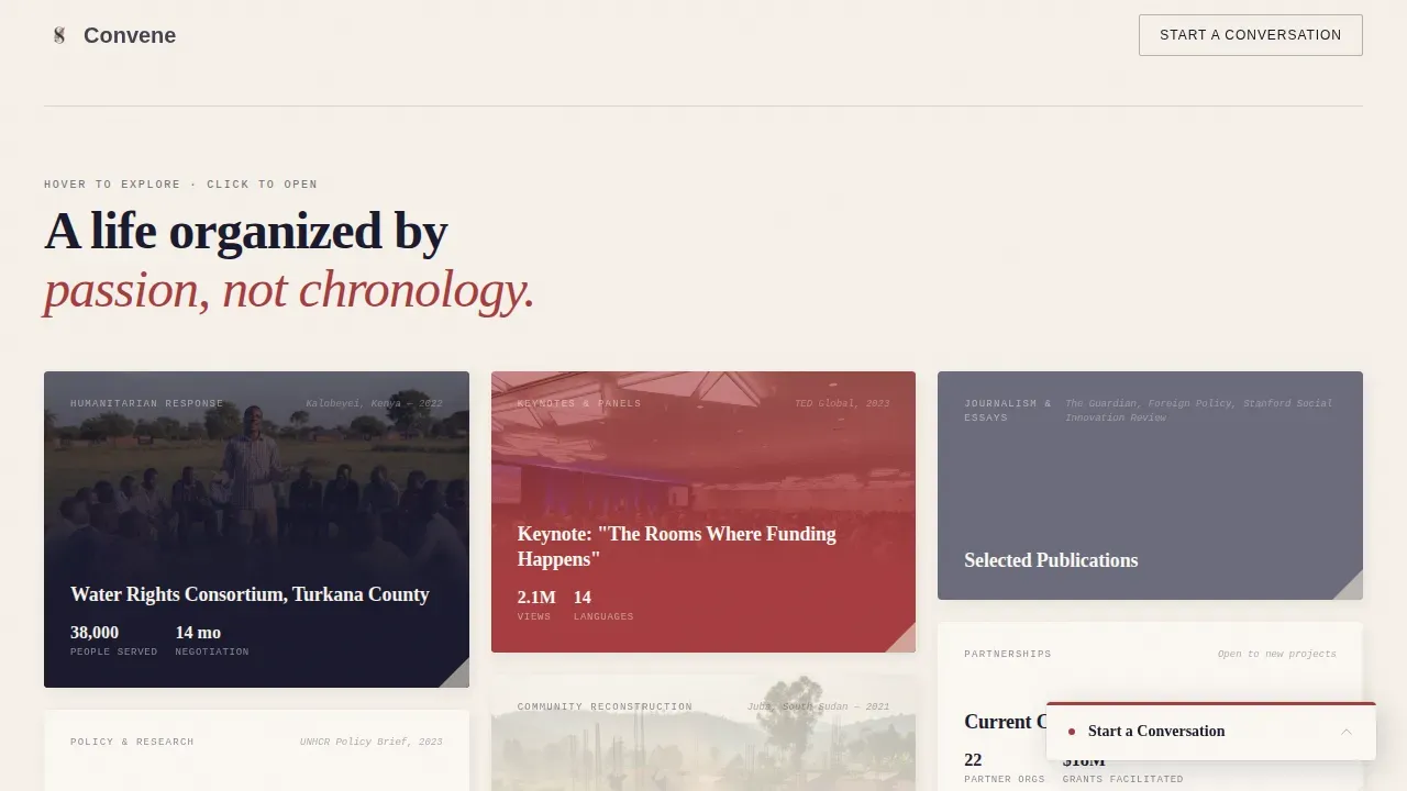
- An interactive masonry grid with hover-reveal labels and expandable tile stories
- Pull quote clusters, a speaking and collaboration bento section, and a parchment-textured sticky contact form
- A secondary conversion path via a "Request the Full CV" email-capture link
- A minimal footer using a horizontal flow layout
Feature list
This section covers the core key features built into the Convene template. Each one addresses a specific need of the target audience and reflects the prompt's design and interaction brief directly.
Collage Hero Header
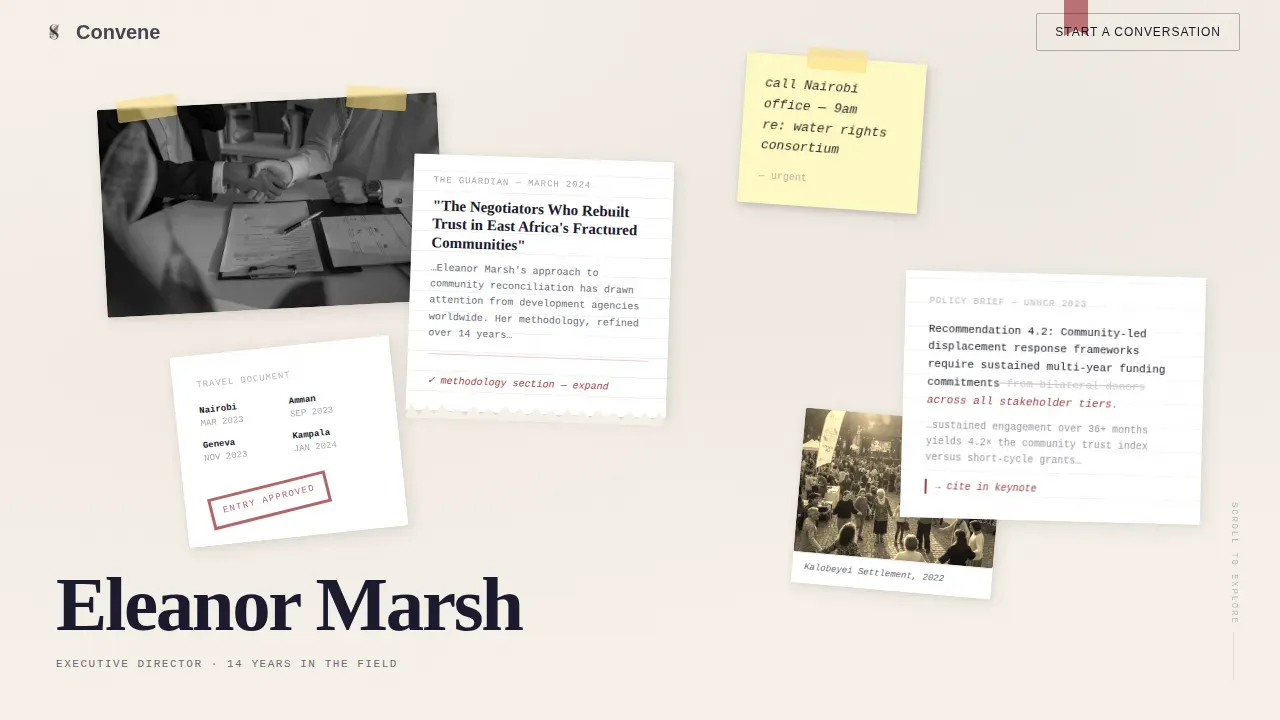
The header is a Collage/Scrapbook composition spread across the full viewport. Overlapping fragments, a photograph of clasped hands, a torn newspaper clipping, a handwritten sticky note, a stamped passport page, and a typed policy excerpt with red pen edits, sit at deliberate angles. No element is perfectly aligned. A single line of serif type anchors the bottom left with the leader's name only, letting the collage act as the introduction. This approach creates strong hero images that communicate a life of field work before a visitor reads a single sentence.
Interactive Masonry Grid
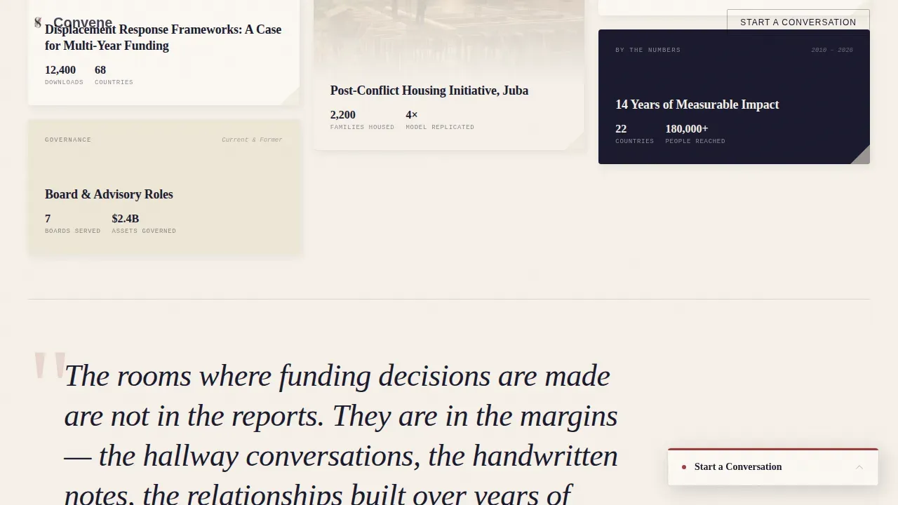
The masonry grid is the heart of the page. Each tile represents a chapter of impact: Field Work, Published Writing, Board Service, Speaking, and Impact Numbers. Hovering a tile reveals a handwritten-style label. Clicking expands the tile into a layered mini-story combining photographs, pull quotes, and document artifacts that feel pinned to a wall. This non-linear structure supports engaging content discovery and keeps website visitors exploring rather than bouncing. The grid's thematic clustering means a foundation officer and a conference organizer can each find their most relevant proof points without being guided down the same path.
Pull Quote Cluster
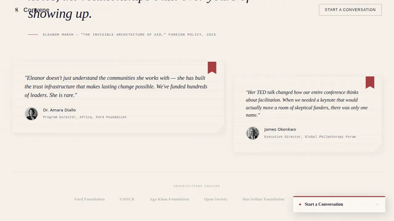
Large italic testimonials sit inside their own section, each paired with an attribution artifact that adds credibility. These authentic testimonials are formatted as visual objects, not standard text blocks, reinforcing the Ink & Paper aesthetic. The pull quote cluster supports compelling calls to action by building social proof before the sticky contact form appears. This kind of transparent, evidence-based storytelling is one of the essential features that separates top nonprofit websites from ordinary bio pages.
Sticky "Start a Conversation" Form
After the first scroll, a parchment-textured card appears fixed in the bottom corner of the page, always present, never intrusive. The contact form asks for name, organization, and a single open field labeled "What are you working on?" This low-friction design turns contact forms into an invitation rather than a demand. The form's placement mirrors the behaviour of the most effective nonprofit websites: compelling calls appear after trust is built, not before.
"Request the Full CV" Email Capture
A secondary conversion path sits alongside the primary contact form. Clicking "Request the Full CV" opens an email-capture modal that delivers a beautifully typeset PDF. This feature turns passive browsers into warm leads and serves as one of the key benefits for leaders who want to build a contact list of genuinely interested collaborators. The approach is consistent with how the best nonprofit website design treats fundraising appeals and partnership outreach: earn the click before asking for the address.
Speaking and Collaboration Bento
An asymmetric bento layout showcases recent speaking engagements, panel appearances, and collaboration credits. Data visualization within the Impact Numbers tile communicates reach and scale at a glance. The section makes upcoming events easy to surface and gives conference organizers a fast, visual summary of the leader's speaking record without requiring them to read long paragraphs.
Page sections overview
| Section | Purpose |
|---|---|
| Collage Hero | Establish identity through overlapping visual fragments and a serif name anchor |
| Masonry Impact Grid | Let visitors explore field work, writing, board service, and speaking in any order |
| Pull Quote Cluster | Build credibility with large-format authentic testimonials and attribution artifacts |
| Speaking Bento Layout | Showcase engagements and upcoming events in an asymmetric visual grid |
| CV and Contact | Capture warm leads via sticky form and CV email-capture modal |
| Minimal Footer | Close the page with clean horizontal flow and essential links |
Design & branding system
The Ink & Paper theme drives every visual decision in Convene. The palette was chosen to feel like physical correspondence, warm where digital is typically cold, and textured where screens are usually flat. Typography follows a clear hierarchy that supports readable fonts across all content types.
- Colors: unbleached parchment (#F5F0E8) for backgrounds, fountain pen black (#1A1A2E) for body text, pencil graphite (#6B6B7B) for secondary text and annotations, dried red ink (#A63D40) reserved for links, hover states, and pull quotes
- Typography: Fraunces serif for headlines, DM Sans for body copy, JetBrains Mono for marginalia-style annotations, a combination that delivers visual interest without sacrificing legibility
- Animation and interaction: high-intensity parallax layers, tile expansion animations, hover-reveal handwritten labels, and scroll-linked effects throughout, all contributing to visual elements that reward exploration
Mobile & speed optimization
Convene is built desktop-first, reflecting the research habits of its primary target audience, foundation officers and executive directors who typically evaluate partners on desktop or tablet during work hours. The layout is fully responsive to tablet viewports. The masonry grid and sticky contact form adapt cleanly across screen sizes, and the collage hero maintains its layered depth on smaller displays.
- The template is responsive to tablet and mobile devices, ensuring the layout does not break on smaller screens
- Mobile optimization ensures that calls to action, contact forms, and the CV capture modal remain accessible and functional across device sizes
- Fast loading speeds are a design-level priority: static sections use server components while interactive masonry uses client-side rendering, keeping the page light for keeping visitors engaged
How this template helps you convert
The page is structured so that persuasion happens before any ask is made. By the time a visitor reaches the sticky contact form, they have already spent several minutes inside the masonry grid, reading field notes, scanning pull quotes, and absorbing impact data. The act of reaching out feels less like submitting a lead and more like writing a letter.
- The collage hero creates an immediate emotional connection that signals depth and intentionality, replacing a standard mission statement with a visual argument for the leader's credibility.
- The Interactive Explorer structure lets each visitor build their own case for partnership, foundation officers follow the impact data, conference organizers follow the speaking tile, and peer executives follow the policy work, so compelling calls land on already-primed readers.
- The sticky "Start a Conversation" form and the secondary "Request the Full CV" path offer two distinct conversion routes that match the different intent levels of website visitors, from a casual first look to a serious evaluation.
Other information about this template
Convene fits naturally alongside a broader content strategy for a non profit leader building their mission online. The landing page design is intentionally modular, so web designers can adapt section content and tile categories to match a specific non profit organization's focus areas, whether that is humanitarian response, mental health advocacy, education policy, or community development. Leaders working across mental health platforms or advocacy organizations will find the pull quote and data visualization sections especially useful for communicating nuanced outcomes.
The non profit sector has made significant strides in web design over the past decade, but only 37% of non profits currently have an active search engine optimization strategy, a gap that represents a real opportunity. Search engine optimization enhances a non profit website's ranking on search engine results pages through relevant keywords and high-quality content. Incorporating SEO best practices, including technical seo improvements, keyword research, and strong meta descriptions, can dramatically improve online visibility and bring the right visitors to the page.
Nonprofits can also leverage the Google Ad Grants program to earn free advertising credits for promoting their websites within Google search results. Google Ads can provide immediate traffic to a non profit website while long-term search engine efforts build authority. Combining google ads with organic content strategy means a non profit organization can appear prominently in google search results for the terms their target audience is actively searching.
The most effective nonprofit websites, from major organizations like the World Wildlife Fund and St. Jude Children's Research Hospital to smaller advocacy organizations, share a common approach: they lead with emotional impact, make giving easy with clear donation buttons and a streamlined donation form, and build trust through transparency. Even though Convene is a personal leadership platform rather than a full organizational non profit website, the same principles apply. The page earns trust through authentic testimonials, data visualization, and informative content before any conversion is attempted.
When comparing nonprofit website templates, it is worth noting that many offer free templates as a starting point, while premium options typically range up to around $200. Free templates can be a practical choice for early-stage non profit organizations, but a purpose-built template like Convene offers the specific interaction model and visual identity that a senior leader's platform demands. Many nonprofit website templates include built in donation tools and volunteer forms, which are important pages for organizational sites. For a personal leadership platform, the equivalent features are the CV capture modal and the warm contact form, both of which serve a similar function of converting a browsing visitor into a meaningful contact.
The most effective nonprofit websites also prioritize a seamless user experience across all devices, using responsive design so that content renders correctly on mobile devices as well as desktop. Accessibility features matter too, they help reach more supporters while demonstrating organizational values. A strong website design avoids overwhelming visitors with too many choices on a single screen by grouping content thematically, which is exactly what the masonry cluster approach in Convene achieves.
- Non profit websites benefit from clear donation page design, prominent donation buttons placed in the upper right hand corner or as a persistent element, and donation form flows that minimize steps
- Built in donation tools and volunteer forms are standard in many organizational nonprofit website templates; Convene replaces these with the CV modal and sticky contact card appropriate to a personal leadership platform
- The best nonprofit website experiences use hero images, image carousel elements, and short video clips alongside readable fonts and professional graphics to build an emotional connection with every type of visitor
- Top nonprofit websites like those built for major organizations demonstrate that a strong mission statement, compelling calls, and engaging content work together to raise awareness and drive action
- Mega menu navigation suits large organizational non profit websites; Convene intentionally omits it in favor of a scroll-exploration model that suits a single-page personal platform
- Marketing materials, fundraising appeals, and a clear content strategy can all be reinforced by directing traffic to a well-designed non profit website that serves as a digital anchor for all outreach
- Many nonprofits use google analytics to track which pages and tiles drive the most engagement, informing future content strategy and web design decisions
- Web designers and mission driven organizations adapting Convene for a new site should consider keyword research and meta descriptions as part of the launch plan to support search engine visibility from day one
Theme
Ink & Paper
Creative direction
Interactive Explorer
Color system
Ink & Paper
Style
Masonry/Pinterest
Direction
Lead Generation
Page Sections
Collage Scrapbook Hero Header
Interactive Masonry Exploration Grid
Pull Quote and Testimonial Cluster
Sticky Warm Contact Form
CV Email Capture Modal
Speaking and Collaboration Bento
Related questions
Who is the Convene template designed for?
Can I adapt the masonry tile categories to my own work?
Does the template include a way to share my CV?
How does the sticky contact form work?
Is this template suitable for a full nonprofit website with donation features?



