Co-Working & Shared Office Pricing Website Template
Converge is a split-screen co-living and co-working landing page template built for precision-driven property brands. It pairs a dramatic Before/After Slider header with a scroll-through architectural tour, a room configurator, and transparent all-in pricing. The design follows a warm Sunset Mesa palette and a Corporate Precision theme, guiding visitors from curiosity to a reserved unit in a single page flow.
by Rocket studio
Quick summary
Converge is a single-page landing page template designed for co-living and co-working hybrid spaces. It opens with a viewport-splitting Before/After Slider, descends through a spatial building tour, and ends at a room configurator with visible pricing. The Corporate Precision theme and Sunset Mesa color system keep every section warm, structured, and conversion-ready.
Who this template is for
This template is built for property operators and leasing teams who need to sell a co-living and co-working concept directly from a single page. It fits brands that compete on transparency, spatial quality, and community rather than on vague lifestyle promises.
- Boutique co-living operators marketing micro-apartments to remote workers and founders
- Property developers launching a new hybrid building and needing direct reservation flow
- Leasing managers who want to present floor plans, unit types, and pricing without a sales call
What problem this template solves
Most rental landing pages bury pricing, hide floor plans behind a contact form, and describe amenities in adjectives rather than dimensions. Prospective residents bounce before they ever reach a decision point. Converge solves that by presenting facts up front and reducing friction at every scroll depth.
- Pricing is visible per unit type, so visitors know what they are committing to before they click
- The room configurator lets users self-select floor, unit type, and move-in month without assistance
- A secondary "Book a Tour" path captures undecided visitors without competing with the primary reservation call to action
What you get with this template
You get a fully structured single-page layout that walks a visitor from first impression to reservation. Every section is designed around the spatial and architectural creative direction described in the brief, pairing floor plan visuals with interior photography and naming materials and dimensions explicitly.
- A Before/After Slider header with a typewriter headline that reveals on drag past center
- A scroll-based building tour moving from rooftop community sections down to private apartment sections
- A room configurator with floor selector, unit type picker, visual move-in calendar, and a sticky mobile call-to-action bar
Feature list
This template includes purpose-built components that serve a direct-sales landing page for a co-living and co-working property.
Before/After Viewport Slider
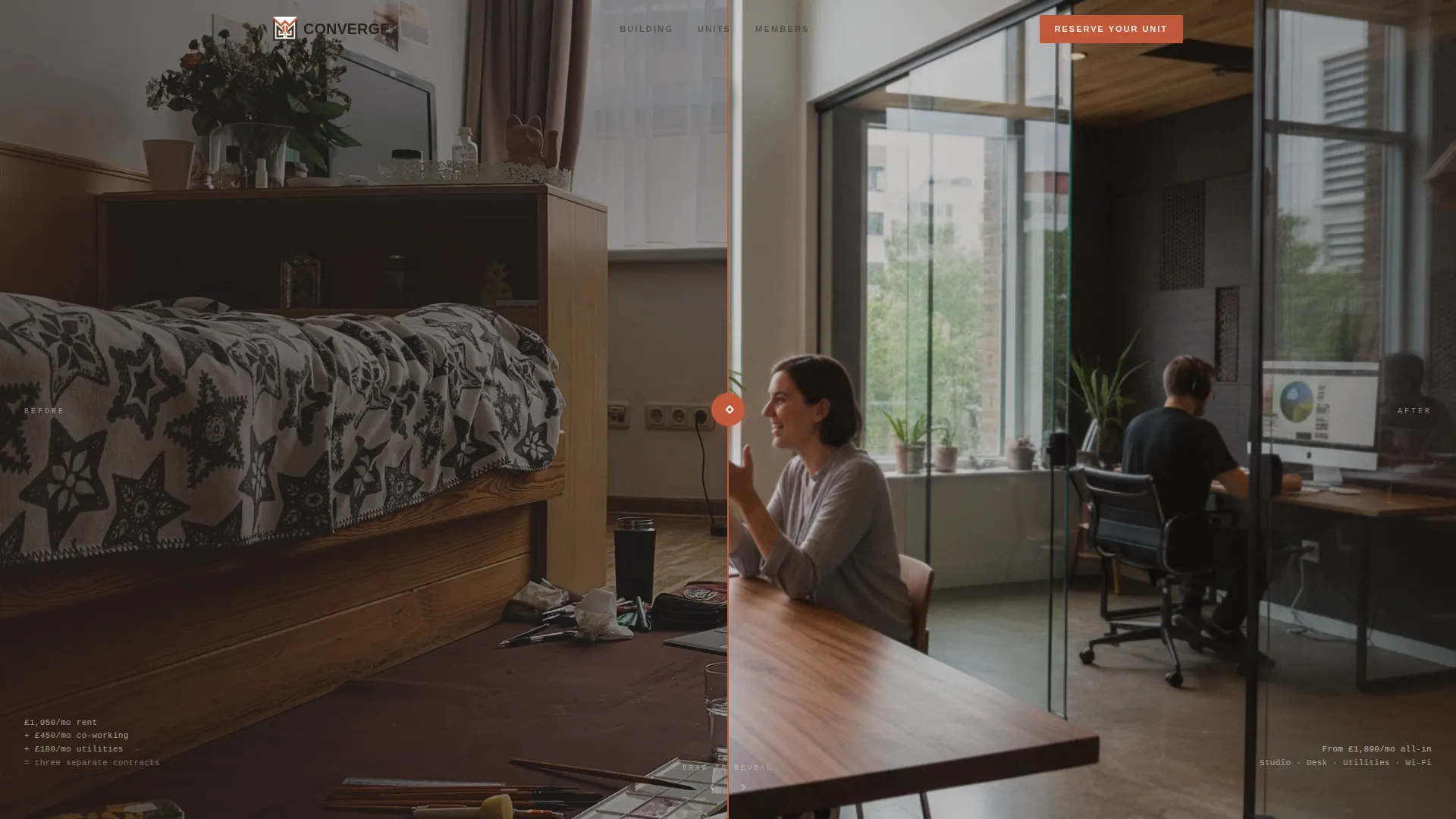
The header splits the viewport 50/50. The left side shows a cluttered apartment workspace and the right reveals a polished communal desk setup. A terracotta drag handle runs vertically down the center. The headline "Live where you work. Work where you live." types in from the left only after the handle is pulled past center.
Scroll-Based Architectural Tour
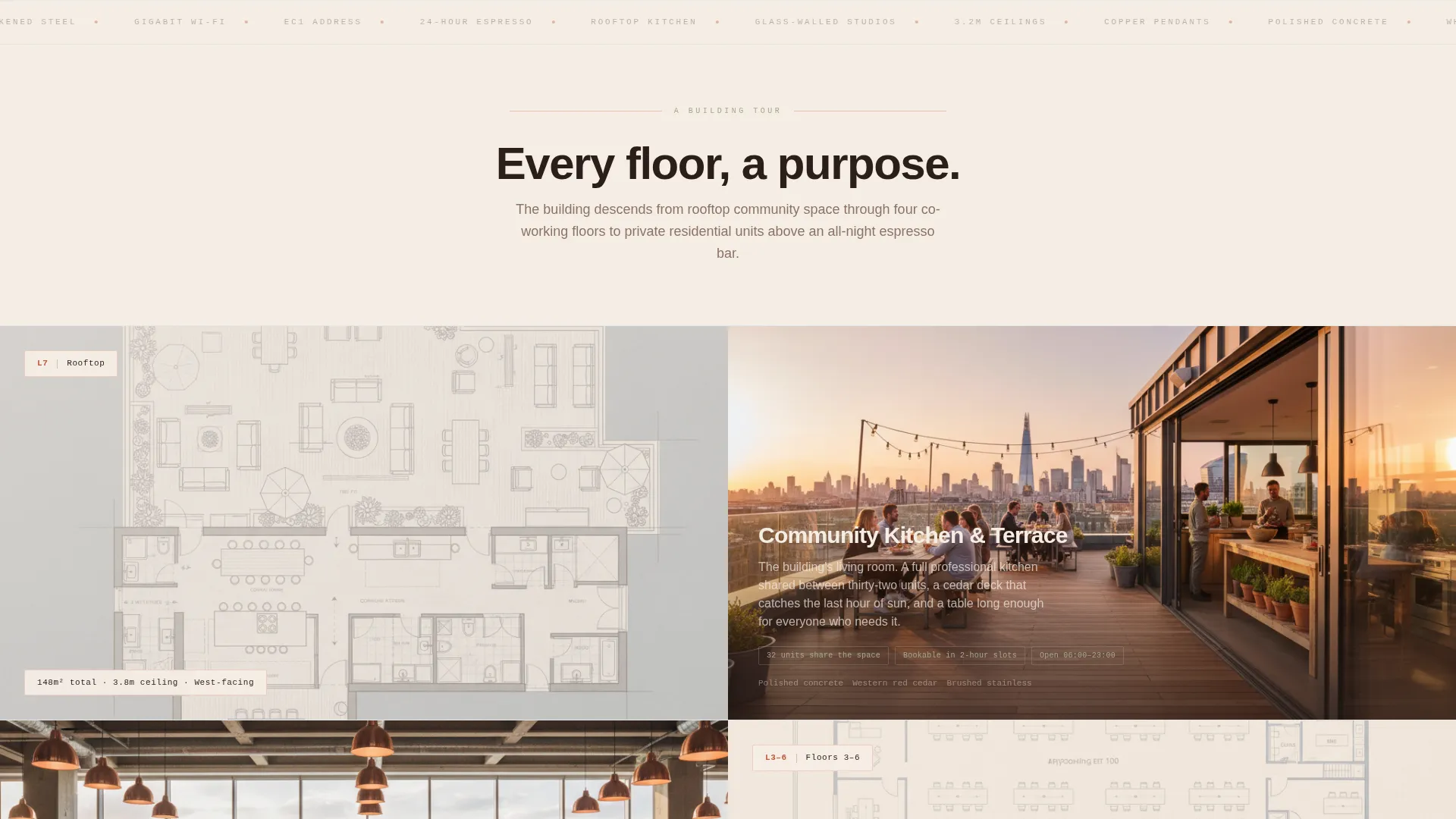
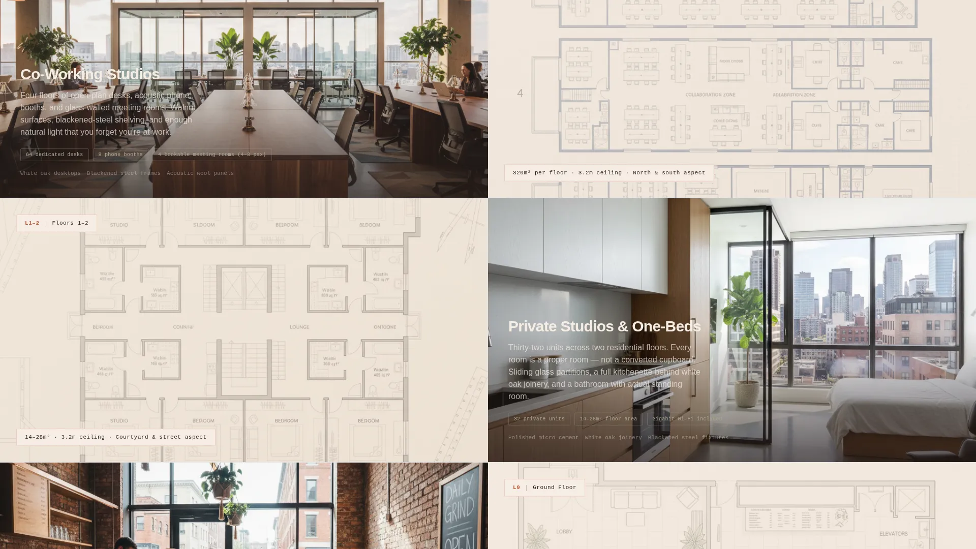
Each section functions as a building floor. The scroll sequence moves from rooftop terrace through co-working floors down to private studios. Each split-screen pair places an architectural floor plan on one side and interior photography on the other, with dimensions and material names visible on-screen.
Room Configurator With Visible Pricing
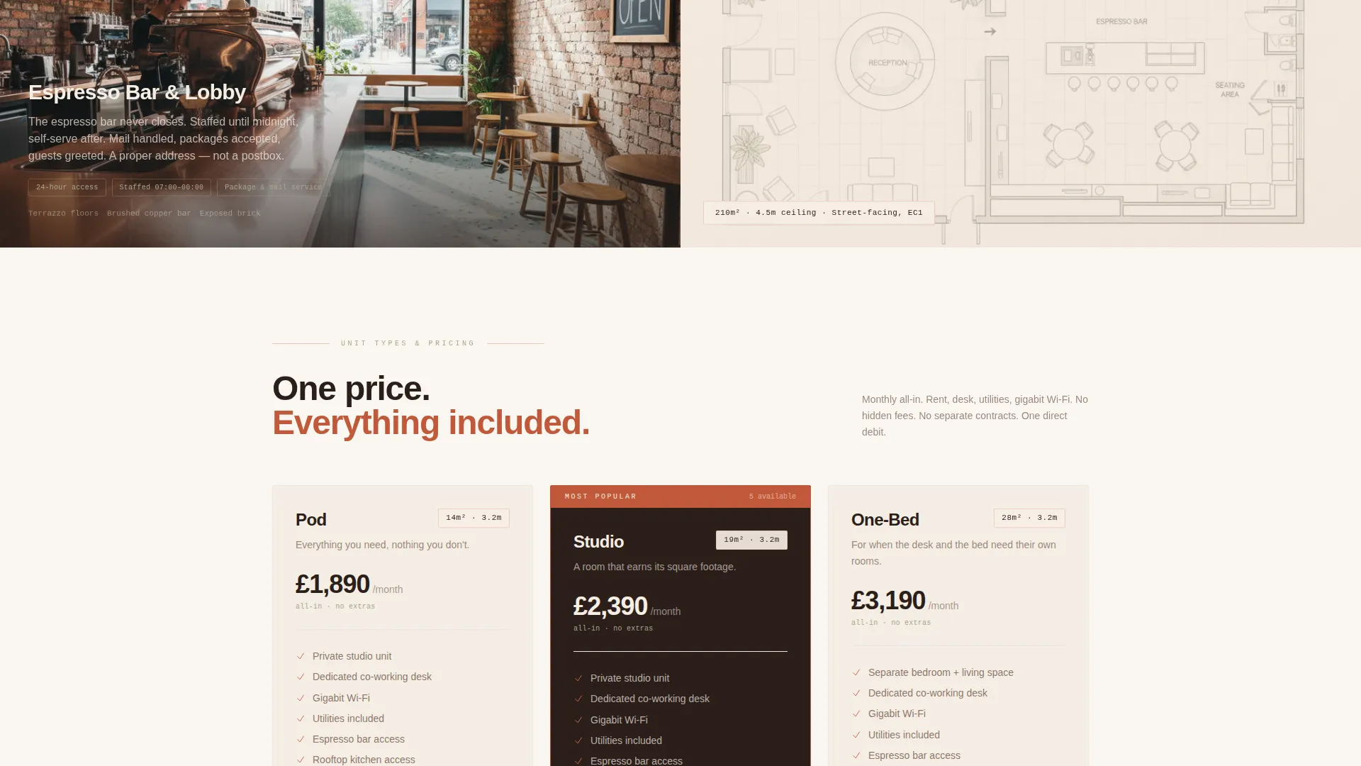
Visitors choose a floor level (high, mid, or ground), a unit type (studio, one-bedroom, or pod), and a move-in month from a visual calendar. All-in monthly pricing is displayed per configuration, covering rent, desk access, utilities, and gigabit internet, so the decision window is short.
Sticky Mobile Reservation Bar
On mobile, the "Reserve Your Unit" call-to-action button persists as a sticky bottom bar throughout the scroll. This keeps the primary conversion action reachable at any point without the visitor needing to scroll back up.
Secondary Tour Booking Path
Beneath the primary call-to-action button, a "Book a Tour" text link offers a lower-commitment entry point. It captures only name, email, and preferred date, designed to convert visitors who are interested but not yet ready to reserve.
Sunset Mesa Design System
The full color palette is embedded in the template: sandstone white for backgrounds, terracotta clay for primary buttons and section dividers, deep mesa shadow for all text, and faded sage for tags, icons, and hover states. Typography and spacing follow the Corporate Precision theme throughout.
Page sections overview
| Section | Purpose |
|---|---|
| Before/After Slider | Opens the page and frames the lifestyle contrast between cluttered remote work and a designed co-living environment |
| Rooftop Terrace Section | Introduces community amenities including the shared rooftop kitchen as the top-of-building anchor |
| Co-Working Floors Section | Showcases open-plan studios, phone booths, and bookable meeting rooms with floor plan and photo pairings |
| Espresso Bar Feature | Highlights the ground-floor social anchor and always-open amenity |
| Private Apartments Section | Presents micro-studio units with visible dimensions such as 14 square metre floor area and 3.2 metre ceiling height |
| Room Configurator | Primary conversion section where visitors select floor, unit type, and move-in date with live pricing |
| Reserve Your Unit call to action | Contains the primary terracotta button and the secondary "Book a Tour" text link |
Design & branding system
The Sunset Mesa color system keeps every visual element warm and deliberate. Nothing feels accidental. The palette references the texture of an adobe wall at last light, but the layout geometry stays precise and corporate rather than rustic.
- Sandstone white (#F5EDE3) backgrounds, terracotta clay (#C1593A) on buttons and dividers, deep mesa shadow (#2B1F1A) on all text, and faded sage (#A3A88B) on tags and hover states
- Split-screen 50/50 layout runs consistently across both the header and every architectural tour section
- Copper pendant light tones in photography, walnut and white oak material references, and polished concrete textures reinforce the spatial identity across the full scroll
Mobile & speed optimization
The template is structured so that the split-screen layout adapts cleanly to narrower viewports. The sticky reservation bar ensures the conversion action is never out of reach on a phone screen.
- On mobile, the 50/50 split sections stack vertically so floor plans and photos remain legible at smaller sizes
- The sticky bottom bar keeps "Reserve Your Unit" visible at all scroll positions on mobile without interrupting content
- The room configurator controls, including floor selector, unit type picker, and calendar, are sized for touch interaction
How this template helps you convert
Converge is built around one principle: reduce the distance between curiosity and commitment. Every design and copy decision in the template shortens that distance.
- Transparent all-in pricing per unit type removes the need for a back-and-forth inquiry, so motivated visitors can reach a decision without a sales conversation.
- The room configurator creates a personalised path through the offering, making the reservation feel like a natural next step rather than a cold commitment.
- The "Book a Tour" secondary path captures visitors who are not ready to reserve, keeping them in the funnel with a low-friction form that asks for only three fields.
Other information about this template
This template is suited for the co-living and co-working hybrid niche within the broader real estate and property category. It is designed for operators who want to present a premium, precision-led product without relying on a full multi-page website build.
- The template style is a split-screen 50/50 layout throughout, consistent with the Corporate Precision theme
- The lp direction is Direct Sales, meaning every section is sequenced to move visitors toward the room configurator and reservation button
- The header concept is a Before/After Slider, a format particularly effective for showing transformation in the co-living context
- The creative direction is Spatial and Architectural, using floor plans, material callouts, and real dimensions to build trust through specificity rather than aspiration
Theme
Corporate Precision
Creative direction
Spatial & Architectural
Color system
Sunset Mesa
Style
Split Screen (50/50)
Direction
Direct Sales
Page Sections
Before/after Viewport Slider Header
Scroll-based Architectural Building Tour
Room Configurator with Live Pricing
Sticky Mobile Reservation Bar
Secondary Tour Booking Path
Sunset Mesa Design System
Related questions
What kind of business is this landing page template designed for?
Can I edit the pricing shown in the room configurator?
What does the Before/After Slider header show?
Is the Book a Tour option separate from the reservation flow?
How does the scroll structure reflect the building layout?