Emergency Dentist Education Website Template
Copay is a split-screen landing page template built for emergency dental billing education. It leads with a bold stat, walks visitors through procedure costs and insurance reimbursement side by side, and earns a guide download through clarity alone. Designed for patients, uninsured workers, and HR teams who need real numbers fast.
by Rocket studio
Quick summary
Copay is a single-page billing education template for emergency dental practices. It opens with a 50/50 split screen: an oversized coverage statistic on the left and a naturally lit dental coordinator portrait on the right. Each section peels away one layer of billing confusion, replacing anxiety with clear arithmetic, and closes with a two-field guide download form.
Who this template is for
This template is built for dental practices and healthcare content teams that want to turn billing confusion into patient trust. It works equally well as a standalone resource page or as a lead-generation asset during benefits enrollment season.
- Dental offices that field after-hours calls about emergency coverage costs
- Independent gig workers and uninsured patients calculating out-of-pocket expenses
- HR coordinators looking for a ready-to-share dental benefits resource for new hires
What problem this template solves
Patients facing an emergency dental procedure often arrive at a practice already anxious about money. They have searched for answers at odd hours and found vague, jargon-heavy pages that add confusion instead of removing it. This template addresses that gap directly.
- Visitors leave without understanding their coverage because most pages bury cost data in fine print
- Uninsured patients have no easy way to compare extraction costs against discount plan savings
- HR teams struggle to find a single, credible resource that explains plan types without a sales pitch
What you get with this template
You get a fully structured, single-page layout that guides visitors from a high-impact stat through cost data, plan comparisons, and social proof, then delivers them to a conversion point they already trust. Every section is designed to feel informative rather than promotional.
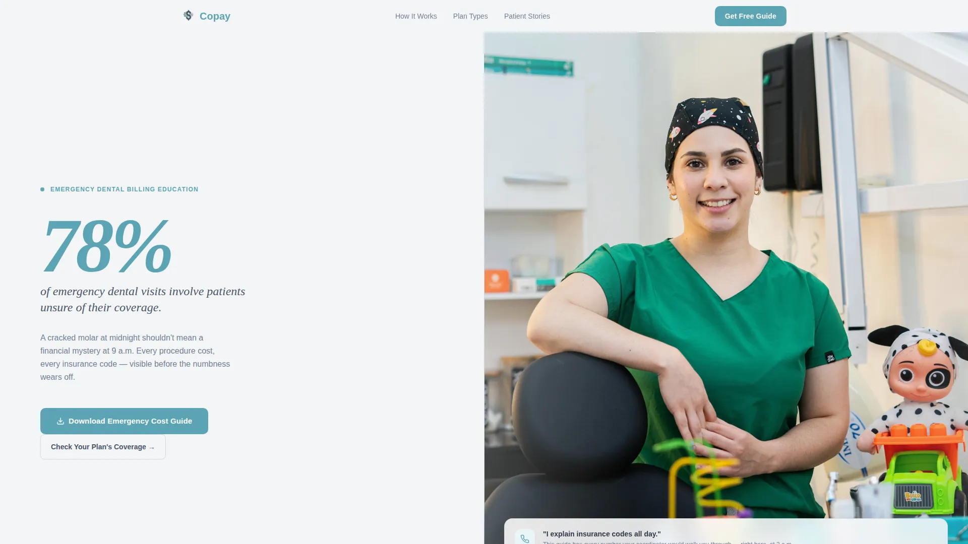
- A 50/50 hero split with reveal-text animation and a portrait-centered coordinator photograph
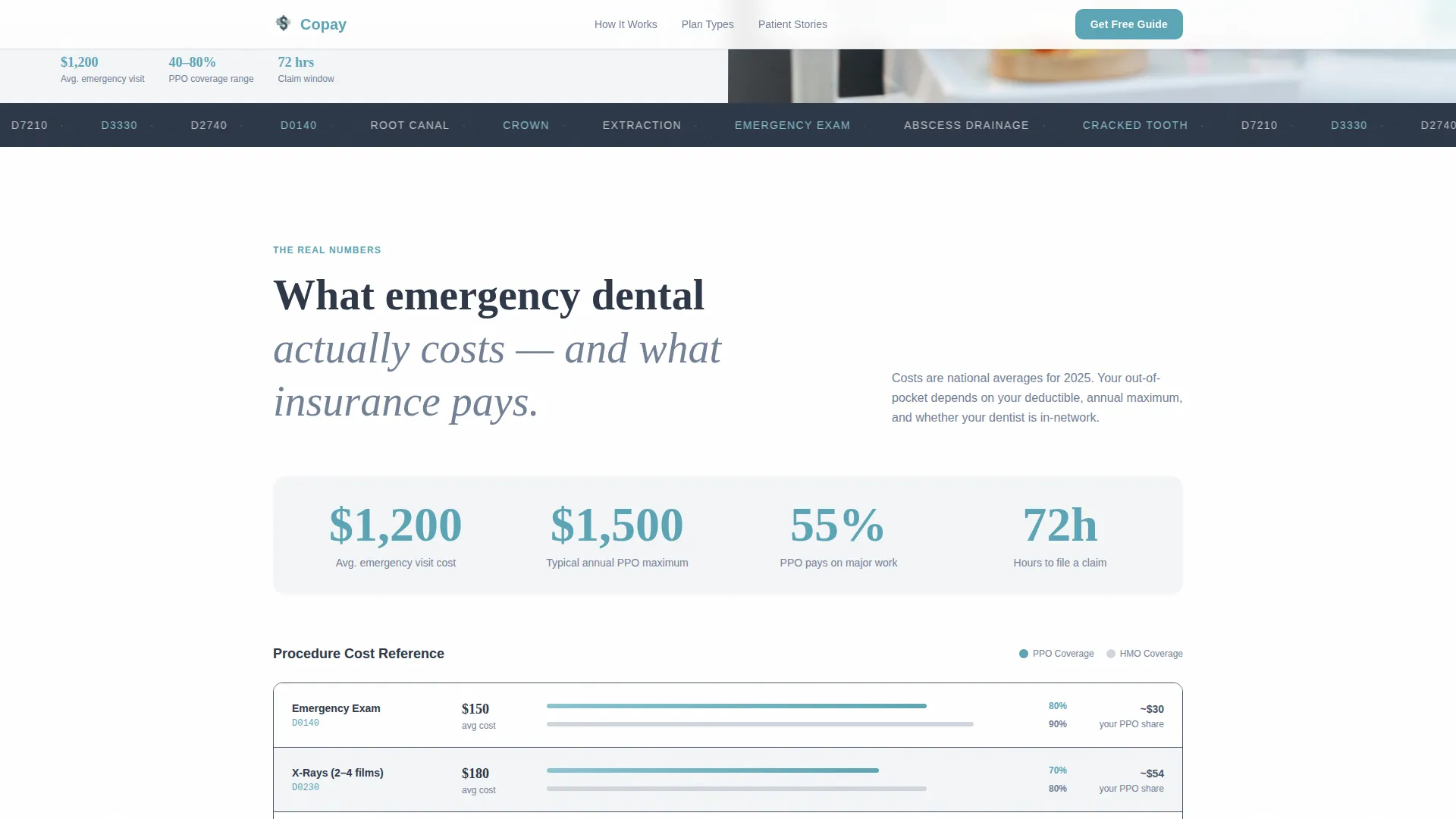
- Animated scroll-linked cost counters comparing procedure prices to insurance reimbursement percentages
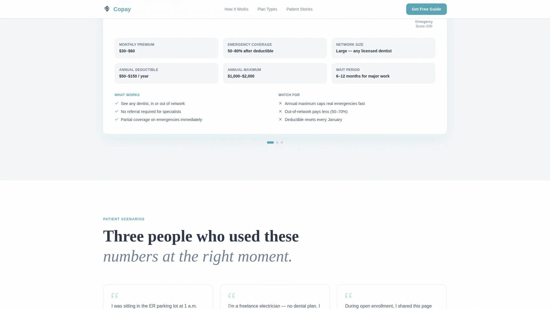
- Stacked sliding plan-comparison cards covering PPO, HMO, and discount plan coverage side by side
- Three scenario-based patient testimonials with specific dollar amounts and outcomes
- A two-field download form for the Emergency Dental Cost Guide and a secondary coverage checker tool
Feature list
This template packs a focused set of interactive and editorial features, each chosen to build billing literacy without overwhelming the visitor.
Scroll-Linked Animated Counters
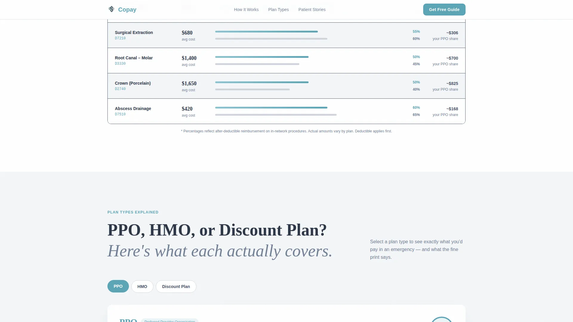
Section two uses animated counters that tick upward as the visitor scrolls into view. Procedure costs appear on the left and typical insurance reimbursement percentages appear on the right, making the gap between billed amount and covered amount immediately readable.
Stacked Sliding Plan Comparison Cards
The plan comparison section replaces a static table with layered cards that slide and stack on scroll. Each card covers one plan type: PPO, HMO, or discount plan. Visitors can scan coverage ranges without decoding a dense grid.
Portrait-Centered Hero Split
The hero section divides the viewport equally. The left half displays a single oversized statistic in display typography. The right half holds a shallow-depth-of-field photograph of a dental coordinator, naturally lit with a blurred operatory chair behind her. The pairing builds immediate credibility.
Two-Field Lead Capture Form
The download form asks only for a first name and email address. Nothing else. This low-friction design respects the visitor's time and keeps the ask proportional to the value offered.
Interactive Coverage Checker Tool
A secondary conversion path lets visitors select their insurance carrier from a dropdown and see estimated coverage ranges for common emergency procedures. It gives uninsured and underinsured visitors a concrete starting point before they call the office.
Scenario-Based Social Proof Section
Three patient testimonials each describe a real billing scenario with specific dollar figures and a clear outcome. This format mirrors the data-first narrative of the rest of the page, so proof feels consistent rather than tacked on.
Page sections overview
| Section | Purpose |
|---|---|
| Hero Split Screen | Lead with coverage stat and coordinator portrait |
| Cost Breakdown | Animate procedure costs against reimbursement percentages |
| Plan Comparison Cards | Compare PPO, HMO, and discount plans visually |
| Patient Testimonials | Reinforce trust with scenario-specific dollar outcomes |
| Guide Download Form | Capture first name and email for cost guide delivery |
| Coverage Checker Tool | Let visitors estimate their plan's coverage range |
| Footer | Provide horizontal navigation and supporting links |
Design & branding system
The visual identity follows an Educational Guide aesthetic that feels like a modern dental office at dawn. Every surface is matte, every edge is softened, and color is used sparingly so the numbers can do the talking.
- Color palette: fog white (#F4F6F8) as the base, quiet lavender-gray (#D0D5DD) for borders and dividers, steady slate (#4A5568) for body text, and reassurance teal (#5BA4B5) reserved for callout numbers, icons, and interactive elements
- Typography pairing: Fraunces handles display numerals and section headlines for editorial weight, while DM Sans carries body copy and interface labels for clean readability
- Visual tone is clinical but kind, with diffused lighting in photography, shallow depth of field, and no sharp or alarming graphic elements
Mobile & speed optimization
The template is built desktop-first around the 50/50 split layout, but it collapses gracefully into a single-column mobile stack without losing the data hierarchy.
- Split-screen sections reflow to stacked vertical blocks on smaller viewports, keeping stat-before-explanation order intact
- Static sections use server-rendered components while scroll animations and interactive elements load as client components, separating rendering concerns cleanly
- Scroll-linked counters, card stacking, reveal text, and parallax effects are scoped to client components so they do not block initial content delivery
How this template helps you convert
Every design decision on this page is pointed at one outcome: making the visitor feel informed enough to want the guide. The conversion path is earned, not imposed.
- The hero stat creates an immediate sense of relevance. A visitor who recognizes themselves in "78% of emergency dental visits involve patients unsure of their coverage" keeps reading, because the page is already about their situation.
- The animated cost breakdown and plan comparison cards replace vague worry with specific numbers. By the time the visitor reaches the download form, they have already received genuine value, so the two-field ask feels like a fair exchange rather than a barrier.
- The secondary coverage checker tool gives HR coordinators and self-pay patients a practical next step without requiring a phone call, keeping them engaged even if they are not ready to download the guide.
Other information about this template
This template is part of the Soft Mist color system family, designed for healthcare education contexts where trust and clarity matter more than visual drama. A few additional details worth noting:
- The page is localized for United States audiences, using USD currency formatting and MM/DD/YYYY date conventions throughout
- Animation intensity is high by design: scroll-linked counters, card stacking, reveal text, and parallax are all included to maintain engagement on a data-heavy page
- The footer follows a horizontal flow pattern, keeping navigation and supporting links accessible without pulling visual weight away from the conversion sections above
- Template style is classified as Split Screen (50/50), making it well suited for content and resource pages where authority and empathy need equal real estate
- The Educational Guide theme and Stats-First Impact creative direction make this template reusable for other healthcare billing literacy contexts beyond emergency dentistry
Theme
Educational Guide
Creative direction
Stats-First Impact
Color system
Soft Mist
Style
Split Screen (50/50)
Direction
Content/Resource
Page Sections
Scroll-linked Animated Cost Counters
Stacked Sliding Plan Comparison Cards
Portrait-centered Hero Split Screen
Low-friction Two-field Download Form
Interactive Coverage Checker Tool
Scenario-based Patient Testimonials
Related questions
Who is this landing page template designed for?
What interactive features are included in this template?
Can I customize the cost figures and insurance data shown on the page?
Does the template include the actual Emergency Dental Cost Guide PDF?
How does the plan comparison section display PPO, HMO, and discount plan differences?



