Dental Insurance & Billing Transparency Website Template
Copay is a single-column dental insurance and billing landing page built for practices that want patients to arrive informed, not anxious. It walks visitors through deductible breakdowns, coverage tiers, and procedure cost estimates in plain language. A portrait-centered hero, amber callout boxes, and a dual call-to-action structure turn billing confusion into booked appointments.
by Rocket studio
Quick summary
Copay is a single-column dental insurance and billing landing page designed for dental practices. It walks patients through coverage tiers, deductible logic, and procedure cost ranges before they ever book. With a warm educational tone and a transparent scroll structure, the page replaces phone-tag anxiety with clear, upfront answers.
Who this template is for
This template is built for dental practices that want to reduce front-desk call volume and convert cautious website visitors into booked patients. It works especially well for practices that accept multiple insurance plans and serve a diverse patient mix.
- Practices welcoming first-time patients who arrive with a new employer insurance card and no idea what is covered
- Offices serving parents who need to confirm whether pediatric preventive care like sealants or fluoride treatments falls under their plan
- Dental teams whose retiree patients need side-by-side clarity on what Medicare Advantage actually covers versus the front-desk quote
What problem this template solves
Most dental websites leave patients guessing. They list accepted insurers in small print and expect people to call for everything else. That friction causes drop-off before a single appointment is booked.
- Patients abandon the booking flow when they cannot quickly confirm their plan is accepted or estimate their out-of-pocket cost
- Parents and retirees with more complex coverage questions have no self-serve path and often choose a practice that gives them answers faster
- Front-desk staff spend significant time answering repetitive insurance questions that a well-structured page could resolve in minutes
What you get with this template
You get a fully structured, single-column landing page that covers the entire patient insurance journey from plan acceptance through cost estimation. Each section is purpose-built to answer the next logical question a patient would ask.
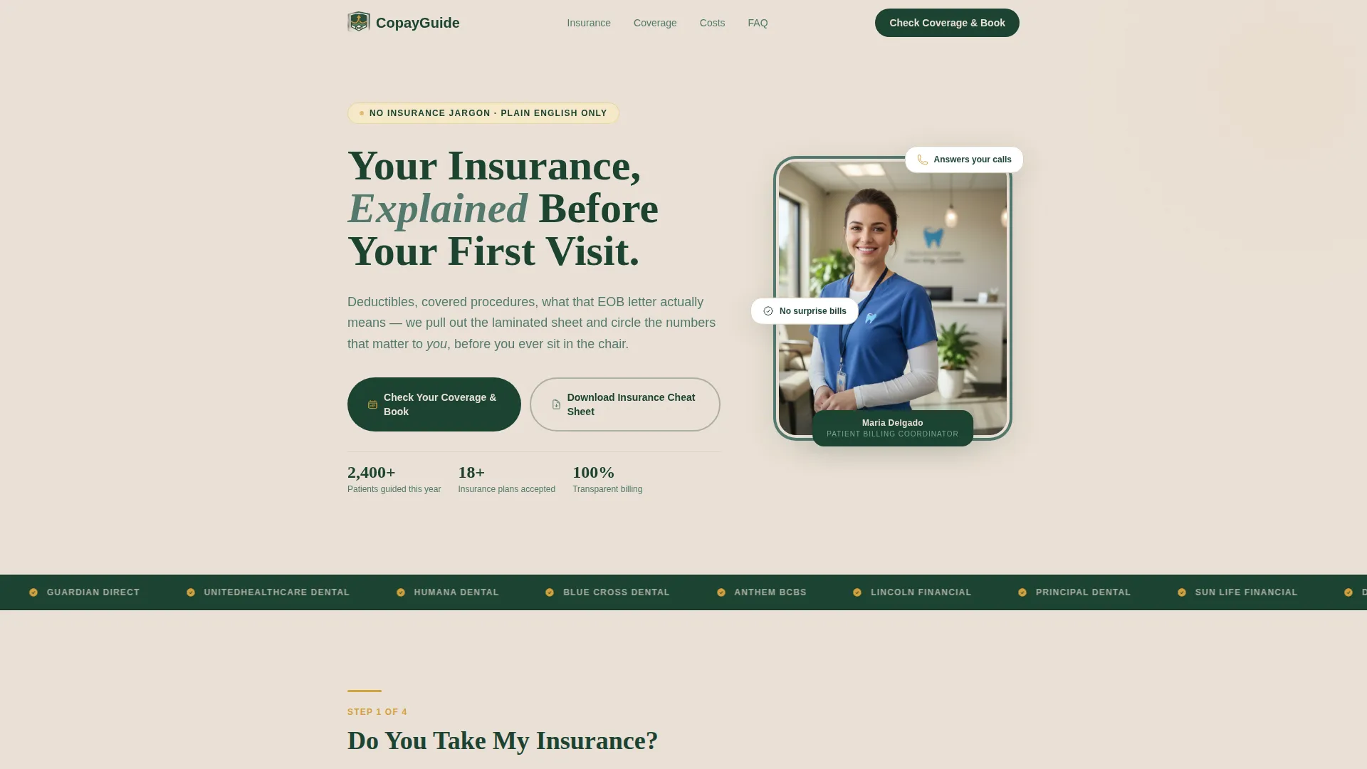
- A portrait-centered hero section with a headline, dual call-to-action buttons, and key practice stats
- A visual insurance acceptance grid, a three-tier coverage chart with real percentage breakdowns, and an interactive cost estimator
- Amber callout boxes woven between sections, patient testimonial cards, and an email capture for a downloadable insurance guide
Feature list
This template is built around one idea: earn the booking by answering every billing question before the patient picks up the phone.
Portrait-Centered Hero Section
The hero leads with a warm, shoulders-up photograph of the practice billing coordinator against a soft birch background. A serif headline in deep evergreen sits beside the portrait, and two calls to action appear immediately below. This setup humanizes billing before patients read a single detail.
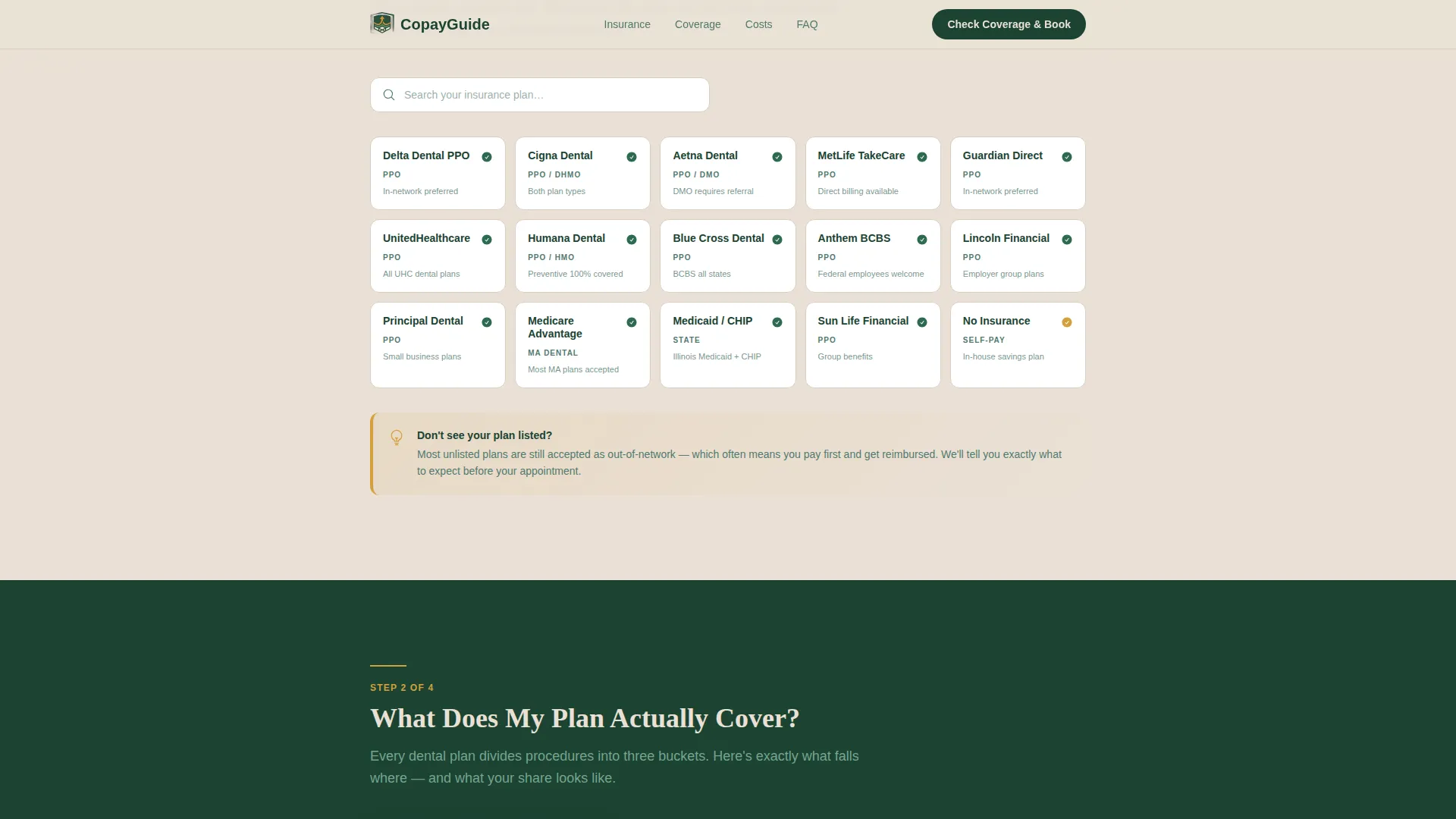
Visual Insurance Acceptance Grid
A scannable grid presents accepted insurance plans in a layout that feels like a searchable directory. Patients can quickly confirm whether their plan is on the list without calling the office, reducing friction at the very first decision point.
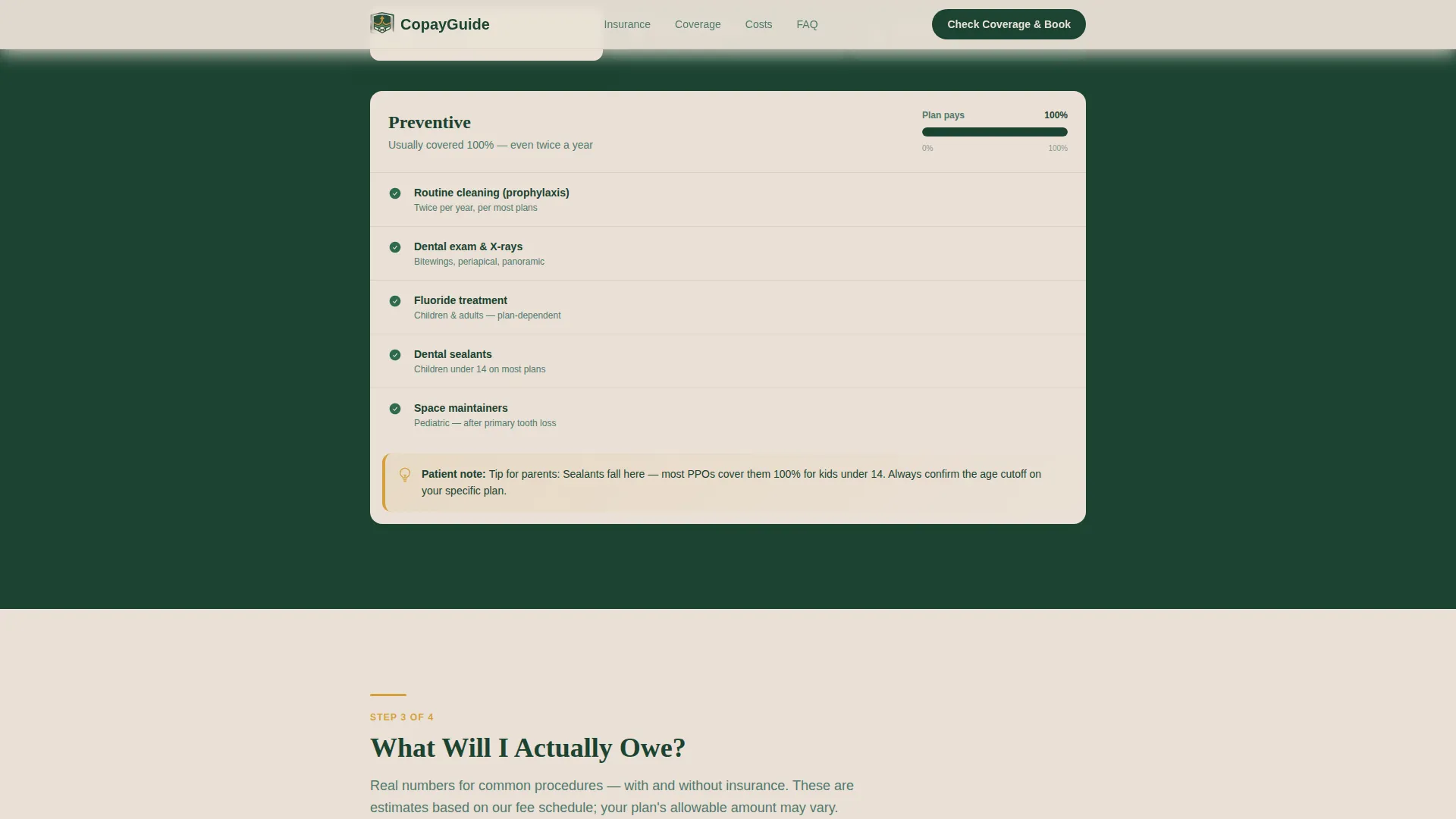
Three-Tier Coverage Chart
A clear visual chart breaks down preventive, basic, and major procedure categories with real percentage breakdowns. Patients see exactly which tier their upcoming treatment falls under and what share their plan is likely to cover.
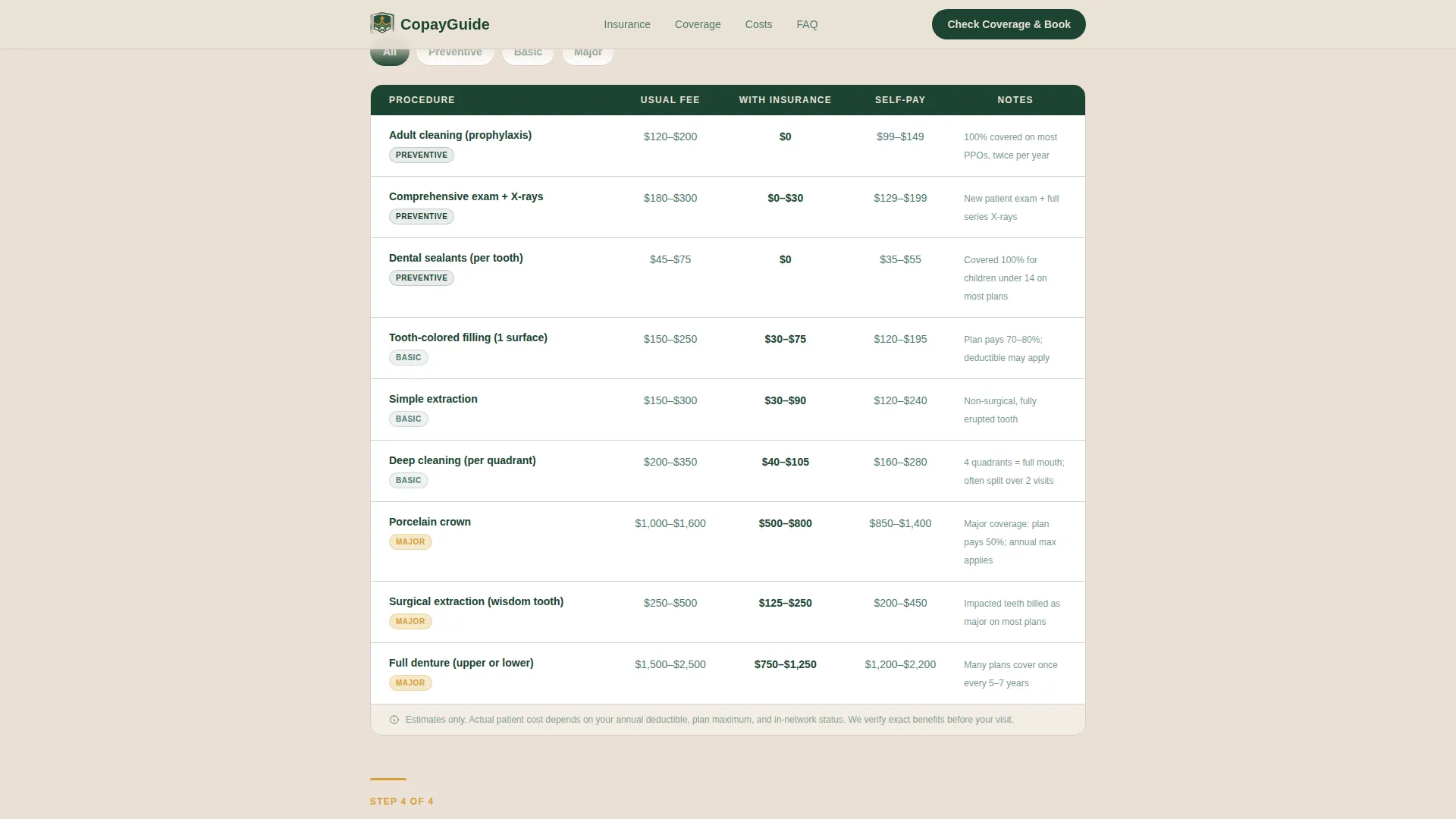
Interactive Cost Estimator
A dedicated section lists common procedures alongside patient cost ranges. Amber callout boxes appear nearby to address unspoken patient fears, such as what happens if a claim is denied or whether uninsured patients are welcome.
Email Capture with Insurance Guide
A one-field email capture offers patients a downloadable insurance cheat sheet. This gives undecided visitors a reason to stay connected with the practice while they compare options.
Patient Testimonial Cards
Spotlight-style testimonial cards display real patient quotes with photos. A supporting metric showing how many patients the practice has helped this year adds social proof that reinforces trust at a key scroll point.
Page sections overview
| Section | Purpose |
|---|---|
| Hero portrait area | Introduce coordinator, headline, and dual call-to-action buttons |
| Insurance acceptance grid | Show accepted plans in a scannable, searchable-feel layout |
| Coverage tier chart | Break down preventive, basic, and major categories with percentages |
| Cost estimator section | Display procedure cost ranges with amber fear-addressing callouts |
| Patient testimonials | Reinforce trust with quote cards, photos, and a patient-count metric |
| Footer row | Provide linear single-row contact and navigation links |
Design & branding system
The visual identity follows an Educational Guide theme built around the Forest Trust color system. The palette feels like a trusted field guide: structured, warm, and immediately readable.
- Deep evergreen (#1B4332) anchors headers and section backgrounds; soft fern (#52796F) handles secondary text and dividers; warm birch (#EAE0D5) serves as the primary page background
- Clear amber (#D4A03C) is reserved for callout boxes, tooltips, and interactive highlights so important warnings and reassurances stand out immediately
- Typography pairs Fraunces serif headings with DM Sans body text, creating a structured but approachable reading rhythm throughout the scroll
Mobile & speed optimization
This template is designed mobile-first because most patients check insurance details on their phone while holding their insurance card. The layout adapts cleanly to smaller screens without losing the scroll logic.
- The single-column flow keeps the reading order intact on every screen size, so patients never lose their place in the coverage walkthrough
- Server Components handle static sections to keep JavaScript minimal, and staggered scroll-linked section entrances add visual polish without heavy load overhead
How this template helps you convert
Every section earns the next click by removing a specific reason to leave. By the time a visitor reaches the call-to-action button, billing uncertainty is gone and booking feels like the natural next step.
- The primary call-to-action button labeled "Check Your Coverage & Book" appears first below the hero portrait and again after the cost estimator, keeping the booking path visible without being pushy
- The secondary email capture path retains patients who are still comparing practices, giving the office a follow-up channel for visitors not yet ready to book
- Amber callout boxes proactively address denied claims and uninsured patient questions, removing the last hesitations that typically cause patients to close the tab
Other information about this template
This template is part of the Health and Medical category under the Dentist Website subcategory, with a niche focus on dental insurance and billing patient education.
- The Transparent Process creative direction structures the scroll as a numbered walkthrough, peeling back one layer of billing mystery per section rather than dumping all information at once
- The template uses a Portrait-Centered header concept deliberately: showing the billing coordinator rather than the dentist signals that this page is about financial clarity, not clinical marketing
- Animation is set to medium intensity with staggered reveals and spotlight hover effects on testimonial cards, scroll-linked section entrances keep the page feeling guided without being distracting
- The footer follows a linear single-row pattern to keep the close of the page clean and uncluttered
Theme
Educational Guide
Creative direction
Transparent Process
Color system
Forest Trust
Style
Single Column Flow
Direction
Click-Through
Page Sections
Portrait-centered Hero with Dual Call to Action
Visual Insurance Acceptance Grid
Three-tier Coverage Chart
Interactive Cost Estimator with Callouts
Email Capture for Insurance Guide
Patient Testimonial Spotlight Cards
Related questions
Can I replace the coordinator photo with my own team photo?
Does the cost estimator show real pricing for my practice?
Can patients use the page if they have no dental insurance?
Is the insurance acceptance grid editable?
What does the email capture section do?



