Cinematic Dark BRT Transit Landing Page Template
Corridor is a cinematic dark Bus Rapid Transit (BRT) landing page template built for transit authorities and city planners. It pairs a dramatic before/after reveal with real ridership data to make the case for dedicated-lane transit. The split-screen layout, signal-green call-to-action elements, and scroll-triggered sections guide every visitor from congestion frustration to confident action.
by Rocket studio
Quick summary
Corridor is a single-page, split-screen landing page template for Bus Rapid Transit systems. It opens with a cinematic drone-video header, walks visitors through an interactive before/after transformation, and closes with a solidified call-to-action bar. The design targets daily commuters and city planners simultaneously, using high-impact data and dark, immersive visuals.
Who this template is for
This landing page speaks to two audiences who share one problem: a broken commute.
- Daily commuters stuck in two-hour car crawls who need to feel the alternative before they trust it
- City planners and municipal transit authorities seeking federal funding support and a compelling public-facing presentation
- Civic tech teams and BRT project advocates who need a design that carries data and narrative together
What problem this template solves
Presenting BRT to a skeptical public is hard. A dry PDF or generic transit website loses the argument before it starts.
- Visitors cannot feel congestion pain and corridor relief on the same screen without an interactive reveal
- Data-driven planners need real ridership metrics visible immediately, not buried in reports
- There is no clear moment when a casual browser becomes a funding applicant or project supporter
What you get with this template
This landing page delivers a full persuasion arc in one scrollable page, combining cinematic visuals with hard transit data.
- A 15-second aerial drone-video hero with an animated typing headline and ghost call-to-action button
- An interactive drag slider revealing before/after street, station, rider, and network views across four escalating sections
- A performance metrics bento grid, a persistent real-time ridership data pill, and a signal-green solidified call-to-action bar
Feature list
This landing page includes purpose-built components designed for transit storytelling and lead conversion.
Cinematic Drone Video Header
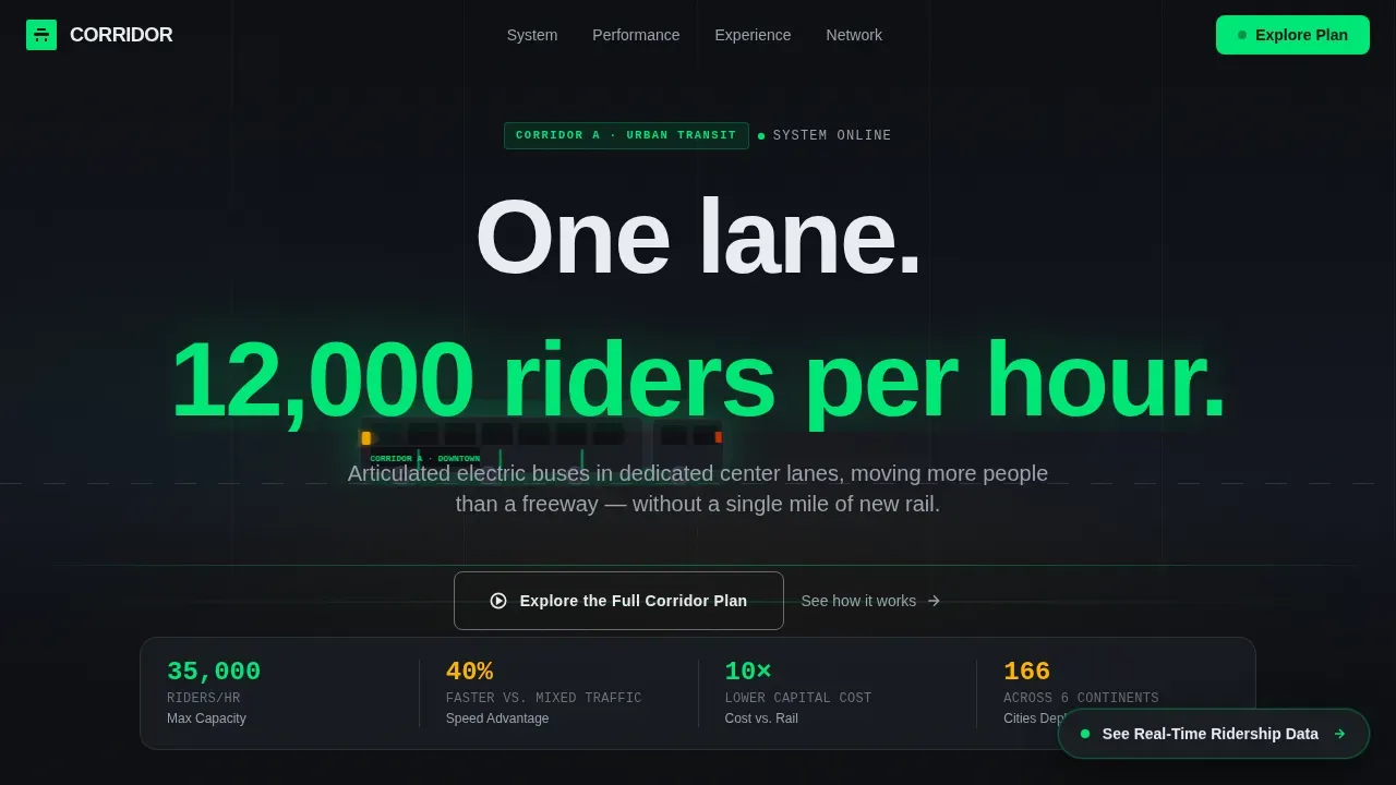
A 15-second aerial video opens the landing page. It tracks a BRT vehicle gliding past stopped traffic, then pulls back to reveal the full corridor. A typing headline reinforces the visual: "One lane. 12,000 riders per hour."
Interactive Before/After Drag Slider
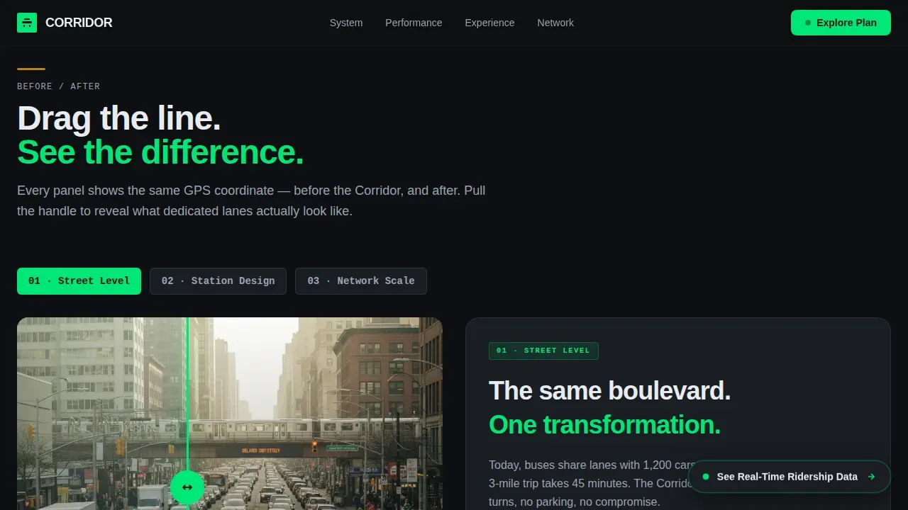
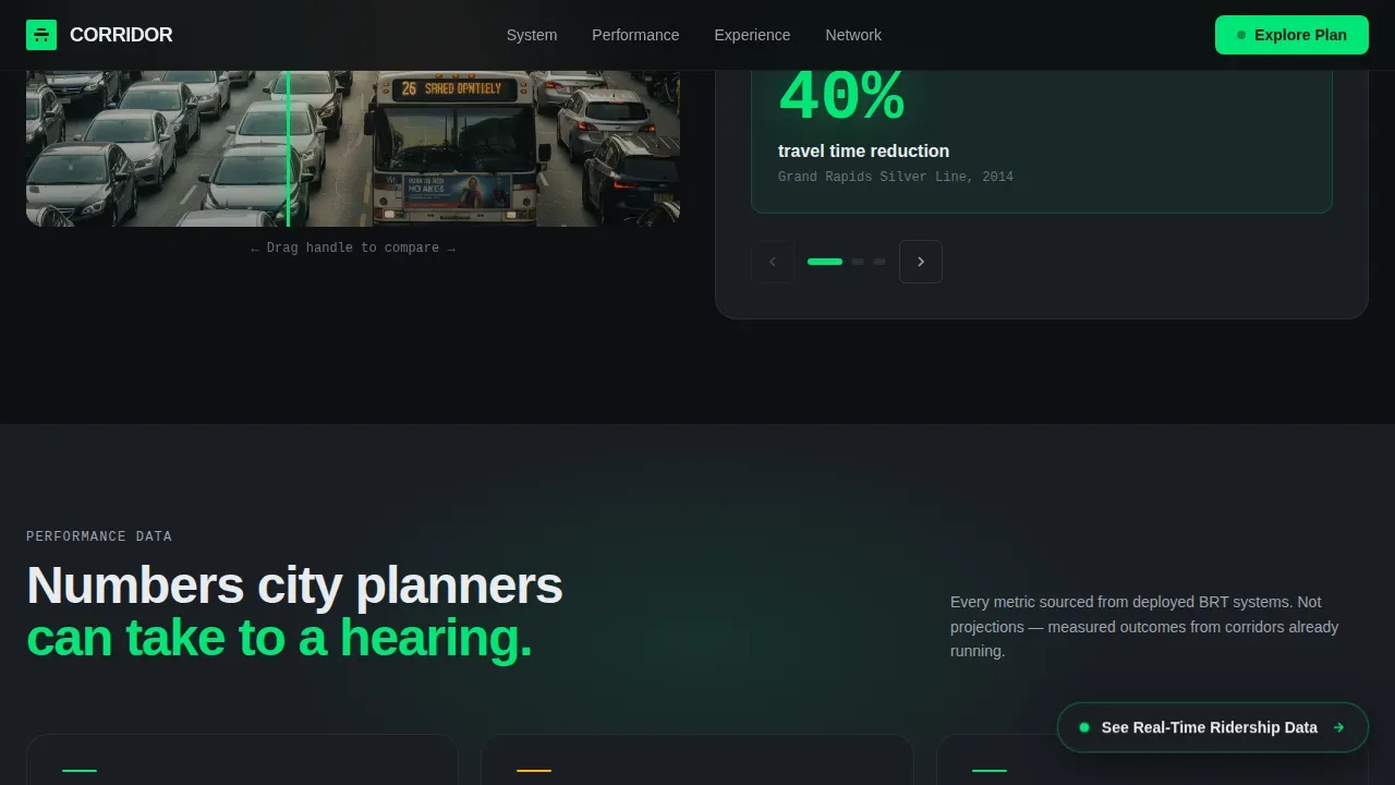
A GPS-matched drag slider lets visitors pull a transformation across the screen. Four sections escalate from street level to a full city network, making the case visually and progressively.
Performance Metrics Bento Grid
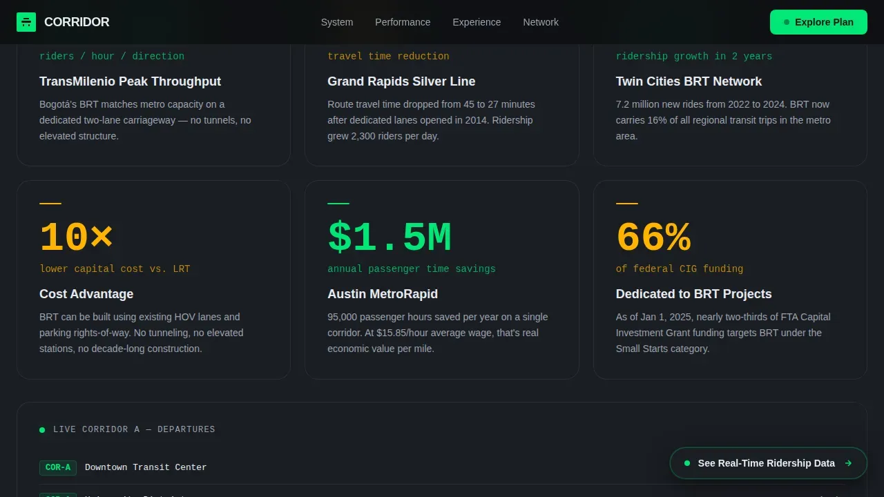
Key metrics highlight real-world outcomes using animated numbers. Data callouts reference systems like TransMilenio at 35,000 riders per hour, Grand Rapids at plus 40 percent ridership, and Twin Cities at plus 115 percent.
Dual Call-to-Action System
The primary call-to-action, "Explore the Full Corridor Plan," begins as a ghost button and solidifies into a signal-green bar after the third section. A secondary pill, "See Real-Time Ridership Data," floats persistently for planners who need numbers before narrative.
Scroll-Triggered Section Animations
Scroll-triggered animations simulate a journey through the corridor as visitors move down the page. Each panel builds from a single commuter's experience to a metropolitan network view.
Page sections overview
| Section | Purpose |
|---|---|
| Hero Video Header | Opens with drone footage and typing headline |
| Before/After Slider | Interactive street-level transformation reveal |
| Performance Metrics Grid | Animated real ridership data callouts |
| Rider Experience Panels | Split alternating station, vehicle, network views |
| Call-to-Action Section | Signal-green bar with network map tease |
| Minimal Footer | Superhuman-style footer with focused links |
Design & branding system
The design uses a Cinematic Dark color system built to feel like a city at 2 a.m. High-contrast text in lane-marking white (#E8ECF1) sits against deep asphalt black (#0D0F12). Dark grey and muted background tones keep focus on content.
- Signal green (#00E676) drives all interactive elements, hover states, and data callouts
- Headlight amber (#FFB300) adds a warm secondary accent on supporting elements
- DM Sans handles massive display headings; JetBrains Mono renders all data and metric figures
Mobile & speed optimization
The landing page is built desktop-first for city planners on workstations, with a fully responsive layout for mobile visitors.
- Interactive maps and cinematic elements are structured to remain touch-friendly on smaller screens
- A minimalist navigation bar with only a few links keeps visitors focused on the content flow
- Consistent branding across typography, color, and layout holds the design together at every breakpoint
How this template helps you convert
This landing page earns the click by building visceral evidence before asking for action.
- The before panels make congestion feel immediate and personal, priming visitors to want the solution shown on the right side of every slider
- Real ridership data and social proof from city officials build institutional trust for planners evaluating project viability
- The dual call-to-action system captures two distinct user intents: narrative-driven commuters and data-driven planners, without splitting the page into two experiences
Other information about this template
The Corridor cinematic dark BRT transit landing page template suits a wide range of civic and transit applications. It works across digital products including websites and mobile app promotional pages.
- High-quality visuals and large, bold typography create a premium feel that sells a transit lifestyle, not just a schedule
- A compact arrival-time widget and glowing call-to-action buttons reinforce the rapid promise of BRT service
- Lead capture forms styled with dark inputs and public feedback forms fit naturally into the existing design system
- Accessibility-conscious high contrast ratios and off-white text (#e0e0e0 range) support readability on dark backgrounds
Theme
Dark Immersive
Creative direction
Before/After Reveal
Color system
Cinematic Dark
Style
Split Screen (50/50)
Direction
Click-Through
Page Sections
Cinematic Drone Video Header
Interactive Before/after Drag Slider
Performance Metrics Bento Grid
Dual Call-to-action System
Scroll-triggered Journey Animations
Minimal Dark Footer Layout
Related questions
Who is this landing page template designed for?
Can I adapt the before/after slider sections for a different transit corridor?
Does the landing page include real ridership data?
Is this landing page template suitable for mobile users?
What call-to-action options does this landing page include?