Neurosurgeon Booking Website Template
A split-screen neurosurgeon appointment booking landing page built for patients arriving with a diagnosis in hand. The left side presents a surgeon's credentials, case volume, and condition-specific consultation quotes. The right side guides visitors through a focused three-step booking form. Every design decision signals precision, not warmth for its own sake, evidence first, commitment second.
by Rocket studio
Quick summary
This landing page template is built for a neurosurgery practice that needs to convert anxious, newly diagnosed patients into booked consultations. The 50/50 split-screen layout pairs a surgeon's credentials and outcome data on the left with a three-step booking form on the right. It earns trust through evidence before asking for any action.
Who this template is for
This template is designed for neurosurgeons and their practice managers who want a credibility-first booking experience. It suits practices that treat a diverse patient mix and need to address varied concerns without a generic welcome page.
- Neurosurgeons seeking a booking page that leads with credentials and case volume rather than stock photography
- Practice administrators managing referrals from neurologists and general practitioners
- Any neurosurgery practice handling tumor, spine, vascular, or epilepsy cases and multiple patient entry points
What problem this template solves
Patients researching a neurosurgeon after a diagnosis are frightened and skeptical. A generic medical website fails them. They need to see the evidence before they trust the process.
- Most medical booking pages bury credentials behind welcome copy, making anxious patients search longer than necessary
- A phone-only contact path excludes patients who are too overwhelmed to call but ready to fill out a short form
- Standard templates treat every patient the same, while different diagnoses carry different fears and questions
What you get with this template
You get a complete single-page booking experience structured around credibility and guided action. Every section has a clear job to do.
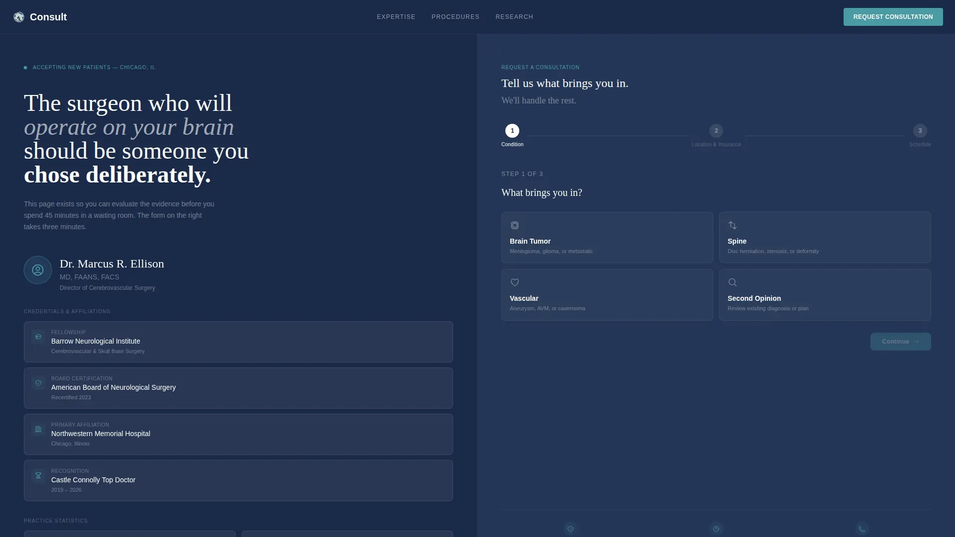
- A 50/50 split-screen hero with a credential stack on the left and a three-step multi-step form on the right
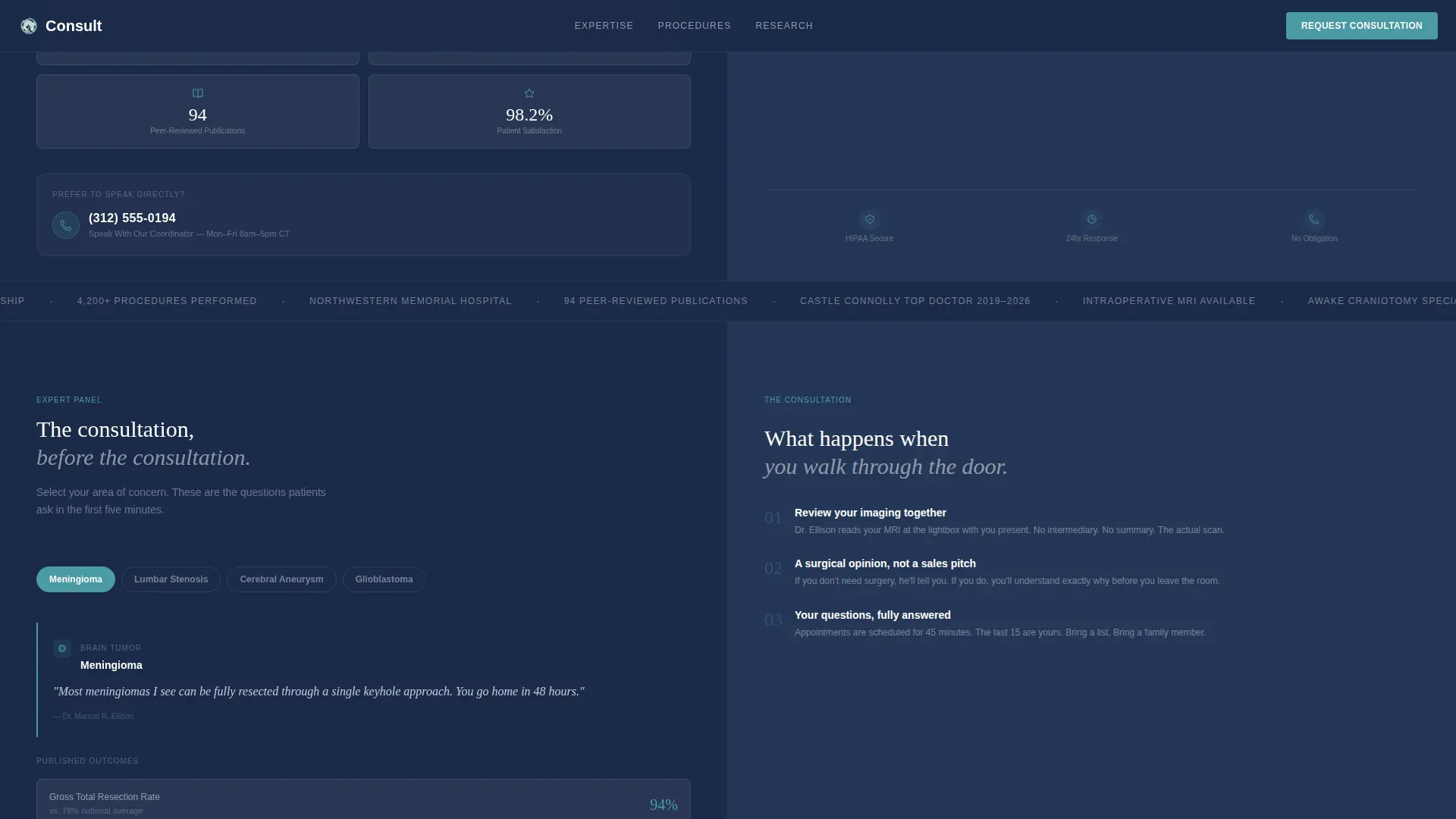
- A scrolling Expert Panel section pairing condition-specific consultation quotes with published outcome statistics
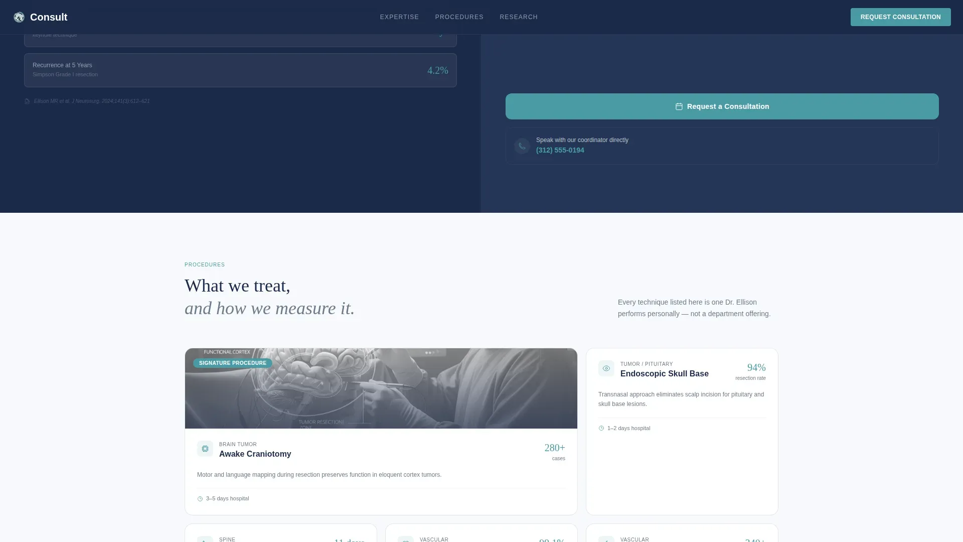
- A Procedure Showcase, a Trust and Publications grid, and a secondary coordinator contact path with a sticky mobile booking bar
Feature list
This template includes a focused set of interactive and visual components drawn directly from the design brief.
Three-Step Multi-Step Booking Form
The form opens at Step 1 with four large tappable condition cards: Tumor, Spine, Vascular, and Second Opinion. Step 2 collects preferred location and insurance carrier. Step 3 captures a date preference and includes a drag-and-drop upload field for MRI scans or referral documents.
Split-Screen Credential Stack
The left half of the hero displays the surgeon's board certifications, fellowship institution, and case volume statistics in a clean vertical layout. This panel evolves as the user scrolls, cycling through condition-specific expertise areas paired with a single authoritative consultation quote for each.
Scrolling Expert Panel with Outcome Data
Each scrolling panel on the left shows a condition name and a direct, plain-language surgical statement. The right column mirrors it with recovery timelines, published success rates, and peer-reviewed citation counts, giving patients the specificity they need to make a confident decision.
Procedure Showcase with Bento Cards
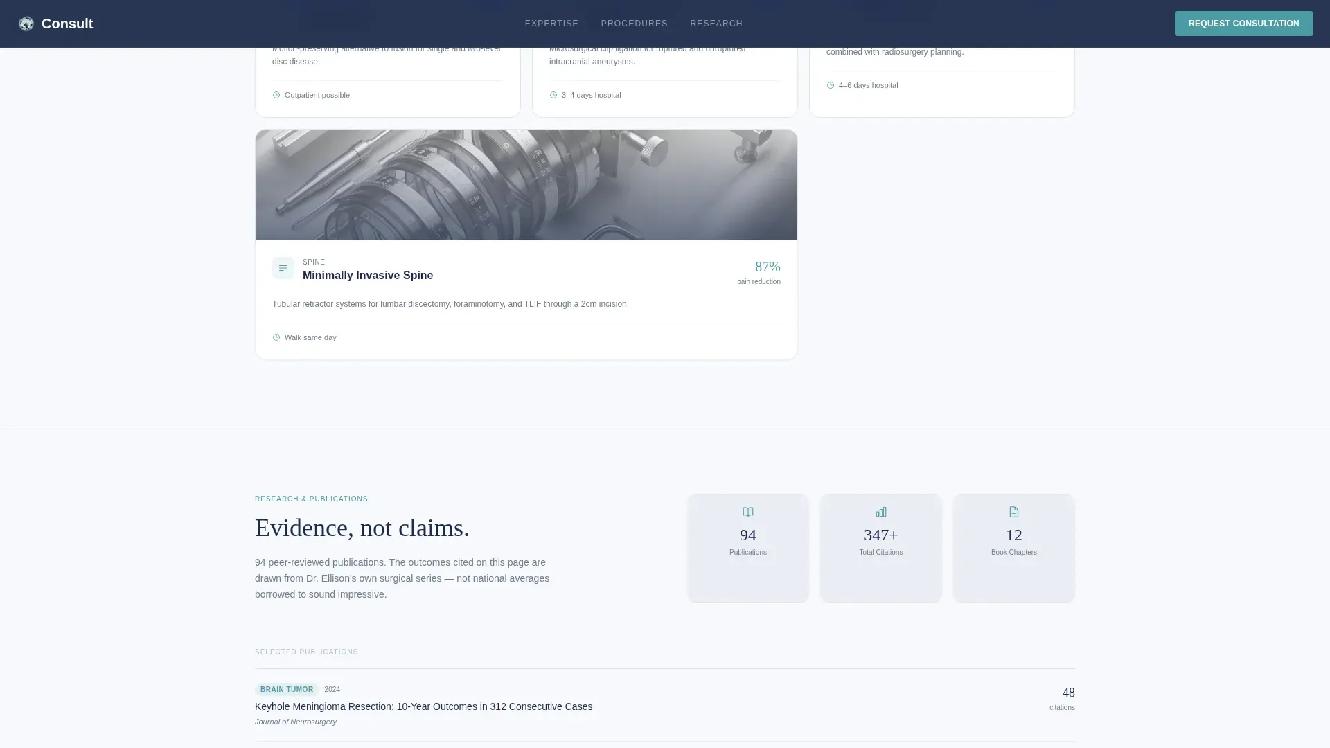
Asymmetric bento-style cards cover Tumor, Spine, Vascular, and Epilepsy procedures. Each card includes a recovery timeline, giving patients a realistic sense of what to expect before they ever speak with the practice.
Trust and Publications Grid
An editorial grid displays peer-reviewed publication counts, named hospital affiliations, and board certification details. This section replaces vague credibility language with verifiable proof.
Secondary Coordinator Contact Path
A "Speak With Our Coordinator" section offers a direct phone number for patients who are too anxious to complete the form. On mobile, the primary "Request a Consultation" call to action collapses into a sticky bottom bar that stays visible throughout scrolling.
Page sections overview
| Section | Purpose |
|---|---|
| Hero Split Screen | Opens with credential stack and three-step booking form side by side |
| Expert Panel Scroll | Pairs condition quotes with outcome statistics as the user scrolls |
| Procedure Showcase Cards | Displays four procedure areas with recovery timelines |
| Trust Publications Grid | Shows certifications, hospital affiliations, and publication data |
| Coordinator Contact Path | Offers a phone-based alternative for anxious patients |
| Footer Linear Row | Closes the page with a clean single-row footer layout |
Design & branding system
The visual identity follows a Corporate Precision theme using the Cloud Canvas color system. The palette reads like a freshly pressed lab coat against a backlit MRI lightbox, sterile but not cold.
- Four colors carry the full design: clinical white (#F7F9FC), surgical steel gray (#6B7B8D), deep cranial navy (#1B2A4A), and muted teal (#4A9BA5) reserved for buttons, progress indicators, and trust badges
- Typography pairs DM Sans for body copy and user interface elements with Fraunces, a serif display face, for the surgeon's name and consultation quotes
- Scroll-triggered reveals and form step transitions add medium animation weight without distracting from the clinical tone
Mobile & speed optimization
The template is designed desktop-first for patients researching on laptops after receiving a diagnosis, with a full mobile fallback built in.
- The multi-step form and credential stack reflow cleanly for smaller screens
- The "Request a Consultation" call to action collapses into a sticky bottom bar on mobile, keeping the primary booking action always within reach
- Static content uses Server Components while the interactive form runs as a Client Component, keeping the interactive layer isolated
How this template helps you convert
The template converts by removing the friction points that cause patients to leave and keep searching.
- The form IS the first impression. Presenting condition selection at the top of the page signals that the practice values the patient's time, which builds immediate trust before a single word of copy is read.
- The scrolling Expert Panel meets each patient where they are. A parent holding a pediatric tumor referral and a post-stroke survivor reading about vascular surgery both find specific, evidence-backed language that speaks to their exact concern.
- Every trust signal is concrete. Case volume numbers, named fellowship institutions, peer-reviewed citation counts, and hospital affiliations replace vague claims with verifiable facts that reduce patient anxiety and move them toward booking.
Other information about this template
This template is localized for English-language, US-based practices. It uses United States date format, USD currency context, and United States medical terminology throughout.
- A marquee ticker animation is included for displaying rotating credentials or key statistics across the page
- The drag-and-drop upload field in Step 3 supports MRI scans and referral document uploads, reducing the back-and-forth typically required before a first consultation
- The template suits a neurosurgeon appointment booking page niche specifically and is categorized under Health and Medical, Neurosurgeon Website
Theme
Corporate Precision
Creative direction
Expert Panel
Color system
Cloud Canvas
Style
Split Screen (50/50)
Direction
Booking/Scheduling
Page Sections
Three-step Multi-step Booking Form
Split-screen Credential Hero
Scrolling Expert Panel
Procedure Showcase with Recovery Timelines
Trust and Publications Grid
Sticky Mobile Coordinator Bar
Related questions
Who is this landing page template designed for?
What does the three-step booking form include?
Can patients contact the practice without filling out the form?
What happens to the booking button on mobile devices?
What kind of social proof does the template display?



