Neurosurgeon Specialist Booking Website Template
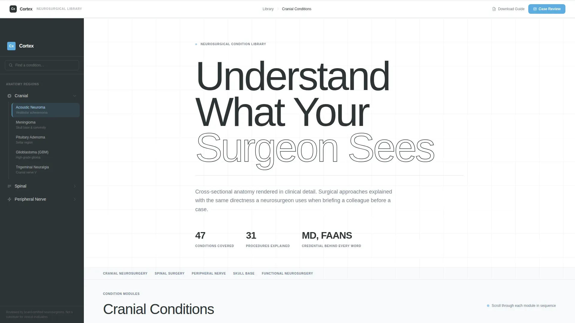
Cortex is a sidebar companion landing page built for neurosurgeons who want to turn a confused patient's research session into a booked consultation. It pairs a fixed anatomical navigation sidebar with scrollable condition modules covering diagnosis, surgical approach, and recovery. The result feels less like a website and more like a surgeon sitting across from you, walking through every detail.
by Rocket studio
Quick summary
Cortex is a neurosurgeon condition and treatment library landing page. A fixed sidebar organizes conditions by anatomy, while the main panel walks visitors through what each condition is, how it is diagnosed, what the surgical approach involves, and what recovery looks like week by week. Every section is built to move a hesitant researcher toward booking a consultation.
Who this template is for
This template is built for neurosurgeons and neurosurgical practices that want their online presence to reflect the same clinical precision they bring to the operating room. It serves both patient-facing and physician-facing audiences from a single, well-organized page.
- Neurosurgeons building a condition and treatment library for patients and referring physicians
- Practices that want to convert late-night research sessions into scheduled consultations
- Surgeons who need a credible, detail-rich resource that earns trust before the first phone call
What problem this template solves
Patients arrive at a neurosurgeon's website holding an imaging report they cannot fully decode. Referring physicians need a fast, reliable way to confirm surgical candidacy. Generic medical websites fail both groups by being too vague to be useful and too clinical to be readable.
- Patients and families cannot find clear, honest explanations of conditions like acoustic neuroma or spinal compression
- Referring physicians have no efficient way to verify a surgeon's approach before making a referral call
- Most practice websites claim expertise without showing it, so visitors leave without converting
What you get with this template
You get a complete, single-page neurosurgery condition library with a fixed sidebar navigation, scrollable condition modules, and two distinct conversion paths. The layout is desktop-first with a responsive mobile collapse built in.
- A fixed left sidebar organized by anatomy (cranial, spinal, peripheral nerve) that expands per region
- Scrollable condition modules covering definition, diagnosis, surgical approach, and recovery timeline
- A primary call-to-action ("Request a Case Review") that locks into the sidebar after two full conditions are scrolled, plus a secondary email-capture path ("Download This Condition Guide as PDF")
Feature list
A brief overview: every feature below is grounded in what the template actually delivers, drawn directly from the design and functional brief.
Fixed Anatomical Sidebar Navigation
The persistent left sidebar organizes conditions by anatomical region: cranial, spinal, and peripheral nerve. Clicking a region expands its condition list. Selecting a condition triggers a smooth scroll to the relevant module in the main panel. The sidebar stays fixed as the visitor reads.
Four-Phase Condition Modules
Each condition module follows a consistent four-phase structure: what the condition is (with annotated cross-section illustrations), how it is diagnosed (imaging modalities and grading scales), what the surgical approach involves (step-by-step with named techniques such as microvascular decompression or endoscopic endonasal), and what recovery looks like in weeks rather than vague generalities.
Scroll-Linked Sidebar Call to Action
The "Request a Case Review" call-to-action button floats freely at first. After the visitor scrolls past two complete condition modules, the button locks into the sidebar. This behavior signals earned engagement rather than a premature sales push.
Giant Headline Hero Section
The hero uses a stark white background with no imagery. A thin, oversized sans-serif headline set at sixty percent of the viewport height reads "Understand What Your Surgeon Sees." A credential strip below it states the number of conditions covered, procedures explained, and the qualification behind every word. The emptiness of the layout is the confidence.
Dual Conversion Paths
Two calls to action serve visitors at different stages of readiness. "Request a Case Review" connects directly to the scheduling page. "Download This Condition Guide as PDF" captures an email address for visitors who are not ready to call yet. Both paths are present and distinct without competing.
Staggered Scroll Reveals and Accordion Interaction
Condition content loads with staggered reveal animations as the visitor scrolls. The sidebar uses an expand-and-collapse accordion for each anatomical region. These interactions keep the experience feeling methodical and controlled, matching the clinical tone of the content.
Page sections overview
| Section | Purpose |
|---|---|
| Hero Headline | Establish authority with oversized headline and credential strip |
| Fixed Sidebar Navigation | Let visitors navigate conditions by anatomical region |
| Condition Library Modules | Deliver four-phase clinical detail per condition |
| Transparent Process Section | Show the four-phase methodology as a standalone visual sequence |
| Testimonials Section | Build trust with patient outcomes and referring physician quotes |
| Primary Call to Action | Drive visitors to schedule a case review consultation |
| Footer | Horizontal flow with contact and practice information |
Design & branding system
The visual identity follows a Medical Clarity theme. Every color decision references a surgical environment: cool, shadowless, and precise. Nothing decorative competes with the information.
- Deep surgical slate (#2D3436) for primary text and the persistent sidebar background; clinical midtone (#6B7B8D) for secondary labels and anatomical annotations
- Open-sky blue (#5DADE2) on interactive elements and active-state indicators; sterile white (#F8F9FB) across the main content field
- DM Sans in thin weights for the oversized hero headline; Manrope for all body text, keeping the reading experience clean and clinical
Mobile & speed optimization
The template is built desktop-first to support the sidebar layout, but it includes a responsive mobile collapse so the experience remains usable on smaller screens. The technical approach prioritizes static delivery with interactive components used only where needed.
- Desktop-first layout with a responsive sidebar that collapses cleanly on mobile devices
- Static-first rendering approach; client-side components are scoped only to the sidebar interaction, smooth-scroll TOC, and the scroll-linked call-to-action lock
How this template helps you convert
Trust is the conversion mechanism here. The template does not ask for a booking until it has shown the visitor exactly what the surgeon knows and how they work. Two structured paths ensure no visitor leaves without a next step.
- The scroll-linked "Request a Case Review" button appears in the sidebar only after two full condition modules have been read, arriving when the visitor is most informed and most ready to act.
- The PDF download call-to-action captures email addresses from visitors who need more time, creating a second conversion opportunity without pressure.
Other information about this template
This template sits at the intersection of patient education and surgical practice marketing. A few additional details help clarify its scope and fit.
- The template is categorized under Health & Medical, specifically built for the Neurosurgeon Condition and Treatment Library niche
- The creative direction follows a Transparent Process model, the header concept is Giant Headline Centered, and the layout style is Sidebar Companion
- The landing page direction is Click-Through, meaning every design decision points toward the surgeon's scheduling page as the final destination
- Typography pairing is DM Sans for display and Manrope for body; both are chosen for legibility at the small point sizes used in clinical annotation contexts
- Animation intensity is medium: scroll-linked sidebar locking, smooth-scroll table of contents, and staggered content reveals are included without overwhelming the clinical tone



Theme
Medical Clarity
Creative direction
Transparent Process
Color system
Slate & Sky
Style
Sidebar Companion
Direction
Click-Through
Page Sections
Fixed Anatomical Sidebar Navigation
Four-phase Condition Modules
Scroll-linked Sidebar Call to Action
Giant Headline Hero Section
Dual Conversion Paths
Staggered Scroll Reveals and Accordion Interaction
Related questions
Who is this landing page designed for?
What makes the sidebar different from a standard navigation menu?
Can this template support more than one surgical condition?
How does the call-to-action locking behavior work?
Is the clinical detail level appropriate for referring physicians?



