Neurosurgeon Specialist Booking Website Template
Cortex is a sidebar companion landing page built for neurosurgeons who need to convert newly diagnosed, anxious patients into booked consultations. It leads with credential medallions and animated statistics, guides visitors through condition-specific panels, and closes with a low-friction five-step eligibility quiz that pre-qualifies patients before a single phone call is made.
by Rocket studio
Quick summary
Cortex is a neurosurgeon new patient welcome landing page with a persistent sidebar layout. It opens with hard statistics, walks visitors through condition-specific guidance, and ends with a five-step eligibility quiz. The design blends clinical authority with organic warmth so recently diagnosed patients arrive feeling less afraid and more ready to act.
Who this template is for
This template is built for neurosurgical practices that treat complex, high-stakes conditions and need a digital presence that earns trust before it asks for a booking. It works especially well when the primary audience arrives scared, informed, and already mid-research.
- Neurosurgeons and neurosurgical group practices seeking to convert new patient inquiries online
- Practice managers who want pre-qualified intake data before the first phone call
- Medical marketing teams replacing a generic contact form with a guided patient journey
What problem this template solves
Most medical practice pages ask for a booking before they earn one. Patients who just received a frightening diagnosis do not respond to generic "Schedule Now" buttons. They need credentials, numbers, and condition-specific context first. Cortex addresses that gap directly.
- Anxious patients leave pages that feel rushed or vague, and this template replaces vagueness with structured clarity
- Cold intake calls add emotional friction, and the five-step quiz reduces that friction before anyone picks up the phone
- Generic hero images and marketing language erode trust, and this template leads with credentials and outcomes instead
What you get with this template
You get a fully structured single-page layout that pairs a persistent credential sidebar with a scrollable main content area. Every section is intentional and ordered to move a nervous visitor toward a consultation booking.
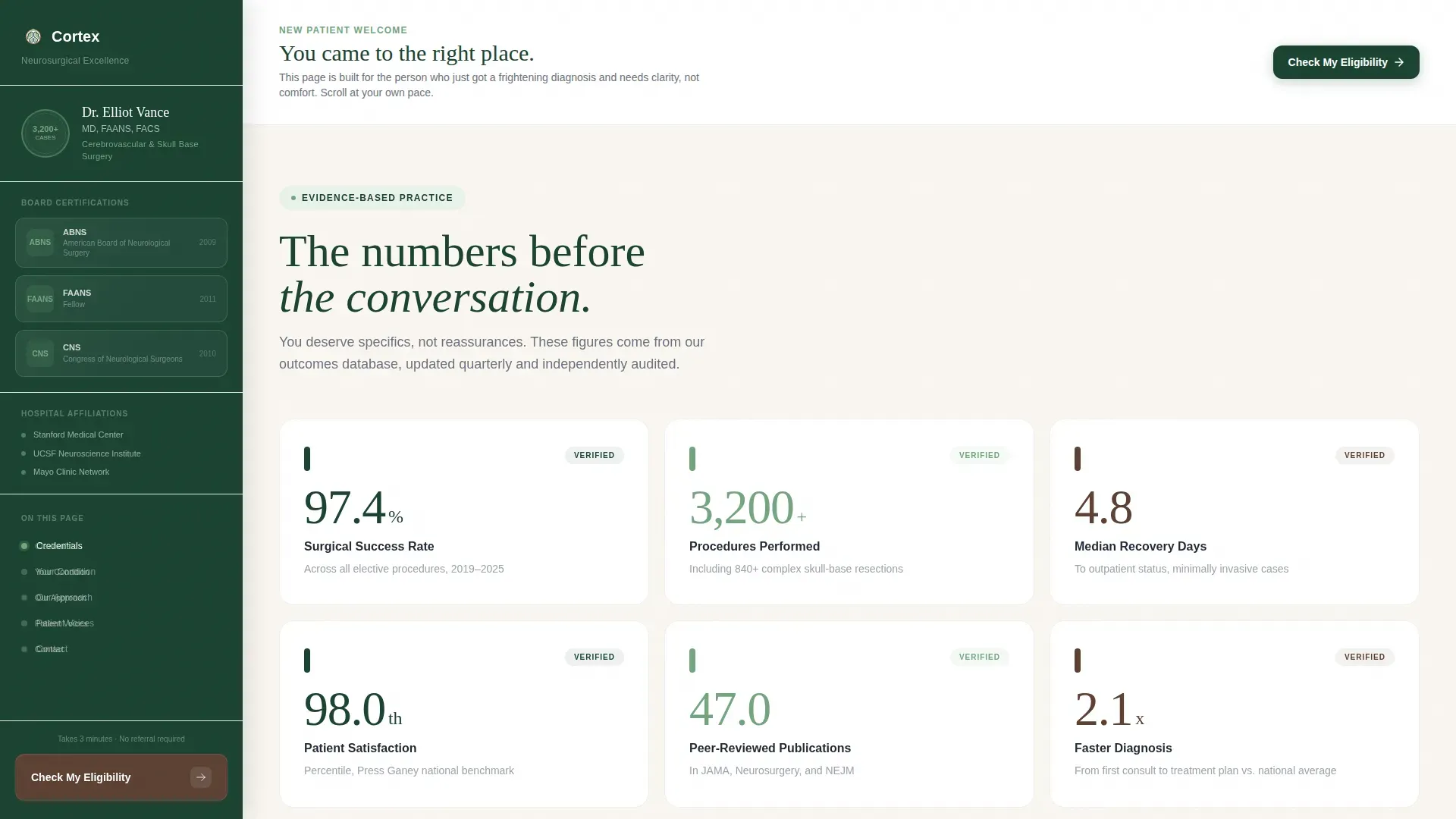
- A persistent evergreen sidebar with engraved-style credential medallions, surgeon name line, and a fixed "Check My Eligibility" call to action
- An animated stats section, three condition-specific panels with patient-perspective quotes, a consultation path section, and a patient voices section
- A five-step guided eligibility quiz modal with sage-colored step progress fill and a personalized next-step summary with calendar embed
Feature list
This landing page is designed around one outcome: turning a frightened, researching patient into a pre-qualified consultation booking. Every feature below serves that goal directly.
Persistent Credential Sidebar
The evergreen sidebar stays visible throughout the entire scroll. It displays engraved-style award badge medallions covering board certifications, fellowship crests, hospital affiliations, and a numerical procedure seal. The surgeon's name, degree string, and subspecialty descriptor appear below the badges in walnut text. The fixed "Check My Eligibility" button anchors the bottom of the sidebar so the primary call to action is always one glance away.
Animated Statistics Section
Hard numbers appear before any narrative copy. Figures such as survival rates, median recovery days, peer-reviewed publication counts, and patient satisfaction percentiles animate into view as the visitor scrolls using GSAP ScrollTrigger counters. Each number is large enough to read without effort and staggered in sequence to hold attention.
Condition-Specific Content Panels
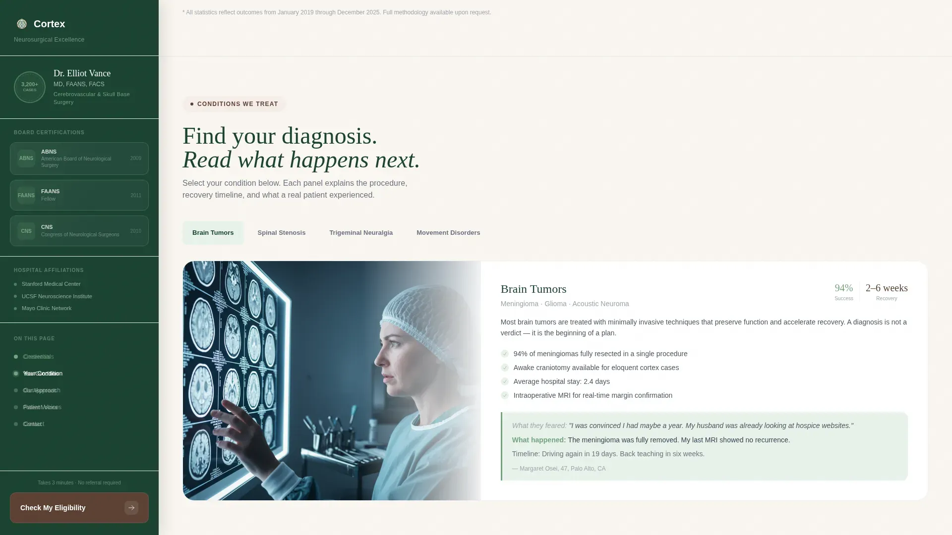
Three condition panels cover brain tumors, spinal stenosis, and trigeminal neuralgia. Each panel can be accessed directly from the sidebar's persistent progress dot navigation so visitors skip straight to their diagnosis. Every panel closes with a factual patient-perspective quote describing what the patient feared, what actually happened, and practical recovery details such as how long until they drove again.
Five-Step Eligibility Quiz Modal
The "Check My Eligibility" quiz opens as a guided modal with one question per screen. Steps cover diagnosed condition or primary symptom, symptom duration, prior treatments, referring physician status, and preferred contact method. Sage-colored progress fill tracks completion across all five steps. The final screen delivers a personalized next-step sentence and a calendar embed for booking.
Sidebar Progress Dot Navigation
As visitors scroll through condition panels, a progress dot indicator in the sidebar tracks their position. Visitors can tap any dot to jump directly to a specific condition section without scrolling. Completed steps display in sage to give a sense of calm forward movement through the page.
Consultation Path Section
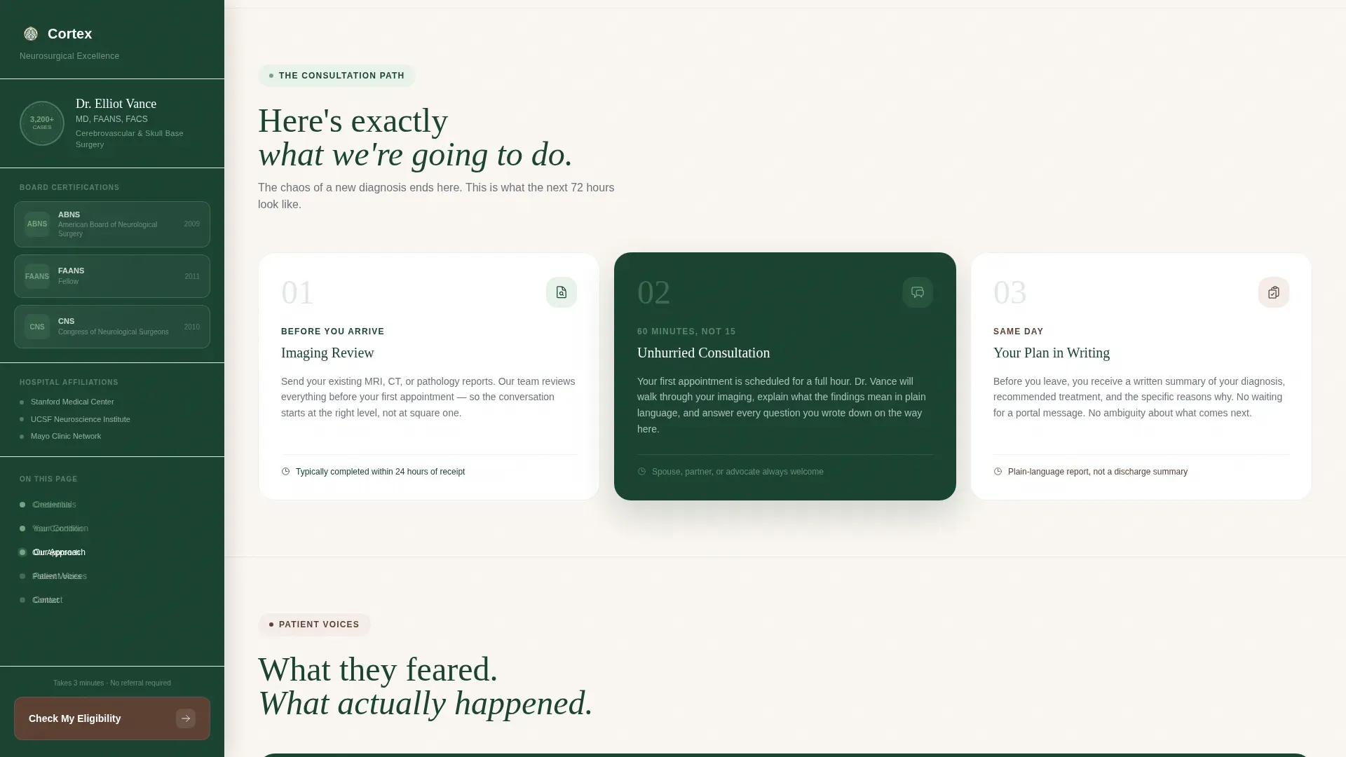
A three-step consultation overview explains the path from eligibility quiz to surgical review without presenting it as a rigid timeline. This section reduces uncertainty about what happens after a patient submits their information, answering the unspoken question every new patient has: "What comes next?"
Page sections overview
| Section | Purpose |
|---|---|
| Credential Sidebar | Display board certifications, fellowship crests, procedure seal, and fixed quiz button |
| Stats Impact | Animate hard outcome numbers to establish authority before narrative |
| Condition Panels | Guide visitors to brain tumor, spinal stenosis, or trigeminal neuralgia content |
| Patient Quotes | Deliver factual outcome voices at the close of each condition panel |
| How It Works | Explain the three-step consultation path in plain language |
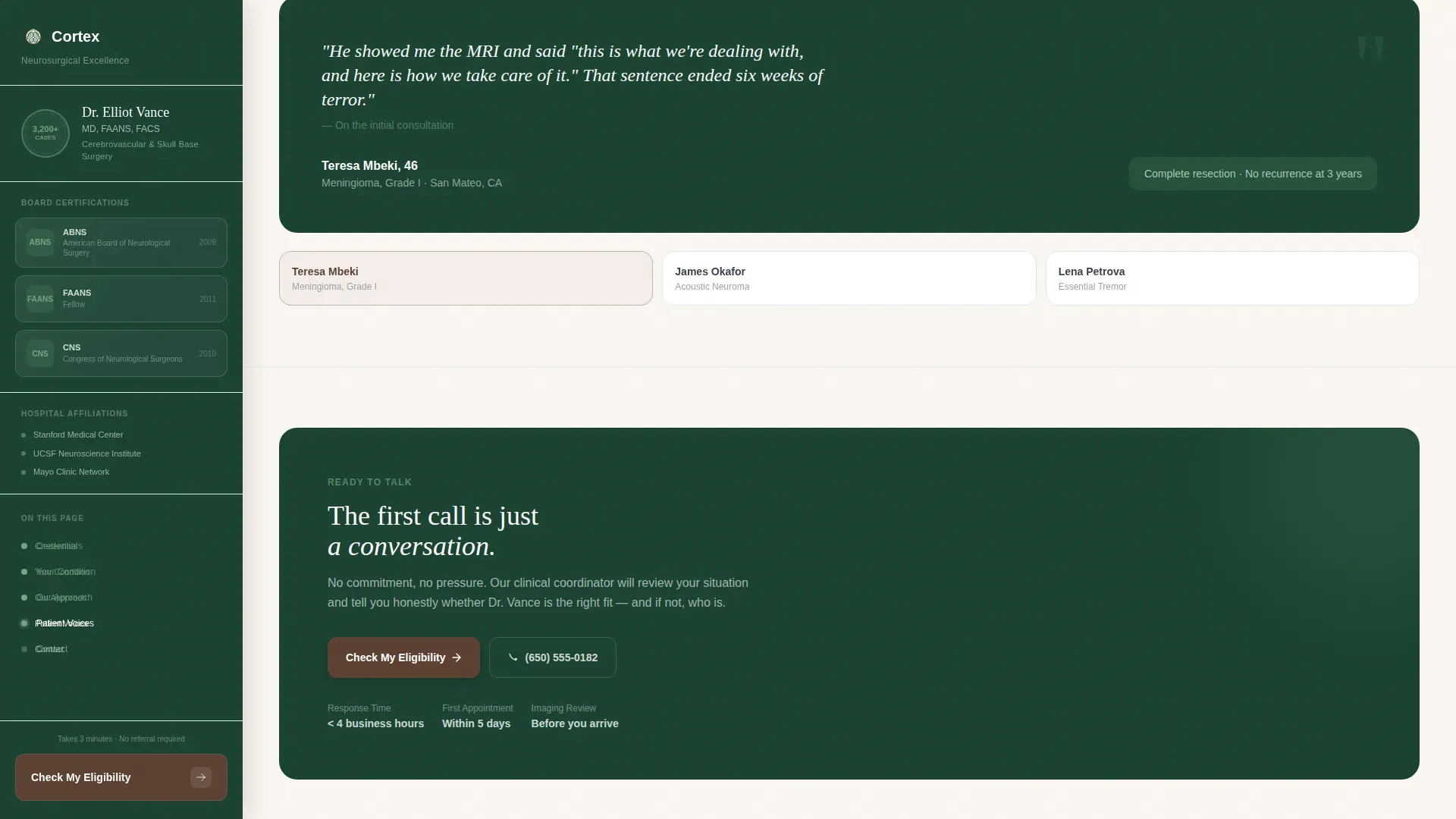
| Patient Voices | Reinforce trust with additional factual outcome quotes |
| Footer | Close the page with horizontal layout footer pattern |
Design & branding system
The visual identity follows a Medical Clarity theme built on the Forest Trust color system. The palette feels like a private consultation room with a living wall: clinical enough to trust and organic enough to breathe. Typography pairs Fraunces serif headlines with DM Sans body text for a tone that is authoritative but readable.
- Deep surgical evergreen (#1B4332) anchors the persistent sidebar and credential area; warm birch white (#FAF6F1) opens the main content area wide
- Steady-state sage (#74A57F) marks completed progress steps and positive statistics; grounding walnut (#5C4033) draws the eye to clickable borders and interactive elements without using anxiety-inducing red or orange
- Credential medallions use an engraved, slightly shadowed style that reads like diplomas on a real office wall, not glossy achievement badges
Mobile & speed optimization
The template is designed desktop-first to support its sidebar layout, and it collapses gracefully to a single-column mobile view. The sidebar stacks above the main content on smaller screens so credential context is not lost. Interactive components such as the quiz modal and condition tab switching are built as client components while static content areas use server components.
- The sidebar's fixed call-to-action button repositions to a bottom-anchored bar on mobile so it stays accessible throughout the scroll
- GSAP ScrollTrigger animations and quiz step transitions are scoped to client components to keep static rendering lightweight
- Desktop-first breakpoints ensure the sidebar-plus-content layout renders correctly on the screens most patients use during late-night research sessions
How this template helps you convert
The conversion architecture of this landing page is built around reducing the emotional cost of taking the first step. Every design and copy decision moves a fearful visitor closer to a booked consultation without ever feeling pushy.
- Credentials and outcome statistics appear before any narrative or call to action, so visitors earn trust in the surgeon before they are asked to do anything.
- Condition-specific panels let visitors navigate directly to their diagnosis, reducing the feeling of reading a generic brochure and increasing relevance for each individual visitor.
- The five-step eligibility quiz replaces the cold phone call with a low-stakes, structured path that ends in a clear personalized next step and a calendar booking embed.
Other information about this template
This template is localized for United States English and uses imperial measurements throughout. The animation level is high, with GSAP ScrollTrigger powering both the stat counter reveals and the staggered section transitions. Interactivity is also high, covering the quiz modal, sidebar progress dots, and condition tab switching. The footer uses a horizontal layout pattern consistent with modern medical practice sites.
- The quiz is designed to pre-qualify patients for the surgical coordinator, delivering structured intake data before any phone contact
- The template targets both primary patients researching their own diagnosis and secondary audiences such as referring physicians and family members researching on behalf of patients
- Page copy and section ordering follow a Stats-First Impact creative direction, meaning hard numbers lead before human narrative, which is the appropriate sequence for a high-stakes medical context
Theme
Medical Clarity
Creative direction
Stats-First Impact
Color system
Forest Trust
Style
Sidebar Companion
Direction
Quiz/Assessment
Page Sections
Persistent Credential Sidebar
Animated Statistics Section
Condition-specific Content Panels
Five-step Eligibility Quiz Modal
Sidebar Progress Dot Navigation
Consultation Path Section
Related questions
Who is this landing page template designed for?
What does the five-step eligibility quiz include?
Can visitors navigate directly to their specific condition?
How does the sidebar layout work on mobile devices?
Does this template include real patient quotes?



