Neurosurgeon Reviews Website Template
Cortex is a neurosurgeon virtual consultation landing page built for a fellowship-trained specialist offering remote MRI scan reviews and video assessments. It combines animated neural line art, hard diagnostic stats, and a guided five-question quiz to help rural patients, anxious families, and referring physicians find the right consultation pathway without a single phone call.
by Rocket studio
Quick summary
Cortex is a single-page virtual consultation template for a fellowship-trained neurosurgeon. It leads with hard clinical stats, flows through alternating zigzag panels, and closes with an adaptive five-question quiz. The design feels calm and authoritative without being cold, giving patients and referring physicians the confidence to take the next step from wherever they are.
Who this template is for
This template is built for neurosurgeons and neurosurgical practices offering remote second opinions and virtual scan reviews. It speaks equally well to the patient sitting alone at midnight and the community physician who needs a subspecialist's input before rounds.
- Rural patients located two or three hours from the nearest neurological center
- Families seeking a second opinion on a brain tumor or complex neurological diagnosis
- Referring physicians at community hospitals who need subspecialist scan review before a Monday morning case conference
What problem this template solves
Geography and fear are the two biggest barriers between a patient and expert neurosurgical care. Most people do not know how to contact a neurosurgeon directly, and the idea of "calling a specialist" feels impossible when you are anxious and isolated. This template removes both barriers at once.
- It replaces the intimidating phone call with a quiet, five-step quiz that feels manageable
- It leads with real diagnostic concordance data so patients trust the quality of remote review before they ever share a name
- It gives referring physicians a clear, professional pathway for submitting scans without navigating a hospital switchboard
What you get with this template
You get a fully structured, single-page landing page with seven purpose-built sections and a guided assessment flow. Every section is designed around a specific moment in the patient or physician journey, from first impression to confirmed consultation pathway.
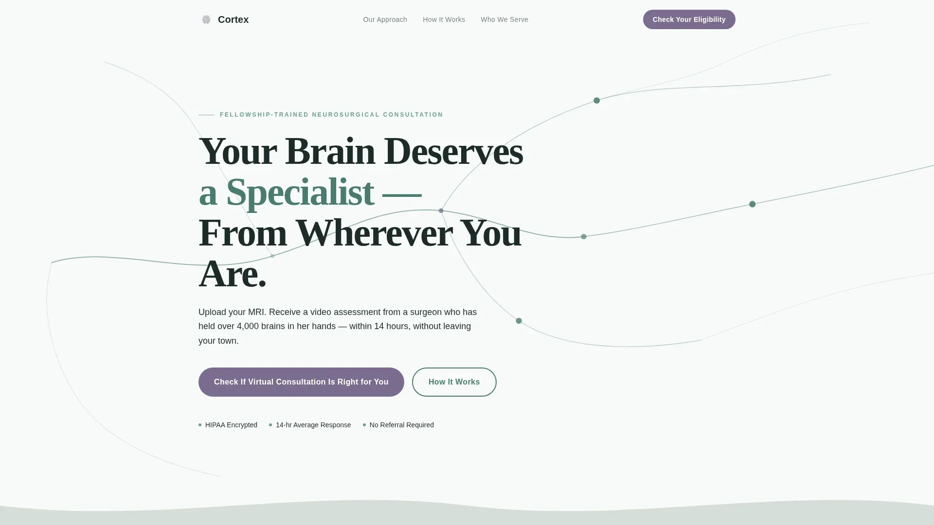
- An animated hero with SVG neural pathway line art and a parallax-scrolling headline
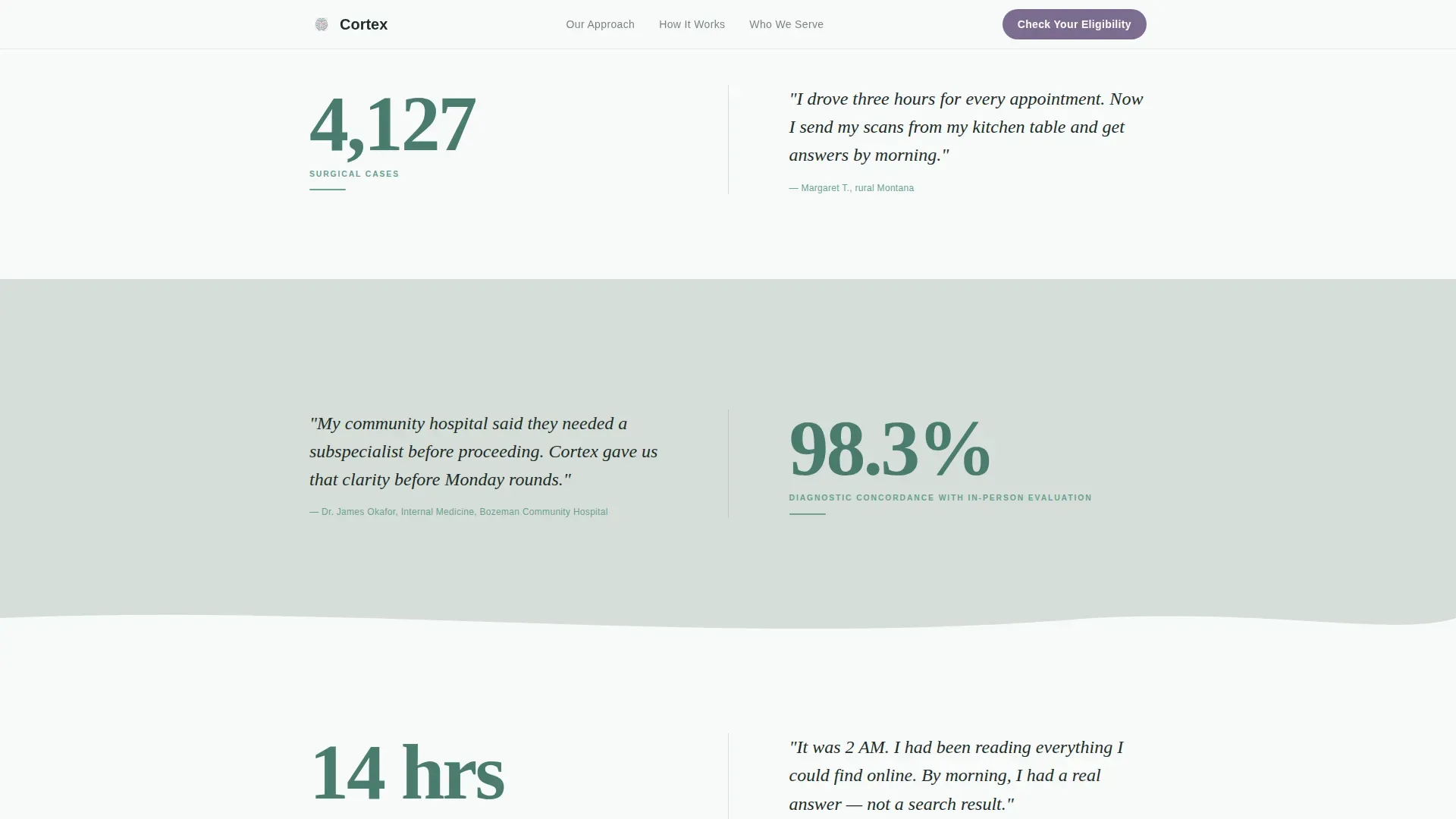
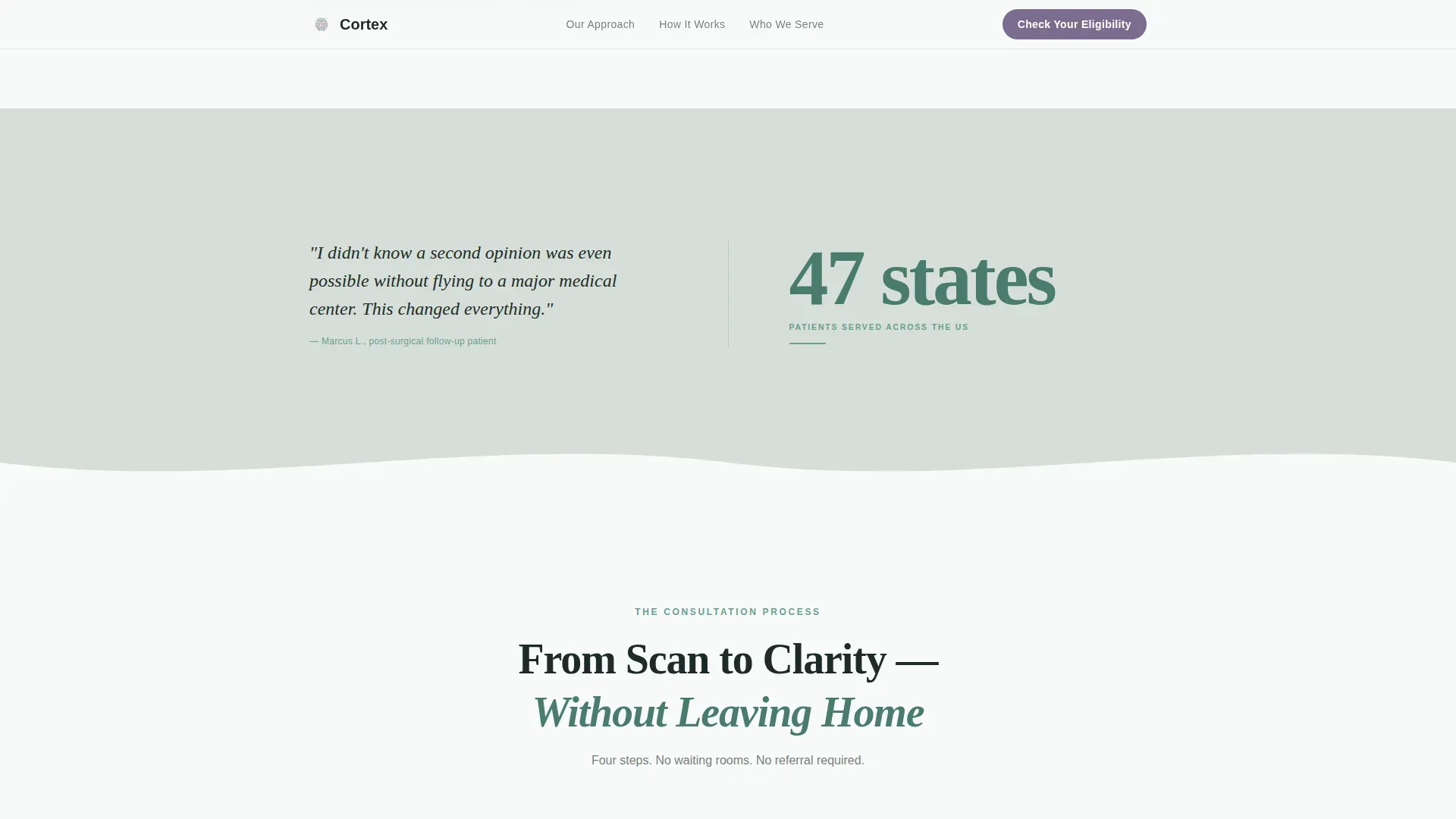
- Four alternating stats-and-story zigzag panels with organic curved dividers connecting each section
- A full-width five-question quiz modal with adaptive results that recommend either an expedited or standard consultation pathway
Feature list
This template is built around a focused set of purposeful, prompt-backed components that move visitors from uncertainty to action.
Animated Neural Pathway Hero
The header features a continuous SVG line art illustration of branching neural pathways drawn in soft pine on glacial white. The lines grow organically across the viewport on load, simulating thought forming in real time. A headline fades in along one of the branches as the visitor arrives. Subtle parallax movement responds to scrolling throughout.
Stats-First Zigzag Panels
Four alternating panels place hard clinical numbers on one side and a single patient-perspective sentence on the other. Stats include surgical case volume, diagnostic concordance rate, and average scan-to-video-review response time. Curved organic dividers replace hard section breaks, keeping the scroll fluid and connected.
Five-Question Guided Quiz Modal
The call-to-action opens a guided assessment covering condition type, diagnosis status, distance from a neurosurgical center, payment method, and urgency level. Each answer adjusts the results screen, which routes the visitor to either an expedited or standard virtual consultation pathway. The flow requires no name, no phone number, and no commitment upfront.
How It Works Process Panels
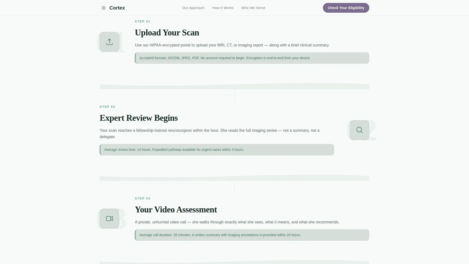
Alternating panels walk the visitor through the four-step consultation process: scan upload, specialist review, video assessment call, and pathway recommendation. Each step occupies its own zigzag panel, keeping the process clear and unintimidating for first-time users.
Who It's For Audience Sections
Three dedicated zigzag panels address patients, families, and referring physicians individually. Each panel uses its own framing so every visitor type feels directly seen rather than grouped into generic copy.
Minimal Horizontal Footer
The footer follows a clean horizontal flow pattern with only the essential links and contact context. It keeps the page feeling light and professional without overwhelming the primary conversion goal.
Page sections overview
| Section | Purpose |
|---|---|
| Hero with Animation | Introduce the practice with animated neural line art and a parallax headline |
| Stats Zigzag Panels | Lead with four hard clinical numbers, each paired with a human-perspective sentence |
| How It Works | Walk through the four-step consultation process in alternating panels |
| Who It's For | Address patients, families, and referring physicians in three separate panels |
| Quiz Call to Action | Launch the five-question guided assessment from a full-width section |
| Minimal Footer | Close with clean horizontal navigation and essential contact context |
Design & branding system
The visual identity uses an Organic Flow approach built on the Alpine Fresh color system. The palette communicates clean medical authority without the sterile coldness of a clinical environment. Typography pairs Fraunces serif headlines with DM Sans body and navigation text for editorial warmth alongside functional readability.
- Glacial white (#F7FAFA) provides primary background breathing room; soft pine (#4A7C6F) anchors headings, body text, and section dividers; morning fog gray (#D6DED8) washes alternating background panels
- Alpine wildflower violet (#7B6D8E) appears exclusively on interactive elements and call-to-action states, reserving visual urgency for the exact moments when the visitor needs to act
- No stock photography of medical equipment or scrubs; the neural line art illustration carries all visual identity work throughout the page
Mobile & speed optimization
The template is built mobile-first, reflecting the reality that most rural patients will reach this page on a phone, often late at night. Desktop layout is equally prioritized for referring physicians reviewing the page at a workstation.
- CSS animations are preferred throughout, with Intersection Observer used to trigger scroll reveals only when sections enter the viewport
- The SVG neural pathway drawing animation and quiz modal transitions are built for smooth performance without reliance on heavy JavaScript libraries
- Staggered scroll reveals keep the page feeling alive on slower mobile connections without blocking the primary content from loading
How this template helps you convert
Every design and copy decision in this template is aimed at one outcome: getting a hesitant, anxious visitor to complete the five-question quiz and identify their consultation pathway.
- The stats-first scroll strategy builds credibility within the first viewport, so trust is established before any ask is made
- The quiz modal removes the emotional weight of contacting a specialist directly, replacing it with five small, answerable questions that require no personal information upfront
- The adaptive results screen gives each visitor a personalized next step rather than a generic contact form, making the path to booking feel specific and manageable
Other information about this template
This template is designed specifically for the neurosurgeon virtual consultation niche within the broader health and medical category. It is well-suited for practices that operate a direct-to-patient remote model alongside a referring physician intake channel.
- The zigzag alternating layout style keeps long-form clinical credibility content skimmable without losing depth
- The Organic Flow theme and Alpine Fresh palette distinguish this page from typical healthcare templates that rely on blue-and-white clinical aesthetics
- The Stats-First Impact creative direction is particularly effective for medical specialists because hard numbers do more to reduce patient anxiety than descriptive paragraphs
- The quiz-led conversion model is a natural fit for neurosurgical consultations, where patients need a low-commitment entry point before they are ready to share sensitive health information
Theme
Organic Flow
Creative direction
Stats-First Impact
Color system
Alpine Fresh
Style
Zigzag/Alternating
Direction
Quiz/Assessment
Page Sections
Animated Neural Pathway Hero
Stats-first Zigzag Panels
Five-question Guided Quiz Modal
How It Works Process Flow
Three-audience Identity Panels
Scroll-triggered Reveal Animations
Related questions
Can I customize the five quiz questions for a different specialty or practice focus?
Does the template include the quiz logic, or is that something I build separately?
Is the neural pathway animation difficult to modify or remove?
Who is the primary conversion audience for this landing page?
Can the color palette and typography be updated to match an existing brand?



