ERISA Attorney Landing Page Template
Counsel is a single-page ERISA landing page template built for employee benefits attorneys who fight denied disability, pension, and health claims. It leads with press credibility, walks visitors through FAQ-driven comparison tables, and captures consultation leads through a two-step form, all before asking for a name or phone number.
by Rocket studio
Quick summary
Counsel is a lead-generation landing page template for Employee Retirement Income Security Act (ERISA) attorneys. It opens with a press mentions bar and weighted serif headline, then guides denied-claimant visitors through comparison tables that expose the gap between what plan administrators say and what federal law requires. Every scroll section earns trust before asking for contact information.
Who this template is for
This template is designed for solo practitioners and boutique firms that specialize in employee benefits litigation. It speaks directly to the experience of receiving a denial letter and needing a clear next step.
- Employee benefits attorneys handling long-term disability, pension, and health claim disputes
- ERISA litigation practices targeting mid-career professionals aged 35 to 58
- Firms that want to generate consultation leads without relying on stock imagery or vague promises
What problem this template solves
A denied claimant searching at midnight does not want a brochure. They want a straight answer to a specific question: "Can they actually do this to me?" Most legal websites answer with credentials instead of clarity.
- Visitors leave when they cannot find plain-language answers to denial-related questions
- Generic legal pages fail to show the gap between corporate policy language and what ERISA actually requires
- Standard contact forms ask for too much trust too soon, before the visitor feels competent enough to reach out
What you get with this template
This template delivers a fully structured, single-page layout built around five scroll-triggered content sections. Each section answers one high-intent question a denied claimant would type into a search engine.
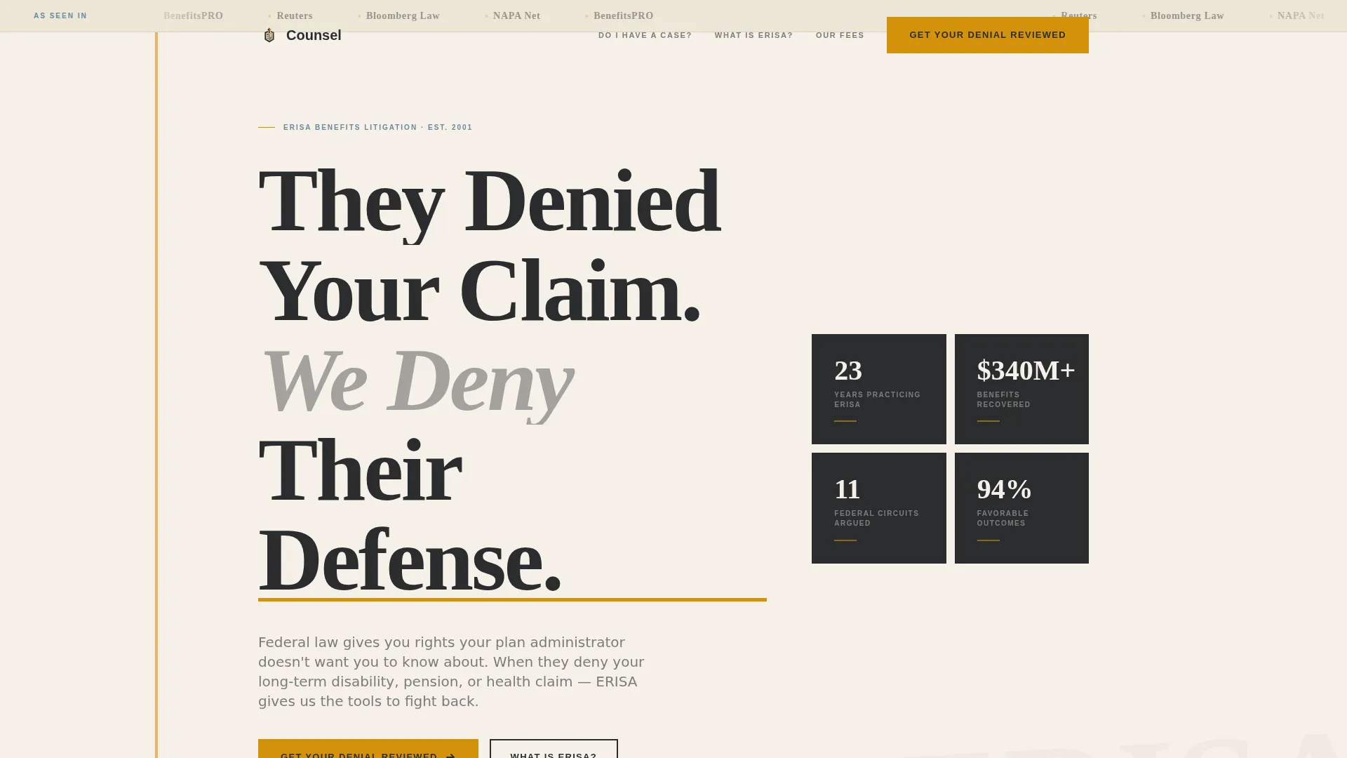
- A hero section with a press mentions bar, credential stats sidebar, and amber-highlighted headline set in large serif type
- Four FAQ-driven content sections, each paired with a comparison table or fee transparency table
- A two-step lead generation form, a PDF download gate, and a sticky mobile call-to-action bar
Feature list
This template includes a focused set of purpose-built components. Each one serves the goal of converting a confused, cautious visitor into a qualified consultation lead.
FAQ-Driven Comparison Tables
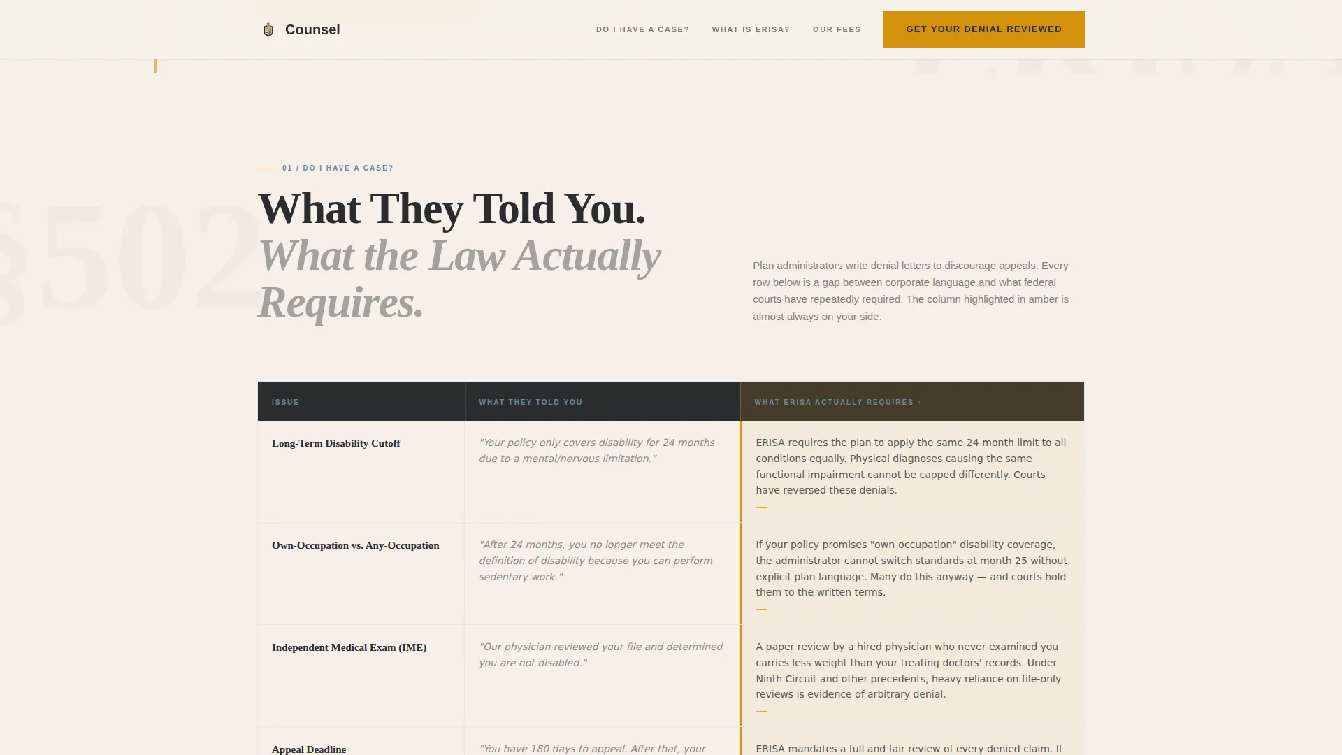
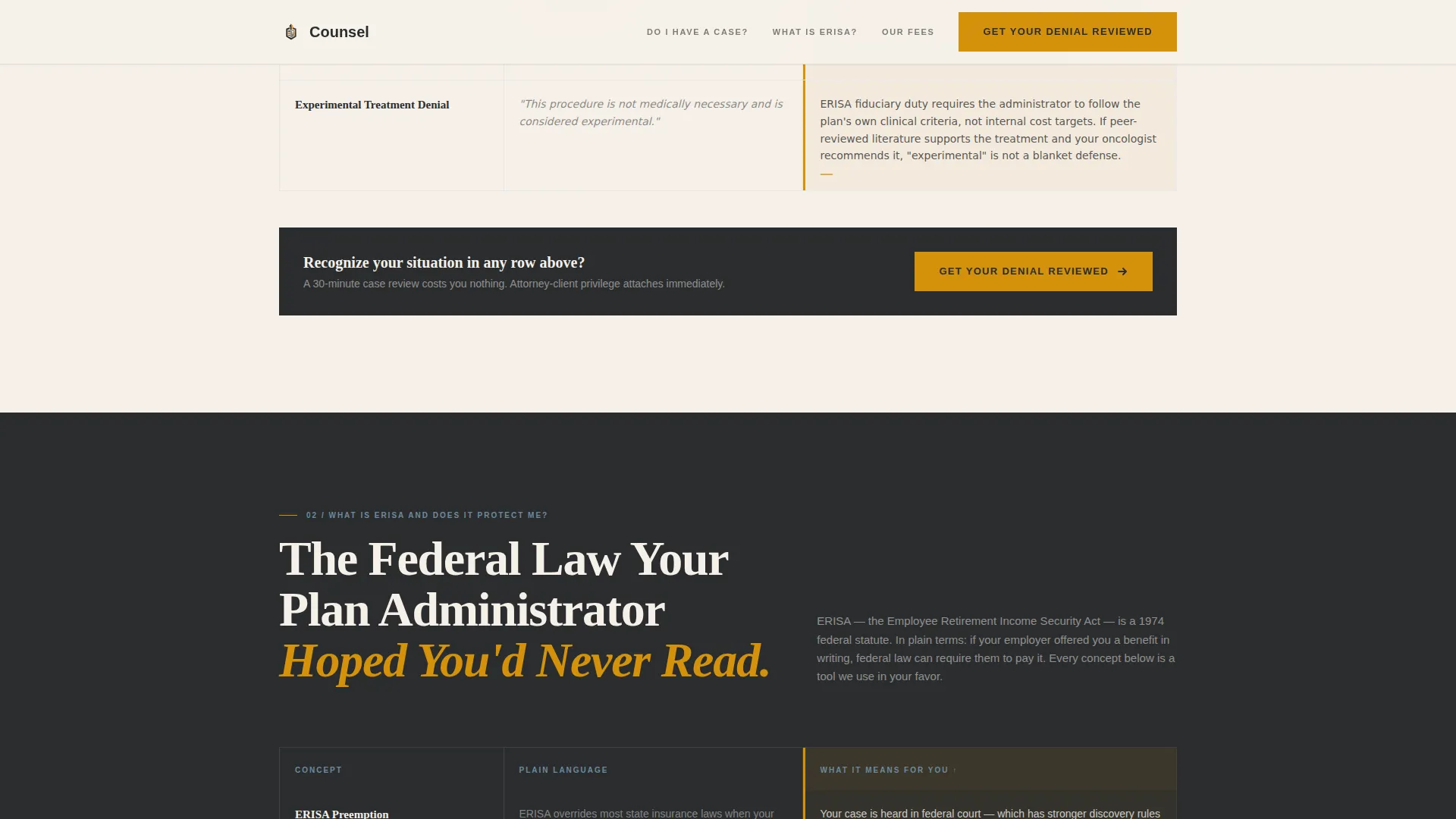
Each content section pairs a plain-language question with a side-by-side comparison table. One column shows what the plan administrator told the claimant. The other column shows what the law actually requires. Amber highlighting marks the column that favors the claimant on every row.
Two-Step Lead Generation Form
The form collects benefit type, denial date, and a brief description before asking for any personal contact details. Step two introduces a reassuring attorney-client privilege note, then requests a name and email address. This sequence reduces friction and builds trust before asking for commitment.
PDF Download Gate
A secondary conversion path offers a free downloadable guide gated behind an email capture modal. This gives visitors who are not ready to book a consultation a lower-stakes way to stay connected and receive useful information.
Sticky Mobile Call-to-Action Bar
A persistent bottom bar keeps the primary call to action visible throughout the entire mobile scroll experience. Denied claimants often search on phones late at night, so this component is built as a critical conversion touchpoint.
Press Mentions Header Bar
The hero opens with a horizontal row of press logo marks above the headline. This establishes editorial credibility in the first second of the page, before any copy is read.
Scroll-Triggered Section Reveals
Sections animate into view as the visitor scrolls, using a spotlight effect on table rows and an amber underline draw animation on key claims. The line-reveal on the hero headline creates a sense of measured authority.
Page sections overview
| Section | Purpose |
|---|---|
| Hero with Press Bar | Establish editorial credibility and present the core value proposition |
| Do I Have a Case? | Comparison table showing denial language versus ERISA requirements |
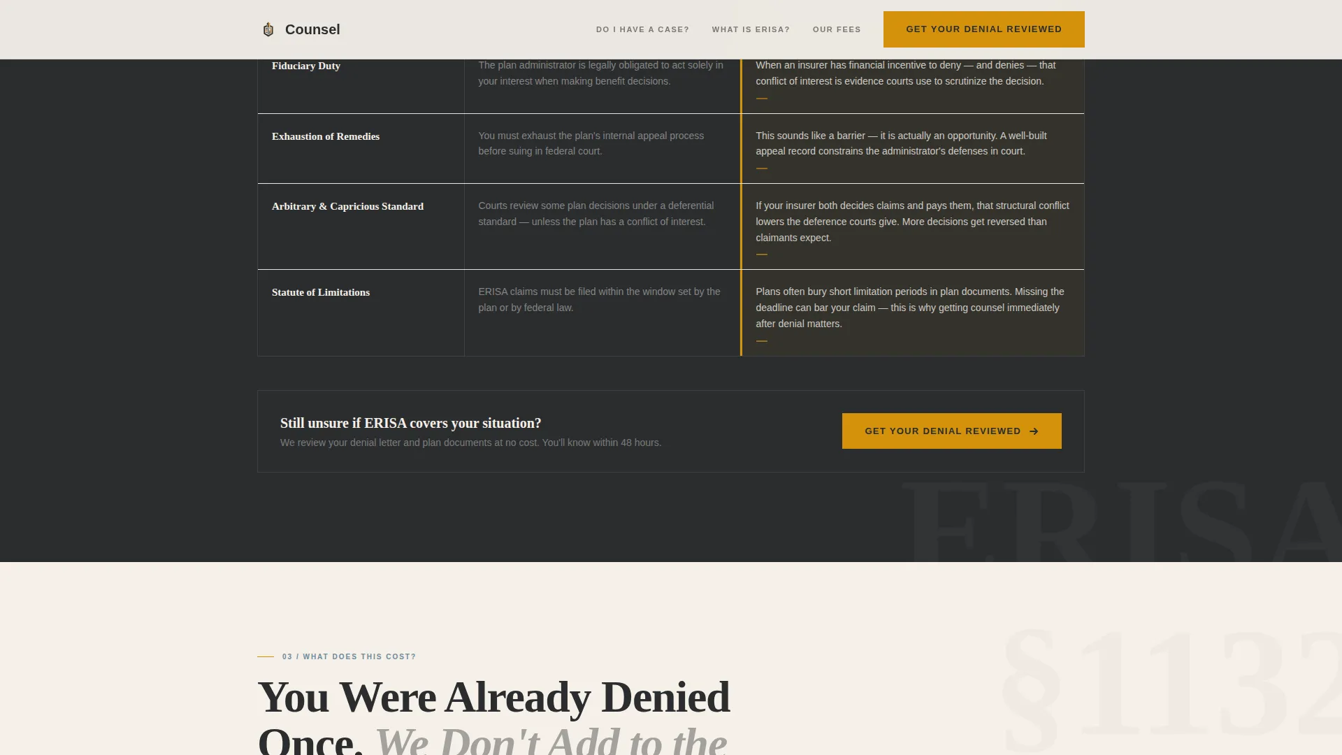
| What Is ERISA? | Plain-language explainer covering preemption, fiduciary duty, and exhaustion rules |
| What Does This Cost? | Contingency fee transparency table with trust signals and a secondary call to action |
| How Do I Start? | Two-step form plus PDF download gate to capture and qualify leads |
| Footer Row | Single-row linear footer with essential links and contact reference |
Design & branding system
The visual identity follows a Legal Shield theme. The palette reads like a senior partner's desk: dark wood, warm brass lamp light, and a stack of case files. Every color choice serves legibility and authority.
- Primary charcoal (#2B2D2F) for backgrounds and headline text, warm parchment (#F5F0E8) for content areas, and deliberate amber (#D4920B) for highlights and interactive states
- Steel blue (#4A6274) for supporting text and table borders, keeping comparison tables readable without competing with amber accents
- Fraunces serif display type for headlines and section intros, with DM Sans handling all body copy and interface elements
Mobile & speed optimization
The template is built mobile-first because the target visitor is most likely searching on a phone, late at night, after reading a denial letter. Every layout decision accounts for that context.
- The sticky bottom call-to-action bar keeps "Get Your Denial Reviewed" reachable on all mobile screen sizes throughout the scroll
- Interactive elements, including the two-step form, PDF gate modal, and comparison table row highlights, are handled as client-side components only, keeping the rest of the page static for faster initial load
How this template helps you convert
The page is structured as an emotional arc, not a brochure. It mirrors the exact progression a denied claimant moves through: from confusion to understanding to conviction to action.
- Comparison tables prove competence section by section, so by the time the call-to-action appears, the visitor already trusts the attorney's knowledge of ERISA law.
- The two-step form lowers the barrier to the first conversion by asking only for case details before requesting personal contact information, making the first step feel safe rather than exposed.
Other information about this template
This template is categorized under Legal and Compliance, specifically Employment and Labor Law, with a niche focus on employee benefits law and ERISA litigation. It is designed for the United States market, using United States dollar currency references, federal law terminology, and United States circuit court language throughout.
- The page references press logos from publications such as Reuters, Bloomberg Law, NAPA Net, and BenefitsPRO as placeholder social proof elements within the hero bar
- Template style is Comparison Table, paired with a Lead Generation landing-page direction and a Press Mentions header concept under the Legal Shield theme
- The credential stats sidebar in the hero is designed to hold years practicing, total dollar amount of benefits recovered, and the number of federal circuits the firm has argued in
Theme
Legal Shield
Creative direction
FAQ-Driven
Color system
Charcoal & Amber
Style
Comparison Table
Direction
Lead Generation
Page Sections
Faq-driven Comparison Tables
Two-step Lead Generation Form
PDF Download Gate
Sticky Mobile Call-to-action Bar
Press Mentions Hero Bar
Scroll-triggered Reveals and Animations
Related questions
Can I customize the comparison table content for my practice area?
Does the two-step form work without a third-party tool?
Is this template suited for a solo ERISA attorney or only larger firms?
What happens to the PDF download gate if I do not have a guide ready?
Can the sticky mobile call-to-action bar be turned off for desktop visitors?