Legal Branding Agency Landing Page Template
Counsel is a landing page template built for legal branding agencies. It uses an asymmetric 60/40 grid, a Before/After Slider header, and a Case Study Narrative scroll structure to showcase identity transformations. The Ink and Paper color system and Lens and Frame visual theme give every section the weight and precision of a well-argued brief.
by Rocket studio
Quick summary
Counsel is a single-page landing page template designed for legal branding agencies. It opens with a Before/After Slider that reveals a firm's identity transformation, then walks visitors through case file-style scroll sections. A waitlist intake form with a live spot counter closes the page, turning interest into committed leads before the next quarterly window opens.
Who this template is for
This template is built for branding professionals who work specifically with law firms and legal practices. It speaks directly to agencies that help clients move past generic legal aesthetics and establish a distinct, credible identity.
- Branding agencies that specialize in law firm identity, positioning, and visual systems
- Boutique legal practices launching into crowded specialties and needing a differentiated brand
- Solo attorneys and managing partners ready to replace tired, generic firm visuals with something unmistakably their own
What problem this template solves
Most legal branding agency pages look exactly like the clients they are trying to help rebrand: safe, anonymous, and forgettable. Counsel solves the credibility gap between what an agency claims and what a visitor actually experiences on arrival.
- Visitors have no immediate visual proof that the agency can transform a firm's identity
- Generic landing page layouts undermine the very craft the agency is selling
- Prospective clients need a clear, low-friction path to reserve a spot or request proof before committing
What you get with this template
Counsel delivers a complete, ready-to-customize landing page built around a precise visual identity and a narrative scroll structure. Every section has a defined role in moving a visitor from skepticism to action.
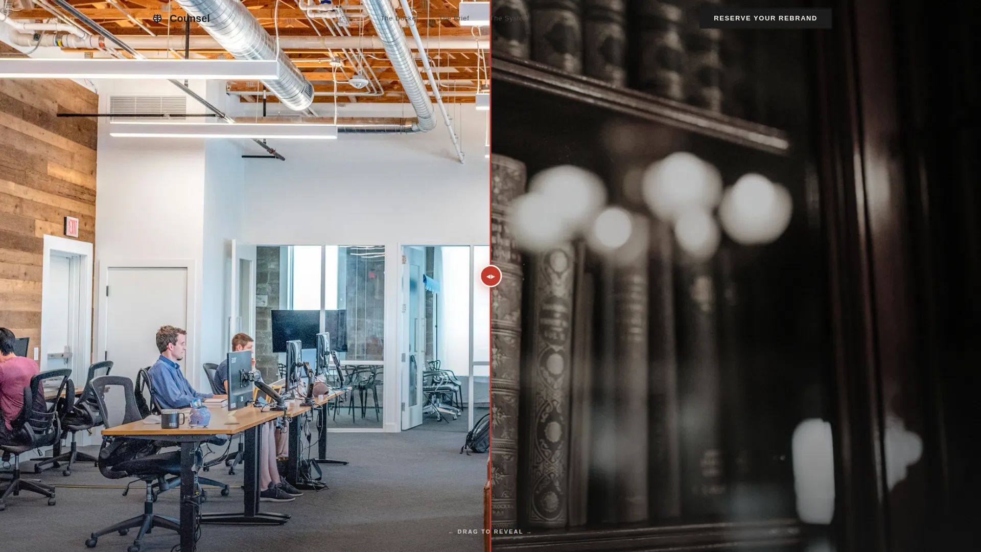
- An interactive Before/After Slider header with a reveal-triggered headline and a red rule slider handle
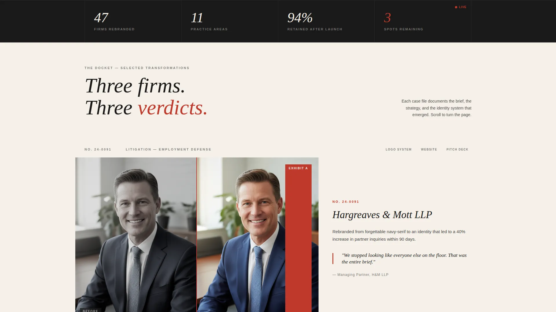
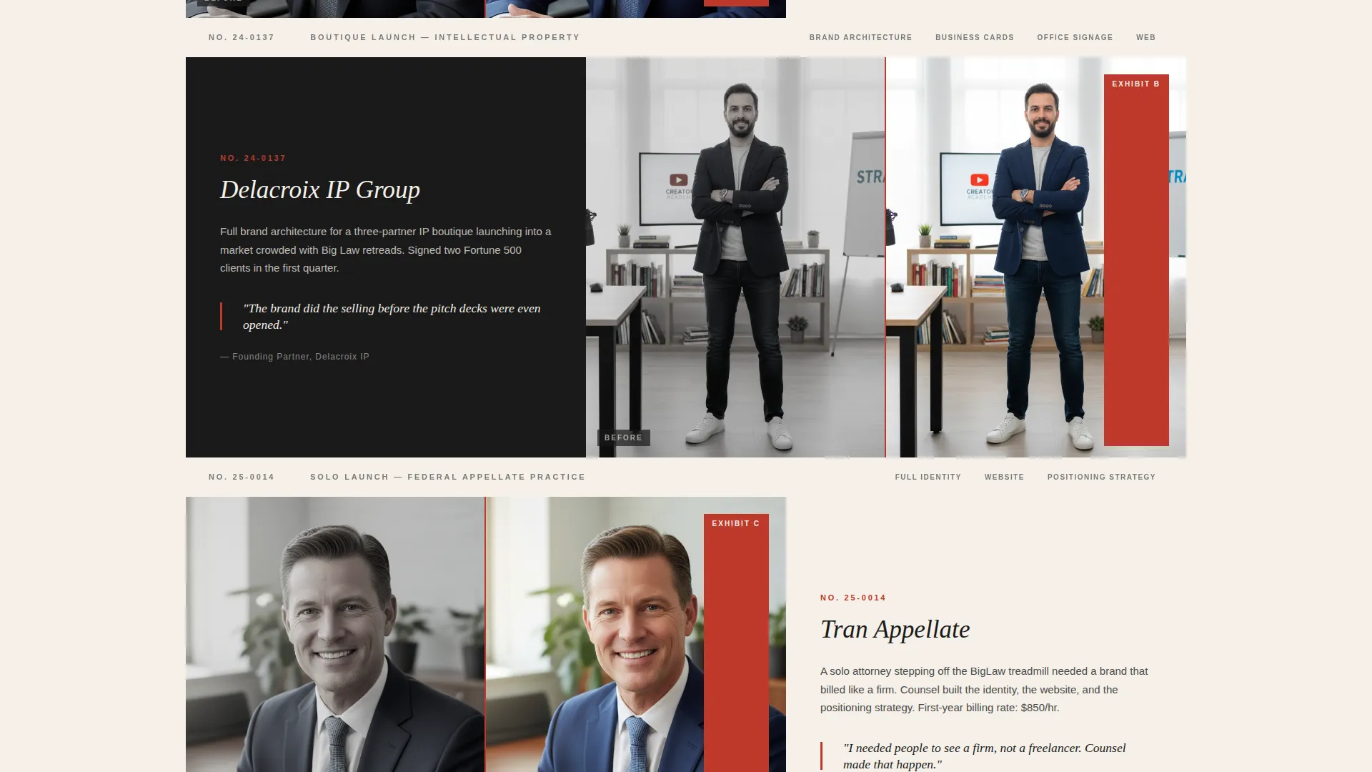
- A scroll-driven Case Study Narrative with three escalating case file sections, each alternating 60/40 grid dominance
- A waitlist intake form with firm name, practice area dropdown, email field, and a live remaining-spots counter, plus a secondary lead capture path for a PDF lookbook download
Feature list
This section describes the core interactive and structural capabilities built into the Counsel template.
Before/After Slider Header
The header uses a side-by-side comparison slider. The left shows a generic, desaturated law firm website viewed through a frosted lens effect. The right reveals the same firm after the agency's intervention. The headline only appears after the visitor moves the slider at least once, typing in: "Your firm has a case. It needs a face."
Asymmetric 60/40 Grid Layout
The page is built on a deliberate asymmetric grid. The 60-column carries photography and identity-in-context imagery. The 40-column holds tight, purposeful type set against generous whitespace. The two columns swap dominance across scroll sections, creating a rhythm like turning pages in a portfolio book.
Case Study Narrative Scroll Sections
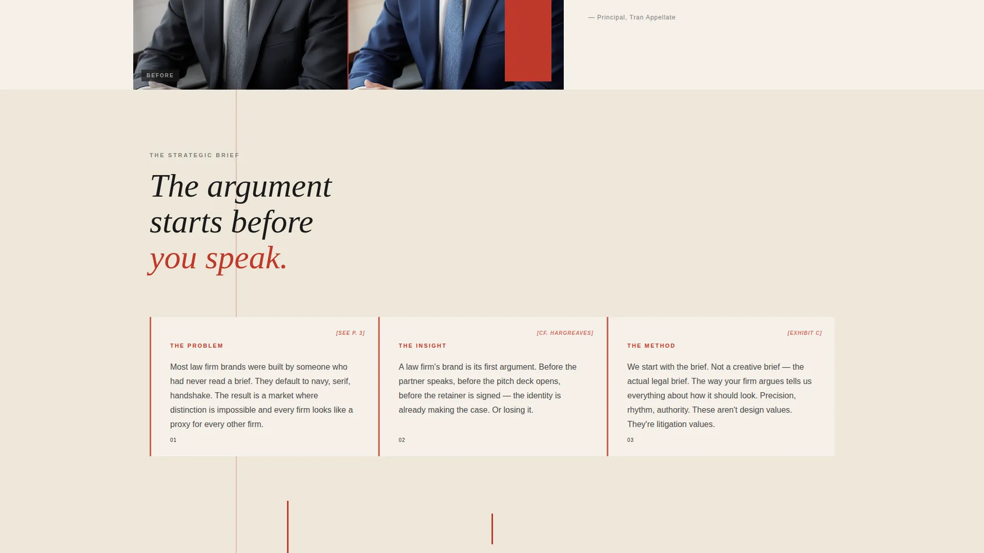
Each scroll section is structured as a discrete case file. Section one shows the client's old brand through a frosted, clinical lens. Section two presents the strategic brief as marginalia and pull quotes on parchment fields. Section three reveals the final identity system shown on business cards, office signage, and courtroom exhibit binders.
Waitlist Intake Form with Live Counter
The primary call to action is a three-field form: firm name, practice area dropdown, and email. Below the form, a live counter displays the number of remaining spots in the current quarterly intake. This creates urgency without manufactured pressure.
Secondary Lead Capture Path
Visitors who are not ready to commit can choose to download a PDF lookbook of past identity transformations. This second path captures email addresses from high-intent browsers who want proof before the next intake window opens.
Redline Annotation Accent System
Interactive elements use a redline annotation red reserved for hover states, active links, and the slider handle. This accent color functions like a literal redline edit dragged across a legal draft, making every interactive moment feel intentional and on-brand.
Page sections overview
| Section | Purpose |
|---|---|
| Before/After Slider | Reveals identity transformation and triggers the headline on first interaction |
| Case File One | Shows the client's original brand in a defocused, clinical visual treatment |
| Strategic Brief Section | Presents agency thinking as marginalia and pull quotes on parchment fields |
| Final Identity Reveal | Displays the finished brand system applied to real business touchpoints |
| Waitlist Intake Form | Captures committed leads with firm name, practice area, and email |
| Live Spot Counter | Shows remaining intake slots to create honest, real-time urgency |
| PDF Lookbook Download | Offers a secondary lead path for visitors who want proof before committing |
Design & branding system
The Counsel template uses the Ink and Paper color system inside a Lens and Frame visual theme. Every design decision echoes the texture and precision of a marked-up legal draft.
- Color palette: deep black ink (#1A1A1A), warm parchment (#F5F0E8), brief-margin gray (#D4CFC6), and redline annotation red (#C0392B) reserved strictly for hover states, active links, and the slider handle
- Typography is set tight against generous whitespace, with every element aligned to an invisible ruling, giving the page the feeling of a freshly printed case file
- The visual language alternates between defocused, clinical photography and sharp, in-context identity shots, creating a deliberate before-and-after textural contrast throughout the scroll
Mobile & speed optimization
The Counsel template is structured to translate its asymmetric desktop layout into a clean, readable single-column flow on smaller screens. The design priorities that make the desktop experience work, deliberate whitespace, tight type, and strong imagery, carry through to mobile without losing hierarchy.
- The 60/40 grid stacks gracefully into a single column on mobile, preserving the case study narrative sequence
- The Before/After Slider, intake form, and live counter are all designed to function within the mobile viewport without layout breakage
- Large imagery sections are intentionally framed for cropping, so the most impactful visual area remains visible at any screen width
How this template helps you convert
Counsel is structured to move visitors along two distinct conversion paths: immediate commitment and deferred proof-seeking. Both paths are designed to capture the lead regardless of where the visitor is in their decision process.
- The Before/After Slider triggers engagement before a single word is read, making the agency's transformation work the first argument rather than a claim buried in copy. The reveal-triggered headline reinforces the message at exactly the right moment.
- The escalating Case Study Narrative raises the stakes with each scroll section, moving from a small rebrand to a full firm launch to a national repositioning. By the time visitors reach the waitlist form, they have seen proof at every scale.
- The dual conversion architecture, a live-counter intake form for ready buyers and a PDF lookbook download for proof-seekers, ensures that no high-intent visitor leaves without exchanging their contact details.
Other information about this template
Counsel is part of a broader set of portfolio and agency landing page templates designed to match the visual sophistication of the work they represent. A few additional details worth knowing before you customize or deploy it.
- The template style is classified as Asymmetric Grid (60/40), which means layout proportions are intentional and should be preserved when adding or swapping content
- The creative direction follows a Case Study Narrative structure, so the scroll order matters: do not reorder sections without considering the narrative escalation built into the sequence
- The header concept is a Before/After Slider, an interactive component that requires at least one slider interaction before the headline appears, making the first move entirely the visitor's
- The waitlist and coming-soon direction means the template is optimized for intake-window campaigns rather than always-open service pages; it can be adapted for ongoing use by removing or replacing the live counter
- The Lens and Frame theme and Ink and Paper color system are paired intentionally; substituting the color palette will affect the overall tonal contrast that makes the legal branding context feel credible
Theme
Lens & Frame
Creative direction
Case Study Narrative
Color system
Ink & Paper
Style
Asymmetric Grid (60/40)
Direction
Waitlist/Coming Soon
Page Sections
Before/after Slider with Triggered Headline
Asymmetric 60/40 Grid Layout
Case Study Narrative Scroll Structure
Waitlist Form with Live Spot Counter
Secondary PDF Lookbook Lead Capture
Redline Annotation Accent System
Related questions
Who is the Counsel template designed for?
Can I use this template for an always-open service page instead of a waitlist?
How does the Before/After Slider header work?
What are the three case study scroll sections?
Does the template support two different lead capture paths?



