Midwifery Legal Resource Landing Page Template
Counsel is a landing page template built for certified nurse-midwife practices and birth center networks that need a credible, organized legal reference resource online. It pairs a dense FAQ-and-comparison-table layout with an authoritative Ink and Paper visual identity, guiding practice directors toward a qualification form through layers of proof, structured content, and trust markers.
by Rocket studio
Quick summary
Counsel is a single-page legal resource template designed for midwifery practices, birth center networks, and professional associations. It presents liability guidance, scope-of-practice checklists, and malpractice scenario content in a structured, FAQ-driven layout. The design feels like a well-organized legal reference binder, authoritative, calm, and immediately useful to a practice director or on-call nurse-midwife.
Who this template is for
This template serves organizations that deliver legal and compliance resources to certified nurse-midwives. It is built for partners who need to establish trust quickly with a clinically busy audience.
- Midwifery practices and solo practitioners seeking a structured online reference resource
- Birth center networks and professional associations offering liability guidance to their members
- Organizations targeting practice directors who make partnership and procurement decisions
What problem this template solves
Certified nurse-midwives (CNMs) often search for liability answers and scope-of-practice guidance late at night, between shifts, with no time to parse dense legal language. A generic webpage cannot hold that audience. This template solves the problem of communicating complex legal content in a way that feels instantly credible and scannable.
- Visitors arrive with urgent, specific questions and leave without a clear answer on poorly structured pages
- Practice directors need density of proof before committing to a partnership or resource subscription
- Standard templates lack the comparison tables and FAQ rhythm needed to serve a compliance-focused audience
What you get with this template
The template delivers a fully structured, single-page layout that alternates between FAQ clusters and comparison tables. Every section is designed to answer a real midwifery legal question and then prove the answer with structured data.
- A press mentions bar, three pull-quote trust cards, and a primary qualification form with a secondary email-gate path
- Alternating FAQ blocks and comparison tables covering state scope matrices, malpractice carrier grids, and credentialing side-by-sides
- A complete Ink and Paper visual system with archival cream backgrounds, ink black body text, ruled-line blue dividers, and burgundy trust markers
Feature list
This section covers the core built-in capabilities that define the Counsel template.
FAQ-Driven Scroll Layout
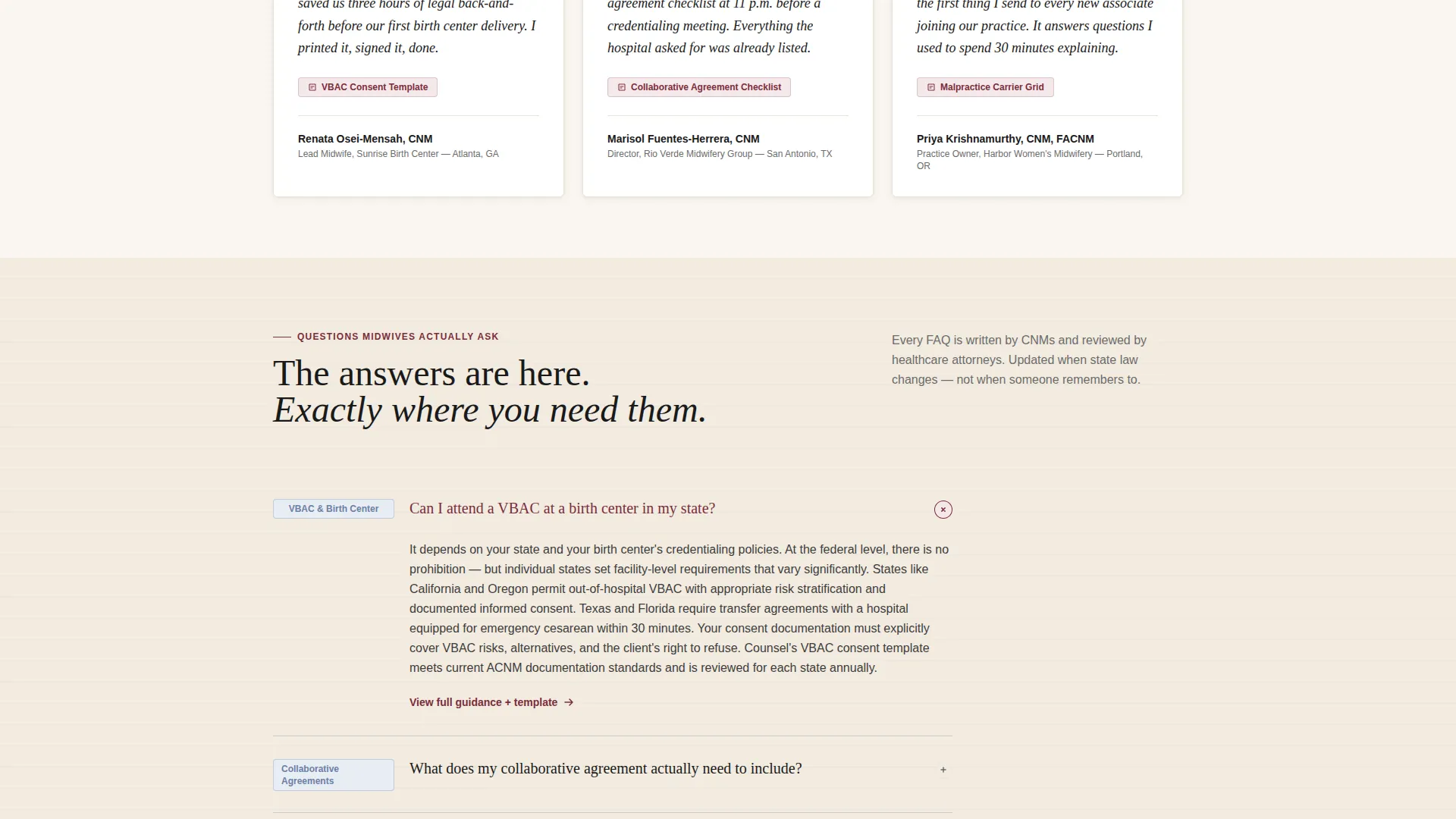
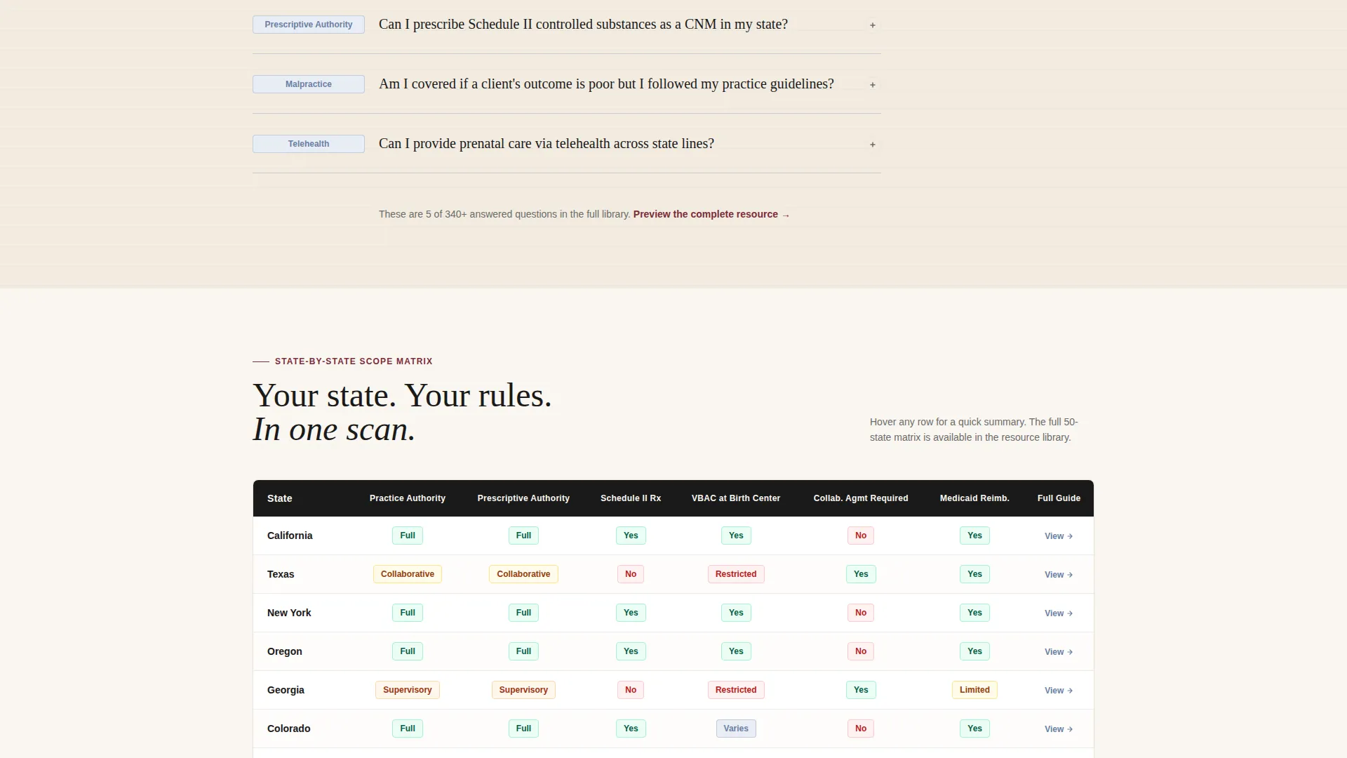
The page is structured around questions that certified nurse-midwives actually ask, such as scope-of-practice limits by state and collaborative agreement requirements. Each answer is partially visible on scroll, drawing the visitor deeper into the content.
Comparison Table Components
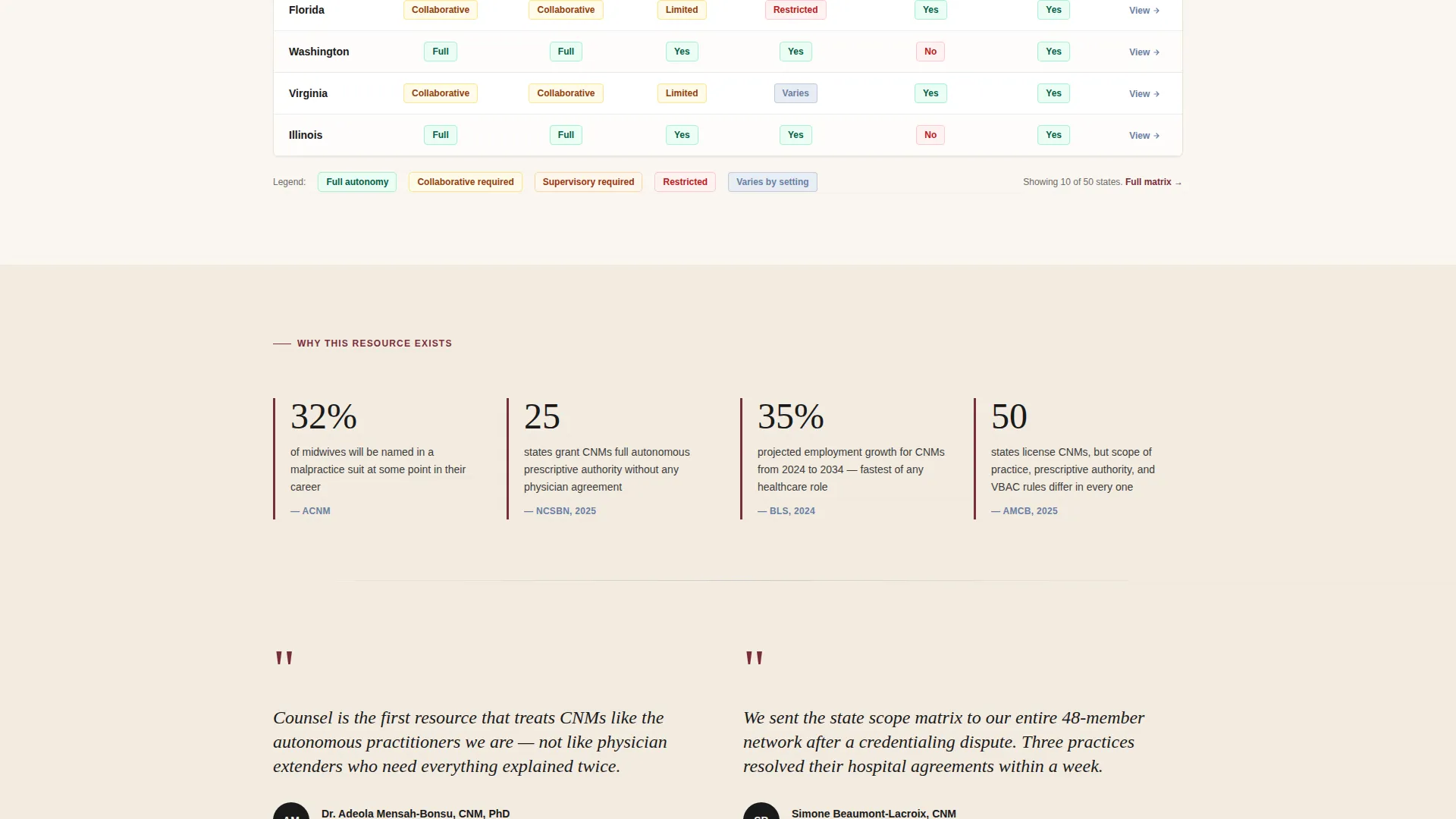
Three types of comparison tables are built into the layout: a state-by-state scope matrix, a malpractice carrier feature grid, and a credentialing requirement side-by-side. Each table row is designed to be scannable in under three seconds.
Press Mentions Bar
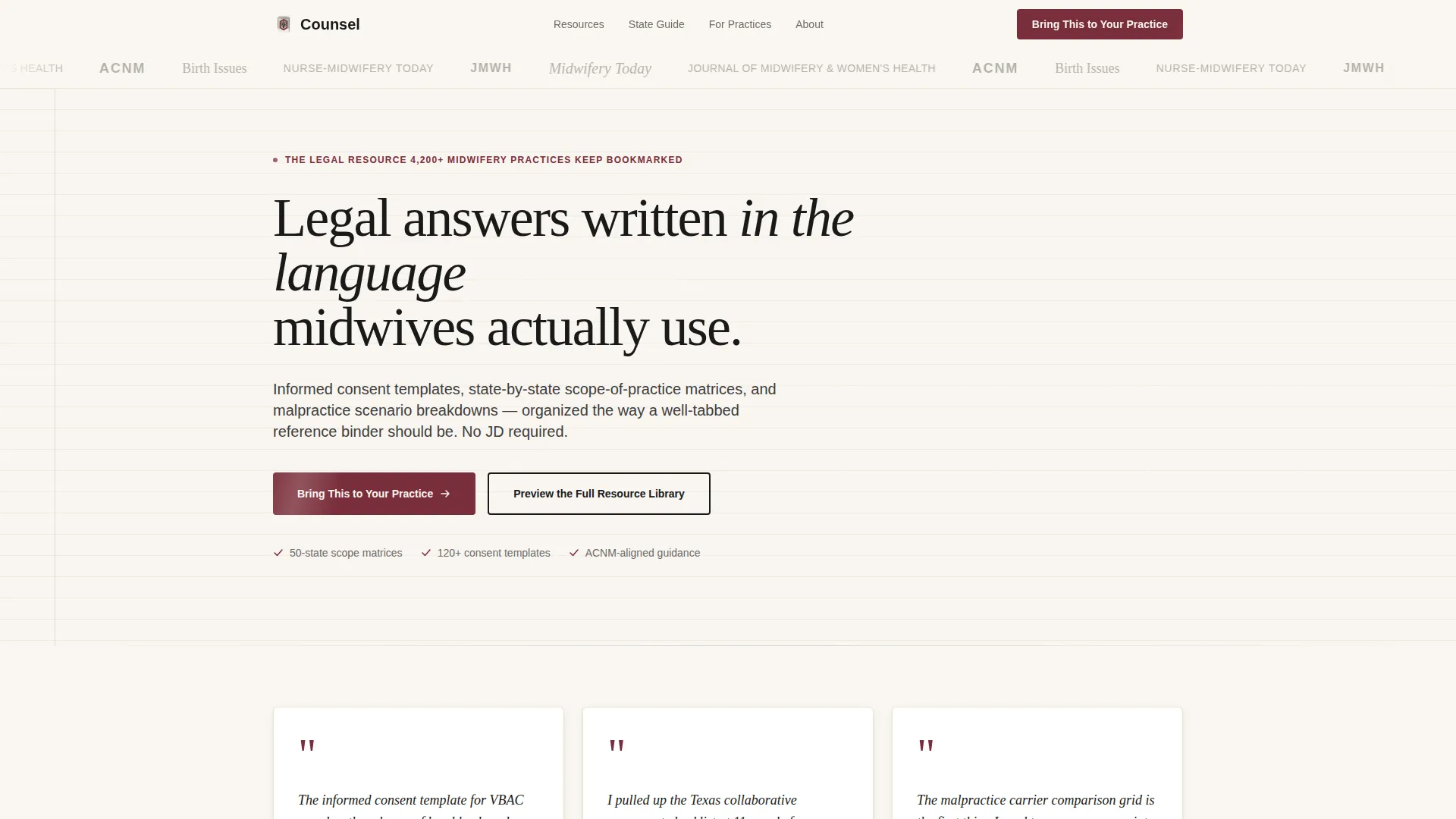
A horizontal scroll bar at the top of the page displays publication logos in desaturated ink tones. It establishes immediate editorial credibility before a visitor reads a single line of body copy.
Pull-Quote Trust Cards
Three named pull-quote cards sit on cream backgrounds with burgundy quotation marks. Each card references a specific resource the practice owner used, grounding social proof in concrete, recognizable content types.
Dual Conversion Path
The primary call to action, labeled "Bring This to Your Practice," opens a short qualification form capturing organization type, number of midwives, and state of licensure. A secondary path offers a resource library preview behind an email gate.
Ink and Paper Visual System
The color system uses archival cream (#FAF6F0) for all backgrounds, fresh black ink (#1A1A1A) for body text, ruled-line blue (#6B7FA3) for table rows and section dividers, and notary-seal burgundy (#7A2E3B) reserved for badges, trust markers, and primary buttons.
Page sections overview
| Section | Purpose |
|---|---|
| Press Mentions Bar | Establishes editorial credibility at first glance |
| Pull-Quote Cards | Provides named, resource-specific social proof |
| FAQ Cluster One | Opens with urgent state-specific scope questions |
| Scope Comparison Table | Visualizes state-by-state practice permissions |
| FAQ Cluster Two | Covers collaborative agreement and consent topics |
| Malpractice Carrier Grid | Compares carrier features side by side |
| FAQ Cluster Three | Addresses telehealth and credentialing questions |
| Credentialing Side-by-Side | Displays requirement differences by setting |
| Primary Qualification Form | Qualifies partnership and B2B leads |
| Email-Gate Preview | Captures secondary leads via library preview |
Design & branding system
The visual identity follows a Legal Shield theme built on the Ink and Paper color system. Every design decision reinforces the feeling of a freshly signed document on cotton bond paper, authoritative without being cold.
- Archival cream (#FAF6F0) dominates all backgrounds; ink black (#1A1A1A) carries all body text at generous sizes; ruled-line blue (#6B7FA3) marks table rows and dividers
- Notary-seal burgundy (#7A2E3B) appears sparingly on badges, trust markers, and primary buttons to signal importance without overpowering the page
Mobile & speed optimization
The Counsel template is designed to remain fully readable and scannable on smaller screens. The dense comparison tables and FAQ rhythm are structured to work across device sizes without losing their utility.
- Comparison tables are built for horizontal scrollability on mobile so no data cell is hidden or truncated
- FAQ blocks stack cleanly in a single-column view, keeping the scroll-and-reveal mechanic intact on touchscreens
How this template helps you convert
The page earns each click through accumulated proof rather than a single persuasive moment. By the time a practice director reaches the qualification form, they have already engaged with multiple layers of relevant content.
- The press mentions bar and pull-quote cards build trust in the first viewport, before any scroll, reducing early bounce.
- The alternating FAQ-and-table rhythm ensures that every visitor encounters at least one answer they needed and at least one table they want to reference again, increasing time on page and form completion intent.
Other information about this template
This template is categorized under Professional Services with a subcategory focus on midwife online presence. It is built for a click-through landing page direction, meaning every section is designed to move a visitor toward one of two conversion actions.
- The template style follows a split-screen approach within the FAQ and table rhythm, keeping content and proof elements side by side where the layout allows
- The header concept draws on data storytelling, using publication logos, named quotes, and structured tables to build a factual, evidence-first narrative
- The creative direction is transparent process, meaning the page shows its work at every step rather than making unsupported claims
- The theme is Service Utility, meaning the page earns trust by being genuinely useful before it asks for anything in return
Theme
Service Utility
Creative direction
Transparent Process
Color system
Monochrome Steel
Style
Split Screen (50/50)
Direction
Click-Through
Page Sections
Faq-driven Scroll Layout
Built-in Comparison Tables
Press Mentions and Trust Bar
Named Pull-quote Cards
Dual Conversion Path
Ink and Paper Visual System
Related questions
What type of organization is this template designed for?
Does the template include the actual legal content, or just the layout?
How does the dual conversion path work?
Can the comparison tables be customized with our own data?
Is this a single-page layout or a multi-page website?



