Staffing Services | Free Website Template | Rocket
Counsel is a split-screen landing page template built for legal and professional temp staffing agencies. It uses a Problem→Solution Arc to move managing partners and general counsel teams from urgent frustration to confident action. The search box drives click-through to a candidate request form, while an editorial visual style and warm color palette build immediate trust.
by Rocket studio
Quick summary
Counsel is a single-page, split-screen landing page template designed for legal temp staffing agencies. It pairs stark problem framing with immediate candidate-card solutions, guiding managing partners and general counsel teams from "we need someone now" to "find your match" in one smooth scroll. The Cloud Canvas color system and Community Hearth theme keep the tone warm, credible, and professionally urgent.
Who this template is for
This template is built for B2B legal staffing agencies that place paralegals, contract attorneys, and compliance specialists on short notice. It speaks directly to the people making placement calls under pressure.
- Managing partners at mid-to-large law firms facing discovery deadlines or sudden associate absences
- General counsel teams at corporations scaling for mergers, acquisitions, or regulatory audits without expanding permanent headcount
- Office managers and legal operations leads who need a vetted candidate this week, not next month
What problem this template solves
Legal teams rarely have time to browse. They arrive with a role, a deadline, and a decision to make. A generic staffing page that leads with company history and ends with a contact form loses them before the first scroll.
- Visitors need to feel understood immediately, not marketed to
- The gap between "we need help" and "here is the person" must be closed visually and fast
- The page must earn the click-through to the intake form by proving specificity before asking for anything
What you get with this template
You get a fully structured, single-page layout built around a search-box conversion mechanic and a scrolling Problem→Solution Arc. Every section has a defined role in moving the visitor toward submitting a candidate request.
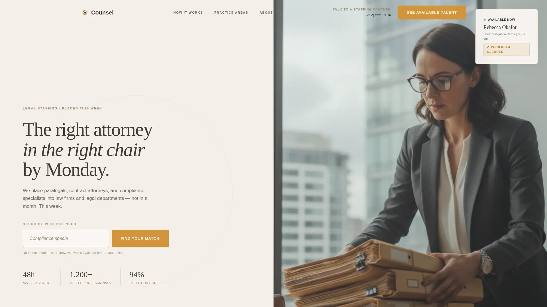
- A 50/50 split-screen hero with a centered search box on the left and an editorial photograph on the right
- Three escalating problem→solution scroll pairs covering discovery surges, regulatory audits, and parental leave coverage scenarios
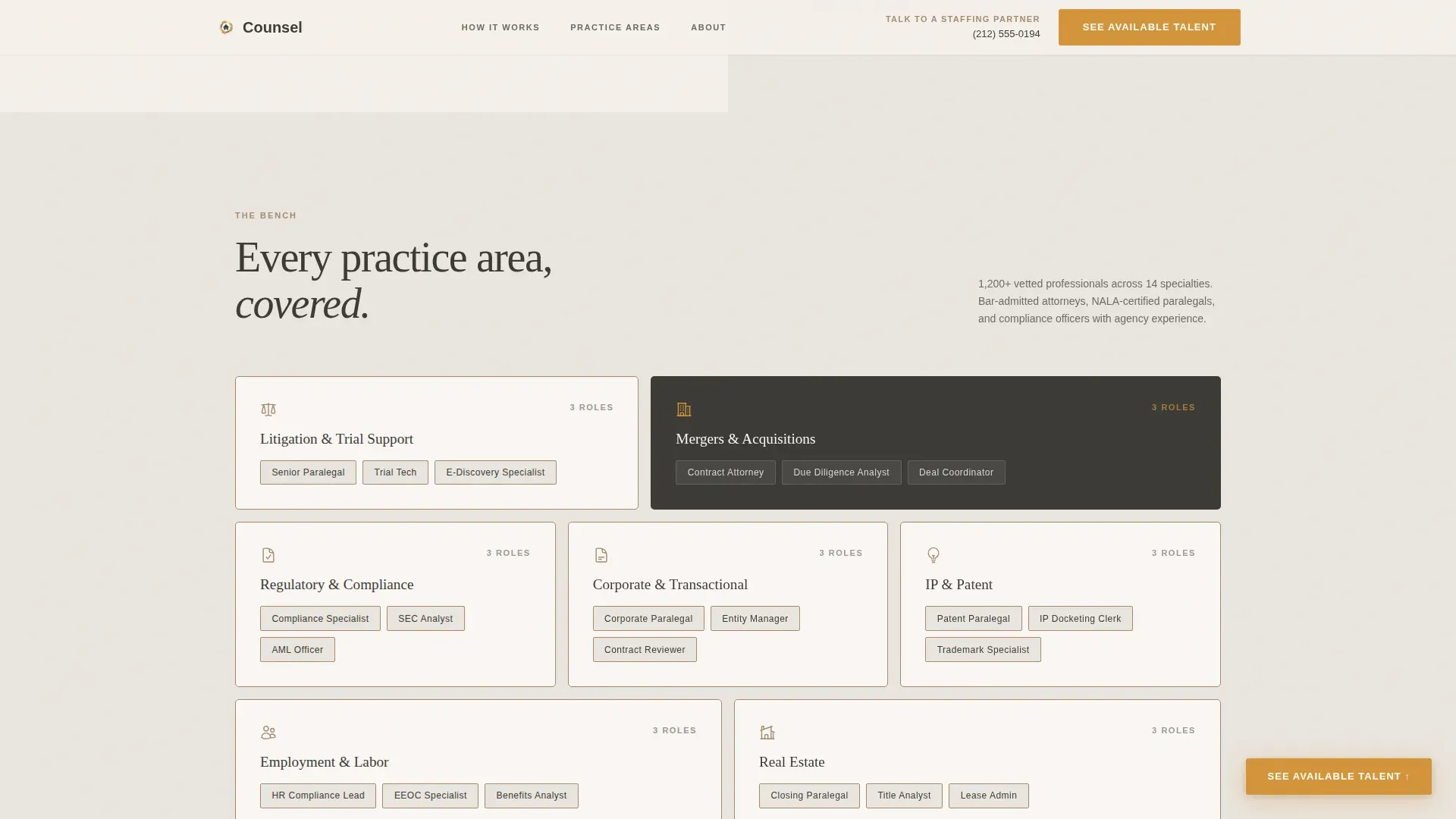
- A bento grid showcasing practice areas and credential tiers, a full-width general counsel testimonial, and a linear single-row footer
Feature list
A paragraph introducing the features: Each component in this template was designed to serve a specific conversion moment. The features below reflect what the prompt specifies as built into the layout and interaction design.
Split-Screen Hero with Search Box
The hero divides the viewport equally. The left half holds a large, softly shadowed search input with ghost text suggesting a real role and availability. A single amber "Find Your Match" button sits below it. The right half displays an editorial-quality photograph of a professional mid-task, reinforcing the message that real, excellent candidates already exist.
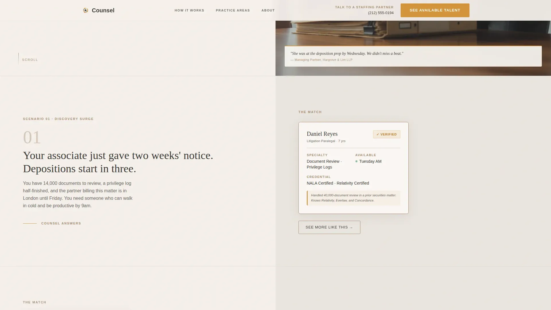
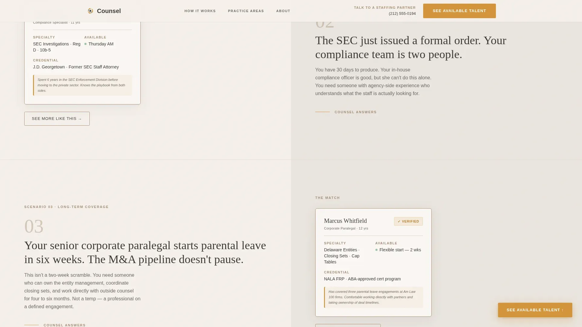
Problem→Solution Arc Scroll Sections
Each scroll section opens with a pressure scenario written in stark charcoal typography on the left panel. The right panel responds with a matching candidate profile card showing name, specialty, availability, and a verified badge. Three scenarios progress from emergency coverage to strategic staffing, building confidence in the depth of the agency's available talent.
Floating Amber Call-to-Action Button
A floating "See Available Talent" button appears after the second problem→solution pair and persists through the close of the page. It uses the amber accent color so it always commands attention without competing with surrounding content.
Practice Area Bento Grid
A bento-style grid section displays the range of practice areas and credential tiers the agency covers. It gives managing partners and general counsel teams a quick visual inventory of what the bench actually looks like across specialties.
Full-Width General Counsel Testimonial
A single full-width testimonial from a general counsel closes the narrative arc. It transitions the tone from "we rescue you" to "we are your permanent flexible layer," reinforcing long-term trust before the final call to action.
Secondary "Talk to a Staffing Partner" Path
A direct phone number and secondary navigation link sit in the top-right of the header. Managing partners who prefer a call over a click can reach a staffing partner without hunting through the page.
Page sections overview
| Section | Purpose |
|---|---|
| Hero Split Screen | Launch search interaction and set editorial tone |
| Problem Arc One | Discovery surge scenario with candidate card response |
| Problem Arc Two | Regulatory audit scenario with compliance profile response |
| The Bench Grid | Display practice areas and credential tiers visually |
| GC Testimonial | Shift tone to strategic partnership and build final trust |
| Final Call to Action | Drive click-through to the candidate request form |
| Linear Footer | Provide single-row navigation and contact reference |
Design & branding system
The visual identity follows a Community Hearth theme built on the Cloud Canvas color system. The palette is designed to feel like a leather portfolio resting on a linen tablecloth: professional without being sterile, warm without being casual.
- Colors: soft parchment white (#F5F0EB) as the primary background, warm charcoal (#3B3A36) for body text and structure, muted clay (#A68B72) on borders and dividers, and steady amber (#D4943A) reserved for buttons, active states, and trust signals
- Typography: Fraunces display serif for headlines paired with DM Sans for body copy, creating editorial authority with clean readability
- Backgrounds alternate between parchment and a warm gray (#EAE5DF) to create section rhythm, while amber appears no more than twice per viewport to preserve its command of attention
Mobile & speed optimization
The template is designed desktop-first to match the primary audience of managing partners working at desks. It is built to scale responsively to tablet viewports as well.
- Static sections use Server Components to keep non-interactive content lightweight and fast to render
- The search interaction is isolated as a Client Component, so dynamic behavior loads only where it is needed
- GSAP scroll reveals, stagger animations, and reveal-up text effects are applied at medium intensity to stay smooth without overloading the experience
How this template helps you convert
The entire page structure is engineered around a single conversion goal: getting the visitor to click through to the candidate request form. Every element earns that click before asking for it.
- The search box opens the conversion funnel from the first second. Typing a role and skill into the input creates momentum, making the visitor feel they are already in motion before any form appears.
- The Problem→Solution Arc builds credibility scroll by scroll. By the time the visitor reaches the final call to action, they have already seen their exact scenario reflected back at them with a specific, vetted candidate answer.
- The floating amber button and the secondary phone path together ensure no visitor leaves without a clear next step, whether they prefer to click or call.
Other information about this template
This template is designed for legal and professional temp staffing agencies operating in the United States, with language, date formatting, and market references calibrated for the US legal market, including New York City contexts. The amber color is used with strict restraint across the layout to ensure every trust signal and call-to-action element retains visual weight.
- Animation is handled through GSAP with scroll reveals, staggered entrance timing, and candidate card hover states for a polished but purposeful interactive feel
- Candidate profile cards include verified badge indicators and display name, specialty, and availability at a glance
- The page carries no form fields beyond the hero search box, keeping the experience frictionless until the dedicated intake form on the following page
Theme
Community Hearth
Creative direction
Problem→Solution Arc
Color system
Cloud Canvas
Style
Split Screen (50/50)
Direction
Click-Through
Page Sections
Split-screen Hero with Search Input
Problem→solution Arc Scroll Design
Candidate Profile Cards with Verified Badges
Practice Area Bento Grid
Floating Amber Conversion Button
Full-width General Counsel Testimonial
Related questions
Does this template include a contact or intake form?
Who is the primary audience this page is written for?
Can the problem and solution scroll sections be adapted to different scenarios?
What happens when a visitor uses the search box?


