Certified Regional & Specialty Restaurant Portfolio & Case Study Website Template
Omakase is a warm artisan gallery landing page built for a twelve-seat chef counter experience. It uses a Desert Rose color system, cinematic scroll-driven course photography, and a single-minded reservation path. Every section earns the click by pulling visitors deeper into the meal before asking them to book.
by Rocket studio
Quick summary
Omakase is a gallery and detail landing page for a reservation-driven chef counter. It leads visitors through a slow, full-width course procession before surfacing a focused booking call to action. The Desert Rose palette, editorial typography, and GSAP scroll animations make the experience feel as considered as the meal itself.
Who this template is for
This template is built for fine dining restaurant owners and operators who need a page that does more than list a menu. It suits any single-location, reservation-only establishment where atmosphere and craft are the primary selling points.
- Omakase sushi bars and intimate chef counter restaurants
- Fine dining venues driven by a single-chef narrative
- Restaurant operators targeting anniversary couples, food-obsessive diners, and corporate client dinner bookings
What problem this template solves
Generic restaurant websites lose the plot. They show menus, hours, and a contact form, and none of that communicates why this meal is worth traveling for. The omakase experience is inherently hard to sell with words alone.
- Visitors arrive without context and leave before they feel the pull of the counter
- Standard layouts cannot pace the story the way the dining experience actually unfolds
- Reservation intent gets buried under navigation clutter instead of being earned through desire
What you get with this template
You get a fully structured, single-page layout that walks visitors through the experience course by course before asking for the booking. Every section has a defined role and a deliberate visual weight.
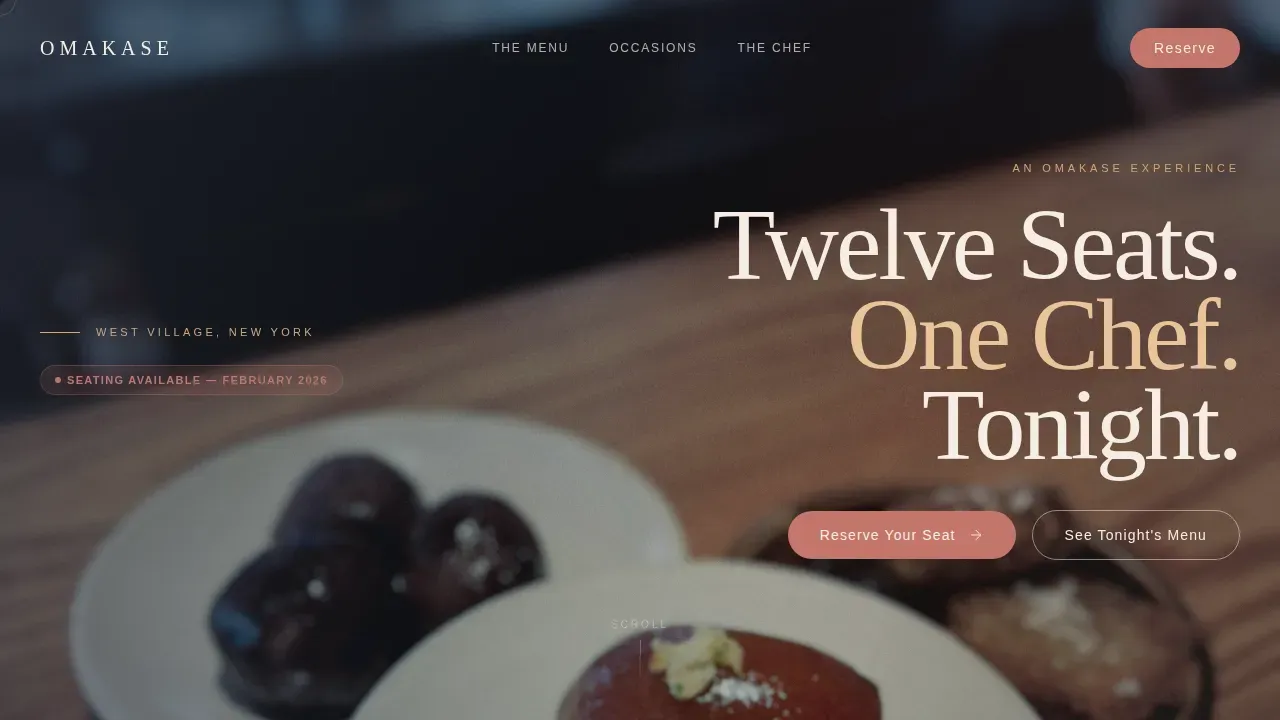
- A cinematic hero with an asymmetric lifestyle shot and a vertical display headline
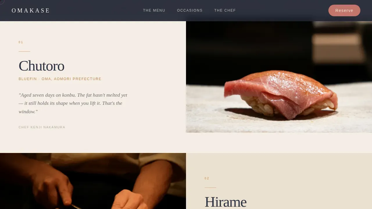
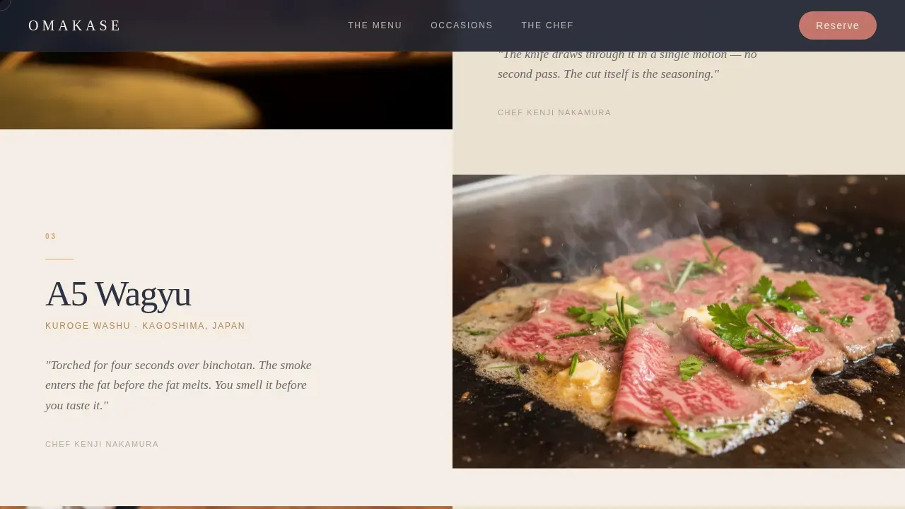
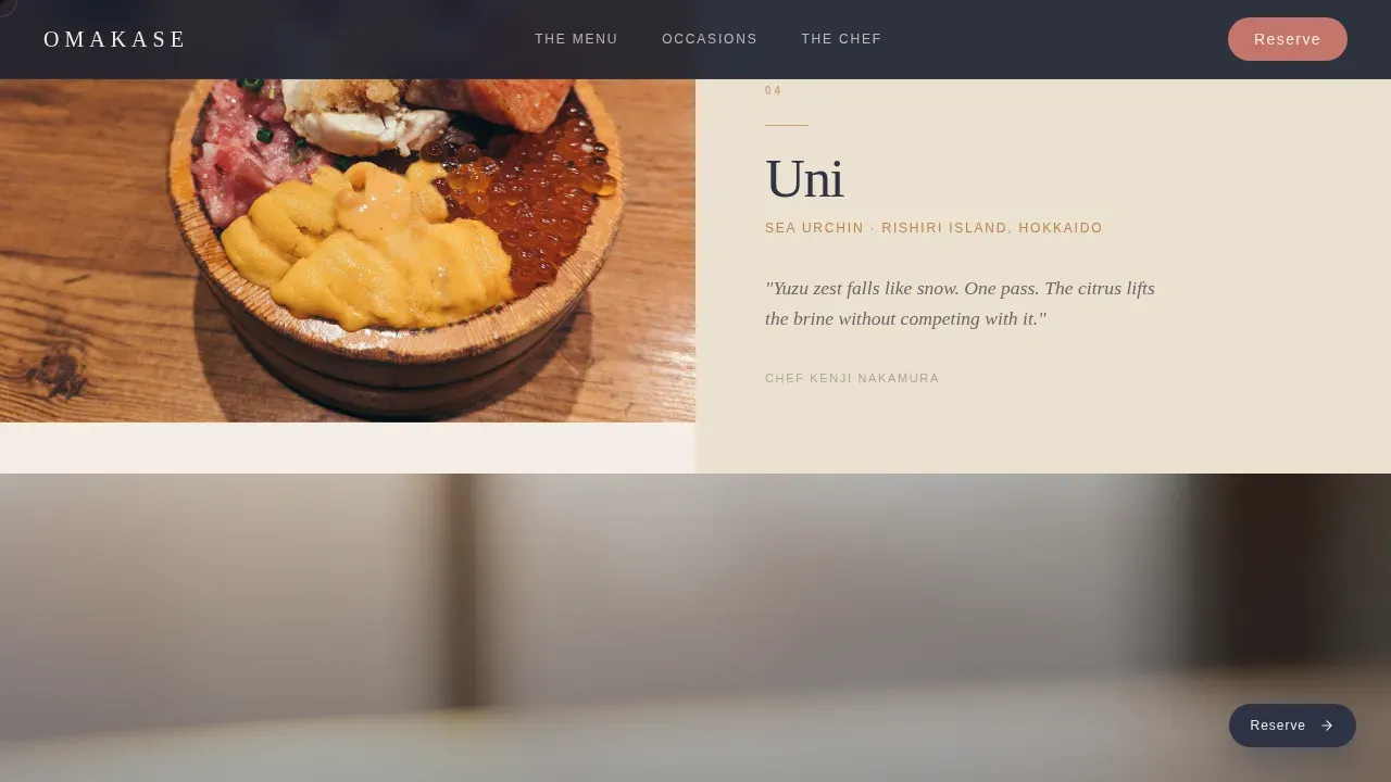
- A five-course gallery walk with full-width imagery, slide-in detail panels, and chef's notes per course
- Occasion targeting cards, a chef credibility section, and a scarcity-anchored reservation call to action
Feature list
The template ships with interconnected sections and interactive behaviors built around one goal: making the visitor feel the counter before they reach the booking step.
Cinematic Hero Section
A tight lifestyle photograph fills the header from the guest's point of view. Two hands rest on a hinoki counter with a single piece of chutoro nigiri centered in shallow depth of field. The vertical headline "Twelve Seats. One Chef. Tonight." sits in brushstroke-weight display type on the right.
Scroll-Driven Gallery Walk
Five full-width course images unfold as the visitor scrolls. Each image is paired with a detail panel that slides in on scroll, showing the course name, its origin, and one sentence from the chef on why it is on tonight's menu. Pacing deliberately slows as the scroll deepens.
Fixed Progressive Call to Action
A "Reserve Your Seat" button appears as a subtle fixed element in noren indigo after the third course image. It grows more prominent with scroll depth. Clicking passes directly through to a booking widget with date, party size, and seating preference already contextualized.
Occasion Targeting Cards
Three bento-style asymmetric occasion cards address the three primary visitor types: Anniversary, Pilgrimage, and Client Dinner. Each card speaks directly to the reader's reason for being on the page.
Chef Credibility Section
A split asymmetric layout places the chef portrait alongside a provenance story and accolades. This section grounds the luxury price point and answers the visitor's unspoken question about who is behind the counter.
Gift Experience Path
A secondary call to action, "Gift the Experience," runs alongside the primary reservation button. It targets gift-givers browsing on behalf of someone else without disrupting the primary conversion path.
Page sections overview
| Section | Purpose |
|---|---|
| Cinematic Hero | Open with atmosphere and headline |
| Gallery Walk Courses | Pace the tasting story visually |
| Occasion Targeting Cards | Address specific visitor intent |
| Chef Credibility | Build trust through provenance and craft |
| Reservation Call to Action | Convert with scarcity and clarity |
| Footer | Close with logo, tagline, and links |
Design & branding system
The visual identity follows a Warm Artisan theme. The Desert Rose color system draws from sun-baked clay, aged wood, and rice-paper white to create an atmosphere that feels intimate and unhurried rather than polished or corporate.
- Background surfaces use rice-paper white (#F5EDE3) and soft clay (#C4756B), with noren indigo (#2C3345) anchoring all typography
- Hover states and reservation highlights use the desert rose accent as a blush of heat against cooler backgrounds
- Typography pairs Fraunces (a high-contrast serif used for display headings) with DM Sans (a clean humanist sans-serif used for body copy and labels)
Mobile & speed optimization
The template is designed desktop-first, reflecting how luxury dining decisions are typically made, while maintaining full mobile parity. Scroll-triggered animations use GPU-accelerated transforms to keep motion smooth across devices.
- CSS smooth scroll and Intersection Observer handle all reveal triggers without heavy JavaScript overhead
- GSAP parallax layers and staggered course reveals are scoped to preserve visual quality on both desktop and mobile viewports
- The fixed call to action adapts its prominence based on scroll depth, remaining functional and unobtrusive across all screen sizes
How this template helps you convert
The page is structured to earn the reservation click rather than ask for it upfront. Desire builds through the gallery, then scarcity closes the loop.
- The five-course gallery walk immerses the visitor in the experience before any booking prompt appears, building genuine intent before the call to action surfaces
- The scarcity signal, twelve seats, one chef, appears at the reservation section alongside both the primary booking path and the secondary gift path, giving every visitor a clear next step
Other information about this template
This template is suited to any reservation-driven food and beverage concept where visual storytelling does the selling. The footer follows a split layout with the logo and tagline on the left and navigation links on the right.
- The page carries no on-page reservation form; all booking intent passes through to an external widget, keeping the page clean and the experience uninterrupted
- Social proof is built into the structure through chef credentials, ingredient provenance notes, and occasion-specific testimonial positions
- The cursor warmth effect and gallery hover states add tactile interactivity that reinforces the artisan, hands-on tone of the brand
- The template is localized for English-language audiences, United States dollar pricing, United States date formatting, and a New York City dining context
Theme
Warm Artisan
Creative direction
Gallery Walk
Color system
Desert Rose
Style
Gallery + Detail
Direction
Click-Through
Page Sections
Cinematic Asymmetric Hero
Scroll-driven Course Gallery
Progressive Fixed Reservation Button
Occasion Targeting Cards
Chef Credibility Split Section
Dual Conversion Paths
Related questions
Does this template include an on-page reservation form?
Can I adapt this template for a different type of fine dining restaurant?
How many courses does the gallery walk section support?
Who is the secondary call to action designed for?
Is this template desktop-first or mobile-first?



