DMV Community Office Landing Page Template
Counter is a sidebar companion landing page built for a community Department of Motor Vehicles office. It combines a smart service search bar, live wait time displays, life-event FAQ clusters, and a multi-step appointment booking form. The design feels warm and trustworthy, so residents know exactly what to bring, how long to wait, and how to reserve their spot before leaving home.
by Rocket studio
Quick summary
Counter is a single-page DMV community office landing page that removes the dread from government service visits. A centered search bar surfaces the right service instantly. A sticky sidebar checklist builds alongside your selections. Live wait times, document guides, and a straightforward appointment form do the heavy lifting so residents arrive prepared, not anxious.
Who this template is for
This template is built for local government offices and civic technology teams that operate or support a Department of Motor Vehicles location. It works equally well for municipal web teams managing a community service portal.
- DMV offices and county government web teams publishing resident-facing service information
- Civic tech developers building appointment and queue management portals for public offices
- Local government agencies that want to modernize a resident services landing page without overcomplicating the experience
What problem this template solves
Most government service pages bury the information residents actually need. People show up with the wrong documents, wait longer than expected, or abandon the process entirely because the online portal timed out. This template puts clarity front and center.
- Residents cannot quickly find which documents they need for their specific service type
- Wait time uncertainty keeps people from committing to a visit or choosing the best office location
- Appointment booking flows on government sites are often confusing, multi-page, and error-prone
What you get with this template
You get a fully designed, single-page DMV landing page with a sidebar companion layout built around the Industry Report creative direction. Every section earns resident trust through data and structure rather than decorative imagery.
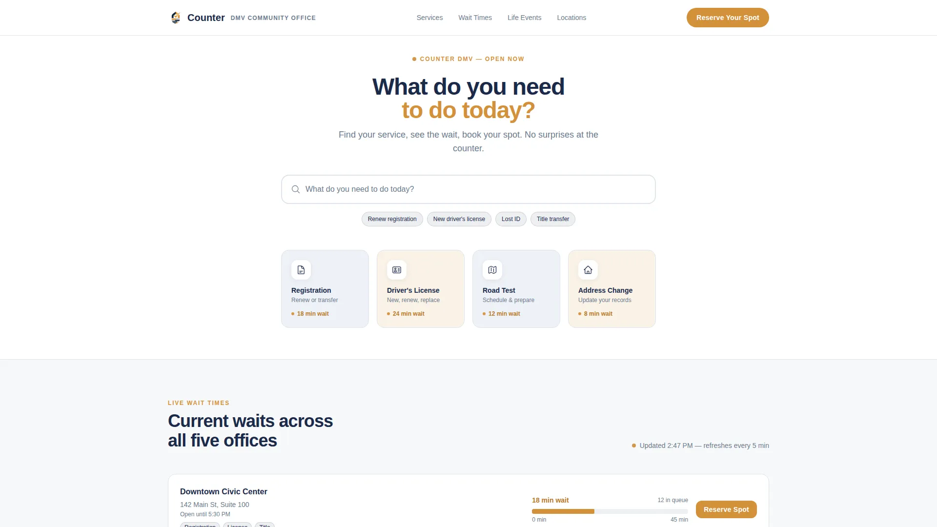
- A smart search bar section with predictive service suggestions and four icon tiles showing live amber wait time indicators
- A sticky sidebar checklist that builds a personalized document list, estimated fees, and nearest office options as the resident selects their service
- A multi-step appointment booking form and a secondary walk-in path with live office wait estimates
Feature list
This template ships with a focused set of interactive and visual components. Each one is designed to reduce friction and increase resident confidence before they ever leave the house.
Smart Service Search Bar
A centered search input with ghost text reading "What do you need to do today?" surfaces predictive suggestions as the resident types. Options include renewing registration, replacing a lost identification card, scheduling a road test, and updating an address. Four icon tiles below the search bar display the most-requested services alongside real-time amber wait time figures.
Sticky Sidebar Checklist Companion
The persistent sidebar tracks the resident's selected service as they scroll. It builds a live checklist of required documents, estimated fees, and the nearest office locations. This component keeps the most useful information visible without forcing the resident to scroll back up or open a new tab.
Live Wait Time Bar Charts
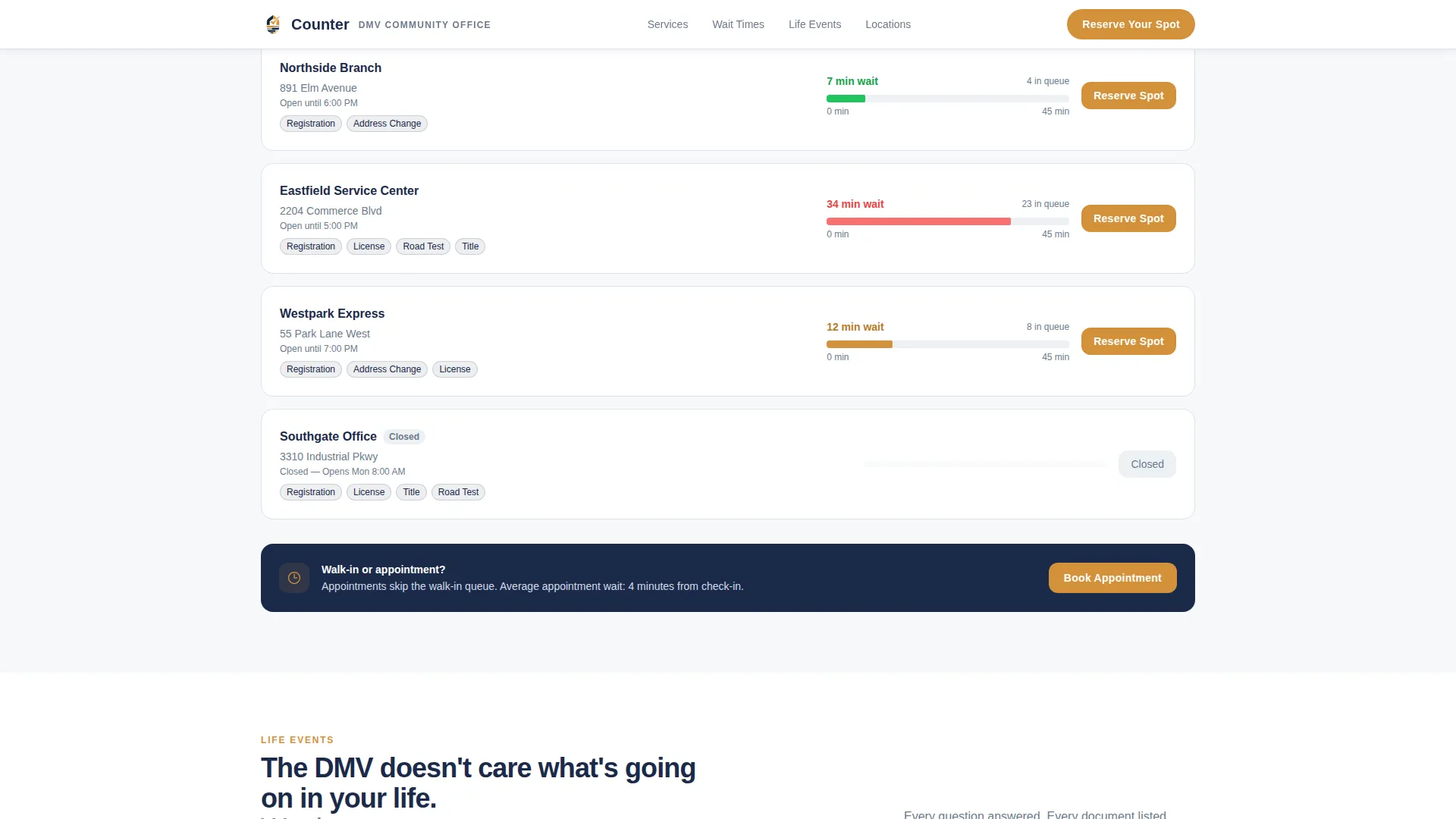
Current average wait times by office location are rendered as horizontal bar charts with scroll-reveal fill animations. The display gives residents a clear, data-driven reason to choose a specific location or time of day. The amber accent color marks wait time figures so they stand out immediately.
Life Event FAQ Clusters
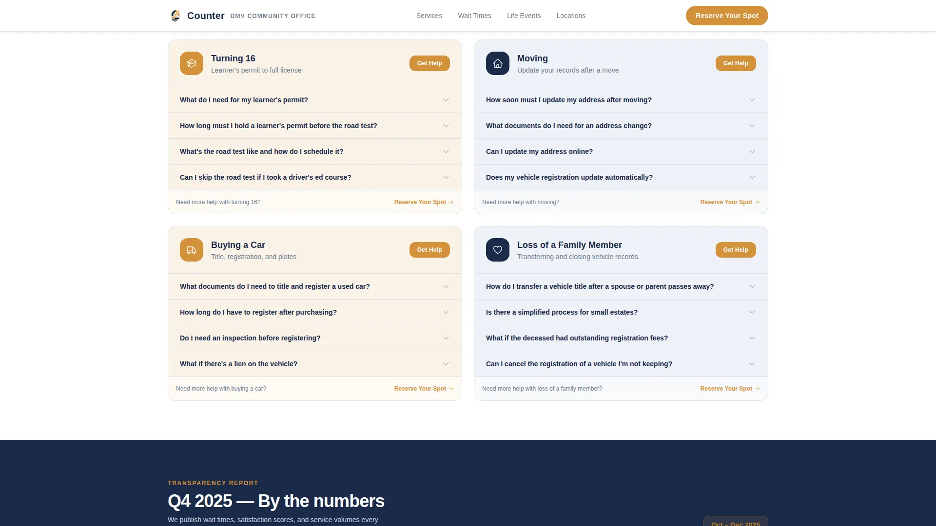
Expandable FAQ sections are organized by real life situations rather than service codes. Clusters cover Moving, Turning 16, Buying a Car, and Loss of a Family Member. Each cluster opens to reveal the specific steps, documents, and fees relevant to that event, written in plain language.
Multi-Step Appointment Booking Form
The booking form asks for service type first, then preferred location, then date and time. Each selection narrows the next field's available options in real time. A secondary call-to-action path labeled "Walk In Today" displays live wait estimates by office so residents who cannot wait for an appointment still have a guided option.
Quarterly Trust Stats Snapshot
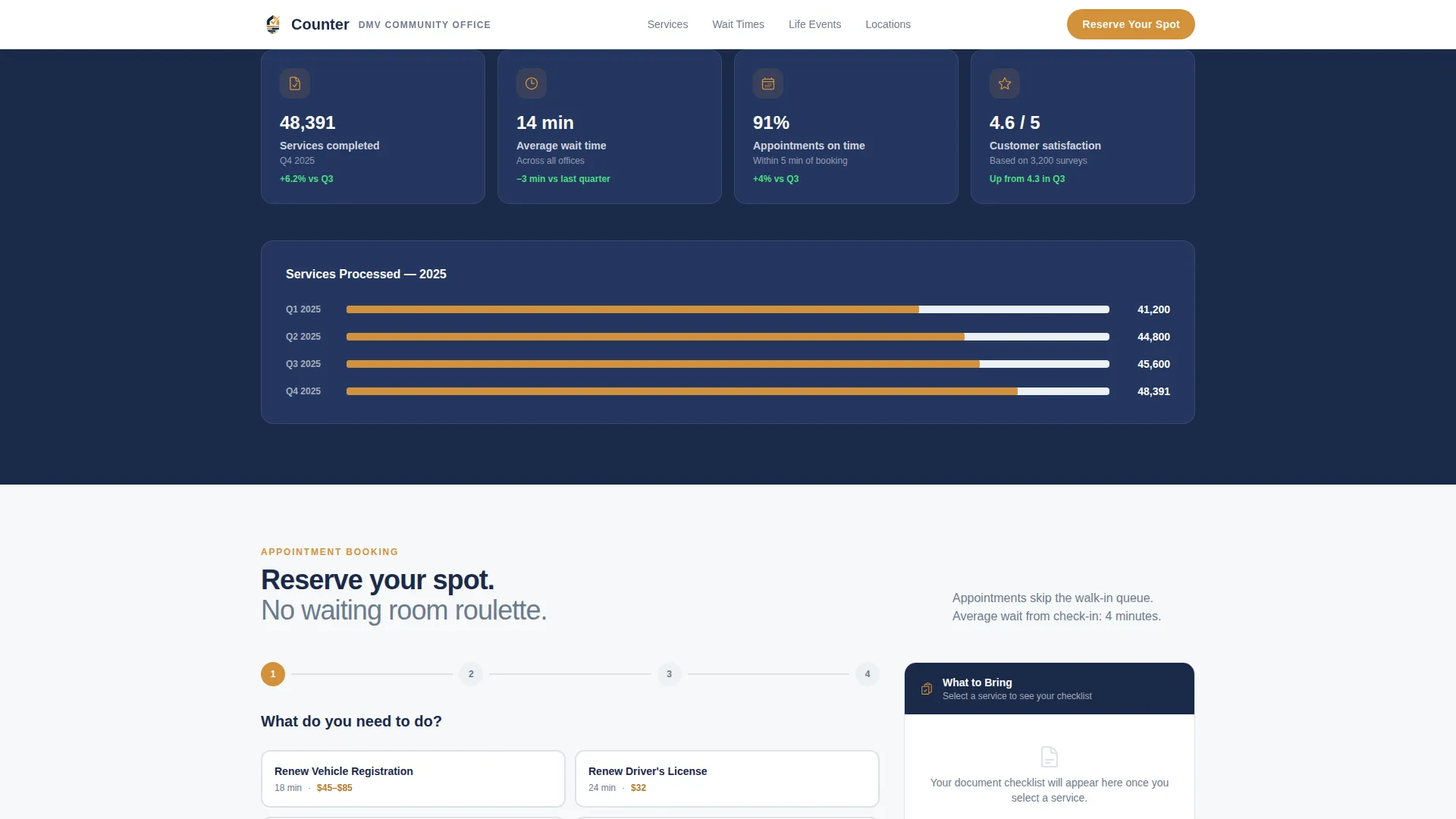
A dedicated section presents a quarterly snapshot of total services processed. This transparent display of volume and activity builds institutional credibility without resorting to stock photography or generic testimonial quotes.
Page sections overview
| Section | Purpose |
|---|---|
| Service Search Hero | Surfaces the right service instantly via predictive search and four icon tiles with live wait times |
| Live Wait Times | Horizontal bar charts show current average wait by office location |
| Life Event FAQs | Expandable clusters guide residents through Moving, Turning 16, Buying a Car, and Loss of a Family Member |
| Appointment Booking | Multi-step form with real-time field narrowing and sticky sidebar checklist |
| Trust Stats Snapshot | Quarterly services-processed figures build institutional credibility |
| Footer | Linear single-row footer with essential office links and contact details |
Design & branding system
The visual identity follows a Community Hearth theme layered over a Navy Authority color system. The result feels like a freshly renovated government building: trustworthy, warm, and easy to read.
- Core palette uses deep institutional navy (#1B2A4A) for primary structure, warm civic gray (#6B7B8D) for supporting text, clean form-field white (#F7F8FA) for inputs and card backgrounds, and steady amber (#D4913B) reserved for buttons, badges, wait time figures, and appointment confirmations
- Typography pairs Plus Jakarta Sans for headings with DM Sans for body text, producing a readable hierarchy your grandmother can follow without squinting
- Animations are set to medium intensity with scroll reveals on content sections and bar chart fill animations on the wait time display, keeping the page lively without feeling flashy
Mobile & speed optimization
The template is designed desktop-first with the sidebar companion as the primary interaction pattern. On smaller screens, the layout stacks responsively so residents on mobile devices still access every feature.
- The sticky sidebar collapses into an inline checklist panel on mobile, keeping document and fee information accessible without competing for screen space
- Interactive components including the search dropdown, multi-step booking form, and expandable FAQs are built as client-side components, while static content sections use server-side rendering to keep initial load lightweight
- The search suggestion dropdown and multi-step form use real-time field narrowing, so mobile users complete the booking flow with fewer taps and less back-and-forth
How this template helps you convert
Every design and layout decision in this template is aimed at one outcome: getting the resident to book an appointment or confidently walk in. The page removes the unknowns that cause people to procrastinate or abandon the process.
- The live wait time display and quarterly stats snapshot show residents real data upfront, replacing vague government language with specific, trustworthy figures that make the visit feel manageable.
- The sticky sidebar checklist means the resident never loses track of what they need to bring, turning the "Reserve Your Spot" call-to-action into a confident next step rather than a leap of faith.
- The "Walk In Today" secondary path with live office estimates captures residents who need same-day service, so no potential visitor is lost simply because an appointment slot is not immediately available.
Other information about this template
This template is part of a broader library of civic and government service page designs. It is a strong fit for any US government services digital initiative that needs to balance institutional credibility with genuine resident usability.
- The sidebar companion layout pattern is suited to service-heavy pages where resident context changes as they navigate, making it a practical choice beyond DMV use cases, such as county clerk offices or permit departments
- The Industry Report creative direction prioritizes data and transparency over promotional language, which aligns naturally with public sector communication standards
- The localization settings are configured for English, US dollar amounts, and the MM/DD/YYYY date format used across US government services
- The footer follows a linear single-row pattern, keeping the page clean and preventing the footer from competing with the primary appointment booking call-to-action
Theme
Community Hearth
Creative direction
Industry Report
Color system
Navy Authority
Style
Sidebar Companion
Direction
Event Registration
Page Sections
Smart Service Search Bar
Sticky Sidebar Checklist
Live Wait Time Display
Life Event FAQ Clusters
Multi-step Appointment Form
Quarterly Trust Stats Snapshot
Related questions
Can I customize the service types listed in the search bar suggestions?
Does the sidebar checklist update based on what a resident selects?
How does the multi-step appointment booking form work?
Is this template suitable for a government office with multiple locations?
What is the primary call-to-action on this landing page?