Audiology Services Landing page Template
This split-screen landing page is built for audiology practices that want patients to trust the billing process before they ever pick up the phone. It leads with three bold stat blocks, walks visitors through accepted plans and claim timelines, and closes with a coverage-check form. The design is clinical-soft, stats-first, and conversion-ready.
by Rocket studio
Quick summary
This single-page template helps audiology practices turn billing confusion into patient confidence. It opens with a typographic hero displaying key stats, then walks visitors through accepted insurance plans, out-of-pocket cost estimates, and a plain-language explanation-of-benefits breakdown. The page closes with a coverage-check form and a sticky mobile call-to-action bar.
Who this template is for
This template is built for audiology practices that handle insurance billing in-house and want to reduce patient anxiety before the first appointment. It works equally well for office managers tired of fielding basic coverage questions over the phone.
- Patients with referral slips wondering whether hearing aids are covered by their plan
- Audiology office managers dealing with a high volume of denied claims
- New patients searching for plain-language answers to insurance coverage questions at any hour
What problem this template solves
Insurance paperwork stops patients from booking. They do not know their out-of-pocket cost, they fear a surprise bill, and they abandon the process before they even call. This template removes each of those friction points one section at a time.
- Patients leave without booking because they cannot confirm their coverage ahead of time
- Offices spend valuable staff hours explaining basic billing concepts over the phone
- Denied claims and unclear pre-authorization steps create distrust between patients and the practice
What you get with this template
You get a fully structured, single-page audiology insurance and billing landing page. Every section is designed to answer a specific patient fear before presenting a next step.
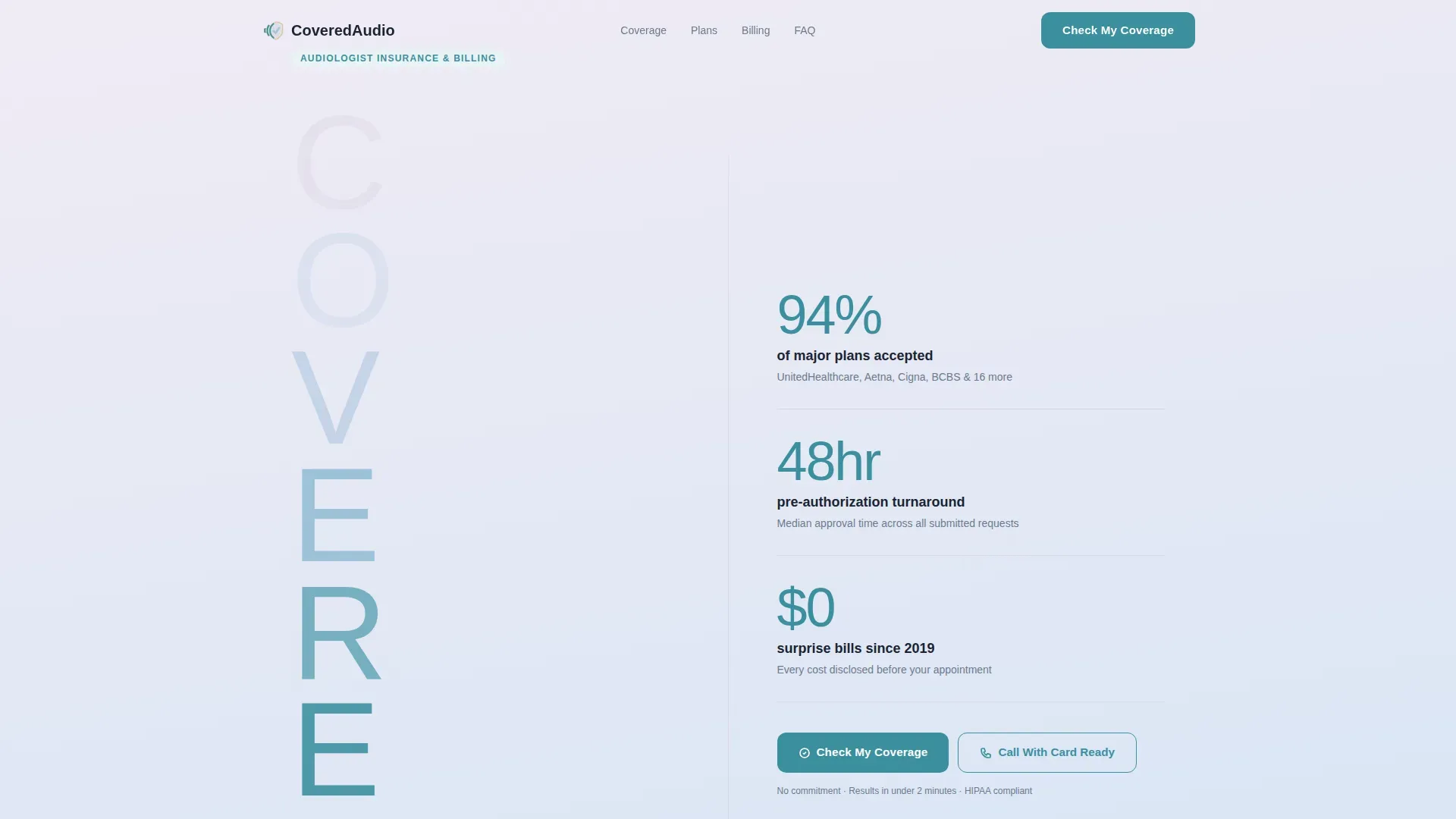
- A split-screen hero with a stacked typographic tower on the left and three bold stat blocks on the right
- Five content sections covering accepted plans, claim timelines, out-of-pocket costs, a real explanation-of-benefits example, and a coverage-check form
- A sticky mobile call-to-action bar and a click-to-call button as a secondary conversion path
Feature list
This template ships with a focused set of interactive and visual components, all drawn from the project brief and designed around the audiology billing use case.
Stats-First Hero Layout
The left half of the hero displays the word "COVERED" as a stacked typographic tower. Each letter shifts in opacity from lavender to teal as the eye travels down. The right half holds three bold stat blocks: 94% of major plans accepted, 48-hour pre-authorization turnaround, and zero surprise bills since 2019. No imagery is used; the numbers carry the visual weight.
Coverage Check Form
A full-width booking form lets visitors confirm their insurance coverage in three fields: a dropdown of the top 20 carriers plus an "Other" option, a member ID field, and a preferred appointment window selector covering morning, afternoon, and evening. The form is the primary conversion point on the page.
Explanation-of-Benefits Section
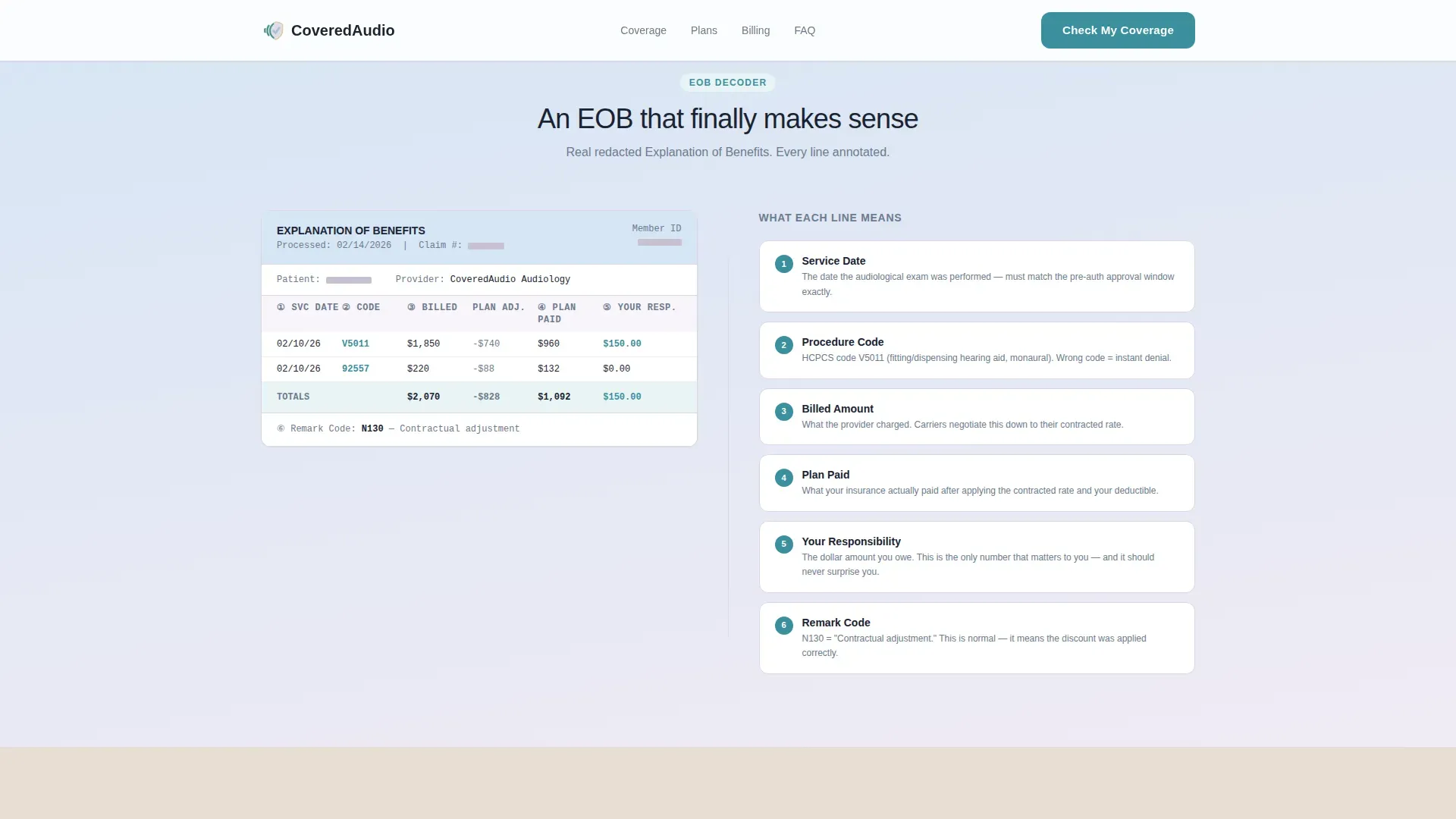
Section four presents a redacted explanation-of-benefits document on the left side of the split screen. The right side provides an annotated breakdown in plain language, so patients understand exactly what each line means before their appointment.
FAQ Accordion
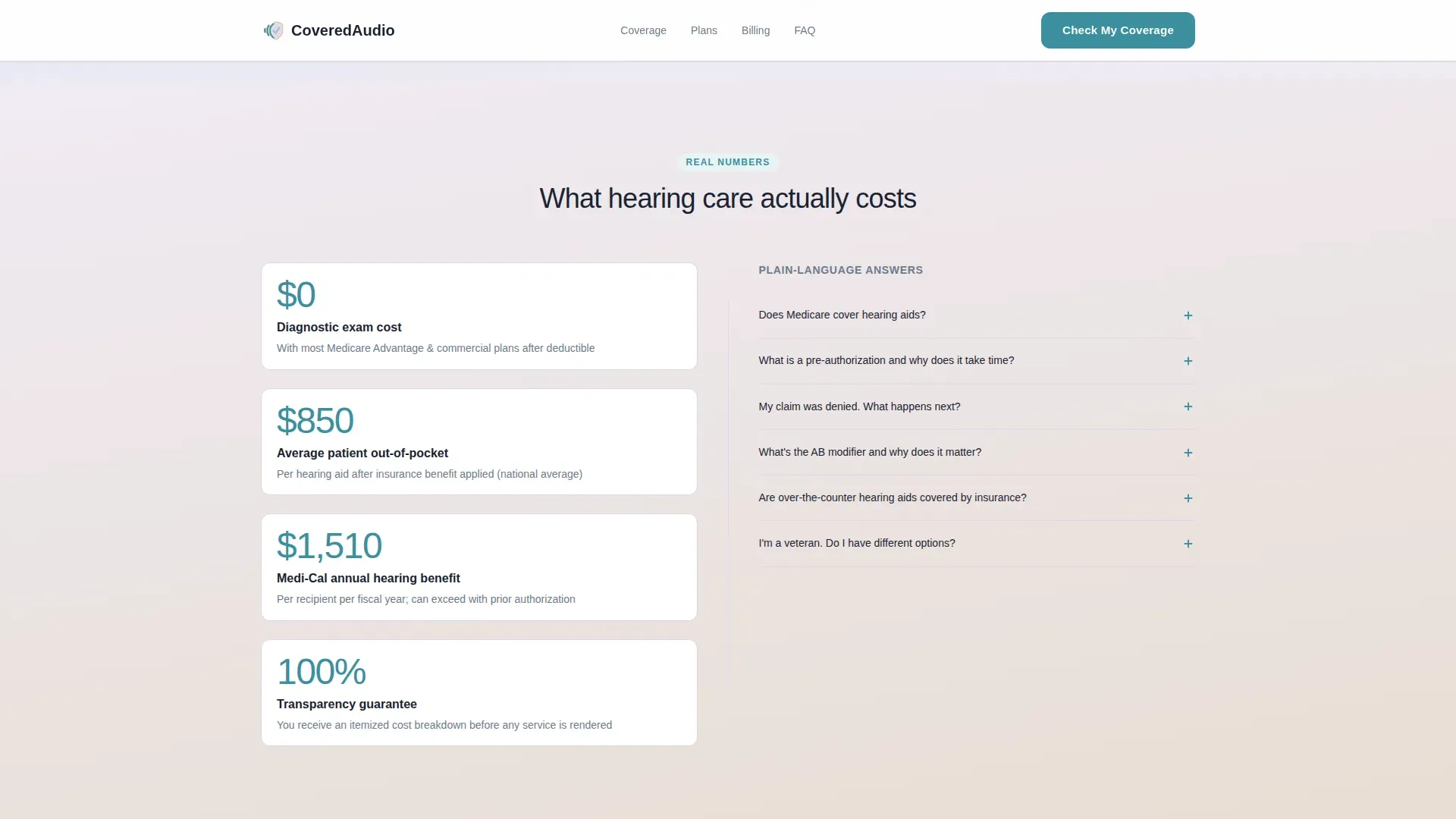
Section three pairs large teal out-of-pocket cost numerals on the left with a plain-language frequently-asked-questions accordion on the right. Each question and answer is written to address common insurance coverage fears without medical jargon.
Scroll-Triggered Stat Counters
Key numbers across the page animate on scroll with staggered reveals and counter animations. This keeps the stats-first scroll rhythm intact: a number appears, context follows, and the next number lands harder.
Sticky Mobile Call-to-Action Bar
On mobile, a persistent bottom bar keeps the primary "Check My Coverage" action visible at all times. A secondary "Call Us With Your Card Ready" click-to-call button gives visitors an alternative path for immediate assistance.
Page sections overview
| Section | Purpose |
|---|---|
| Hero Split Screen | Lead with three confidence-building stats alongside the stacked "COVERED" type tower |
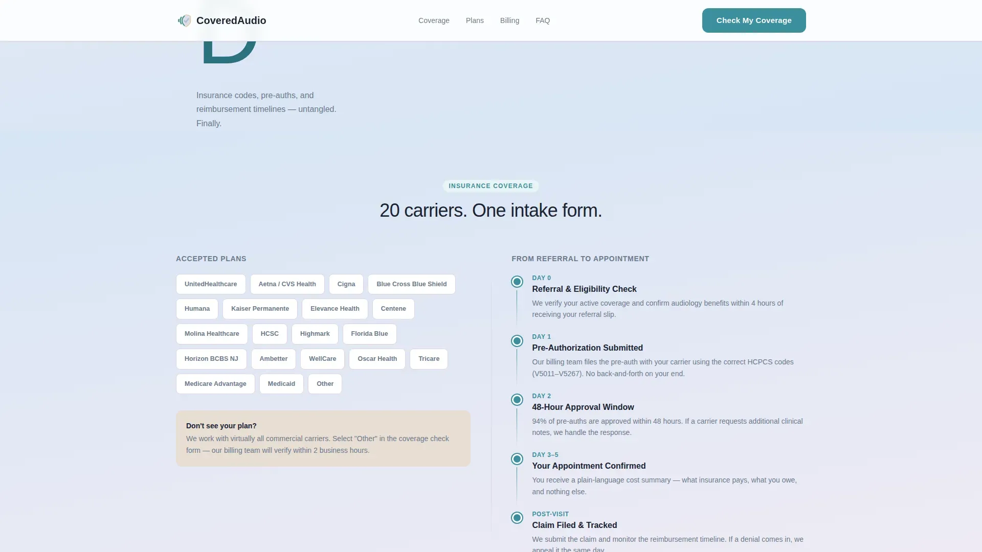
| Insurance Logos Left | Display accepted plan logos to confirm coverage eligibility at a glance |
| Claim Timeline Right | Walk through each step of the claims process in plain sequential order |
| Out-of-Pocket Costs | Show average cost figures as large teal numerals to answer the top patient fear |
| Plain-Language FAQ | Address common coverage questions using an interactive accordion format |
| EOB Document Left | Present a redacted explanation-of-benefits sample to normalize the billing document |
| Annotated Breakdown Right | Label each EOB line item in plain language so patients understand what they owe |
| Coverage Check Form | Collect insurance provider, member ID, and appointment preference to confirm coverage |
| Footer Row | Provide practice contact details and secondary navigation in a single linear row |
Design & branding system
The visual identity follows a Soft Gradient theme using the Cloud Canvas color system. The palette is clinical-soft and unhurried, built to feel like a well-lit waiting room rather than a cold medical portal.
- Color palette: diffused lavender-white (#F0EBF4) and clinical sky (#D6E5F5) gradient vertically from top to bottom; warm hearing-aid beige (#E8DDD3) warms card backgrounds and form fields; confident teal (#3A8F9E) is reserved for buttons, data highlights, and stat callouts only
- Typography: DM Sans is used for all headings and the stacked type tower; Manrope handles body text and stat numerals for a clean, readable contrast
- Gradients move vertically from lavender-white into sky blue; teal appears only on interactive elements and key numbers to preserve its visual impact
Mobile & speed optimization
The template is built desktop-first to support its split-screen layout, with a dedicated mobile experience that keeps conversion accessible on smaller screens.
- Static content sections use server-rendered components to keep initial load light; counter animations and the coverage form run as client components
- Split-screen parallax and staggered stat reveals use medium-intensity animation, designed to add movement without slowing down the scroll experience
- The sticky mobile call-to-action bar and click-to-call button ensure the primary and secondary conversion paths are always within reach on any device
How this template helps you convert
Every design and copy decision on this page is built to earn the form submission before the visitor reaches the form.
- The stats-first scroll rhythm places a concrete number at the start of every section, so visitors accumulate trust before they see a single input field.
- The explanation-of-benefits example and annotated breakdown handle the most common objection, fear of surprise billing, visually and in plain language, well before the coverage-check form appears.
- The sticky mobile call-to-action bar and the secondary click-to-call path ensure no visitor leaves without a clear next step, regardless of how they prefer to communicate.
Other information about this template
This template is part of the Audiologist Website subcategory within the Health and Medical category on the platform. It is designed specifically for the Audiologist Insurance and Billing Page niche, where the gap between patient confusion and practice revenue is widest.
- The landing page supports both a business-to-consumer path for patients and a business-to-business path for practice managers evaluating billing workflow improvements
- All localization defaults are set for United States audiences: English language, USD currency, and MM/DD/YYYY date format with USA-based insurance carrier references
- The footer follows a linear single-row pattern, keeping the page clean and focused on the primary conversion goal throughout the entire scroll
Theme
Soft Gradient
Creative direction
Stats-First Impact
Color system
Cloud Canvas
Style
Split Screen (50/50)
Direction
Booking/Scheduling
Page Sections
Stats-first Hero with Type Tower
Coverage Check Form
Explanation-of-benefits Walkthrough
Scroll-triggered Stat Counters
FAQ Accordion with Cost Callouts
Sticky Mobile Call-to-action Bar
Related questions
What kind of practice is this landing page built for?
Can I customize the list of accepted insurance carriers in the form dropdown?
Does the page include a way for patients to call the office directly?
What is the explanation-of-benefits section and why is it included?
Is this template suitable for both desktop and mobile visitors?



