Insurance Company Reviews Website Template
Coverage is a travel insurance landing page template built for providers who need to convert cautious buyers into confident policyholders. It pairs a dark, map-driven hero with five alternating coverage audit cards, a metrics bar, testimonial marquee, and a gated Coverage Matrix download. Every section is designed to surface an uninsured risk and immediately resolve it.
by Rocket studio
Quick summary
Coverage is a precision-built travel insurance landing page template. It guides corporate travel managers, solo travelers, and family vacation planners through five escalating coverage scenarios. Each section names a real risk and shows the policy response. The page ends with a gated Coverage Matrix download and a secondary policy audit path, turning passive readers into motivated leads.
Who this template is for
This template is built for travel insurance providers who serve a demanding, detail-oriented buyer. It speaks equally to B2B and B2C audiences in a tone that feels thorough rather than salesy.
- Corporate travel managers coordinating large teams across multiple continents
- Frequent solo travelers who have faced unexpected medical bills abroad
- Family vacation planners who need clear, itemized coverage before booking
What problem this template solves
Most travel insurance pages bury their value in dense policy language. Buyers leave unconvinced because they cannot connect abstract coverage terms to the specific disasters they actually fear. This template fixes that directly.
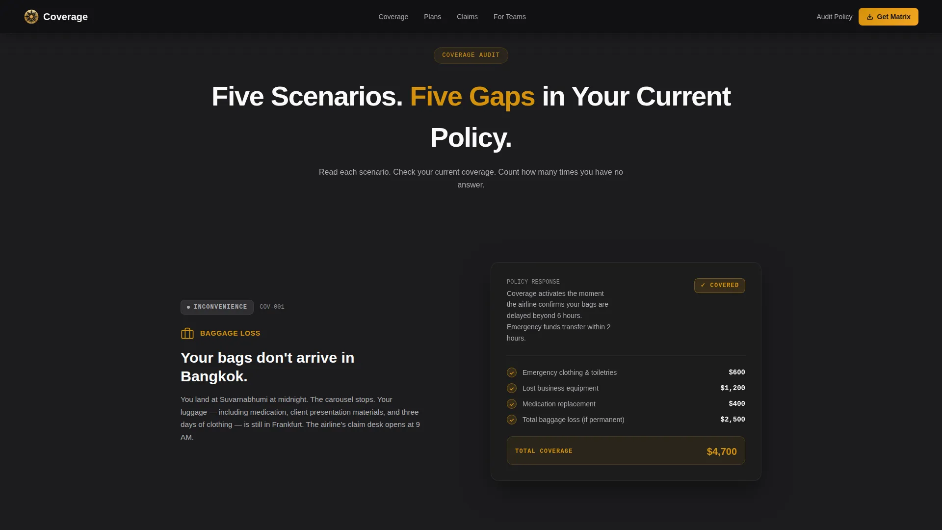
- It names concrete scenarios, a cancelled overnight connection, an emergency evacuation, a missing suitcase, and pairs each with a visible policy response
- It moves visitors through a logical escalation from minor inconvenience to life-altering emergency, building urgency naturally
- It converts passive browsing into an active download by making the visitor realize, section by section, how many gaps their current coverage has
What you get with this template
You get a fully structured, single-page landing page built around a Checklist and Audit creative direction. Every visual and layout decision reinforces the message that every risk is already handled.
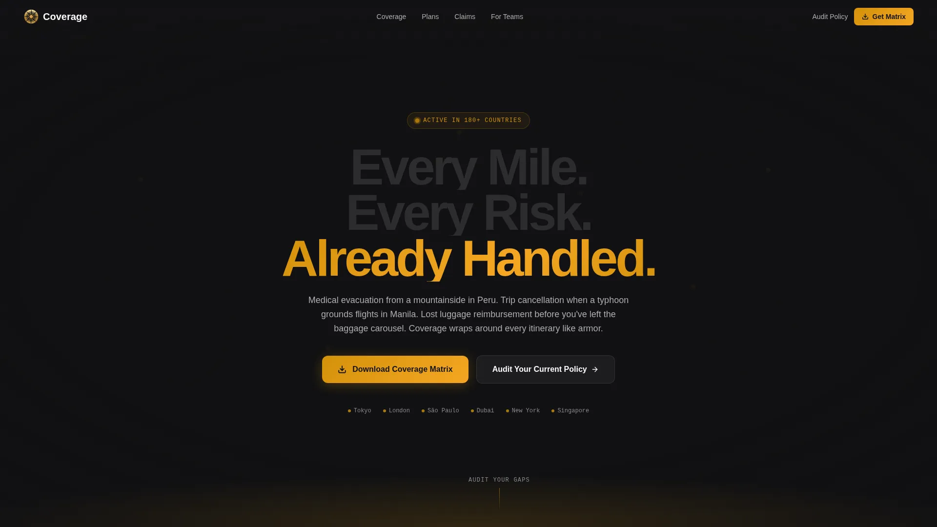
- A dark full-bleed hero with a world map, animated amber hub pulses, and a cinematic headline fade-in
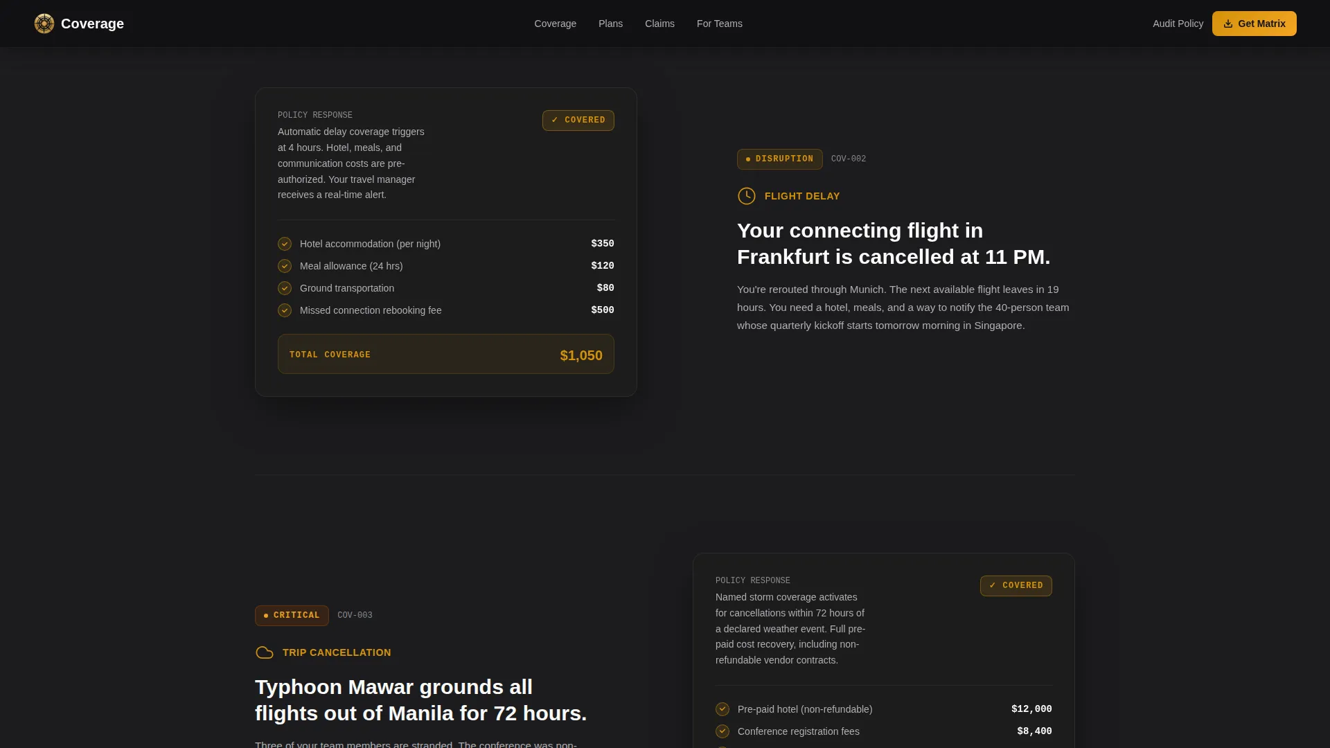
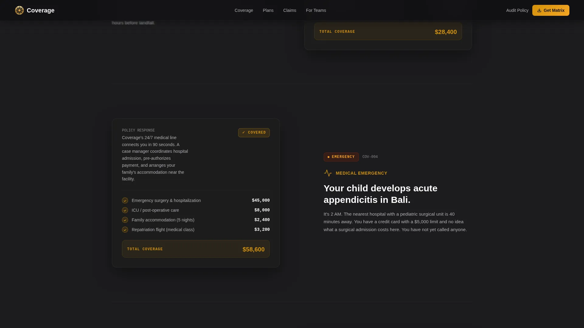
- Five alternating zigzag audit cards covering medical, cancellation, baggage, delay, and evacuation scenarios
- A metrics bar, dual-direction testimonial marquee, gated download section, and a linear single-row footer
Feature list
This template includes six core features drawn directly from its design brief. Each one serves a specific conversion or trust-building function.
Five-Scenario Coverage Audit Cards
Each card presents one coverage category as an interactive audit. The left-aligned side states the risk in plain narrative language. The right-aligned side reveals the itemized policy response, animated checkmarks, and an amber COVERED status badge. Cards cover medical emergencies, trip cancellation, baggage loss, travel delay, and emergency evacuation.
Gated Coverage Matrix Download
The primary call to action is a downloadable Coverage Matrix. It sits behind a single email field and a destination-region selector with four options: Americas, Europe, Asia-Pacific, and Africa and Middle East. The gate is intentionally minimal to reduce friction while still capturing qualified leads.
Dark Full-Bleed Hero with Animated World Map
The hero section renders a world map in fine charcoal contour lines against a near-black background. Amber pulses animate steadily at major hub cities including Tokyo, London, São Paulo, and Dubai. A headline fades in at center with a char-reveal animation, and an amber glow rises from the bottom edge like cockpit instrument lighting.
Metrics Bar with Coverage Statistics
A dedicated metrics bar displays key figures such as response time, payout rate, and countries covered. These data points are styled in JetBrains Mono to reinforce precision and credibility, and they appear between the audit section and testimonials to anchor trust at a critical scroll point.
Dual-Direction Testimonial Marquee
A scrolling testimonial marquee runs in two opposing directions simultaneously. Each testimonial includes the traveler's role and scenario context, making social proof feel specific and credible rather than generic. The marquee creates motion and energy between the heavier content sections.
Secondary Policy Audit Path
Below the primary download call to action, a secondary link invites visitors to audit their current policy through an interactive comparison tool. This path captures buyers who are not yet ready to download but are actively questioning whether their existing coverage is sufficient.
Page sections overview
| Section | Purpose |
|---|---|
| Hero World Map | Opens with global scale and a headline that frames total coverage |
| Coverage Audit Zigzag | Five alternating scenario cards escalate from inconvenience to emergency |
| Metrics Bar | Anchors trust with key coverage statistics before testimonials |
| Testimonial Marquee | Dual-direction social proof with role and scenario specificity |
| Download Call to Action | Gated Coverage Matrix download with region selector and policy audit link |
| Footer | Linear single-row footer closes the page cleanly |
Design & branding system
The visual identity follows a Corporate Precision theme. The overall feeling is a senior analyst's desk at midnight, dark leather surfaces lit by a single brass lamp, every document stacked flush and accounted for.
- Color system uses deep boardroom charcoal (#1C1C1E) for backgrounds, warm document amber (#D4920B) for all actionable elements and data points, muted briefing-paper gray (#3A3A3C) as section dividers, and clean contract white (#FAFAFA) for readable content panels
- Typography pairs Manrope for headlines, DM Sans for body text, and JetBrains Mono for coverage amounts and policy codes, reinforcing the precision aesthetic throughout
Mobile & speed optimization
The template is designed desktop-first, reflecting the primary user of a corporate travel manager working at a workstation. However, the layout is fully responsive for mobile and tablet views.
- Zigzag sections reflow to a single-column stack on smaller screens, keeping the audit card narrative readable without horizontal scrolling
- Animations including the amber pulse heartbeat, stagger-grid reveal, checkmark sequence, and blur-reveal are handled by client-side components while static content uses server-side rendering for faster initial load
How this template helps you convert
The page is structured as a Content and Resource destination rather than a hard-sell page. It earns the click by making the visitor feel understood before asking for anything.
- Each audit card surfaces a fear the visitor may not have yet fully articulated, then resolves it with an itemized policy response and an animated COVERED badge, building psychological momentum toward the download
- The gated Coverage Matrix positions the download as the answer sheet to a test the visitor just worked through, making the email field feel like a worthwhile exchange rather than a barrier
- The secondary policy audit path captures hesitant buyers by redirecting their doubt into an interactive comparison, keeping them engaged rather than letting them leave
Other information about this template
This template is a strong fit for travel insurance providers operating in the insurtech space, whether they serve individual travelers or corporate travel programs. It is built as a single landing page with a clear content and resource direction, making it suitable for paid traffic campaigns, partner referral programs, and organic content placements.
- The template is categorized under Finance and Insurance, specifically the Insurance Company subcategory within the Travel Insurance niche
- Template style is Zigzag and Alternating, header concept is Dark Full-Bleed with Glow, and the creative direction follows a Checklist and Audit scroll rhythm
- Animation level is high, including char-reveal, stagger-grid, checkmark sequence, amber pulse heartbeat, light-scan gradient, and blur-reveal effects driven by client-side interactivity
- The hover spotlight on audit cards and the animated checkmarks on scroll add tactile engagement that reinforces the feeling that every risk is being ticked off in real time
Theme
Corporate Precision
Creative direction
Checklist & Audit
Color system
Charcoal & Amber
Style
Zigzag/Alternating
Direction
Content/Resource
Page Sections
Five-scenario Coverage Audit Cards
Gated Coverage Matrix Download
Animated World Map Hero
Metrics Bar with Key Statistics
Dual-direction Testimonial Marquee
Secondary Policy Audit Path
Related questions
Who is this landing page template designed for?
What sections are included in this template?
How does the gated download section work?
Can I customize the coverage scenarios in the audit cards?
What makes this template different from a standard insurance page?



