Medical Tourism & Concierge FAQ Website Template
Covered is a medical travel insurance landing page template built for direct-to-consumer insurance providers. It uses a zigzag FAQ-driven layout to answer travelers' real fears before asking for anything in return. With an Arctic White color system, editorial typography, and a gated Pre-Trip Checklist as the primary conversion tool, this template turns anxiety into trust, one calm answer at a time.
by Rocket studio
Quick summary
Covered is a single-page medical travel insurance template with a zigzag FAQ layout, soft gradient visuals, and a content-first conversion strategy. It leads with honest scenario walkthroughs, real cost comparisons, and a downloadable Pre-Trip Checklist to earn email signups. The design feels calm, editorial, and reassuring rather than sales-forward.
Who this template is for
This template is built for travel medical insurance providers selling directly to individual travelers. It works especially well for brands that want to educate before they sell, earning trust through clarity rather than pressure.
- Gap-year parents, retired long-stay travelers, and remote workers on extended visa runs
- Direct-to-consumer insurance brands in the medical travel niche
- Travel-lifestyle businesses offering policy comparison or concierge health coverage
What problem this template solves
Most travel insurance pages bury the important details in dense policy language. Visitors arrive anxious and leave more confused. This template solves that directly by putting real answers front and center before any signup prompt appears.
- Travelers researching at 2 a.m. before departure can't find clear, scenario-specific answers anywhere
- Competing pages ask for personal details before explaining what the policy actually covers
- Visitors don't convert because they feel sold to, not informed
What you get with this template
You get a fully structured single-page layout with every section mapped to a real traveler concern. The design, copy structure, and interactive components work together to reduce hesitation and move visitors naturally toward a low-friction conversion point.
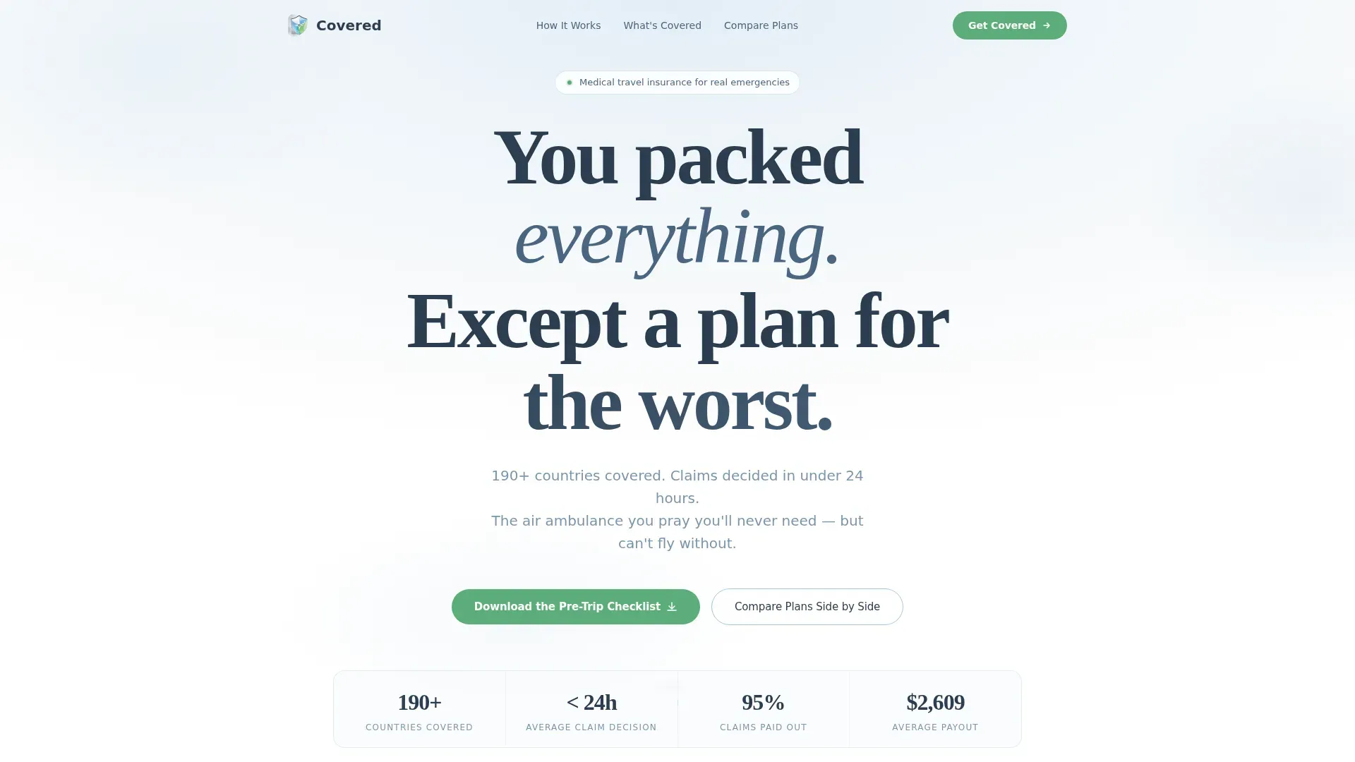
- A hero section with a giant centered headline, frost gradient background, and a stats ticker showing coverage reach and claim payout speed
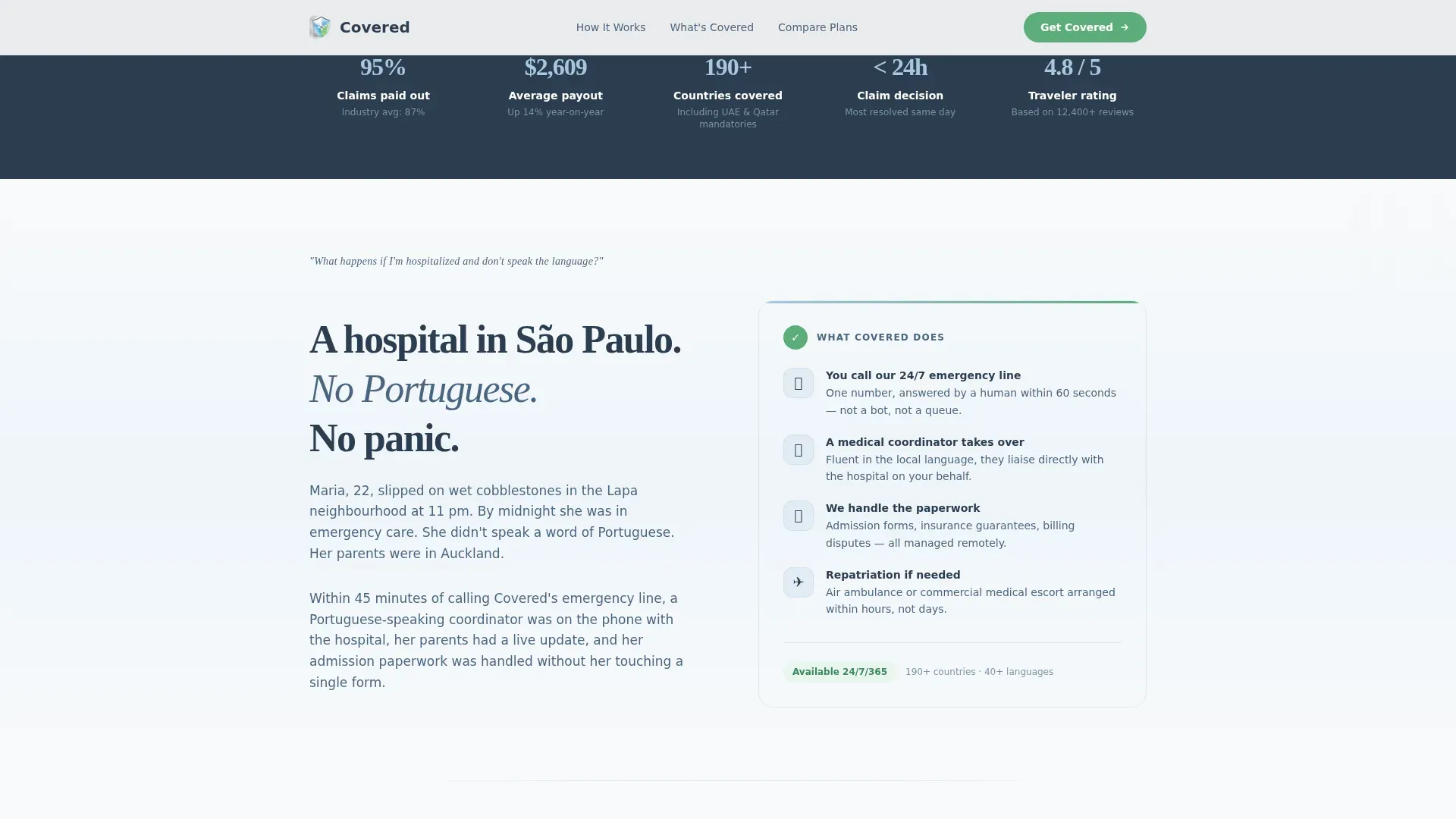
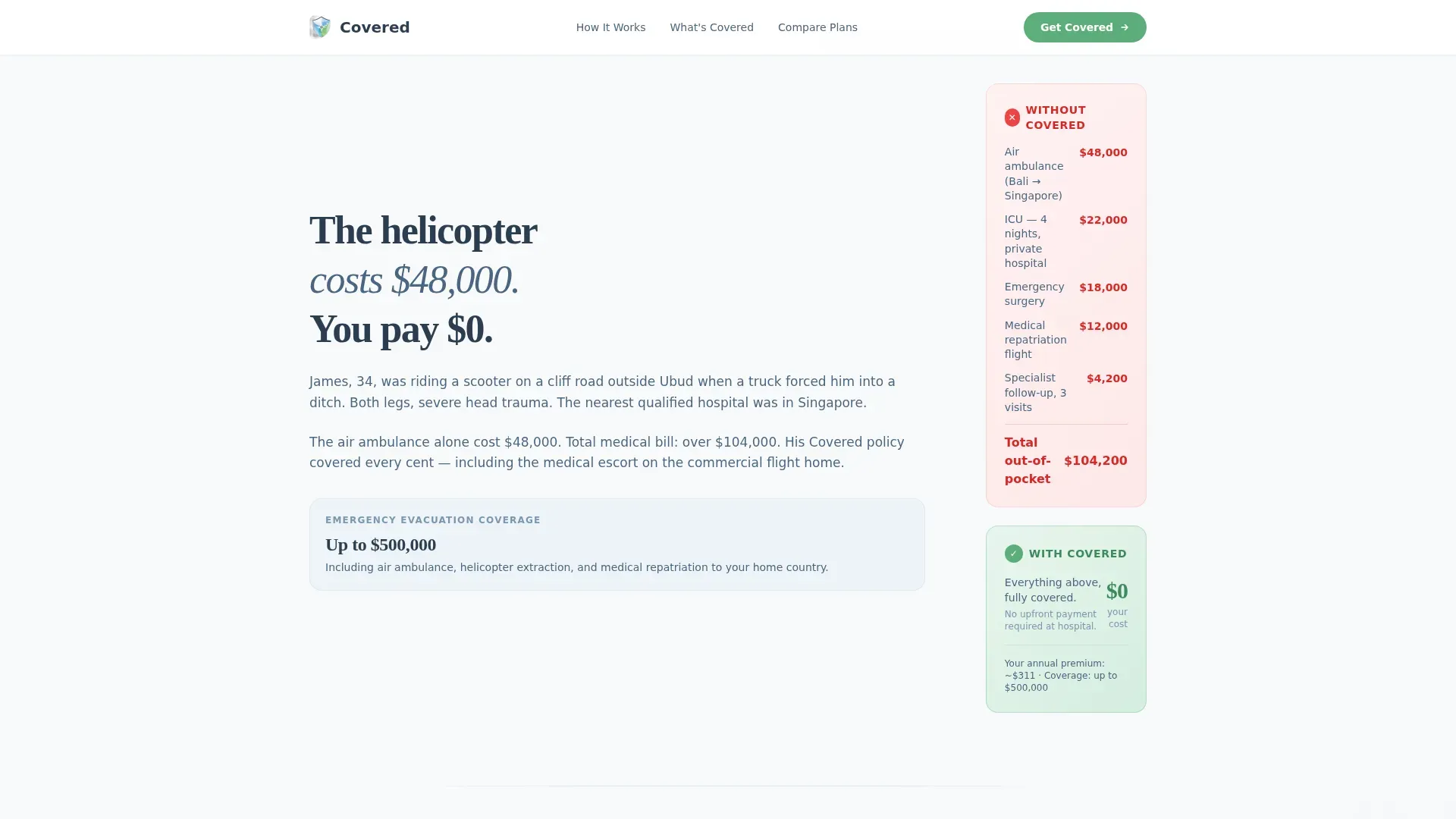
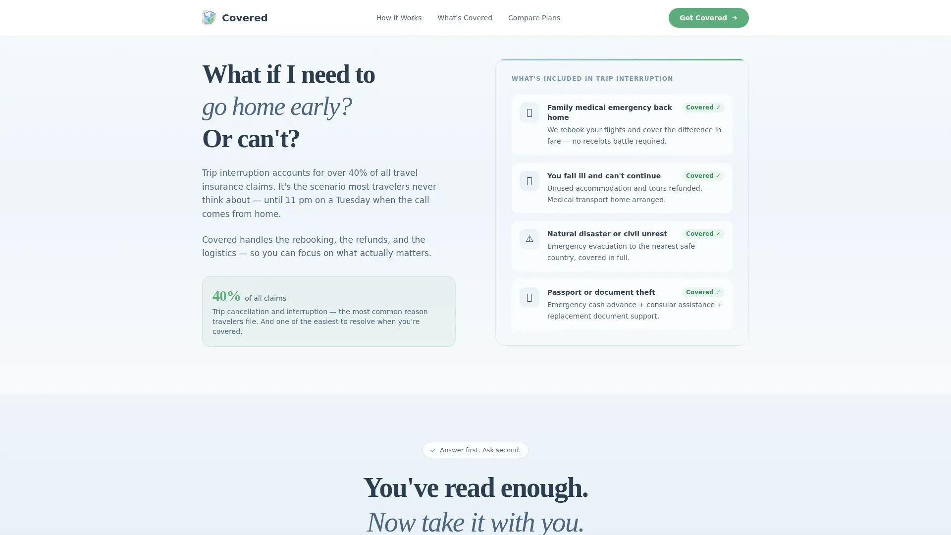
- Three zigzag FAQ sections covering hospitalization, helicopter evacuation, and early trip interruption, each with scenario walkthroughs or cost comparisons
- A resource gate with an email capture form, destination-region selector, and a no-signup plan comparison table
Feature list
This template is built around a focused set of components that serve one purpose: replacing traveler anxiety with genuine clarity.
Giant Headline Hero with Stats Ticker
The hero opens with a single typographic statement in deep slate on a pure frost-to-white gradient background. No imagery, no visual clutter. A subline in calm sky blue displays key stats such as countries covered and average claim payout time, grounding the emotional headline in real credibility.
Zigzag FAQ Section Layout
Three alternating left-right content blocks each open with a real question travelers ask before departure. The layout pairs the question on one side with a detailed answer on the other, including specific scenario walkthroughs and cost comparisons between uninsured and covered outcomes.
Interactive Plan Comparison Table
A side-by-side plan comparison table lets visitors evaluate options without signing up. It is built as an interactive client-side component so visitors can explore coverage tiers freely before committing to any contact form.
Gated Pre-Trip Checklist Download
The primary conversion point is a downloadable Pre-Trip Checklist gated behind an email input and a destination-region selector. Regions include Southeast Asia, Latin America, Europe, Africa, and Multi-Region. The gate feels like a fair trade because the page has already delivered genuine value before asking.
Soft Gradient Arctic White Design System
The visual identity uses glacier white, pale frost blue, calm sky, and a single reassurance green reserved strictly for call-to-action buttons and confirmation states. The result is a palette that feels like looking out an airplane window above the clouds, clean, unhurried, and trustworthy.
Scroll-Reveal Animation and Soft Parallax
Medium-weight scroll reveal animations and staggered entry effects bring each zigzag section to life as visitors scroll. A soft parallax drift on the hero background reinforces the aerial, above-the-clouds feeling without overwhelming the editorial calm of the layout.
Page sections overview
| Section | Purpose |
|---|---|
| Hero Headline | Opens with a bold typographic statement and a frost gradient, anchored by a stats ticker |
| Hospitalization FAQ | Answers what happens during a foreign hospital admission with a full scenario walkthrough |
| Evacuation FAQ | Covers helicopter and air ambulance coverage with a real uninsured versus covered cost comparison |
| Trip Interruption FAQ | Explains early-return coverage and what triggers a valid claim |
| Resource Gate | Captures email via a Pre-Trip Checklist download with a destination-region selector |
| Plan Comparison | Lets visitors compare coverage tiers side by side with no signup required |
| Footer | Horizontal flow footer pattern with navigation and supporting links |
Design & branding system
The design uses a Soft Gradient theme built entirely on the Arctic White color system. Every visual choice reinforces calm and confidence, the opposite of the alarming fine print most insurance pages default to.
- Color palette: glacier white (#F8FAFB), pale frost blue (#E3EEF6), calm sky (#A8C6DF), reassurance green (#5BAD7A) for calls to action, and deep slate (#2C3E50) for primary text
- Typography pairing: Fraunces serif for headlines gives editorial weight, while DM Sans handles body copy with clean readability
- Visual style: no photography, no illustrations in the hero, whitespace and typographic scale carry the emotional impact
Mobile & speed optimization
This template is designed mobile-first, reflecting how travelers actually research insurance, often on a phone in a hotel lobby or at a gate. The layout scales naturally from small screens to desktop without sacrificing the editorial hierarchy.
- Zigzag sections reflow to a stacked single-column layout on mobile while preserving the question-answer reading order
- Static sections use server components for fast initial load, while the interactive plan comparison table runs as a client component only when needed
- Scroll reveals and stagger animations are medium weight, kept intentionally light to avoid slowing the experience on slower mobile connections
How this template helps you convert
This template is built around a content-first conversion philosophy. Visitors receive real answers and genuine clarity before they are ever asked for an email address or a decision.
- The zigzag FAQ sections dissolve hesitation layer by layer, covering the three questions travelers most commonly search before buying travel medical insurance, so by the mid-page point, trust is already built
- The no-signup plan comparison table removes the biggest friction point in insurance shopping, letting visitors evaluate options freely, which makes the eventual email gate feel like a natural next step rather than an obstacle
- The Pre-Trip Checklist download converts a passive reader into a qualified lead by offering a concrete, useful resource that matches the exact moment of need, the night before departure
Other information about this template
This template is designed for the medical travel insurance niche within the broader Health and Medical category, specifically serving the Medical Tourism and Concierge subcategory. It is localized for English-language audiences in the United States, with USD currency references and international destination framing.
- The footer uses a horizontal flow pattern suited to insurance brand navigation, supporting policy links, regional coverage pages, and legal copy placement
- The template supports three distinct audience segments in a single page flow: parents buying coverage for young adult travelers, retired couples planning extended itineraries, and remote workers navigating multi-country visa schedules
- Animation behavior is intentionally medium weight, using scroll reveals, stagger effects, and soft parallax to create a sense of motion without disrupting the calm editorial tone
Theme
Soft Gradient
Creative direction
FAQ-Driven
Color system
Arctic White
Style
Zigzag/Alternating
Direction
Content/Resource
Page Sections
Giant Headline Hero with Stats Ticker
Zigzag FAQ Section Layout
Interactive Plan Comparison Table
Gated Pre-trip Checklist Download
Arctic White Soft Gradient Design System
Scroll Reveal and Soft Parallax Animation
Related questions
What kind of business is this template designed for?
Does the plan comparison table require visitors to sign up?
Can I change the destination regions in the checklist download form?
How does the hero section establish trust without using images?
Is this template suitable for mobile users?



