Family Health Insurance Advisory Landing Page
Covered is a sidebar companion landing page built for growing family health insurance advisories. It guides first-time parents and dual-income households through a five-stage interactive coverage audit, surfacing plan gaps before enrollment deadlines hit. With a data-forward Cloud Canvas design, animated stat cards, and real-time checklist progress, the page earns trust before it ever asks for an email.
by Rocket studio
Quick summary
Covered is a single-page sidebar companion template designed for family health insurance advisories. It leads visitors through a five-stage interactive coverage audit using checklists, a radial progress ring, and downloadable gap summaries. The layout feels organized and calm, with a data-forward visual style built specifically for families making coverage decisions under pressure.
Who this template is for
This template is built for digital insurance advisories and health coverage consultants who serve families at critical enrollment moments. It speaks directly to the audience doing the research, not to brokers sitting in offices.
- First-time parents comparing marketplace plans while juggling a second-trimester checklist
- Dual-income couples whose employer plan options just changed mid-year
- Growing households adding a newborn to coverage with a sixty-day enrollment window approaching
What problem this template solves
Most family health coverage pages are walls of text with no clear starting point. Families arrive overwhelmed by deductibles, copays, and network tiers, then leave without taking action. This template changes that dynamic entirely.
- It replaces passive reading with an active, stage-by-stage audit that surfaces real coverage gaps
- It removes the email barrier by showing personalized results before asking for anything
- It eliminates enrollment confusion by organizing the process into five clearly labeled stages
What you get with this template
You get a fully structured sidebar companion landing page ready to represent a growing family health insurance advisory. Every section, interaction, and visual element comes predefined.
- A five-stage interactive coverage audit with a persistent sidebar tracking real-time radial progress
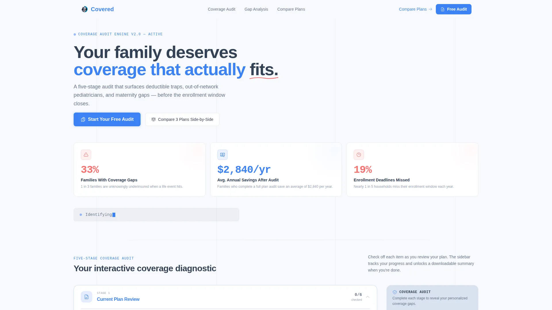
- Animated stat cards in the header and a terminal-style kinetic headline that loads like a readout
- A primary download call-to-action form and a no-signup plan comparison tool as a secondary path
Feature list
This template is built around meaningful interactivity and a visual identity that makes a stressful subject feel manageable. Each feature below comes directly from the brief.
Five-Stage Coverage Audit Sidebar
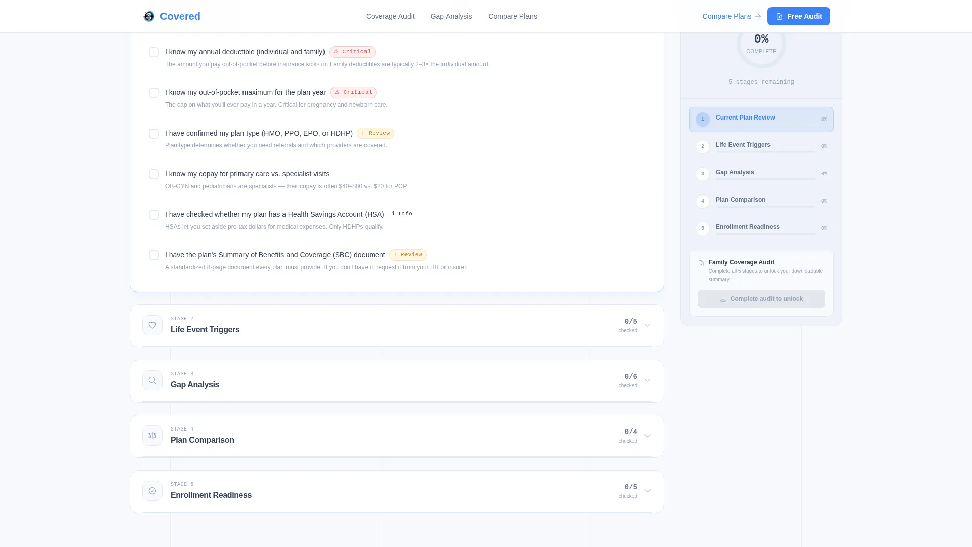
A persistent sidebar companion tracks the visitor's progress through five sequential audit stages: Current Plan Review, Life Event Triggers, Gap Analysis, Plan Comparison, and Enrollment Readiness. A radial progress ring fills in real time as checklist items are marked complete.
Interactive Section Checklists
Each main canvas section presents practical, family-specific checklist questions such as "Do you have maternity rider coverage?" and "Is your pediatrician in-network?" Completing each stage unlocks a downloadable one-page summary for that section.
Animated Stats Dashboard Header
Three oversized metric cards open the page with bold data points: one in three families face coverage gaps, the average plan audit saves $2,840 per year, and 19 percent of households miss enrollment deadlines annually. Numbers are typeset in a monospaced weight with coral accents on alarming figures and blue on savings.
Primary Download Call-to-Action Form
The "Download Your Family Coverage Audit" call-to-action appears both locked at the sidebar bottom and inline after the Gap Analysis section. The form collects email, expected or recent life event via dropdown, and current coverage type, keeping the ask short and contextually timed.
No-Signup Plan Comparison Tool
A secondary conversion path labeled "Compare 3 Plans Side-by-Side" links to an interactive tool that requires no account creation. It gives visitors an immediate, low-friction next step even before they are ready to download.
Terminal Kinetic Type Headline
Below the stat cards, a single line of animated type finishes loading like a terminal readout: "Your family's coverage score is waiting." This micro-animation signals that the page is about to do something useful, not just describe a service.
Page sections overview
| Section | Purpose |
|---|---|
| Hero Stats Dashboard | Opens with three bold metric cards and kinetic headline to establish urgency and credibility |
| Audit Sidebar Companion | Persistent sidebar with radial progress ring tracking all five audit stages |
| Current Plan Review | Stage one checklist helping visitors evaluate their existing coverage |
| Life Event Triggers | Stage two checklist identifying qualifying life events that open enrollment windows |
| Gap Analysis | Stage three with inline call-to-action and personalized gap results surfaced before email ask |
| Plan Comparison Tool | Stage four linking to a no-signup side-by-side plan comparison |
| Enrollment Readiness | Stage five final checklist plus the primary download call-to-action form |
| Page Footer | Linear single-row footer pattern closing the page cleanly |
Design & branding system
The visual identity uses the Cloud Canvas color system paired with a Startup Velocity theme. The palette feels like a weather app on the first warm spring morning: clean, optimistic, and data-forward without any clinical coldness.
- Colors: cumulus white (#F7F9FC) for backgrounds, misted periwinkle (#A8B8D8) for the sidebar, clear-sky blue (#3B82F6) for interactive elements and progress indicators, coral (#F87171) for action states and warning flags on audit results, and grounded slate (#334155) for body text
- Typography: DM Sans handles body copy for warmth and readability, while JetBrains Mono is used for all statistics and numeric displays to reinforce data credibility
- Animation: counter animations on stat cards, scroll-reveal on checklist sections, a real-time radial progress ring, and a terminal typewriter effect on the kinetic headline
Mobile & speed optimization
The template is designed desktop-first to support the sidebar companion layout, with a mobile fallback built in for visitors on smaller screens. The technical architecture separates static and interactive concerns intentionally.
- Server Components handle all static content sections to keep initial load fast
- Client Components power the interactive audit, real-time checklist progress, and form dropdowns
- The sidebar collapses gracefully on mobile so the audit flow remains usable without the persistent panel
How this template helps you convert
The conversion strategy is built around trust-first sequencing. Visitors earn something useful before they are asked to give anything back.
- The stat dashboard creates immediate relevance by showing that coverage gaps are common and costly, pulling the visitor into the audit without any friction.
- The interactive checklist stages give real, personalized gap results before the email form appears, so by the time the download prompt arrives the visitor already sees their problem and wants the solution document.
- The no-signup comparison tool provides a second conversion path for visitors who are not yet ready to share an email, keeping them engaged with the content rather than bouncing.
Other information about this template
This template fits naturally within the Finance and Insurance category, specifically the growing family health insurance niche. It is structured as a Content and Resource hub that earns credibility through data before making any direct ask.
- The Checklist and Audit creative direction means every section doubles as a self-diagnostic tool, not just a marketing page
- The Stats and Metrics header concept uses real, citable figures to establish authority in the first scroll
- The sidebar companion template style is purpose-built for multi-stage advisory flows where progress visibility matters
- The page uses United States localization defaults: currency in USD, dates in MM/DD/YYYY format, and copy written in American English
- The life event dropdown in the form covers four common qualifying scenarios: expecting a child, newborn addition, adoption, and spouse plan change

Theme
Startup Velocity
Creative direction
Checklist & Audit
Color system
Cloud Canvas
Style
Sidebar Companion
Direction
Content/Resource
Page Sections
Five-stage Coverage Audit Sidebar
Interactive Section Checklists
Animated Stats Dashboard Header
Trust-first Download Call-to-action
No-signup Plan Comparison Tool
Terminal Kinetic Type Headline
Related questions
Who is this landing page template built for?
Does the audit show results before asking for an email?
What does the persistent sidebar do during the audit?
Is there a conversion path for visitors who do not want to sign up?
What life events does the form dropdown cover?



