Women's Health & OB-GYN Specialist Booking Website Template
Cradle is a comparison table landing page built for freestanding birthing centers. It walks expectant mothers, partners, and doulas through a six-phase birth journey, using side-by-side data tables to compare midwife-led care against typical hospital protocols. A floating booking button and an inline PDF lead capture keep two conversion paths open at once.
by Rocket studio
Quick summary
Cradle is a single-page template designed for freestanding birthing centers. It blends warm, residential design with sharp clinical data. Six sequential journey steps, each backed by a comparison table, build visitor confidence through evidence. Two conversion paths run in parallel: a floating consultation booking form and an inline PDF download gate for research-mode visitors.
Who this template is for
This template is built for birthing centers that need to earn trust and drive bookings from a research-oriented audience. It speaks to people who want facts alongside the warmth.
- Birthing center owners and practice managers launching or refreshing their web presence
- Expectant mothers in their second trimester who are actively comparing care options
- Doulas and birth educators who refer clients and need credential-backed resources to share
What problem this template solves
Expectant families are choosing between familiar hospital settings and birthing center care. The problem is that most birthing center pages offer only reassurance without proof. Visitors leave without booking because they still have unanswered questions.
- The template replaces vague "personalized care" claims with actual side-by-side data tables
- It organizes the decision-making journey into six clear phases so visitors never feel lost
- It captures leads at two different readiness levels, keeping both early researchers and ready-to-book visitors engaged
What you get with this template
You get a fully structured landing page that takes visitors from first impression to booked consultation. Every section is purposeful and carries the visitor forward.
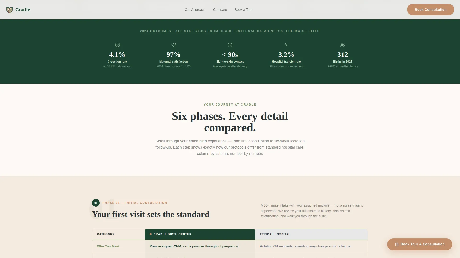
- A half-page hero section with a photo-and-text split, headline, and three micro-stat indicator pills showing transfer rate, satisfaction score, and minutes to skin-to-skin contact
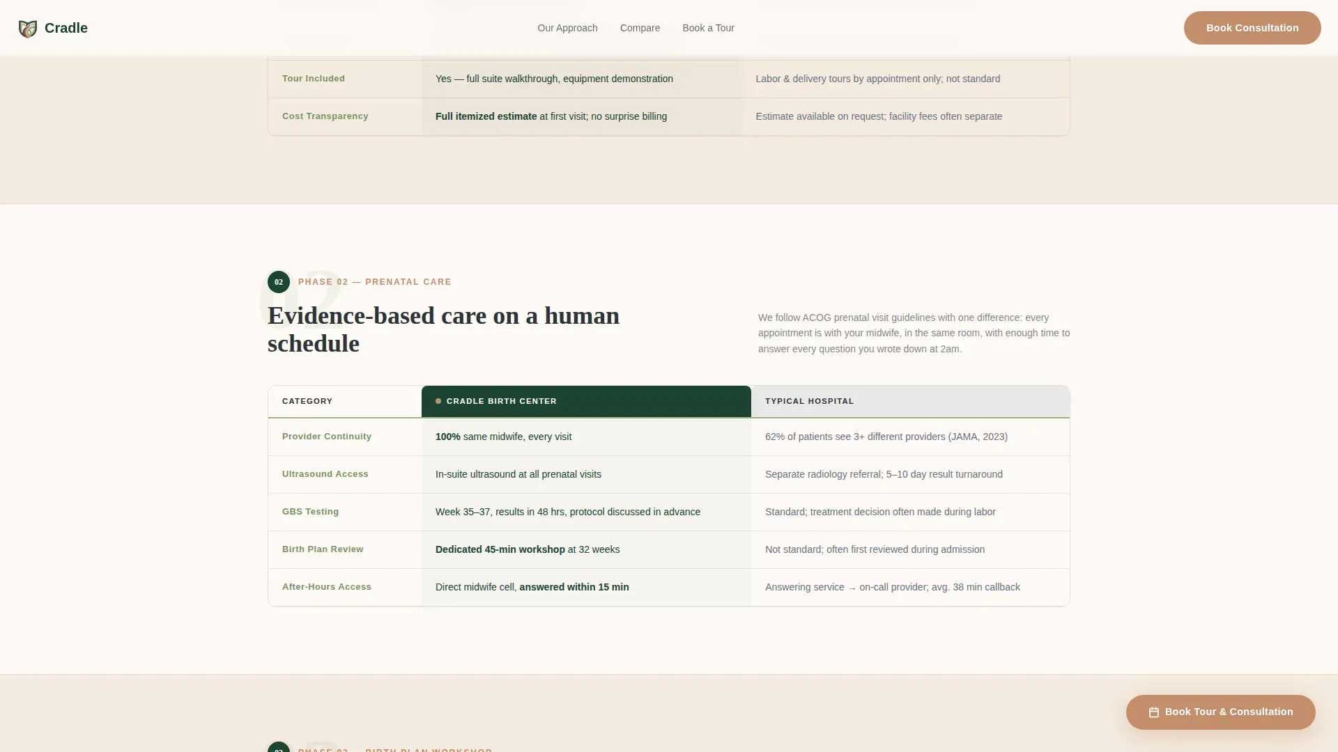
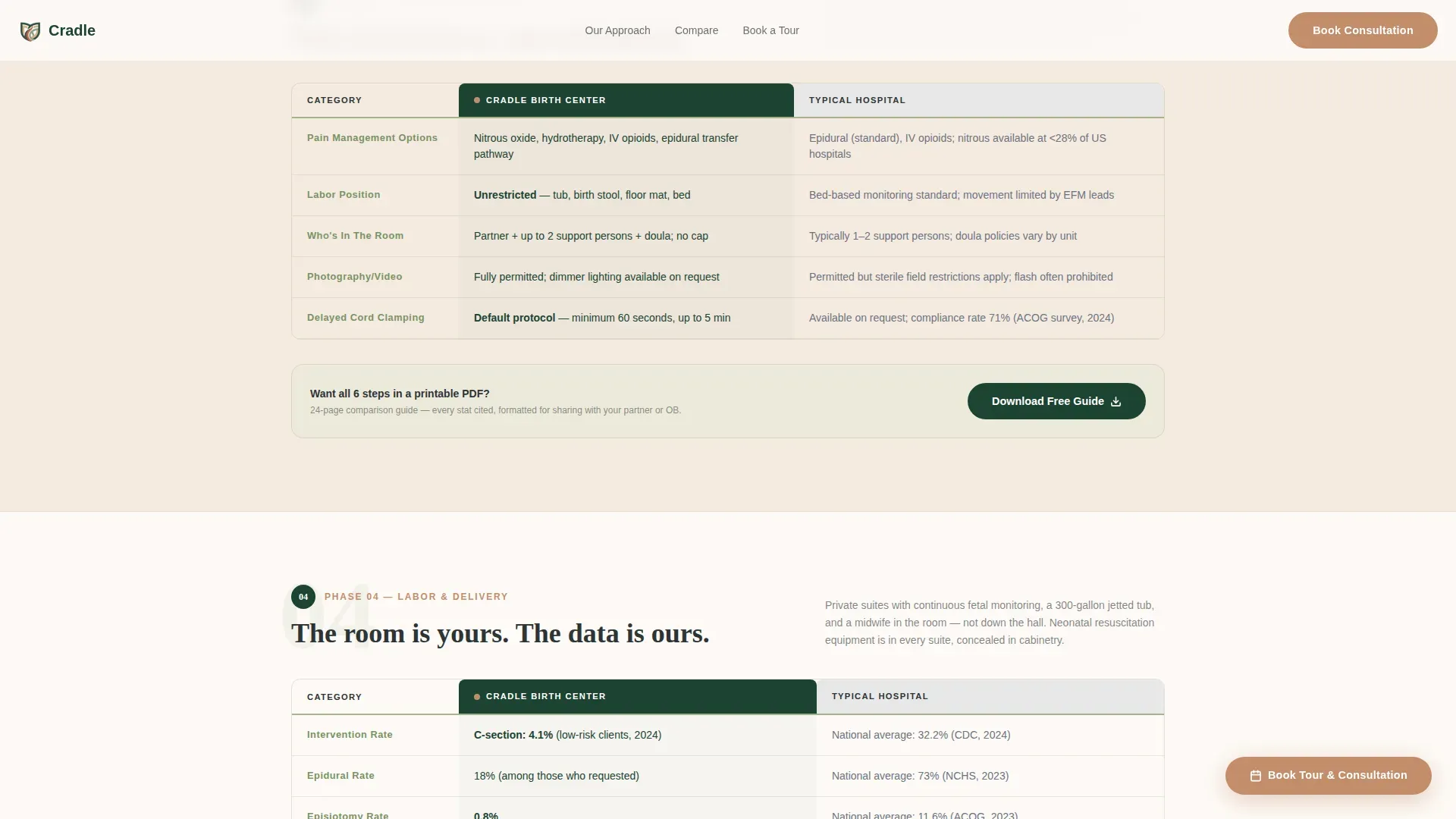
- Six numbered journey-step bands, each containing a comparison table contrasting the birthing center's approach with typical hospital protocol across dimensions like intervention rates, pain management, and cost transparency
- A three-field progressive booking form with due date picker, insurance provider dropdown, and tour format selector, plus an inline PDF lead capture gate requiring only a first name and email
Feature list
This template is built around a set of purposeful, prompt-defined components. Each one serves a specific role in moving a cautious visitor toward confident action.
Six-Phase Journey Step Layout
The page is structured as six horizontal alternating bands representing consultation, prenatal care, birth plan workshop, labor and delivery, postpartum recovery, and lactation support. Each band is numbered and scrolls in sequence, so the visitor always knows where they are in the decision journey.
Side-by-Side Comparison Tables
Every journey step contains a comparison table loaded with real data. Columns cover who is in the room, average intervention rates, pain management options, newborn procedures, partner involvement, and cost transparency. The tables are the primary trust-building mechanism on the page.
Floating Booking Button
After the visitor scrolls past the second journey step, a terracotta-colored floating button reading "Book Your Tour and Consultation" appears and stays pinned. It gives the visitor a consistent and low-friction path to schedule without hunting for a contact form.
Progressive Booking Form
The booking form uses a three-field progressive reveal sequence. Visitors select their due date, choose an insurance provider from a dropdown that includes a self-pay option, and pick between an in-person or virtual tour. The sequence feels conversational rather than clinical.
Inline PDF Lead Capture
Embedded inside the comparison table section, a gated download offers a full birth plan comparison document. Visitors provide only a first name and email. This captures visitors who are still in research mode and not yet ready to schedule a tour.
Hero Micro-Stat Pills
Three small sage-backed indicator pills sit below the hero headline. They display the center's transfer rate, maternal satisfaction score, and average time to skin-to-skin contact. These stats anchor the emotional headline with immediate credibility.
Page sections overview
| Section | Purpose |
|---|---|
| Hero Photo Split | Establish warm tone and surface three key proof stats |
| Journey Step 1 | Walk through initial consultation and introduce comparison format |
| Journey Step 2 | Cover prenatal care schedule with hospital protocol comparison |
| Journey Step 3 | Present birth plan workshop details and comparison data |
| Journey Step 4 | Detail labor and delivery approach with side-by-side table |
| Journey Step 5 | Explain postpartum recovery and compare standard procedures |
| Journey Step 6 | Cover lactation support and finalize the evidence sequence |
| PDF Lead Capture | Gate a birth plan comparison download with name and email |
| Booking Form | Collect due date, insurance, and tour preference to confirm visit |
| Footer Row | Provide single-row linear navigation and contact reference |
Design & branding system
The visual identity follows a Corporate Precision theme layered over a national park lodge warmth. The result feels like a well-organized midwife's office: every credential framed, every number cited, every surface tactile.
- Color palette uses deep evergreen (#1B4332), warm birch (#F5EBE0), clinical sage (#A3B18A), and decisive charcoal (#2D3436), with quiet terracotta (#C38D6B) reserved for calls to action and interactive highlights
- Typography pairs DM Sans for body text with Fraunces serif headings, giving data-dense tables a readable, human feel
- Alternating birch and white backgrounds across journey step bands create visual rhythm without decoration
Mobile & speed optimization
Partners searching for water birth logistics late at night on a phone are a core audience. The template is built mobile-first so the most important content arrives clearly on small screens.
- Comparison tables are structured to scroll and reflow gracefully on narrow viewports, keeping data readable without horizontal scrolling
- Scroll reveal animations and staggered entry effects use a medium intensity, keeping the page engaging without slowing perceived load time
- Static sections use server-rendered components while the booking form and PDF modal rely on client-side interactions only where needed
How this template helps you convert
The page runs two conversion tracks simultaneously, one for visitors ready to commit and one for visitors still comparing. Both tracks feed into the same goal: a booked consultation.
- The floating booking button activates after step two, catching visitors whose confidence has built enough to act, without requiring them to scroll to the bottom to find the form
- The inline PDF gate captures early-stage researchers with a low-commitment ask, a name and email, before they leave the page and continue comparing elsewhere
Other information about this template
This template is categorized under Health and Medical, specifically Women's Health and OB-GYN, with a niche focus on maternity and birthing center marketing. It is a strong fit for any freestanding birth center that needs to communicate evidence-based care to an educated, comparison-oriented audience.
- The Intersection Match Score of 13 reflects a high-precision alignment between the template's design direction, creative structure, and the maternity care niche
- The step-by-step creative direction was chosen specifically because the birth journey is inherently sequential, making the numbered band layout feel natural to the visitor rather than contrived
- Animation intensity is set to medium: scroll reveals and stagger effects add life to the page without overwhelming visitors who are looking for information rather than entertainment
- The footer uses a linear single-row pattern to keep the page's focus on the journey sections rather than a multi-column footer that would dilute attention

Theme
Corporate Precision
Creative direction
Step-by-Step Guide
Color system
Forest Trust
Style
Comparison Table
Direction
Booking/Scheduling
Page Sections
Six-phase Journey Step Layout
Side-by-side Comparison Tables
Floating Booking Call to Action
Progressive Three-field Booking Form
Inline PDF Lead Capture Gate
Hero Micro-stat Indicator Pills
Related questions
Who is this template designed for?
Can the comparison tables be updated with the center's own data?
What are the two conversion paths in this template?
Does the booking form include a self-pay option?
How many pages does this template include?



