Baby Monitor Landing Page Template with Quiz
Cradle is a hero-dominant landing page template built for baby monitor brands. It opens with a softly animated nursery scene and walks visitors through a four-step personalized quiz. The result is a matched monitor recommendation, followed by a free nursery consultation booking flow. Designed for sleep-deprived parents on their phones at 2 a.m.
by Rocket studio
Quick summary
Cradle is a calming, quiz-driven landing page template for baby monitor brands. It replaces decision overwhelm with a single personalized recommendation. Visitors take a four-step visual quiz, receive a matched result, and book a free fifteen-minute nursery consultation. The entire experience is built around the exhausted, first-time parent checking their phone in the dark.
Who this template is for
This template is built for direct-to-consumer baby monitor brands that want to convert first-time parents without overwhelming them. It suits businesses that pair a physical product with a personal consultation or advisory service.
- Baby monitor brands selling direct to new and expecting parents
- Registry-focused product lines targeting couples in the planning stage
- Smart parenting tech companies offering setup or onboarding consultations
What problem this template solves
New parents open fifteen browser tabs and still feel lost. A standard product page adds to that noise. This template replaces the noise with a guided, conversational experience that ends in one clear answer.
- Parents feel seen instead of sold to, which lowers resistance to booking
- The quiz narrows down options by nursery type, worry, tech comfort, and budget
- The consultation booking step captures high-intent leads at the moment of decision
What you get with this template
You get a fully structured, single-page layout that moves visitors from curiosity to commitment. Every section serves a purpose, and the design stays visually consistent from the first scroll to the final form field.
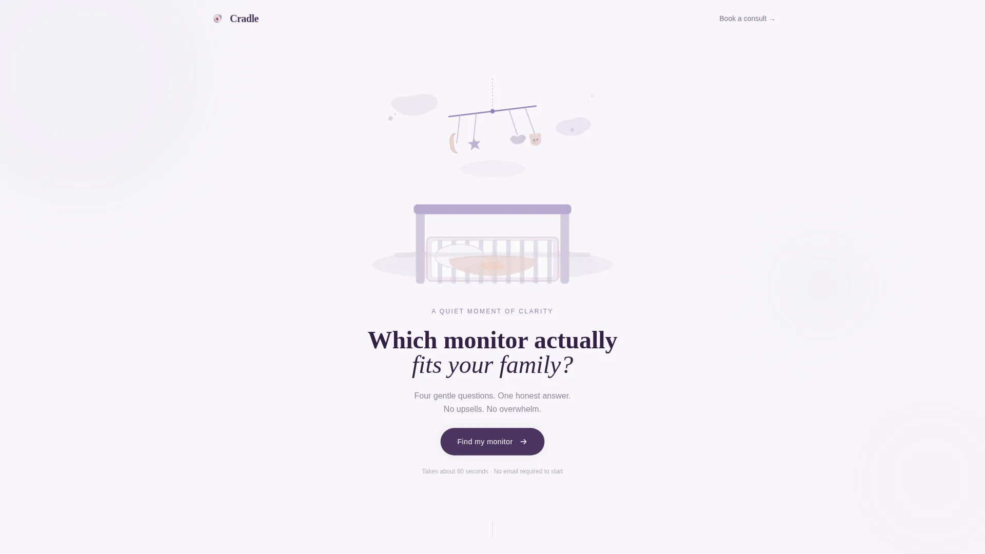
- An animated hero section covering ninety percent of the viewport with a watercolor nursery scene
- A four-step visual quiz with dynamic accent color shifts per answer
- A personalized result card, a consultation booking form, and a secondary email capture path
Feature list
This template packs meaningful interactivity into a calm, focused layout. Each feature below is grounded in the original design brief.
Animated Watercolor Hero Scene
The hero fills ninety percent of the viewport with a softly animated nursery illustration. A watercolor-style rotating mobile hangs above a crib. A single headline in deep plum asks which monitor fits your family, and a rounded button pulses once to invite the first tap. No product shots, no feature grids.
Four-Step Visual Quiz
The quiz unfolds like a short bedtime story across four steps: nursery layout, biggest worry, tech comfort level, and budget range. Each step uses illustrated choices rather than text-heavy dropdowns. Answers shift the page's accent color warmer or cooler, making the experience feel responsive and alive.
Personalized Monitor Result Card
After the final quiz answer, the page scrolls into a tailored recommendation. Visitors see one matched monitor, the reasons it fits their answers, and a quiet comparison note against the runner-up. This focused result removes the need to compare a product catalog independently.
Consultation Booking Form
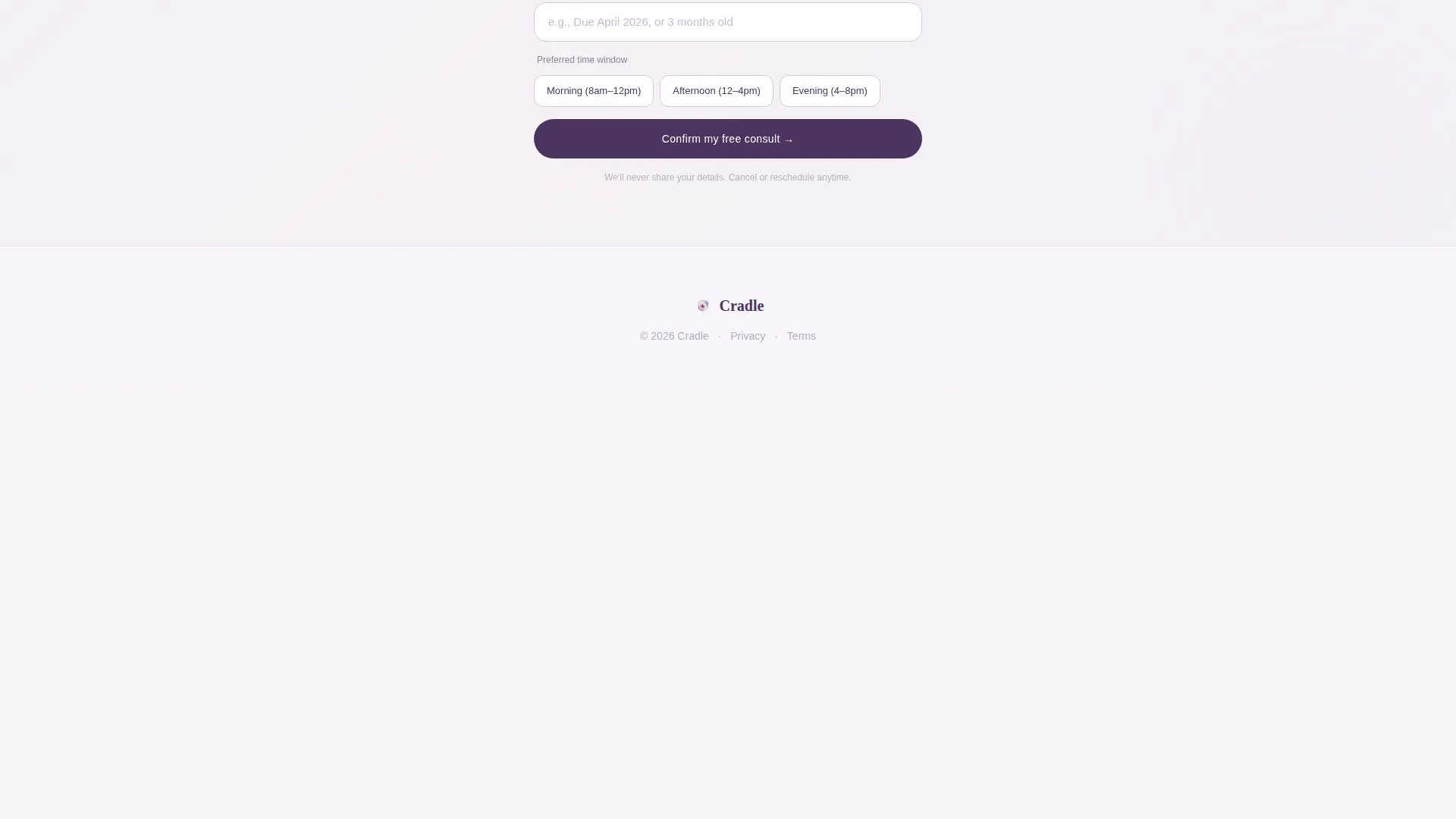
The primary call to action beneath the result card is "Book a Free Nursery Consult." It links to a fifteen-minute calendar slot. The form collects only first name, due date or baby's age, and preferred time window, keeping friction as low as possible.
Secondary Email Capture Path
A softer path labeled "Send My Results" lets partners share the recommendation by email. This captures the lead without forcing an immediate booking, which suits couples who make decisions together.
Trust Bar with Social Proof
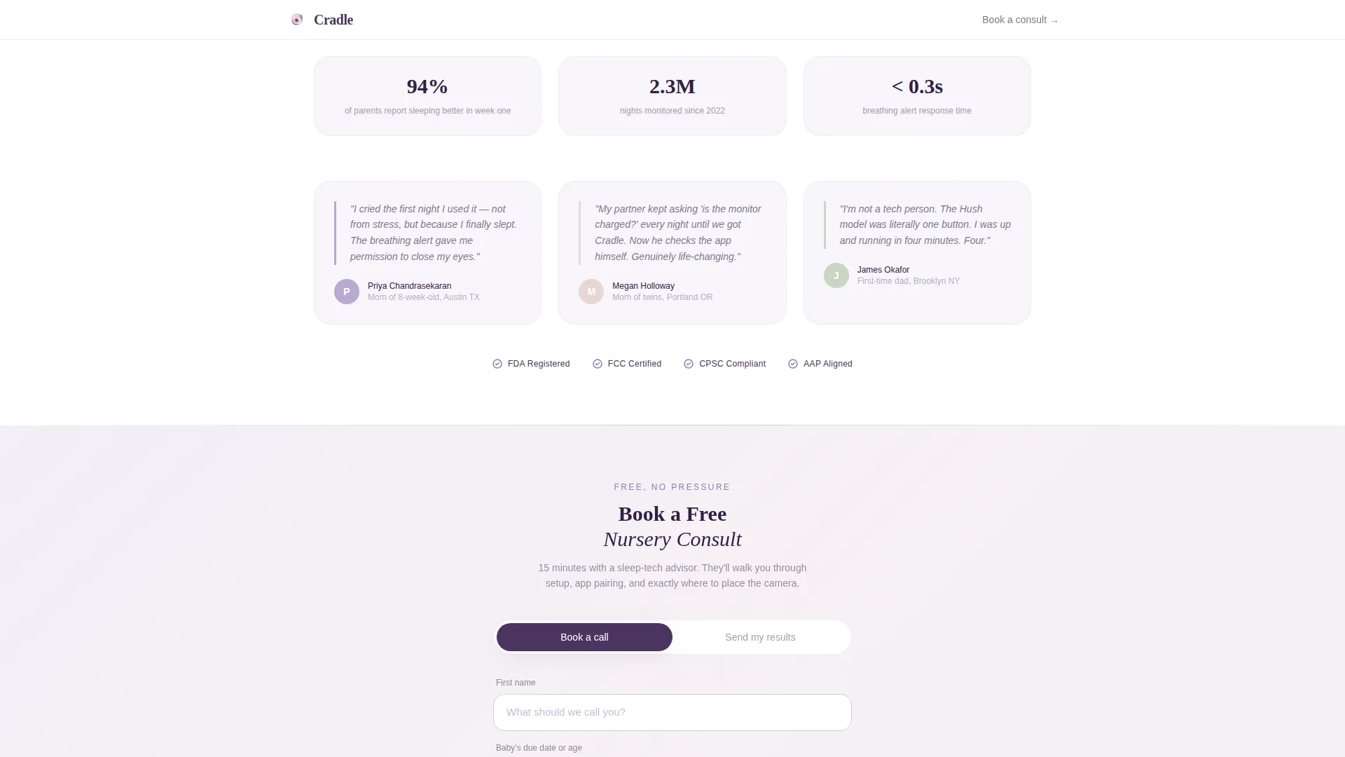
A dedicated trust section displays parent testimonials, safety certifications, and usage metrics. This section reassures hesitant buyers before they commit to a booking.
Page sections overview
| Section | Purpose |
|---|---|
| Animated Hero | Quiz starter with nursery scene and single headline |
| Four-Step Quiz | Personalized matching flow across nursery, worry, tech, budget |
| Result Card | One matched monitor with reasons and runner-up note |
| Booking Form | Free nursery consult calendar and email capture |
| Trust Bar | Parent quotes, certifications, and usage stats |
| Minimal Footer | Clean close with essential links |
Design & branding system
The visual identity follows an Educational Guide theme using the Lavender Dream color system. Every color choice is intentional: soft enough to lower a parent's heart rate, authoritative enough to earn trust.
- Cloud-white (#F7F5FA) backgrounds, soft wisteria (#B8A9D0) section dividers, warm blush (#E8D5D3) button hover states, and deep plum (#4A3460) headlines
- Fraunces serif for headlines, DM Sans for body copy, creating a warm yet readable typographic pairing
- Watercolor illustration style throughout, with no hard-edged product photography in the hero
Mobile & speed optimization
This template is built with a mobile-first mindset. Sleep-deprived parents are on their phones at 2 a.m., not at a desktop. Every layout decision prioritizes the small screen.
- All animations use GPU-accelerated CSS to keep transitions smooth on low-powered devices
- Sections below the fold load lazily, so the hero and quiz feel instant on first tap
- The quiz interaction, color shifts, and booking form are all touch-friendly with generous tap targets
How this template helps you convert
Conversion here is not about pressure. It is about reducing the effort required to make a confident decision. The template creates a natural path from curiosity to booking.
- The quiz personalizes the experience immediately, so visitors feel the page was made for their exact situation rather than a generic audience.
- The single result card removes comparison paralysis by presenting one clear recommendation with supporting reasons, making the decision feel easy.
- The low-friction booking form and the "Send My Results" email option give visitors two routes to convert, capturing both decisive buyers and couples who need a second opinion.
Other information about this template
This template is part of a hero-dominant layout family where the first section commands ninety percent of the viewport. That proportion is a deliberate creative choice to establish emotional tone before any product detail appears.
- The quiz uses state management to track answers across all four steps and generate the correct result card dynamically
- Accent color shifts are tied to quiz answers, giving the page a living quality that flat product pages cannot replicate
- The footer follows a Superhuman Extreme Minimal pattern, keeping the close of the page as calm as the opening
- The template is localized for English (United States) with USD pricing and MM/DD/YYYY date formatting in the booking form

Theme
Educational Guide
Creative direction
Quiz & Personalize
Color system
Lavender Dream
Style
Hero-Dominant (90/10)
Direction
Booking/Scheduling
Page Sections
Animated Watercolor Hero Scene
Four-step Visual Quiz Flow
Personalized Monitor Result Card
Free Nursery Consult Booking
Secondary Email Capture Path
Social Proof Trust Bar
Related questions
Can I use this template without the quiz feature?
How many steps does the quiz have?
What does the nursery consult booking form collect?
Is there a way to capture leads without requiring a booking?
Can the color palette be changed to match a different brand?