Women's Health & OB-GYN Booking Website Template
Cradle is a single-column landing page for a certified nurse-midwife practice. It opens with one mother's raw, real testimonial, then walks visitors through the full birth journey in numbered chapters. The design is warm and editorial, built to earn trust before asking for anything, then guide readers toward booking a free consultation or downloading a birth plan worksheet.
by Rocket studio
Quick summary
Cradle is a landing page template for a small certified nurse-midwife practice. It leads with a single oversized testimonial card, then unfolds a numbered journey timeline from the first prenatal visit through the first hour of skin-to-skin contact. The design teaches rather than sells, and every section is structured to move an anxious, midnight-researching parent closer to booking.
Who this template is for
This template is built for certified nurse-midwife practices serving families who want personal, continuous care through pregnancy and birth. It speaks directly to parents who are still deciding and need warmth before they need a sales pitch.
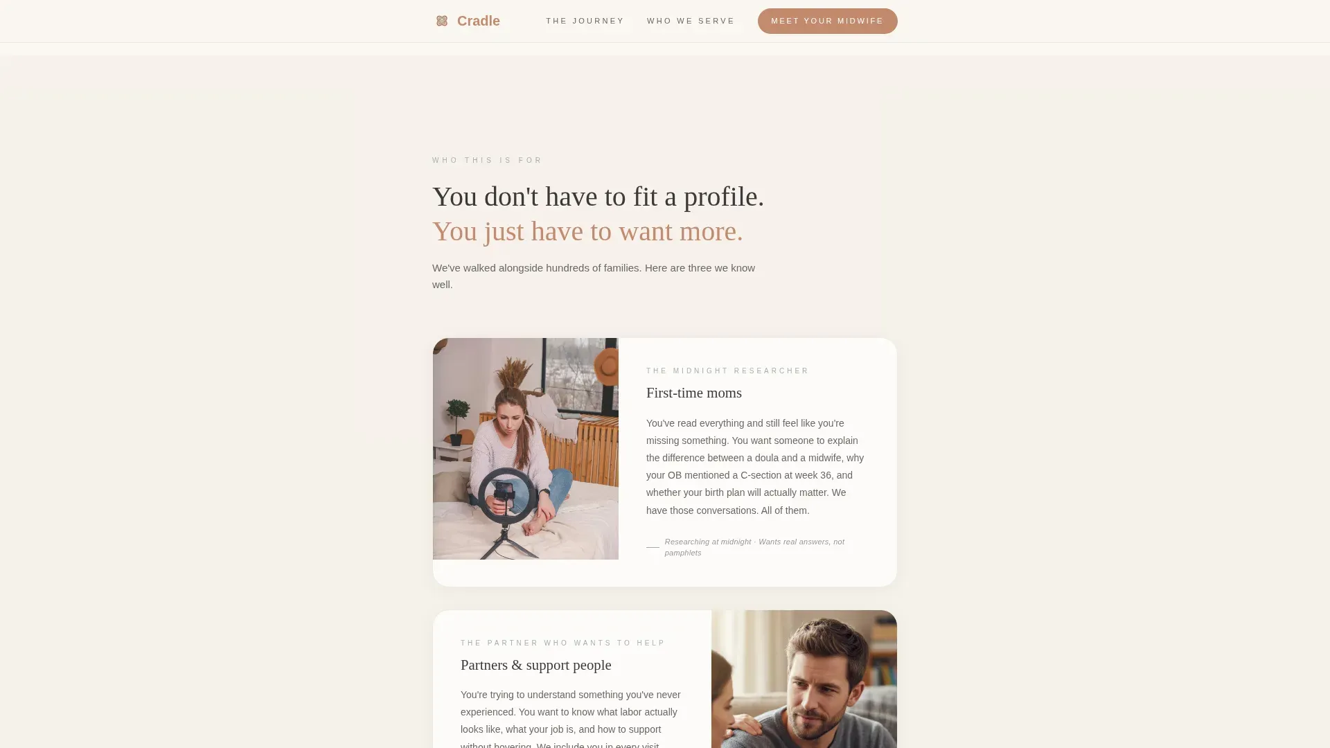
- First-time mothers researching birth options late at night, looking for emotional reassurance alongside factual clarity
- Partners trying to understand what a birth plan involves and what to expect in the room
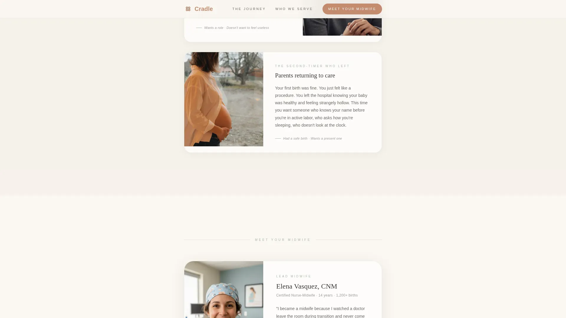
- Second-time parents who felt like a number at an obstetrics practice and are now choosing a different path
What problem this template solves
Most healthcare landing pages lead with credentials and call-to-action buttons. For a midwife practice, that approach feels cold and misses the point. The people reading this page are nervous, curious, and often doing their research alone at midnight. They do not need to be sold. They need to feel understood first.
- Visitors arrive with anxiety and specific questions; the template meets them with a real mother's voice before anything else
- The journey timeline answers the "what actually happens" question chapter by chapter, reducing hesitation without requiring a sales call
- The page captures two types of visitors: those ready to book and those who want more information before they commit
What you get with this template
This template gives you a complete, single-column landing page structured as a warm editorial guide. Every section has a clear purpose, from the opening testimonial to the footer, and the layout is designed to be scrolled start to finish on a mobile phone.
- An oversized testimonial hero card, a four-chapter journey timeline with embedded micro-testimonials, a "Who This Is For" section, a primary call-to-action block, and a secondary email-capture section for the birth plan worksheet
- A Cloud Canvas color palette using soft linen white, warm graphite, muted sage, and gentle terracotta, paired with Fraunces serif headlines and DM Sans body text
- Scroll-linked chapter reveals, hover states on timeline sections, and subtle floating animations that bring the page to life without feeling clinical
Feature list
Oversized Testimonial Hero Card
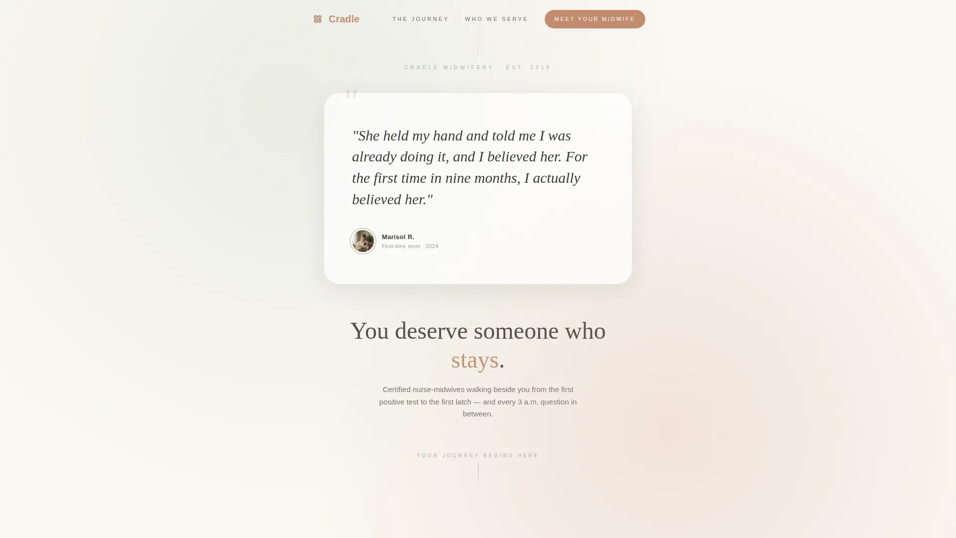
The page opens with a single large quote card centered on a linen background. It features a handwritten-style quote from a named mother, a small circular portrait, a first name, and a year. There is no hero illustration and no stock image. One woman's voice fills the viewport and earns trust before the practice introduces itself.
Four-Chapter Journey Timeline
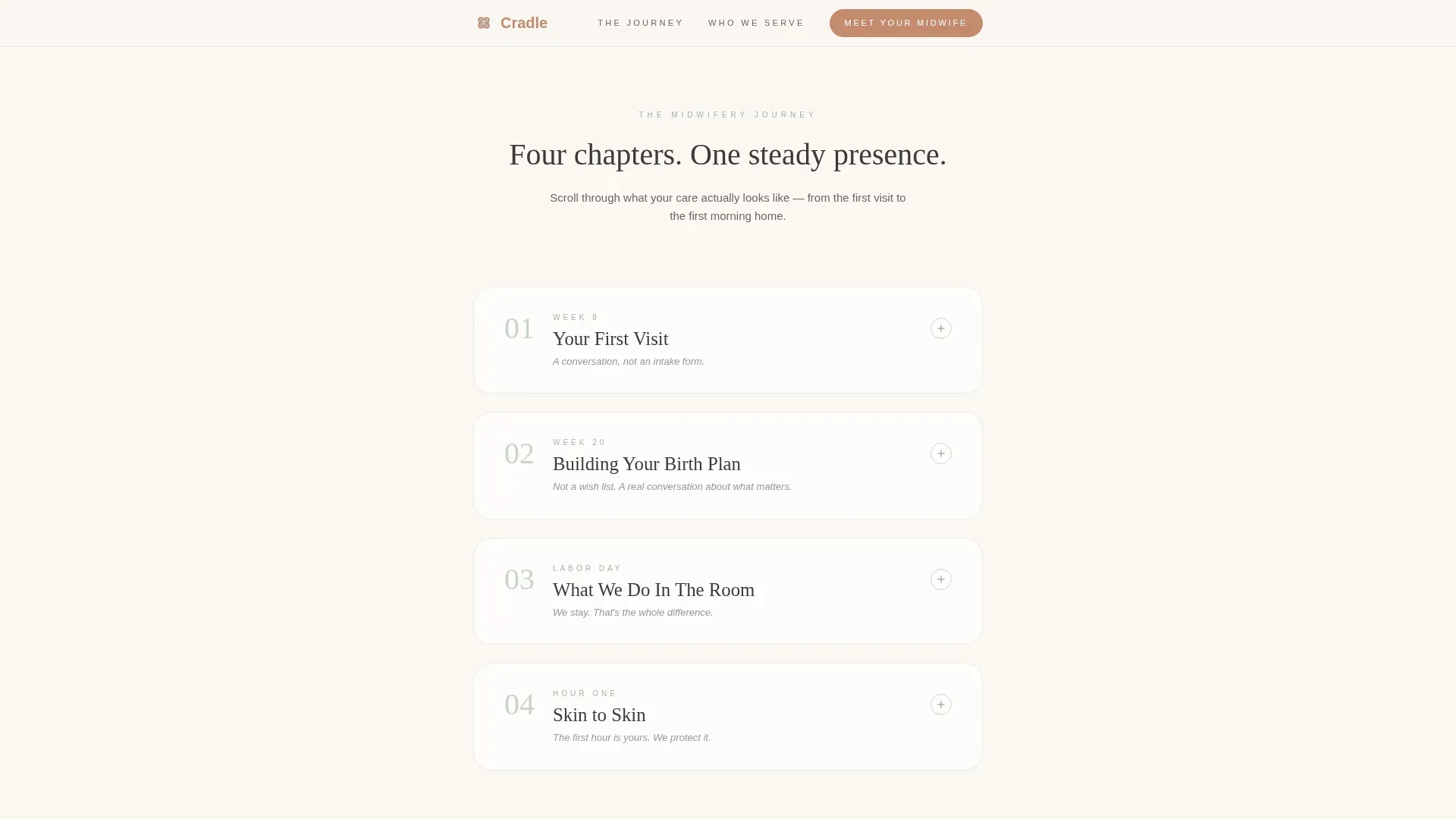
After the testimonial, the scroll becomes a vertical timeline of the midwifery experience. Each chapter is numbered and titled like a book section: Week 8, Week 20, Labor Day, and Hour One. Every chapter opens with a direct, honest paragraph, then expands into what-to-expect details, gentle illustrations, and an embedded micro-testimonial from a named mother.
Dual Call-to-Action Structure
The primary call-to-action button, labeled "Meet Your Midwife," appears after the third chapter when the reader is emotionally invested. It is repeated at the bottom of the page as "Schedule a Free Consultation." Both buttons carry the visitor to a booking page where they choose between a 20-minute video or in-person meet-and-greet.
Secondary Email Capture via Worksheet
A text link labeled "Download Our Birth Plan Worksheet" sits below the primary call-to-action. It captures email addresses from visitors who are not yet ready to book but are already leaning toward the practice. No form appears on the main page; the interaction is light and low-pressure.
Scroll-Linked Reveal Animations
Chapters reveal themselves as the visitor scrolls, with words fading in and sections appearing in sequence. The animation pace is medium, not jarring, matching the calm and steady tone of the overall page. Hover states on each chapter section add a layer of gentle interactivity.
Mobile-First Single Column Layout
The template uses a single-column flow designed for mobile phones first. Someone researching at midnight in bed sees a clean, readable, uncluttered page with no sidebars or competing elements. The typographic scale and spacing are set to work at small screen sizes without sacrificing editorial warmth.
Page sections overview
| Section | Purpose |
|---|---|
| Testimonial Hero Card | Opens with one mother's voice to build immediate emotional trust |
| Week 8 Chapter | Introduces the first prenatal visit with honest detail and a micro-testimonial |
| Week 20 Chapter | Guides the reader through building a birth plan step by step |
| Labor Day Chapter | Describes what the midwife team does in the room during labor |
| Hour One Chapter | Covers the first skin-to-skin hour after birth with warmth and specificity |
| Who This Is For | Three specific visitor portraits that help readers recognize themselves |
| Meet Your Midwife call to action | Primary terracotta button placed at peak emotional investment |
| Birth Plan Worksheet | Secondary email capture for visitors not yet ready to book |
| Minimal Footer | Horizontal footer pattern with essential links, no clutter |
Design & branding system
The visual identity follows an Educational Guide theme using the Cloud Canvas color system. The overall aesthetic is warm and editorial, like a hand-bound pregnancy journal with cream pages and a cloth cover softened from daily use. Nothing here looks clinical or overly polished.
- Color palette: soft linen white (#FAF7F2) for backgrounds, warm graphite (#3D3A38) for body text, muted sage (#A3B5A6) for section dividers and progress indicators, and gentle terracotta (#C48B6F) for buttons, highlighted terms, and interactive callouts
- Typography pairing: Fraunces serif for headlines to give warmth and editorial authority, and DM Sans for body text to keep reading comfortable and clear at any size
Mobile & speed optimization
The template is built as a single-column flow with mobile-first priorities baked into every layout decision. A parent researching birth options on their phone at midnight gets a page that loads cleanly and reads without effort.
- Static site generation (SSG) approach keeps the page fast and stable, with no heavy dependencies slowing the initial load
- Scroll-reveal animations and chapter transitions are set to medium intensity, smooth enough to feel intentional without taxing a mobile device or interrupting the reading experience
How this template helps you convert
This template earns conversion by teaching first and asking second. The structure is built to move a cautious, researching visitor from emotional recognition to confident action across a single scroll.
- The testimonial hero opens with a named mother's raw quote, so the visitor feels seen and trusting before the practice mentions credentials or services
- The four-chapter timeline answers the most common fear-driven questions in sequence, so by the time the "Meet Your Midwife" button appears, the reader already feels like they know what to expect
- The worksheet email capture gives a second path for visitors who need more time, keeping the practice connected with leads who are not yet ready to book but are already engaged
Other information about this template
This template is categorized under Health and Medical, specifically the Women's Health and OB-GYN subcategory, and is purpose-built for the midwife practice niche. It is part of the Single Column Flow template style family within the Educational Guide theme.
- The intersection match between the Cloud Canvas color system, Step-by-Step Guide creative direction, and Click-Through landing page direction makes this a strong fit for practices that want to teach their care model before asking for a booking
- Fraunces and DM Sans are both available as free web fonts, making the typographic system straightforward to customize without licensing costs
- The template supports image placements using sources like Unsplash for the portrait and chapter illustrations, keeping the visual style warm without requiring a custom photo shoot at launch
Theme
Educational Guide
Creative direction
Step-by-Step Guide
Color system
Cloud Canvas
Style
Single Column Flow
Direction
Click-Through
Page Sections
Oversized Testimonial Hero Card
Four-chapter Journey Timeline
Dual Call-to-action Flow
Secondary Worksheet Email Capture
Scroll-linked Chapter Reveals
Mobile-first Single Column Layout
Related questions
Does this template include a booking form on the page?
How many testimonials are included in the template layout?
What is the birth plan worksheet section designed to do?
Can a new midwife practice use this template without many client reviews?
Is the layout suitable for a small team of more than one midwife?



