Heirloom Sake Distillery Landing Page Template
Kura is a hero-dominant landing page template built for artisan sake breweries selling direct to consumer. A nine-tile Photo Grid Mosaic hero, scroll-triggered sensory bottle sections, and a celadon green "Add to Masu" cart system guide visitors from first visual impression to completed order. The warm stone palette and Neo-Retro aesthetic make every scroll feel like a guided tasting.
by Rocket studio
Quick summary
Kura is a single-page, hero-dominant template crafted for premium sake producers who sell direct to consumer. It leads with a nine-tile Photo Grid Mosaic that fills ninety percent of the viewport, then unfolds three bottle sections as sensory journeys. Every design choice, from the warm washi backgrounds to the celadon cart button, is built to earn the purchase before asking for payment.
Who this template is for
This template is designed for sake producers, importers, and gift-focused beverage brands who want a page that reflects the craft behind every bottle. It suits businesses where story and provenance drive purchase decisions as much as price does.
- Artisan sake breweries seeking a direct-to-consumer sales channel with a premium feel
- Omakase chefs and culinary-focused retailers who need flavor profiles and food pairing details presented clearly
- Gift-focused sake brands and importers who sell to story-sensitive buyers across America
What problem this template solves
Most beverage landing pages treat sake like any other spirits product: a label image, a tasting note, and a buy button. That approach fails the drink entirely. Sake has centuries of history, a deeply Japanese identity, and a brewing process that rewards explanation. Buyers who are new to sake need context before they commit. Buyers who already love sake want provenance and craft detail.
- Generic product pages cannot communicate the sensory difference between a floral junmai daiginjo and a bold aged koshu
- Checkout flows that ignore alcohol shipping compliance frustrate buyers and waste the brewery's time
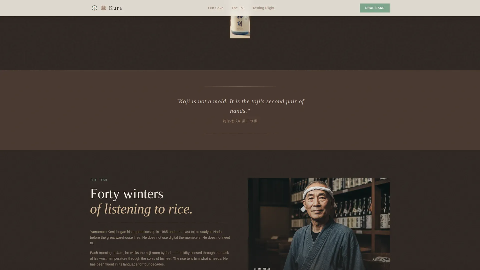
- Pages that skip the story behind the rice, the koji, and the toji lose the gift-givers and the curious chefs who were almost sold
What you get with this template
You get a fully structured, single-page layout that guides each visitor through a tasting experience before they ever reach the cart. The template ships with three complete bottle sections, a sticky cart bar, a state-gating checkout entry point, and a Tasting Flight bundle path. Every visual zone is mapped to the Neo-Retro Warm Stone color system.
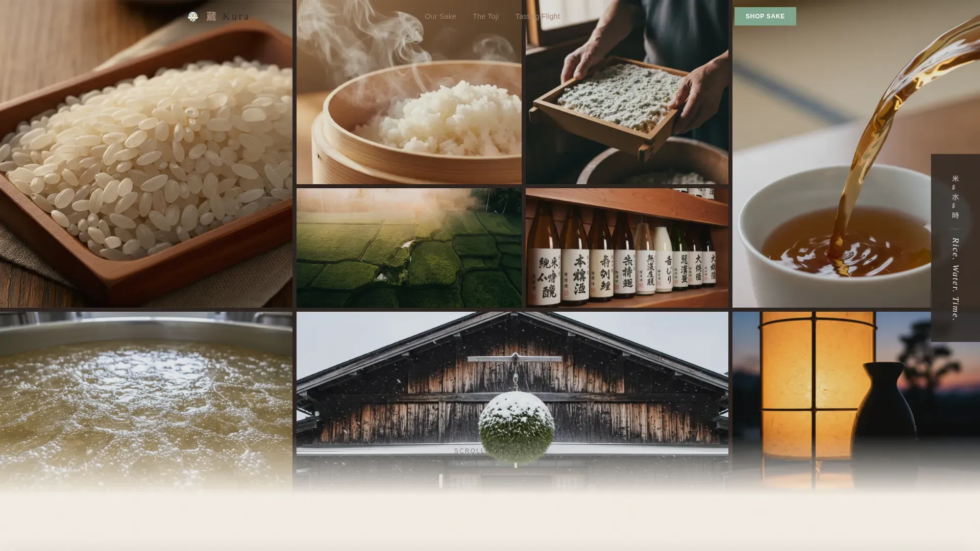
- A nine-tile Photo Grid Mosaic hero with staggered GSAP fade animations and a sliding bilingual headline
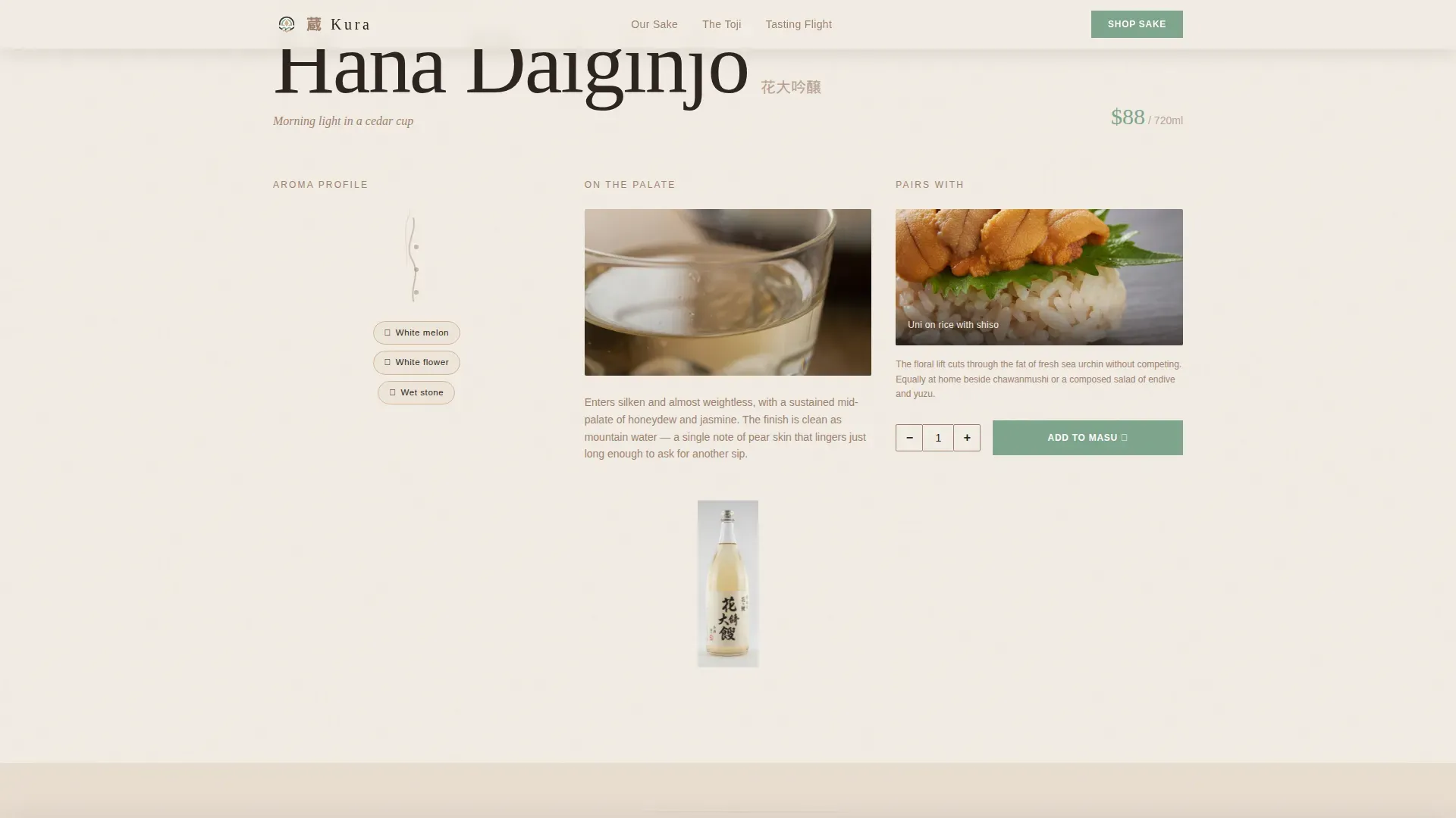
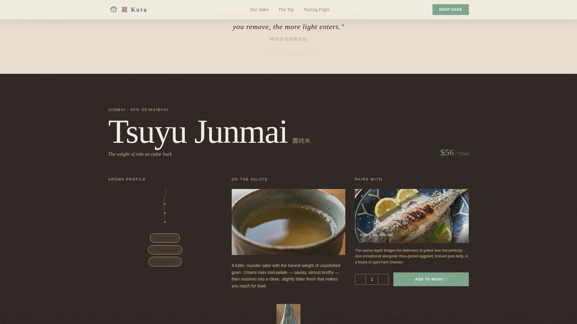
- Three sensory bottle sections, each with aroma vapor trail illustration, palate macro photography zone, food pairing moment, and a quantity stepper with an "Add to Masu" cart button
- A sticky bottom cart bar, a state-gating checkout flow for alcohol delivery compliance, and a Tasting Flight auto-select bundle for scrollers who pass two or more bottle sections
Feature list
This template offers six core built-in capabilities, each grounded in what the brief specifies.
Nine-Tile Photo Grid Mosaic Hero
The hero fills ninety percent of the viewport with an asymmetric grid of nine photographic tiles. Each tile loads with a staggered GSAP fade from top-left to bottom-right, giving the mosaic an unhurried, breathing reveal. A vertical headline in Japanese calligraphy and English slides in from the right edge. The hero is the visual power of the page.
Scroll-Triggered Sensory Bottle Sections
Each of the three bottle sections, Hana Daiginjo, Tsuyu Junmai, and Kage Koshu, is structured as a sensory journey. The visitor first sees an illustrated aroma vapor trail, then a macro photograph of the sake's surface tension, then a styled food pairing image. The background color interpolates from washi white toward deeper clay as the visitor scrolls deeper, mirroring the intensifying flavor arc from light and floral to bold and aged.
Brewing Concept Interstitials
Short interstitial lines sit between bottle sections. Each one teaches a single sake making concept, such as "Polishing ratio is the soul's window," in handwritten-style type. These moments give the scroll a rhythm of sensation then knowledge. They communicate the craft of traditional sake brewing without interrupting the purchase flow.
Add to Masu Cart System
Each bottle section ends with a quantity stepper and a celadon green "Add to Masu" button. The wooden masu drinking cup metaphor carries through the entire cart experience. A sticky bottom bar appears after the first bottle section, showing cart count and a "Complete Your Order" button. This keeps the purchase path visible without forcing it.
State-Gating Checkout Flow
The checkout process asks for shipping state before collecting any personal or payment information. This is critical for sake and other regulated spirits sold across the country. Ineligible buyers are identified early, reducing abandonment and protecting the brewery from compliance issues. It is a practical, buyer-respectful first step.
Tasting Flight Auto-Select Bundle
When a visitor scrolls past at least two bottle sections, the page automatically pre-selects a three-bottle Tasting Flight bundle offered at a slight discount. The page earns this upsell by making the visitor taste with their eyes first. No pop-up interrupts the experience. The bundle appears as a natural next step.
Page sections overview
| Section | Purpose |
|---|---|
| Hero Mosaic Grid | Nine-tile full-viewport opener with staggered fade and bilingual headline |
| Hana Daiginjo | Sensory journey for the first bottle: aroma, palate, food pairing, and cart |
| Brewing Concept Interstitial | Single-line sake making education between bottle sections |
| Tsuyu Junmai | Sensory journey for the second bottle with Add to Masu cart action |
| Kage Koshu | Bold aged bottle section with Tasting Flight call to action |
| Sticky Cart Bar | Persistent bottom bar showing cart count and Complete Your Order button |
| Footer Arc Split | Logo and tagline on the left, navigation links on the right |
Design & branding system
The visual identity follows a Neo-Retro theme built on a Warm Stone color system. The palette feels like a two-hundred-year-old storehouse lit by a single modern pendant light. Heritage textures meet contemporary restraint in every section.
- Color system uses four tones: kiln-fired clay (#A0826D) for body text, aged hinoki wood (#D4B896) for texture zones, deep kura shadow (#2C2420) for headlines, and a celadon green (#7EA58C) reserved strictly for buttons and price tags
- Typography pairs Fraunces for display headlines with generous tracking that echoes woodblock print tradition, and DM Sans for body copy, with Japanese calligraphy accents delivered via web font
- Backgrounds alternate between kura shadow and a warm off-white (#F3EDE4) that reads like handmade washi paper, shifting gradually to deeper clay as the scroll progresses
Mobile & speed optimization
The template is built desktop-first to serve omakase chefs and gift-givers who browse on larger screens, while maintaining full mobile support for every interactive element. Static sections use server components, while cart and interactive zones use client components to keep the experience responsive.
- The Photo Grid Mosaic adapts its asymmetric tile layout for smaller viewports without losing the staggered fade behavior
- Interactive components such as the quantity stepper, sticky cart bar, and state-gating checkout are isolated as client components for efficient rendering
- GSAP scroll triggers and background color interpolation are scoped to the scroll container so they do not block initial page load
How this template helps you convert
The template is built around a single idea: earn the purchase before asking for it. Every layout decision points toward conversion without ever feeling pushy.
- The mosaic hero creates immediate sensory desire through nine high-quality images of rice, koji, fermentation, and the brewery itself, giving the visitor a reason to keep scrolling before a single word is read
- The three sensory bottle sections build appetite and trust by presenting aroma, palate, and food pairing context in a visual sequence, so the "Add to Masu" button arrives at the moment of maximum readiness
- The Tasting Flight auto-select and the sticky cart bar keep the purchase path open at all times, while the state-gating checkout removes friction for eligible buyers and reduces wasted effort for ineligible ones
Other information about this template
This template is designed with the broader sake industry in mind, and its structure reflects the real educational challenge that sake producers face in the American market. Sake exports from Japan have nearly doubled since 2014, and sake is increasingly being served in non-Japanese restaurants alongside wine and craft beer. More people are discovering that sake pairs well with a far wider range of food than most Americans assume, including sushi, raw shellfish, and even aged cheese.
The history of sake brewing is long. Sake making in Kyoto dates back to the Heian period (794 to 1185). During the Kamakura period, sake held economic value comparable to rice itself. By the Muromachi period, Kyoto alone had 342 breweries. The Fushimi district, where several natural spring water sources provide ideal brewing conditions, remains the heart of Kyoto's sake industry with over 40 active breweries today. That history gives modern sake producers powerful stories to tell.
Brooklyn Kura, founded after a 2013 trip to Japan where Brian Polen and Brandon Doughan first met, became the first sake brewery in New York. The company focuses on junmai-style sake with no added distilled alcohol. Brooklyn Kura uses a high temperature saccharification method and produces nama (unpasteurized) sake. Their brewing process is designed for clean, bright, fruit-driven profiles. Brooklyn Kura has partnered with Hakkaisan Brewery to expand technical knowledge and production capacity. They serve sake in wine glasses, offer it on draught, and have championed canned sake as a format to reach more people. Brooklyn Kura operates a taproom at Industry City in Brooklyn and actively educates consumers and hospitality professionals. Their approach represents the advantage of adapting traditional Japanese brewing techniques to locally sourced American ingredients and local palates.
- Sake is deeply tied to Japanese culture and is associated with national pride across generations
- Ready-to-drink sake cocktails are a growing segment, reflecting how producers sell to broader American audiences
- This is the kura artisan heritage sake brewery landing page template built for direct-to-consumer sake businesses
- Prestigious sake breweries in Japan and America use educational content to drive investment in their products
- The template is well-suited for any sake brewery that wants to present its Japanese brewery heritage with clarity and convert visits into sales
Theme
Neo-Retro
Creative direction
Taste & Aroma
Color system
Warm Stone
Style
Hero-Dominant (90/10)
Direction
Direct Sales
Page Sections
Nine-tile Photo Grid Mosaic Hero
Sensory Scroll Bottle Sections
Brewing Concept Interstitials
Add to Masu Cart System
State-gating Checkout Entry
Tasting Flight Auto-select Bundle
Related questions
Can I use this template for a sake brewery that sells multiple bottle types?
Does the state-gating checkout work for all US alcohol shipping states?
Is this template suitable for gift-focused sake brands, not just breweries?
What is the 'Add to Masu' button, and can I rename it?
How does the Tasting Flight auto-select work?



