Dairy & Cheese Booking Website Template
The Creamery pastoral farm booking landing page template is built for goat cheese farms and agritourism producers who want visitors to feel the place before they arrive. A modular card grid walks visitors through every farm stop, a cinemagraph hero sets the mood instantly, and terracotta booking buttons move market regulars, chefs, and families toward a confirmed reservation.
by Rocket studio
Quick summary
This is a single-page, card-grid landing page built around one goal: turning curious browsers into confirmed farm visitors. Every section earns the click. The golden-hour cinemagraph header, first-person experience cards, and a lightweight booking modal work together to make a small goat cheese farm feel real, warm, and worth the drive.
Who this template is for
This landing page template is thoughtfully designed for agriculture and farming businesses that sell both an experience and a product. It suits artisan producers who need a page that does two jobs at once: fill booking slots and move cheese off the counter.
- Small goat cheese farms and pastoral creameries offering tastings, tours, or cheesemaking workshops
- Farm-to-table producers and agritourism operators who want families, chefs, and market regulars to book direct
- Dairy artisans and rural food businesses ready to build a professional landing page without starting from scratch
What problem this template solves
Most farming businesses rely on a farmers market table or a basic social profile to drive visits. That approach makes it hard to communicate the full experience, collect bookings in advance, or give chefs and families the detail they need to commit. This landing page template fixes that gap.
- Visitors land without context and leave without booking, because no single page tells the whole farm story
- Cheese pre-orders get lost in direct messages, with no clear pickup slot or order form to protect the transaction
- Farming operations with unique experiences struggle to stand out when their landing page looks like every other agriculture website
What you get with this template
You get a fully structured, ready-to-customize landing page with every section already in place. The page is set up for immediate use, so you spend time personalizing content rather than building layout from zero.
- A cinemagraph-style hero section with a "Reserve Your Visit" call to action in terracotta, plus a modular experience card grid covering five farm stops
- A multi-step booking modal that collects group size, visit type, and contact details, alongside a quieter "Order for Pickup" path for cheese pre-orders
- A hand-drawn property map element, a social proof section for chef and market-regular testimonials, and a Pattern 7 Arc footer with logo, tagline, and social links
Feature list
This landing page template ships with a focused set of features built specifically for farming and agritourism booking pages.
Cinemagraph Hero Section
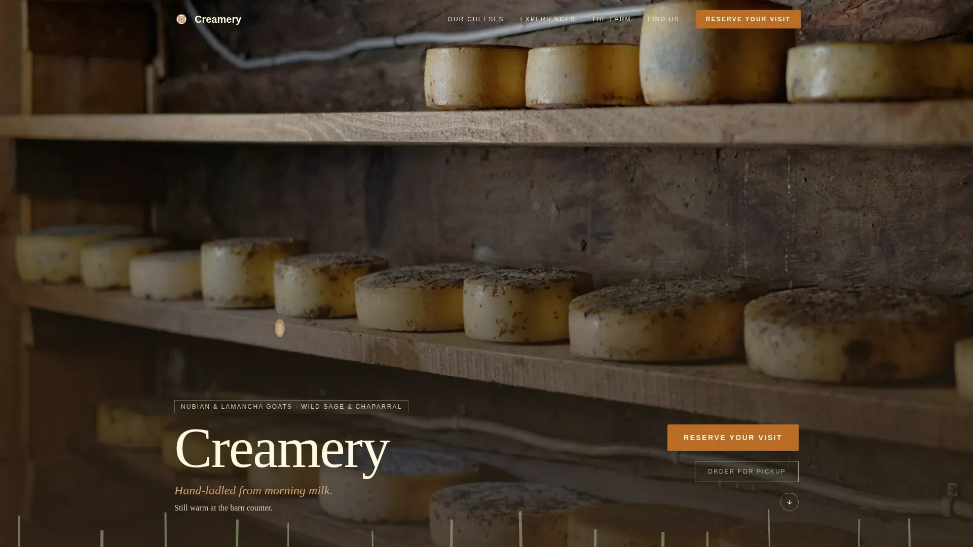
The header is a wide golden-hour farmstead still with three animated details: a goat ear flicking, a hand turning a cheese wheel, and tall grass swaying. Everything else holds perfectly still. The farm name appears in a hand-lettered serif, bottom-left, unhurried. This hero section delivers the strong visual hierarchy that an effective booking landing page requires.
Modular Experience Card Grid
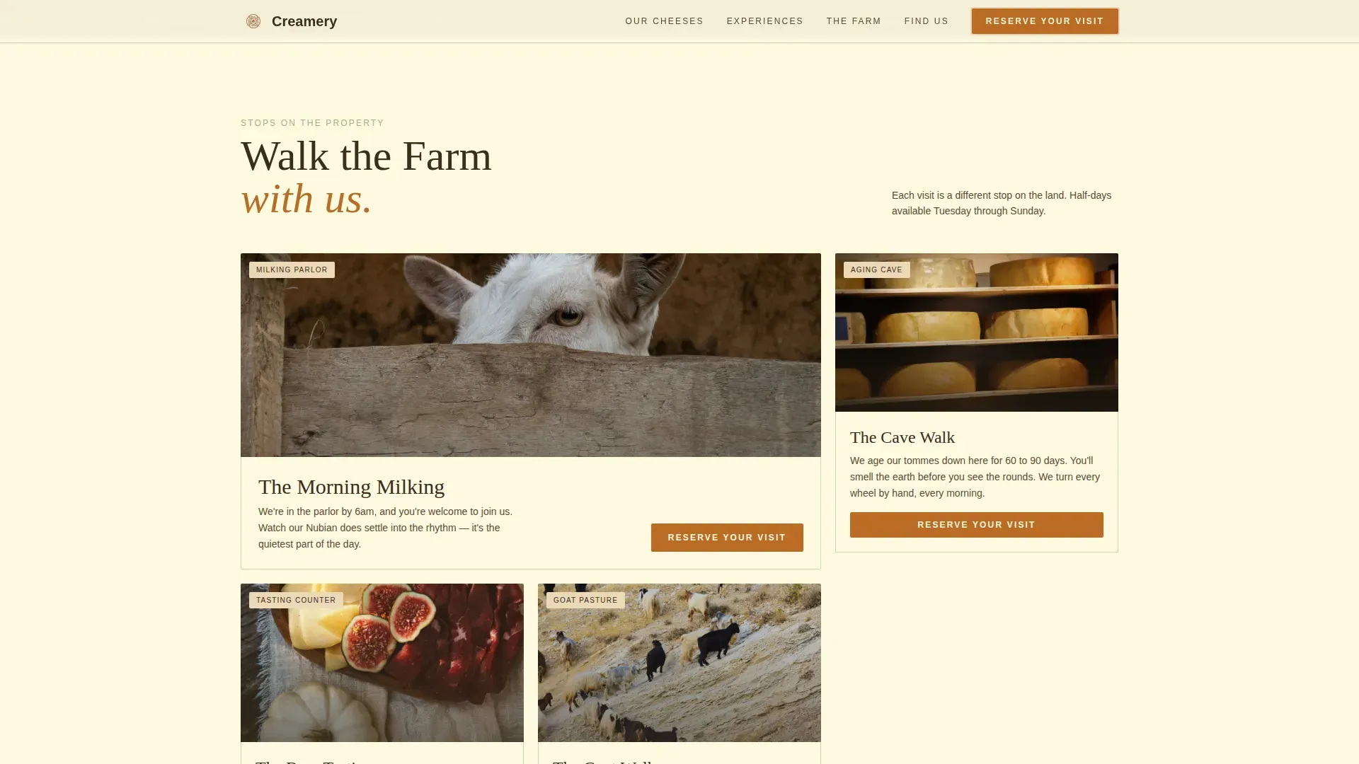
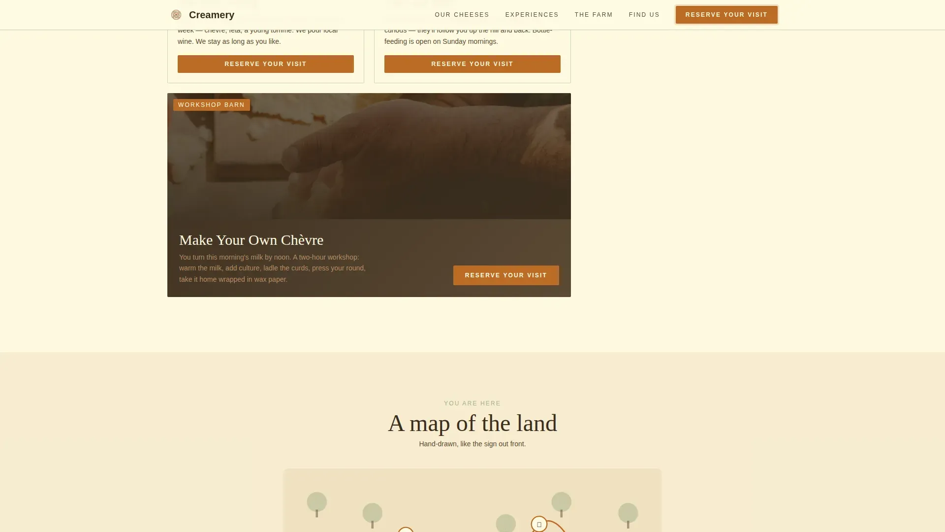
Five cards represent five farm stops: the milking parlor, the aging cave, the tasting counter, the goat pasture, and the workshop barn. Each card carries a single photo, a two-line first-person description, and a "Reserve Your Visit" booking button. The grid uses generous gaps so the page breathes like the property itself.
Multi-Step Booking Modal
Clicking any "Reserve Your Visit" button opens a lightweight calendar showing available half-days. Visitors then select group size (1 to 4, 5 to 12, or private), choose a visit type (tasting, tour and tasting, or cheesemaking workshop), and fill in a single name-and-phone field. The booking flow surfaces clear logistics including dates, times, and location details, which is required for reducing drop-off before confirmation.
Cheese Product Grid and Pre-Order Path
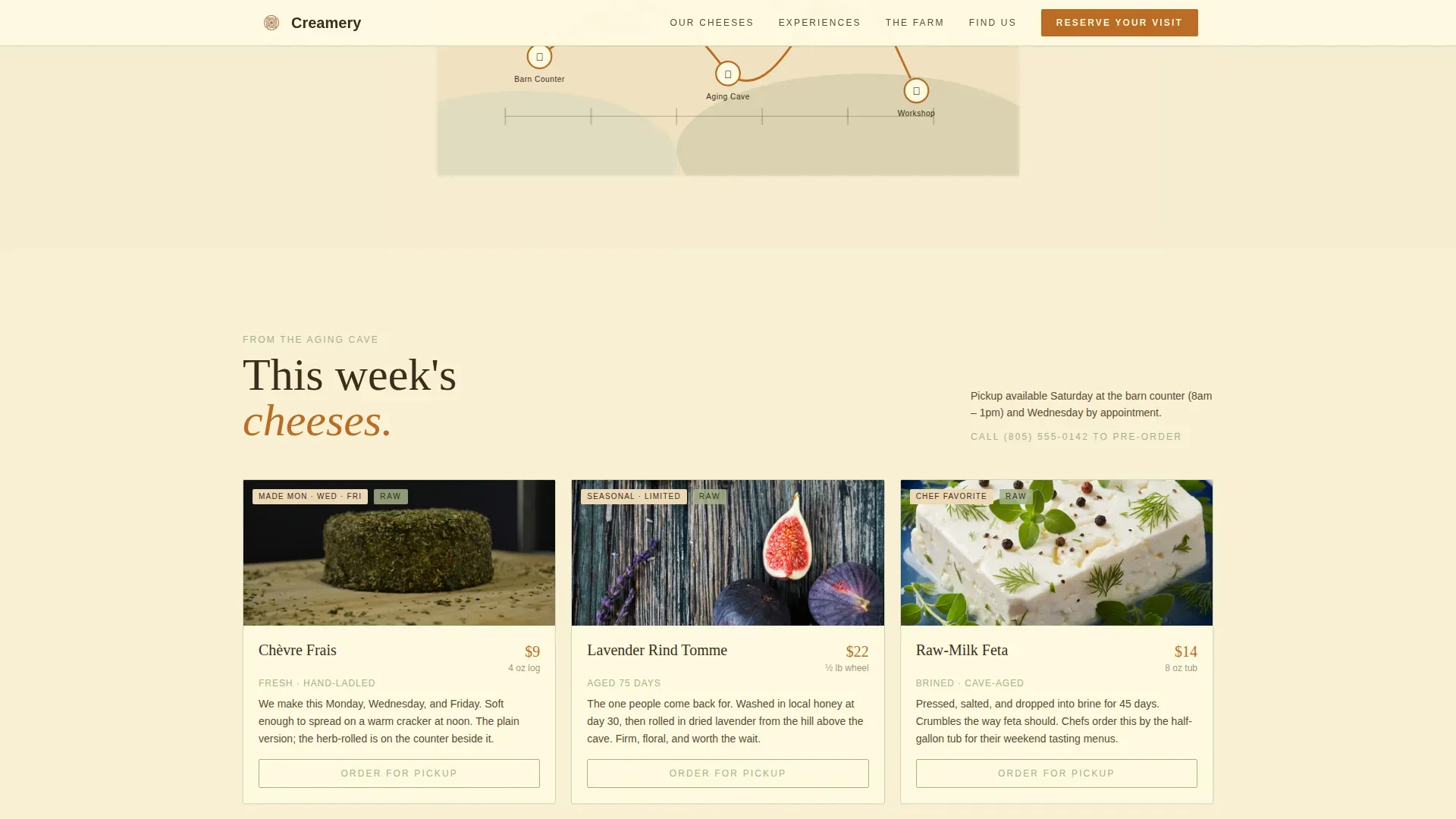
A dedicated cheese grid displays hand-ladled products with a secondary "Order for Pickup" sage-colored link beneath each card. Clicking routes visitors to a simple pre-order form with Saturday or Wednesday pickup slots. This dual-path design serves both first-time visitors and repeat market regulars browsing on any device.
Hand-Drawn Property Map
A illustrated map of the farm property stitches the modular sections together between the card grid and the booking modal. Visitors always know where they are on the land. This design element reinforces the Local and Neighborhood creative direction, making scrolling feel like walking the property.
Social Proof Section
A dedicated testimonial block collects first-person quotes from chefs and market regulars, referencing specific cheese names like the lavender-rind variety. Short, impactful reviews from real visitors build the credibility that a farming landing page needs to convert cautious browsers into confirmed guests.
Page sections overview
| Section | Purpose |
|---|---|
| Cinemagraph Hero | Sets golden-hour mood and presents the primary booking call to action |
| Experience Card Grid | Walks visitors through five farm stops with booking buttons on each card |
| Cheese Product Grid | Displays artisan products and routes to the pre-order pickup form |
| Social Proof Block | Shows chef and market-regular testimonials with specific cheese references |
| Booking Modal and Map | Hosts the multi-step reservation form alongside the hand-drawn farm map |
| Arc Footer | Anchors the page with logo, tagline, navigation links, and social icons |
Design & branding system
The Sunset Mesa color system gives this landing page a palette that feels like the last forty minutes of daylight on a hillside pasture. The design balances a clean, modern layout structure with earthy tones and a spacious, unhurried feel, which is exactly what visitors need before they commit to a farm booking.
- Raw cream (#FEFAE0) grounds every card and serves as the dominant background; sage (#A3B18A) borders sections like fence rows; terracotta (#BC6C25) marks all buttons and pricing
- Deep barn shadow (#3A2D1E) anchors the footer and navigation text; sun-bleached adobe (#D4A373) and dried sagebrush tones carry the mid-page warmth
- Typography pairs Crimson Text serif headings with DM Sans body text, giving the page an artisan feel without sacrificing readability on any device
Mobile & speed optimization
Farm visitors browse on phones at Saturday markets, often deciding on the spot whether to visit next Sunday. This landing page template is built desktop-first but optimized to perform cleanly on every device a visitor might use.
- The modular card grid stacks gracefully on smaller screens so no experience card gets lost on mobile
- Images are structured for fast loading to help reduce bounce rates, keeping the page responsive on slower rural connections
- The booking modal is touch-friendly on every device, and the pre-order form requires only a name, phone number, and pickup slot to complete
How this template helps you convert
An effective farming landing page does not just look good. It moves people from curious to committed. This template is set up with conversion in mind at every scroll stop.
- The cinemagraph hero opens with a benefit-driven headline and a "Reserve Your Visit" call to action immediately visible above the fold, giving visitors a clear next step before they read a single word of copy.
- Every experience card repeats the booking button so the invitation to reserve is always one tap away, and the pre-order path gives cheese buyers a secondary action that keeps them engaged even if they are not ready to visit.
- Testimonials from chefs and market regulars provide the social proof that urban consumers increasingly look for when exploring sustainable dairy and farming experiences, helping visitors trust the farm before they arrive.
Other information about this template
This landing page template fits a broader category of farming and agriculture page templates designed for artisan food producers, agritourism operators, and rural food businesses of all sizes. A few additional details worth knowing before you customize:
- The template is part of a set that covers food and beverage farming niches, making it practical for agri-tech startups, farm-to-table businesses, organic stores, and rural cooperatives
- Booking integration on this type of page can sync with scheduling tools like Calendly or Google Calendar to manage reservation slots and reduce no-shows, which is a recommended next step after launch
- Niche farm page templates are available from providers like Grapevine Local Food Marketing and Anna Fleishman Design for small farms and creameries, while general high-conversion builders like Unbounce offer more customizable layouts for teams with development resources
- The design approach here, earthy tones, spacious layout, and a clean modern structure, aligns with what a free Figma file in this category would typically deliver for dairy and farming businesses
- The page is designed to protect the farm's brand voice throughout: first-person card copy, hand-lettered typography, and a pastoral color system all count toward a consistent identity that visitors remember
Theme
Pastoral Calm
Creative direction
Local & Neighborhood
Color system
Sunset Mesa
Style
Card Grid (Modular)
Direction
Booking/Scheduling
Page Sections
Cinemagraph Hero with Primary Call to Action
Modular Experience Card Grid
Multi-step Booking Modal
Cheese Grid with Pre-order Path
Social Proof Testimonial Block
Hand-drawn Property Map Element
Related questions
Can I customize the booking modal for different visit types?
Does the template include a cheese pre-order form?
Is this template suitable for other farming or agriculture businesses?
What makes this a landing page and not a full website?
How does the hand-drawn property map work within the page?



