Creative Professional Career Blog Website Template
Folio is a storybook-style landing page template built for a creative professional résumé and CV studio. It opens with a Before/After Slider that replaces every headline argument with a single visual proof. Full-page manifesto spreads, a partnership-focused conversion path, and a typographically precise Ink and Paper design system make this template an editorial statement, not just a page.
by Rocket studio
Quick summary
Folio is a full-page landing page template for a résumé and CV studio serving creative professionals. It uses a Before/After Slider as its hero, manifesto-style spreads to build conviction, and a partnership conversion path aimed at agencies and staffing firms. The visual identity follows an Ink and Paper color system with deliberate Swiss-design sensibility.
Who this template is for
This template is built for creative studio founders and design-led service providers who want to sell résumé and CV work at scale. It speaks directly to a B2B audience while still resonating with the individual creatives those buyers serve.
- Résumé and CV studios pitching white-label partnerships to recruitment agencies and creative staffing firms
- Design bootcamps looking to embed portfolio-grade résumé services into their graduate placement pipelines
- Creative professionals and art directors who want to present their own studio offer with editorial confidence
What problem this template solves
Most service pages for résumé studios rely on bullet-pointed feature lists and stock photography. That approach does nothing to communicate design sensibility. Folio replaces the standard pitch with visual evidence and a manifesto that indicts mediocrity before a single word of copy is read.
- Generic landing pages fail to show the transformation a design-led résumé delivers, losing trust before the scroll begins
- Partnership inquiries from agencies and staffing firms rarely have a dedicated, professional conversion path to capture them
- Creative studio brands get watered down by templates that look like every other service page on the internet
What you get with this template
You get a single-page storybook layout built in sections that read like spreads in a design annual. Every section has a defined role, and the scroll builds a deliberate arc from visual proof to manifesto conviction to social proof to conversion.
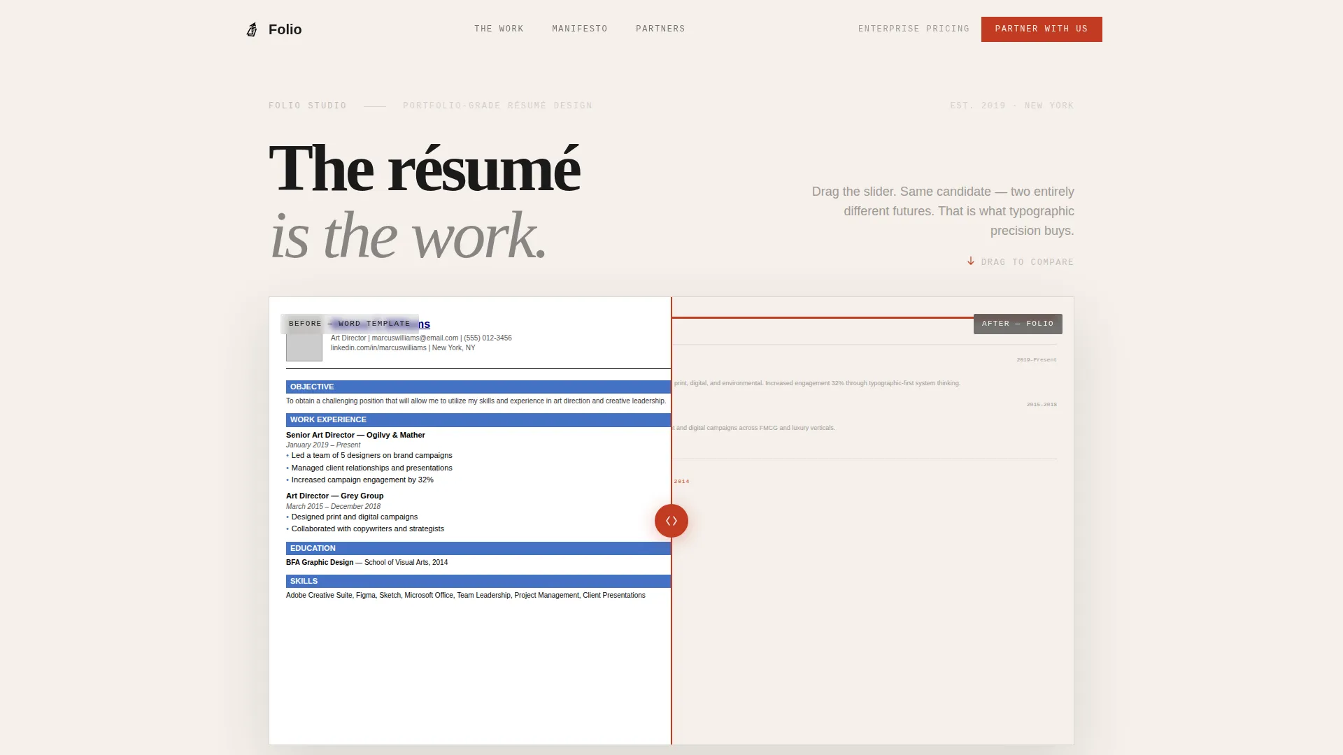
- A Before/After Slider hero that demonstrates résumé transformation without a single word of headline copy
- Full-page manifesto spreads pairing bold typographic statements with real redesigned résumé examples
- A partnership inquiry form with purposeful fields, partner logo social proof, and a supporting callback statistic
Feature list
This template is built around a small set of high-impact components. Each one earns its place in the layout.
Before/After Transformation Slider
The hero opens with a side-by-side slider. The left shows a generic Word-template résumé with default fonts and misaligned margins. The right shows the same information redesigned into an editorial layout. The slider sits at the midpoint on load, inviting interaction before any headline is read.
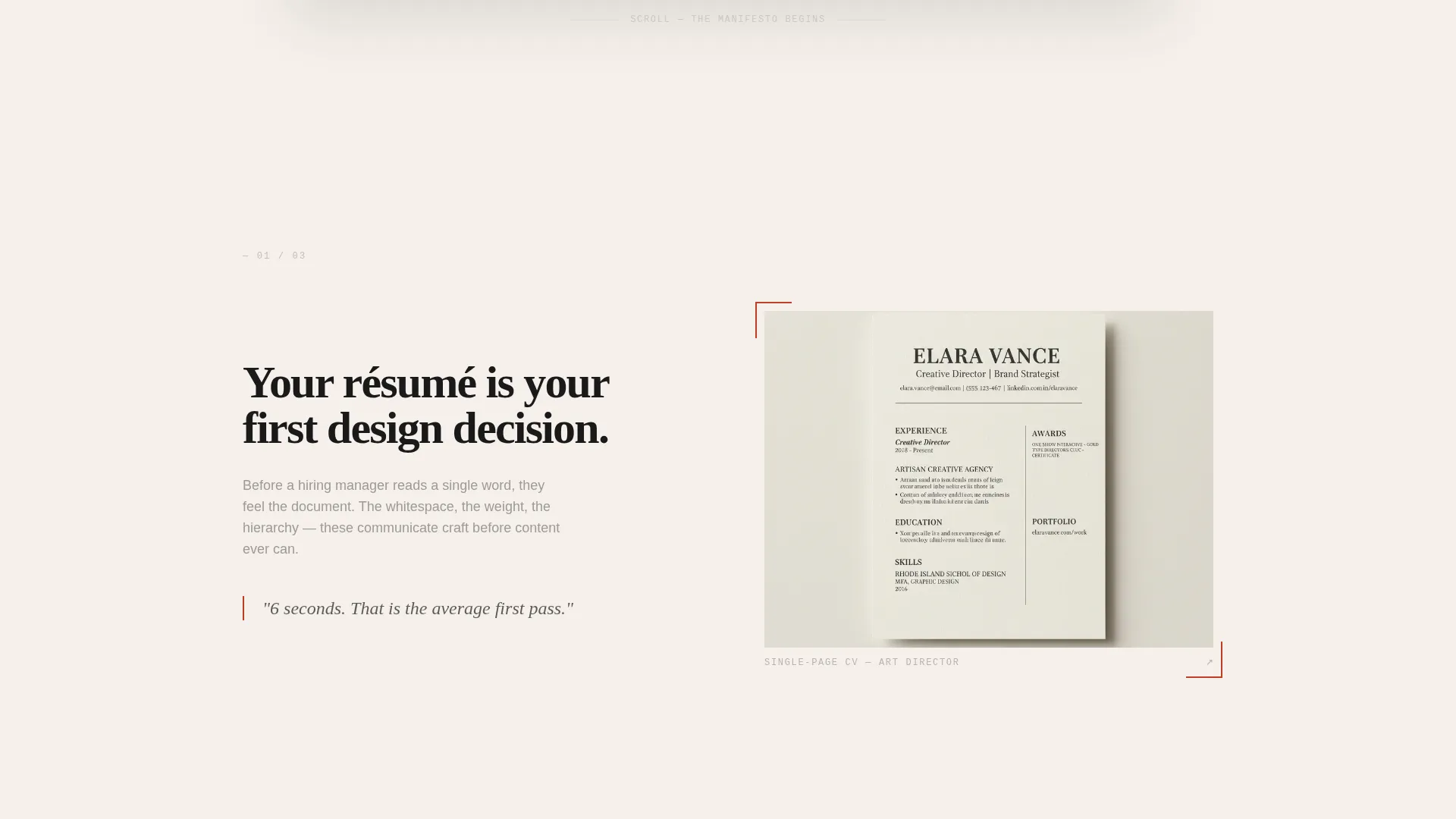
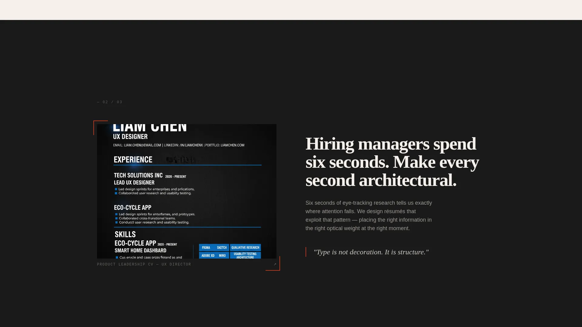
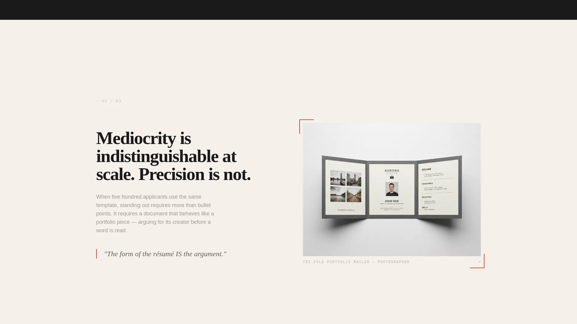
Full-Page Manifesto Spreads
Each scroll section delivers one declarative belief about what a résumé should be. A bold typographic statement occupies one side of the spread; a real redesigned résumé example occupies the other. The work escalates in ambition from single-page CVs to tri-fold portfolio mailers to interactive PDF systems.
Alternating Background Spreads
Backgrounds alternate between warm cotton stock and deep registration black. This creates full-page drama without decorative complexity. Each spread feels like turning a page in a printed monograph.
Partnership Inquiry Form
The conversion section targets agencies, staffing firms, and bootcamps. The form collects company name, number of annual placements, and a single open field that asks what the applicant's talent deserves. This framing positions the inquiry as a creative alignment check rather than a vendor sign-up.
Social Proof Anchor Block
Just before the form, a block of partner agency logos and a single supporting stat ("Candidates redesigned by us are called back 3.4 times more often") give the conversion section earned credibility without urgency-driven pressure tactics.
Dual Call-to-Action Path
The primary call to action is "Bring Us Into Your Studio," aimed at partnership-level buyers. A secondary "See Enterprise Pricing" call to action anchors the final spread. Both paths coexist without competing.
Page sections overview
| Section | Purpose |
|---|---|
| Before/After Hero | Opens with slider proof of résumé transformation |
| Manifesto Spread One | Delivers first declarative belief with résumé example |
| Manifesto Spread Two | Escalates argument with more ambitious résumé work |
| Manifesto Spread Three | Builds peak conviction before the conversion pivot |
| Social Proof Block | Partner logos and callback stat earn the final click |
| Partnership Inquiry Form | Captures agency and studio partnership leads |
| Enterprise Pricing Anchor | Secondary call to action for pricing-focused visitors |
Design & branding system
The visual identity follows a Lens and Frame theme with an Ink and Paper color system. Every color choice references the physical world of print rather than the screen defaults of most web templates.
- Deep registration black (#1A1A1A) and warm cotton stock (#F5F0EB) create alternating full-page backgrounds that feel matte and deliberate
- Pencil-sketch gray (#9E9A94) handles body text and secondary information with graphite softness, avoiding the harshness of pure black on light backgrounds
- Editorial red (#C23B22) is used exclusively for interactive elements and pull-quotes, so every red mark on the page carries intentional weight
Mobile & speed optimization
The storybook layout is structured so full-page spreads reflow cleanly at smaller viewport widths. The Before/After Slider remains the hero at every screen size, and manifesto spreads stack vertically without losing their typographic impact.
- Full-page alternating spreads are designed to reflow into single-column stacks on mobile without losing visual contrast
- The slider hero maintains its interactive midpoint behavior so mobile visitors experience the same transformation proof as desktop visitors
How this template helps you convert
Folio is engineered to convert a specific kind of buyer: the agency or creative director who is skeptical of vendor pages and needs to feel editorial alignment before filling out a form. The page earns that trust systematically.
- The Before/After Slider removes the need for claims by showing transformation directly, creating immediate proof-of-work credibility before any text is processed
- The manifesto spread sequence builds conviction through repetition and escalation, so by the midpoint the visitor is mentally auditing their own placement pipeline rather than passively reading about a service
- The social proof block with partner logos and the 3.4-times callback statistic lands just before the form, converting belief into action at precisely the right moment
Other information about this template
Folio was built with a specific intersection in mind: the creative professional résumé and CV niche, where the product being sold is also a demonstration of the seller's design ability. That constraint shaped every decision in the template.
- The template style is Storybook/Full-Page, meaning sections are designed as immersive spreads rather than modular card-based rows
- The creative direction is Manifesto, a format that works particularly well for studios selling a point of view rather than a commodity service
- The Partnership/B2B conversion path is uncommon in personal résumé and CV templates, making Folio distinctly useful for studios operating at placement-pipeline scale
- The template is categorized under Personal and Resume, subcategory Creative Professional Career, and is suited for studios, agencies, and bootcamps in the creative professional career space
Theme
Lens & Frame
Creative direction
Manifesto
Color system
Ink & Paper
Style
Storybook/Full-Page
Direction
Partnership/B2B
Page Sections
Before/after Transformation Slider
Full-page Manifesto Spreads
Alternating Ink and Paper Backgrounds
Partnership Inquiry Form
Social Proof Anchor Block
Dual Call-to-action Path
Related questions
Who is this landing page template primarily built for?
Can this template also speak to individual creative professionals?
What makes the Before/After Slider different from a standard hero section?
What color system does this template use?
Does the partnership form support customization?


