Precision Climbing Gear Bento Grid Landing Page
Crimp is a bento grid landing page built for a precision climbing hardware workshop. It blends a Luxe Minimal visual identity with Dopamine Pop color accents, interactive scroll animations, and a persistent "Build Your Rack" call-to-action bar. Every tile, hover state, and micro-interaction guides serious climbers toward a custom gear configurator.
by Rocket studio
Quick summary
Crimp is a single-page bento grid landing page designed for a boutique climbing hardware brand. The template uses a matte black canvas, hot coral and electric violet accents, and a rich set of scroll-driven interactions to turn product browsing into hands-on play. A persistent bottom bar drives every visitor toward the gear configurator.
Who this template is for
This template suits brands that sell precision-made, performance-driven climbing hardware in small batches. It is ideal for founders and creative directors who want a product page that feels as intentional as the gear it showcases.
- Small-batch climbing gear workshops selling carabiners, cams, and related hardware
- Sport and trad climbing brands targeting weight-conscious, visually driven buyers
- Alpine guides or sponsored athletes looking to launch a premium gear storefront
What problem this template solves
Most outdoor gear pages present products through static grids and flat photography. That approach rarely communicates craftsmanship, weight obsession, or the tactile thrill of picking up a perfectly machined piece. Crimp solves that gap.
- Flat product pages fail to convey the tactile quality of precision hardware
- Buyers need to feel invested before they click through to a configurator
- A generic store layout cannot match the identity of a niche, craft-driven brand
What you get with this template
You get a fully structured bento grid landing page with layered, scroll-driven interactions built into every row. The layout is designed so that each tile teaches the product catalog through play rather than persuasion.
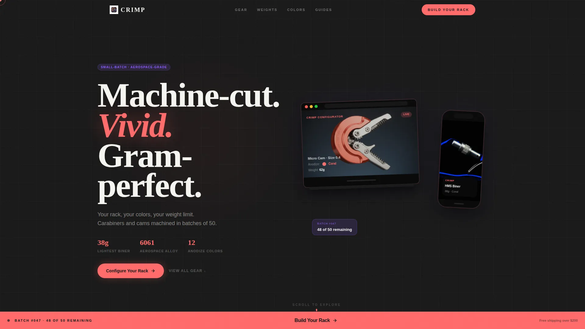
- A Device Mockup header featuring an iPhone and MacBook displaying a 3D gear configurator mid-build
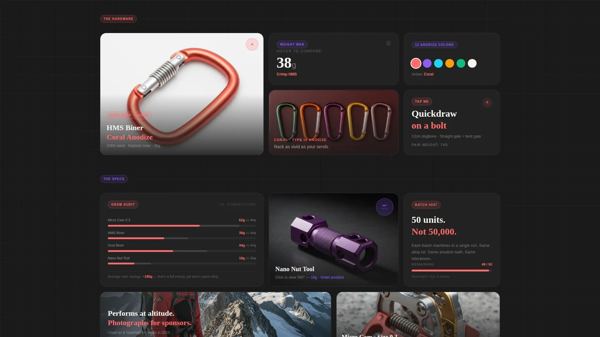
- An interactive bento grid with spring animations, hover reveals, slow-motion video tiles, and a click-to-spin 360° product viewer
- A persistent "Build Your Rack" bottom bar in chalk white on hot coral that appears after the second grid row
Feature list
This section covers the core interactive and visual capabilities delivered by the Crimp template.
Bento Grid with Spring Animations
The bento grid rearranges its tiles in size and position as visitors scroll. Each row shift uses buttery spring animations to create a sense of physical momentum that mirrors the weight and precision of the hardware being sold.
Scroll-Driven Tile Interactions
Individual tiles carry distinct behaviors tied to scroll and user input. One tile plays a two-second slow-motion loop of a carabiner gate snapping shut. Another reveals a gram comparison countdown on hover. A third expands on click to show a 360° spin of a nut tool. A fourth shakes like a quickdraw on a bolt when tapped on mobile.
Live Color Picker
A single color picker tile repaints every product photo on the page simultaneously. Visitors can explore anodized color options across the full catalog before ever reaching the configurator, arriving already knowing what they want.
Device Mockup Header
The header features a floating iPhone and MacBook set at a slight angle against a pure black background. The screens show a cam mid-build in the gear configurator, with the coral anodize catching a virtual light source. The mockup rotates five degrees on scroll to reveal interactive depth.
Persistent Click-Through call to action Bar
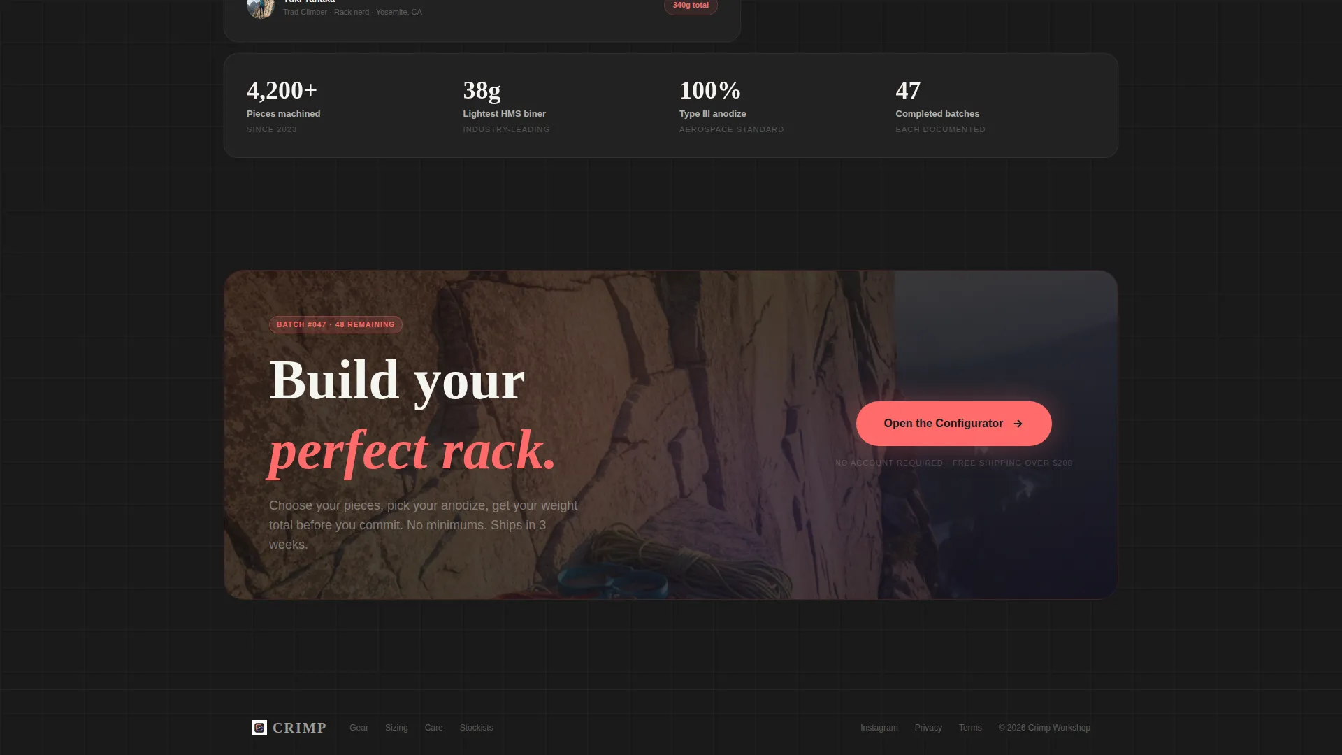
A bottom bar reading "Build Your Rack" in chalk white on hot coral appears after the visitor passes the second grid row. It stays fixed during scroll and carries contextual intent, so a visitor who engaged with cam tiles lands in the cam section of the configurator.
Parallax Weight Stats
Select tiles display parallax weight statistics that shift in depth as the page scrolls. The effect turns gram counts into a visual performance statement rather than a footnote in a spec table.
Page sections overview
| Section | Purpose |
|---|---|
| Device Mockup Header | Introduces the brand and configurator with an immersive 3D visual |
| First Bento Row | Opens the product catalog with animated tile interactions |
| Video Tile | Plays a slow-motion carabiner gate loop to communicate precision |
| Hover Reveal Tile | Shows a gram comparison countdown against a competitor on hover |
| Color Picker Tile | Lets visitors repaint all product photos simultaneously |
| Click-to-Spin Tile | Expands to a 360° nut tool viewer on click |
| Parallax Stats Row | Delivers weight performance data through depth-layered scroll |
| Shake Interaction Tile | Simulates a quickdraw tap to demonstrate tactile product feel |
| Persistent call to action Bar | Anchors "Build Your Rack" after row two for continuous conversion |
Design & branding system
The visual identity follows a Luxe Minimal theme paired with a Dopamine Pop color approach. The result feels like opening a Pelican case full of prototype gear under studio lights, surgical darkness cut through by objects vivid enough to vibrate.
- Matte black (#1A1A1A) dominates the canvas; hot coral (#FF6B6B) fires on anodized accents and hover states; electric violet (#8B5CF6) marks secondary accents and category tags
- Chalk white (#F5F5F0) handles all primary typography, giving text room to breathe against the dark background
- The Overlap and Layered template style adds physical depth to every grid section, reinforcing the precision-engineered character of the hardware
Mobile & speed optimization
The template is built with a touch-first interaction set so that mobile visitors experience the same sense of play as desktop users. Tap gestures replace hover triggers where needed, and the shake interaction is designed for on-device tapping.
- The bento grid reflows cleanly for smaller viewports without losing tile hierarchy or animation intent
- Touch-optimized tap-to-shake and tap-to-expand interactions replace desktop hover and click behaviors on mobile
- The persistent call to action bar remains anchored at the bottom of the screen on all device sizes
How this template helps you convert
Crimp earns the click before it asks for it. By the time a visitor reaches the call to action bar, they have already played with the product, chosen a color, and compared gram counts. That level of pre-commitment makes the move to the configurator feel natural rather than pressured.
- Every tile interaction builds product familiarity, so visitors arrive at the configurator with clear intent rather than vague curiosity
- The contextual call to action bar carries the visitor's tile engagement into the configurator, opening directly to the product category they explored most
- The color picker and gram comparison create a personalization moment that turns browsing into a decision, removing hesitation before the final click
Other information about this template
Crimp sits at the intersection of the Retail and E-Commerce category and the Sports and Outdoor Store subcategory. It is built for a climbing gear niche where the buyer is as detail-obsessed as the maker. A few additional notes on scope and fit:
- The template follows the Unboxing Experience creative direction, meaning every scroll moment is designed to feel like revealing something new from premium packaging
- The Marketplace and Multi landing-page direction means each bento tile resolves to a shared destination, the gear configurator, rather than separate product detail pages
- The Intersection Match Score for this template is 9 out of 10, reflecting a very strong alignment between the Retail and E-Commerce category and the climbing gear niche
- No form fields appear anywhere on the page; the entire conversion path is a single click-through to the configurator
- The template ships as a structured starting point; brand copy, product photography, and configurator links require customization before launch
Theme
Luxe Minimal
Creative direction
Unboxing Experience
Color system
Citrus Burst
Style
Overlap/Layered
Direction
Marketplace/Multi
Page Sections
Bento Grid with Spring Animations
Scroll-driven Tile Interactions
Live On-page Color Picker
Device Mockup Header
Persistent Contextual Call to Action Bar
Parallax Weight Stats
Related questions
Does this template include a working product configurator?
Can I update the color palette to match my brand?
Do the tile interactions work on mobile devices?
What type of product photography suits this template best?
Is this template suitable for brands outside the climbing gear niche?



