Korean Fried Chicken Landing Page Template
Batter is a modular card-grid landing page template built for Korean fried chicken restaurants that want to earn orders, reservations, catering inquiries, and merch sales from a single page. The design draws on a Haute Craft visual identity, a Day-in-the-Life creative direction, and a Parchment and Rust color system that makes every piece of fried chicken look impossible to ignore.
by Rocket studio
Quick summary
Batter is a modular, card-grid landing page template purpose-built for Korean fried chicken restaurants. It pairs a Haute Craft visual identity with a Day-in-the-Life creative narrative, guiding visitors through the full arc of the restaurant day, from morning fermentation to late-night single-wing close-ups. Every card is both content and a conversion point.
Who this template is for
This template fits restaurant owners and creative teams who need a landing page that does more than display a menu. It is especially well-suited for Korean fried chicken concepts with a craft-forward identity, a loyal repeat-customer base, and multiple revenue streams to promote at once.
- Korean fried chicken restaurant operators launching or refreshing a digital presence
- Food and beverage brand teams seeking a multi-conversion landing page design with strong visual storytelling
- Designers building a site for a Korean cuisine and dining concept that needs pickup ordering, catering, reservations, and merch in one place
What problem this template solves
Most restaurant landing pages force visitors to choose one action and then stop. A Korean fried chicken restaurant with catering, reservations, and merch cannot afford that kind of single-track design. Batter solves the problem of fragmented conversion by embedding every call to action inside a card grid that feels editorial rather than transactional.
- Visitors who arrive for one reason, say, a late-night pickup order, discover catering and merch options naturally as they scroll
- The design removes the need to choose between appetizing storytelling and practical functionality; every card delivers both
- A mobile-first structure ensures that customers searching for fried chicken on a smartphone can reach an order button in seconds, not after three taps through a navigation menu
What you get with this template
You get a fully structured, section-led landing page built around a modular bento card grid. The layout treats every card as its own micro-moment in the restaurant's day, so the page reads like a story and converts like a storefront.
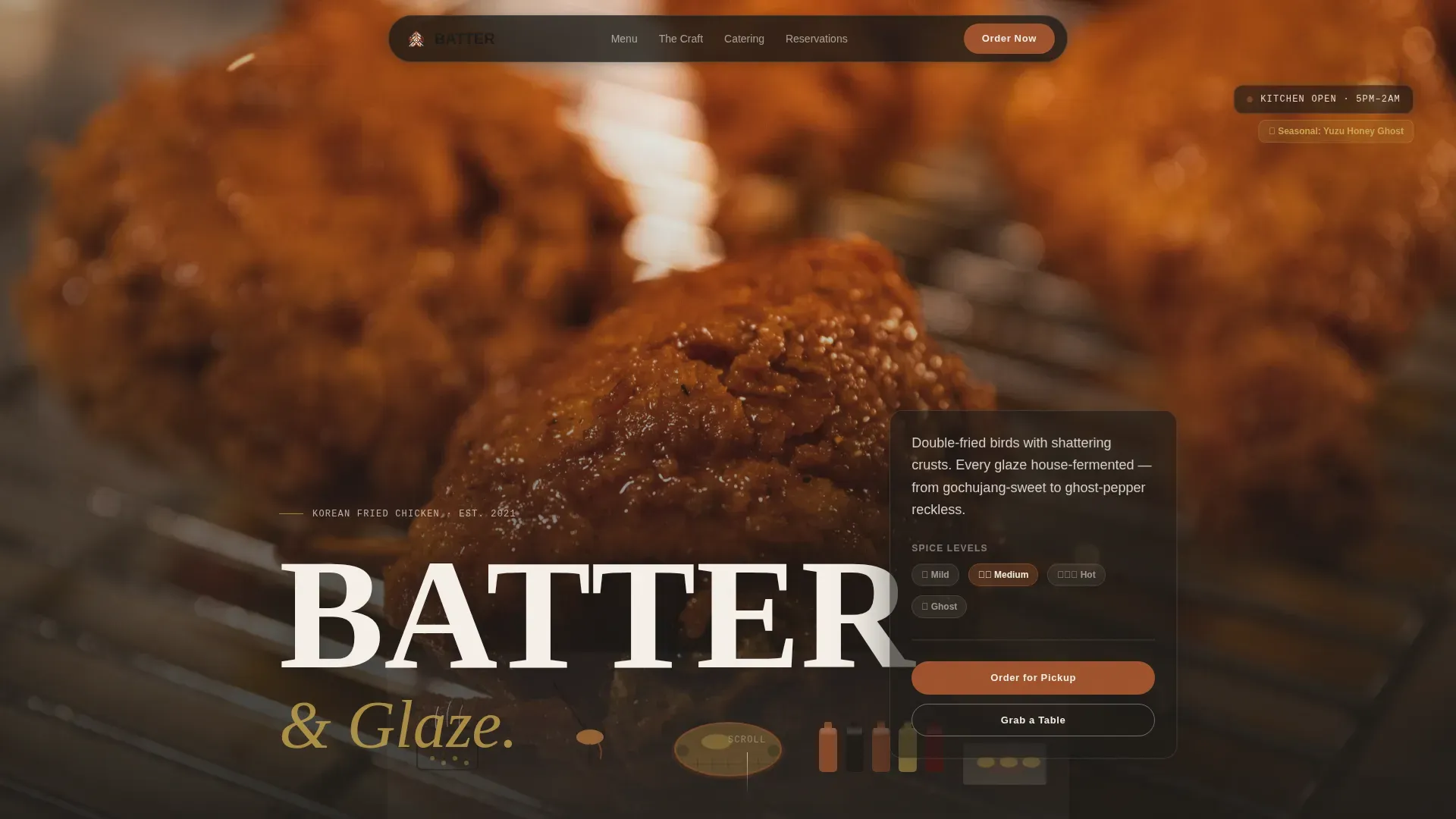
- A hero section with a cinematic full-bleed fried chicken photo, a large display headline, and a glassmorphic order card overlay
- A multi-section card grid covering the craft narrative, the menu, multi-conversion pathways, and a late-night mood close for social proof
- A Custom Illustration header rendered in ink-brush style that references Korean minhwa folk painting, with rust and gold blooming on the chicken and sauces
Feature list
This section gives a closer description of the key capabilities built into the Batter template.
Modular Bento Card Grid with Brush-Stroke Hover
The grid is the engine of the page. Cards vary in size to create visual rhythm and surprise, and each card carries its own conversion intent. Hovering any card triggers a subtle brush-stroke border animation, turning passive browsing into an active, tactile search through the menu and offerings. The layout supports multiple ideas simultaneously without feeling cluttered.
Day-in-the-Life Narrative Scroll
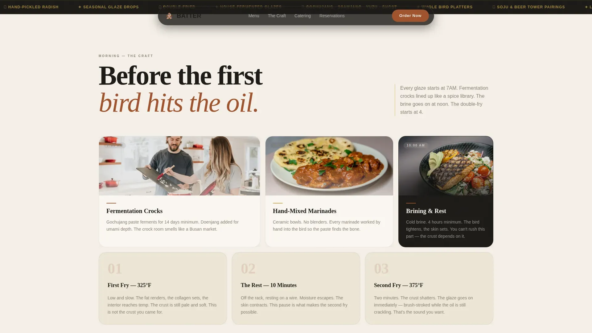
The scroll acts like a clock moving through the restaurant's day. Morning cards share fermentation crock imagery and hand-mixed marinade descriptions. Afternoon cards walk through the double-fry ritual. Evening cards explode with shared platters and beer towers. Late-night cards go moody with close-up fried chicken imagery and condensation details. This structure gives visitors a reason to read through every section rather than bouncing after the hero.
Multi-Conversion Card Pathways
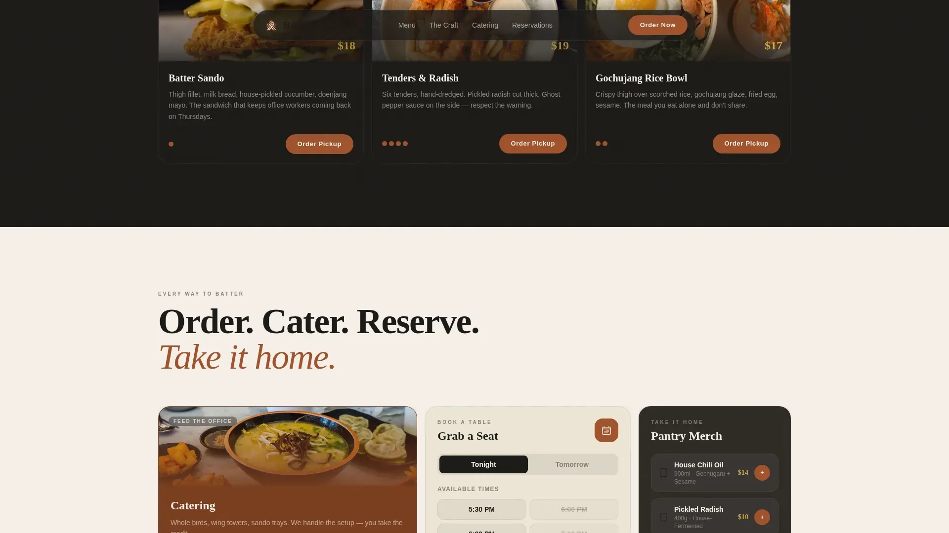
Four distinct conversion types live inside the grid itself. A menu card carries an "Order for Pickup" button. A catering card offers a headcount slider and date picker so office groups can plan ahead. A reservations card opens a time-slot selector. A merch card supports "Add to Cart" for signature chili oil and house-made pickled radish. The design results in a page where every scroll position is a potential conversion.
Custom Illustration Hero Header
The hero header is a sweeping, ink-brush-style panorama of the kitchen in full service. The illustration splits the difference between Korean minhwa folk painting and modern editorial illustration. Steam curls from fryer baskets in calligraphic wisps. A chef's hand lifts golden fried chicken drumsticks with steel tongs. The color is restrained, charcoal linework on parchment, with rust and gold reserved for the chicken and sauces, pulling the eye exactly where it belongs.
Social Proof and Seasonal Glaze Tracker
The late-night mood section anchors the page with customer testimonials tied to specific spice-level stories and a seasonal glaze tracker. Regulars who follow the rotating glaze the way others track sneaker drops can see what is current. This social proof section builds trust with new visitors and rewards loyalty from returning ones, making the page feel alive rather than static.
Cinematic Entrance Animations and IntersectionObserver Stagger
Cards entrance with cinematic stagger powered by IntersectionObserver, so elements animate into view as the user scrolls rather than all at once. Shimmer effects on cards and GPU-accelerated CSS animations keep the motion smooth. The animation design reinforces the craft identity without overwhelming the food photography.
Page sections overview
| Section | Purpose |
|---|---|
| Hero with Order Card | Full-bleed fried chicken photo, bold display headline, glassmorphic quick-order overlay |
| The Craft Morning | Fermentation and marinade story told through bento technique cards |
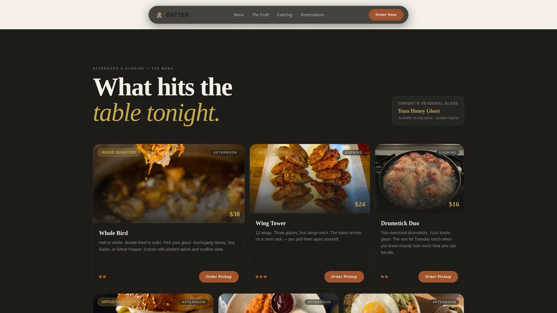
| The Menu Afternoon | Asymmetric menu card grid highlighting 3 to 4 signature fried chicken items with pickup calls to action |
| Multi-Conversion Row | Catering headcount slider, reservations time-slot selector, and merch add-to-cart in one bento row |
| Late-Night Mood | Testimonials, seasonal glaze tracker, and closing call to action |
| Footer Flow | Location, hours, contact details, and social media links in horizontal Vercel-style flow |
Design & branding system
The Parchment and Rust color system gives the page the feel of unfolding a hand-lettered menu on thick cotton stock. Bold, warm colors like fermented chili rust and brushstroke gold make every piece of fried chicken look more appetizing. The design category here is Haute Craft: artisanal without cliche, editorial without being cold.
- Color palette: aged rice paper (#F5F0E8), fermented chili rust (#A0522D), charred sesame black (#1C1A17), brushstroke gold (#C9A84C) for highlights and interactive hover states
- Typography: Fraunces for display headings and DM Sans for body copy, combining editorial weight with clean readability
- Visual tone: raw plaster walls, blackened iron fixtures, ink-brush vectors and calligraphic steam wisps rendered in charcoal linework on parchment backgrounds
Mobile & speed optimization
Late-night fried chicken ordering is phone-dominant, so this template is built mobile-first. The card grid reflows cleanly at every breakpoint, and action-oriented call-to-action buttons stay prominent on small screens. CSS animations are GPU-accelerated to keep motion smooth without introducing jank on lower-powered devices.
- Mobile-first card grid that stacks and reflows logically, keeping the order button visible without extra taps
- GPU-accelerated CSS animations and IntersectionObserver stagger that keep the page feeling responsive as users scroll on a smartphone
- Optimized image delivery so that the full-bleed fried chicken photography and Custom Illustration load quickly, reducing drop-off from slow renders
How this template helps you convert
The Batter template is designed around the idea that appetite is the best persuasion. Every card teaches visitors to click whatever tempts them, so conversion happens through engagement rather than pressure.
- Multiple embedded call-to-action paths, pickup, catering, reservations, and merch, mean that any visitor, regardless of their intent when they arrive, finds a relevant action to take without leaving the page or returning to a navigation menu to search for it.
- Sensory-language headlines, close-up fried chicken photography, and the seasonal glaze tracker create emotional investment before any button appears, so users are already convinced by the time they reach a conversion card.
- A sticky primary call-to-action and action-oriented button text such as "Order for Pickup," "Feed Your Office," and "Grab a Table" keep the next step clear at every scroll position, reducing friction and improving the number of completed conversions.
Other information about this template
The Batter template sits inside the Food and Beverage category, specifically the Korean Cuisine and Dining sub-category, targeting the Korean fried chicken restaurant niche. Below is additional context that helps clarify the full scope and intended use of this template.
- This is the Batter Haute Craft Korean Fried Chicken landing page template, built as a single-page, card-grid layout with a Marketplace and Multi-conversion direction
- Korean fried chicken has grown rapidly as a street food and restaurant category, and specialized concepts benefit from landing pages that reflect that craft identity with vibrant colors, bold typography, and high-quality food imagery
- The template supports promotion banner ideas for seasonal glaze campaigns, sharing on social media, and other marketing pushes that a Korean fried chicken company might run across both online and offline channels
- The design can accommodate Korean fried chicken promotion banners with the same Parchment and Rust color vocabulary, keeping all customer-facing materials visually consistent
- Many online platforms offer free vectors and illustration assets that can complement the ink-brush Custom Illustration already included in this template, making it straightforward to extend the visual system for a blog post, a seasonal menu drop, or a catering brochure
- The footer section is designed to display location, hours, and contact details clearly, which supports local search results and helps customers find the restaurant when they search on a smartphone late at night
- The menu section showcases 3 to 4 signature fried chicken items with photos rather than listing the entire menu, keeping the page focused and results-driven
- The template design can also be adapted for related food and beverage concepts such as a Korean burger or Korean fried chicken and cheese pairing menu, where the same card-grid structure works well for sharing multiple items in one view
- All cookies and consent notice placement, social media sharing links, and site footer information fields are included as part of the standard layout so operators can reject or accept third-party scripts according to their own policies without disrupting the design
- The template is built so that users can select card modules, reorder sections, and update color tokens to match their own brand without rebuilding the layout from scratch
- Page design includes strategic white space between card rows so that the grid never feels overcrowded, even when displaying a large number of menu categories and conversion options together
- The description fields inside each card are kept short and sensory, following best practice for landing pages where benefit-driven copy outperforms ingredient lists
- The cooked chicken photography guidelines built into the brief call for authentic dish images rather than stock photography, which builds visitor trust and produces better conversion results than generic food vectors alone
- Because the template targets a Korean fried chicken restaurant niche with strong street food roots, the design vocabulary intentionally borrows from the energy and immediacy of street food culture while elevating it through the Haute Craft editorial lens
Theme
Haute Craft
Creative direction
Day-in-the-Life
Color system
Parchment & Rust
Style
Card Grid (Modular)
Direction
Marketplace/Multi
Page Sections
Modular Bento Card Grid with Brush-stroke Hover
Day-in-the-life Narrative Scroll
Multi-conversion Card Pathways
Custom Illustration Hero Header
Social Proof and Seasonal Glaze Tracker
Cinematic Entrance Animations and Staggered Card Reveal
Related questions
Can I use this template for a Korean fried chicken restaurant with multiple menu categories?
Does this template include the catering headcount slider and time-slot reservation picker?
Is this template suitable for mobile users who order late at night?
Where do the social proof elements appear on this template?
Can the card grid design be adapted for related food concepts like a Korean burger or cheese pairing menu?



