Quick Service & Takeaway Professional Website Template
Crisp is a masonry-grid fried chicken landing page built for neighborhood quick-service spots that want to drive direct orders without a chain feel. A cinematic hero banner, polaroid-style community tiles, a spotlight menu design, and a no-account order modal work together to turn hungry visitors into paying customers fast.
by Rocket studio
Quick summary
Crisp is a single-page fast food template for a fried chicken shop that wants every scroll to feel earned. The design pulls together a Neo-Retro Japanese Zen aesthetic, a staggered masonry banner grid, signature menu design cards, and a streamlined order modal. It is built mobile-first, with high-interactivity animation and a direct "Order Your Box" call to action pinned to the viewport.
Who this template is for
This template fits any local fast food operator who needs a page that feels personal, not corporate. It is especially well-suited for corner fried chicken shops, quick-service takeaway counters, and neighborhood food businesses that compete on character rather than scale.
- Independent fried chicken shop owners launching or refreshing their online presence
- Food entrepreneurs creating a direct-order landing page without platform fees
- Designers building a client page for a neighborhood fast food or takeaway brand
What problem this template solves
Most fast food templates look identical. They recycle the same hero banner layout, the same generic chicken menu grid, and the same checkout flow that could belong to any chain. Crisp solves the "looks like everyone else" problem by anchoring design and copy to community identity.
- Visitors leave fast food pages quickly when the food photography feels stock and lifeless
- Generic menu design fails to communicate craft, which weakens trust before customers order
- Long account-creation flows lose mobile users mid-commute before they reach the order step
What you get with this template
You get a complete, ready-to-deploy fried chicken landing page with every section pre-built and fully editable. The design fried chicken aesthetic is set from the first banner frame to the footer pattern, so you spend time on your content, not on layout decisions.
- A cinematic hero banner with a lifestyle food photograph, fade-in headline, and prominent call-to-action button
- A masonry banner grid of polaroid-style community and food tiles that alternate between close-up crispy fried chicken shots and neighborhood moments
- A menu spotlight section, a regulars quote wall, an interactive order modal, and an ultra-minimal footer
Feature list
This template packs targeted design and interactivity into a lean single-page structure. Every feature listed below comes directly from the template build.
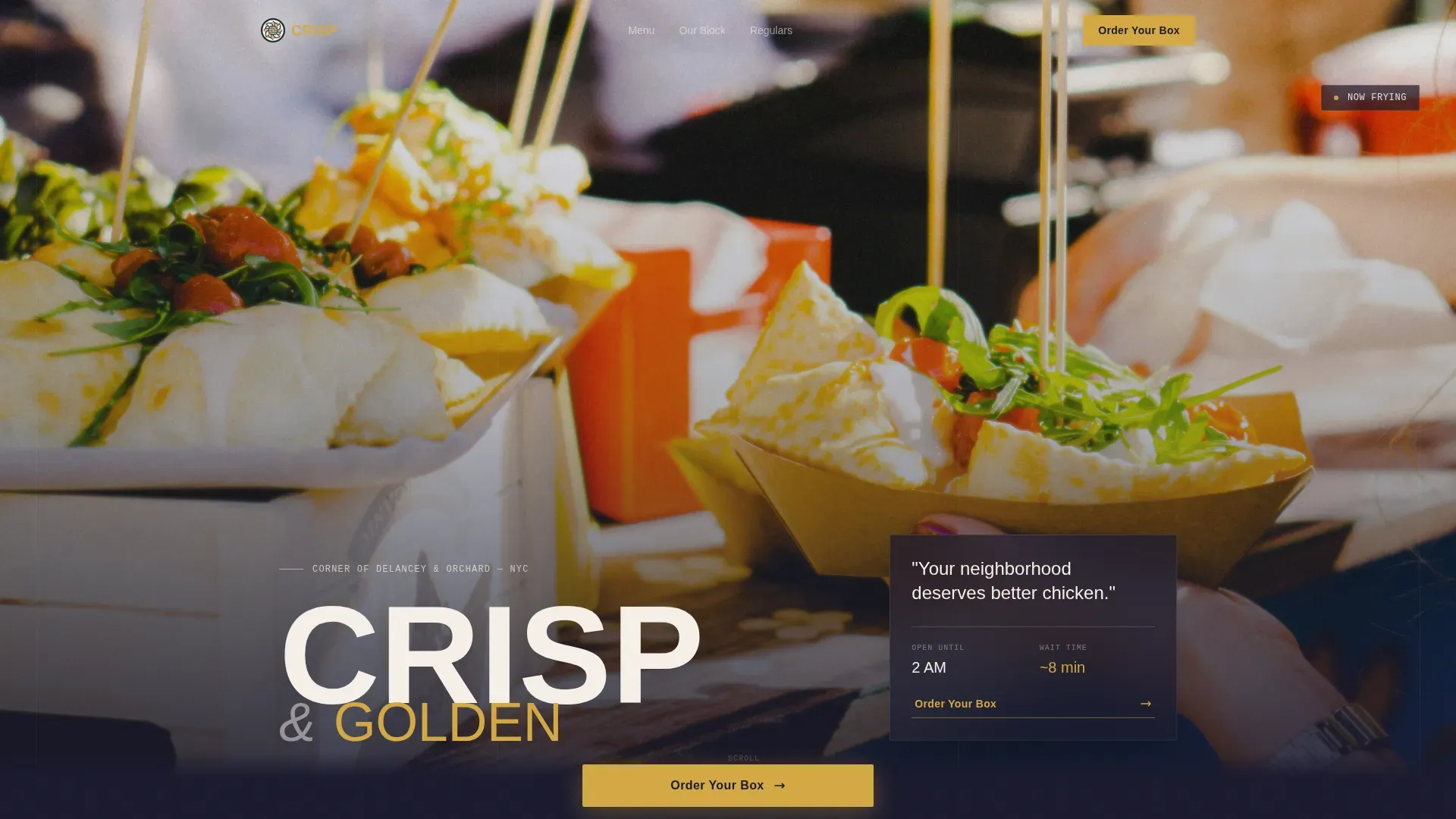
Cinematic Hero Banner
The hero is a full-width lifestyle banner framed tight around a hand reaching into golden fried chicken, steam still rising. A shallow-focus background of string lights and a chalkboard menu creates depth. A single fade-in headline sets the neighborhood tone before the user scrolls anywhere.
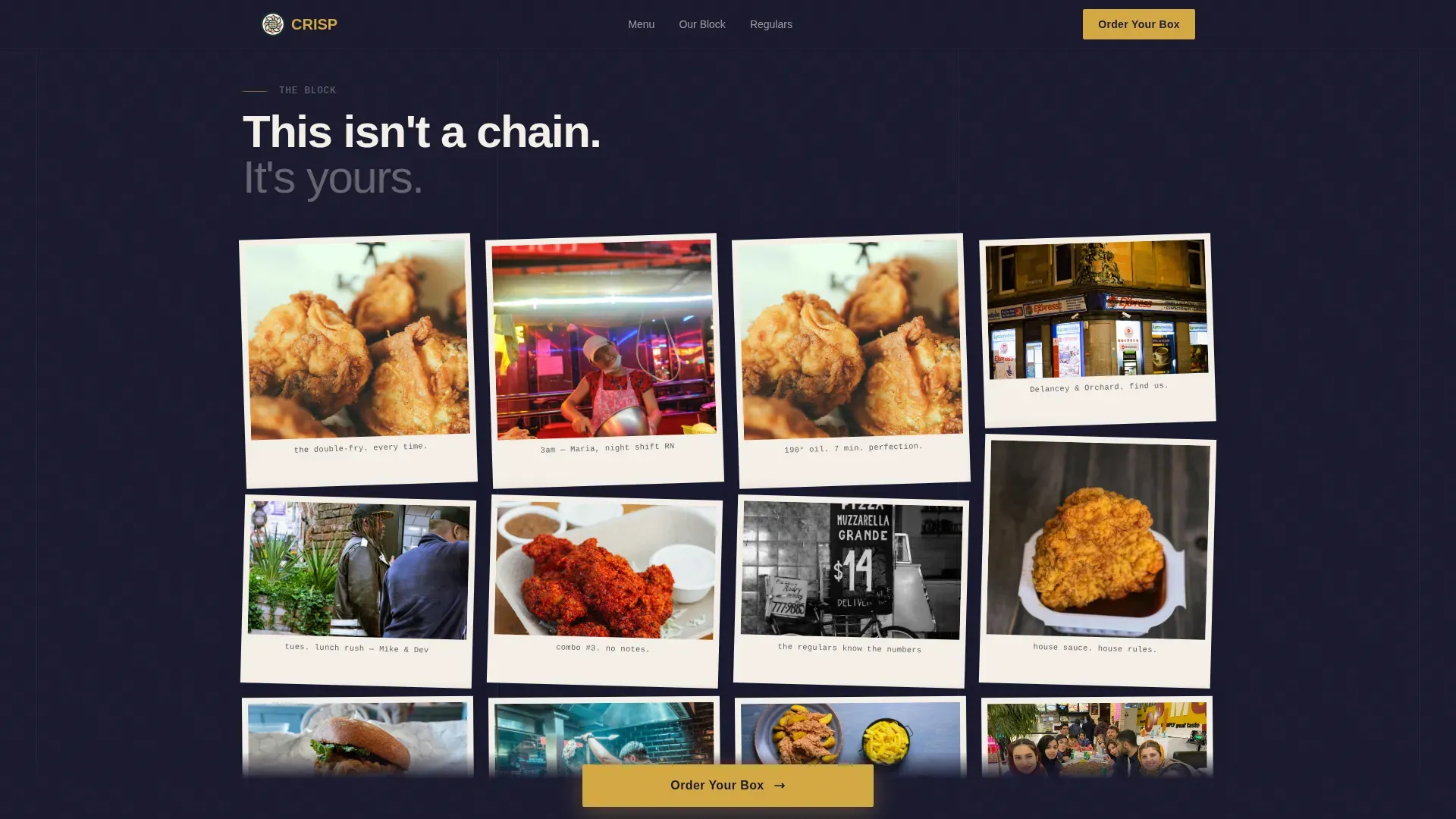
Masonry Community Grid
The masonry banner grid tiles polaroid-style cards in a staggered rhythm. Cards alternate between food close-ups and community moments including crew portraits, a hand-drawn map card, and first-name customer quotes. Each card feels pinned to a corkboard, creating a design that earns belonging rather than just appetite.
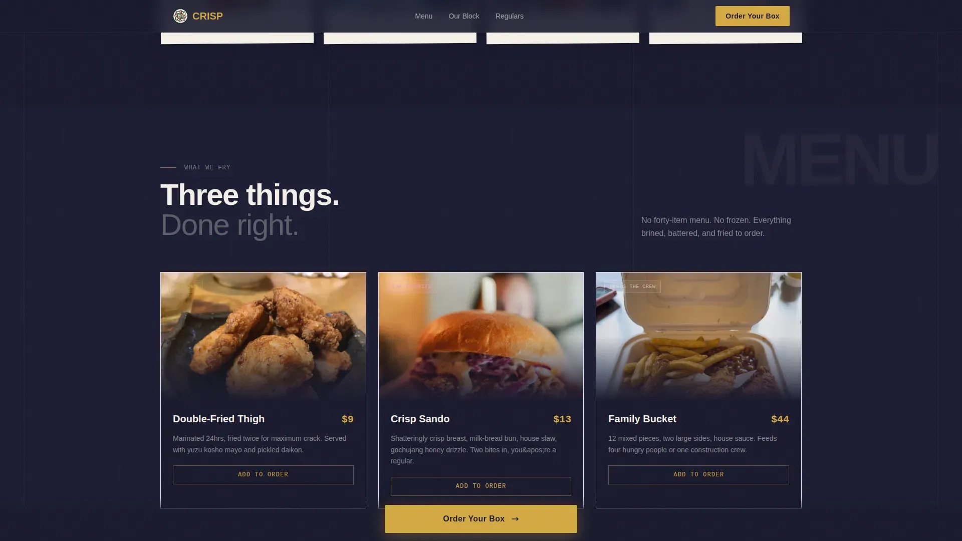
Menu Spotlight with Pricing
Three signature fried chicken items appear in a staggered-reveal menu design section. Prices display in tempura gold using JetBrains Mono, a monospaced label font that reads like a hand-stamped receipt. The chicken menu layout uses full-width food photography to showcase each dish with clarity.
No-Account Order Modal
The order modal slides up from the bottom of the page without requiring account creation. It includes combo photos, a size selector for 2-piece, 4-piece, or family bucket, sides as toggle chips, and a pickup-time selector that defaults to "ASAP." This keeps the fast food ordering step frictionless on mobile.
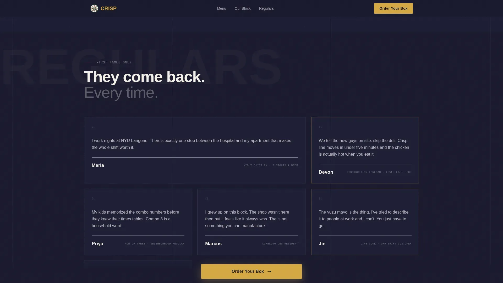
Regulars Quote Wall
First-name-only customer quotes are displayed in a banner-style wall section that reinforces neighborhood identity. This section adds social proof without relying on star ratings or review platform widgets, keeping the design self-contained and on-brand.
Pinned Order Call to Action
The "Order Your Box" button is pinned to the bottom of the viewport throughout the page. It stays visible in tempura gold as the user scrolls, creating a persistent fast food conversion anchor at every design section.
Page sections overview
| Section | Purpose |
|---|---|
| Hero Lifestyle Banner | Opens with cinematic fried chicken food photo and fade-in headline |
| Masonry Community Grid | Alternating food and neighborhood polaroid tiles build appetite and belonging |
| Menu Spotlight Cards | Three crispy fried chicken items with pricing in tempura gold |
| Regulars Quote Wall | First-name customer quotes add community trust and social proof |
| Order Modal Overlay | Size selector, sides toggles, and pickup-time input drive direct fast food orders |
| Minimal Footer | Ultra-minimal horizontal footer closes the page cleanly |
Design & branding system
The design follows a Neo-Retro Japanese Zen kissaten aesthetic. This means the visual identity in fried chicken branding is built through deliberate color, shape, and typography choices rather than generic fast food clichés. The result feels like a vintage diner reimagined with clean lines.
- Color palette: deep nori black (#1A1A2E) for the background, rice-paper cream (#F5F0E8) for body surfaces, pickled ginger blush (#E8A0BF) for accents, and tempura gold (#D4A843) reserved for prices, buttons, and key highlights
- Typography: Bricolage Grotesque for headlines, DM Sans for body copy, and JetBrains Mono for prices and labels, balancing bold nostalgic type with clean sans-serif readability
- Illustrations, icons, and hand-stamped graphic details run throughout the design to add tactile warmth to the background and card surfaces
Mobile & speed optimization
This template is designed mobile-first because the primary customers are ordering on phones mid-commute. The design fried chicken layout prioritizes thumb-friendly tap targets, a pinned order button, and a fast food flow that reaches the checkout step in the fewest possible taps.
- Images are lazy-loaded so the page can run without blocking the hero banner on slower connections
- CSS scroll-behavior is handled natively, keeping the design light without heavy libraries
- The modal slide-up animation and staggered masonry banner reveal use CSS-driven transitions to save on render cost
How this template helps you convert
A landing page must balance visual appeal with high-conversion functionality, and this template is built with that principle throughout. Strong branding and menu design work together to create a page that earns the order before the modal even opens.
- The food banner hierarchy is intentional: food comes first, people come second, and the order form appears only after the design has built hunger and trust, reducing drop-off at every step
- The pinned "Order Your Box" button means the fast food conversion action is never more than one tap away, no matter which page section the visitor is reading
- No account creation is required, which removes the single biggest friction point for mobile fast food customers ordering in a short window of time
Other information about this template
This template is well-suited for food businesses creating a professional page without starting from scratch. Users can edit text, color values, and images to match their own fried chicken brand. The design supports full-width food photography for close-up crispy fried chicken shots and accommodates hand-drawn illustrations and icons throughout the banner tiles.
- Prominent hero sections display high-quality images that vividly showcase signature dishes, following best practice for fast food and quick-service food banner design
- The template structure supports LocalBusiness information blocks for name, address, and contact details, which helps search engines surface correct business data
- Effective food banner design attracts customers through visually appealing graphics and enticing food photography, and every banner tile in this template follows that principle
- Fried chicken design inspiration here includes playful community illustrations, humorous first-name quotes, and a hand-drawn map card, moving beyond plain product photography
- Food marketing templates can include icons, illustrations, and photos to boost visual appeal, and this template delivers all three across its masonry banner grid
- Canva offers food banner templates for quick edits, but this template goes further by providing a full landing page with an interactive order modal and a complete menu design system
- Download the template to get every section, animation, and design asset in one package, ready to deploy for your fried chicken shop
Theme
Neo-Retro
Creative direction
Local & Neighborhood
Color system
Japanese Zen
Style
Masonry/Pinterest
Direction
Direct Sales
Page Sections
Cinematic Lifestyle Hero Banner
Staggered Masonry Banner Grid
Menu Spotlight with Tempura Gold Pricing
Frictionless Order Modal
Regulars Quote Wall
Pinned Viewport Order Button
Related questions
Can I edit the colors and typography in this template?
Does the order modal require a backend or third-party service?
Is this template suitable for a fast food business other than fried chicken?
How do I get the template after purchase?
What makes this different from generic restaurant templates?



