Vibrant British Bistro Landing Page Template
Chippy is a neo-retro British fast casual landing page built for counter-service fish and chip restaurants. It pairs a full-bleed hero photograph with an overhead dish gallery, a neighbourhood map section, and a collection order form with 15-minute time slots. The design channels a 1970s chippy menu card, reprinted sharp and warm on modern stock.
by Rocket studio
Quick summary
Chippy is a single-page restaurant template designed for British fish and chip shops. It leads with a cinematic counter photograph, moves through a click-to-detail food gallery, and closes with a collection booking form. Every section earns the visitor's trust before asking for the order. The design is warm, local, and unapologetically chippy.
Who this template is for
This template is built for independent fish and chip shops that want an online presence as characterful as their food. It suits counter-service restaurants that rely on regulars but also need to convert first-time visitors browsing on a phone at lunchtime.
- Fish and chip restaurant owners wanting to drive collection orders online
- Operators running a back room for parties or group bookings
- Shop owners who want a strong brand identity without a bespoke agency build
What problem this template solves
Most fast casual restaurant pages either look too generic or push the booking form before the visitor is even hungry. Chippy solves the sequencing problem. It shows the food and the neighbourhood first, then asks for the order. This logical flow guides visitors from awareness to action without friction.
- Visitors leave pages that feel cold or corporate before the food is even visible
- Generic templates erase the local brand identity that makes a chippy worth queuing for
- Forms placed too early reduce conversion before trust is built
What you get with this template
You get a fully structured, section-led landing page ready for a British fish and chip restaurant. The design handles visual storytelling, menu presentation, and order capture in one continuous scroll. Every section is purposeful and every design choice reflects the food it represents.
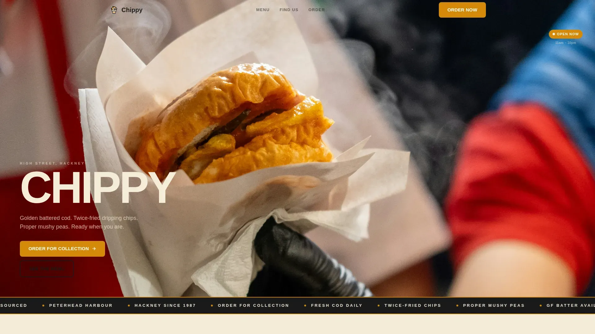
- A cinematic hero section with a full-bleed fish and chips counter photograph
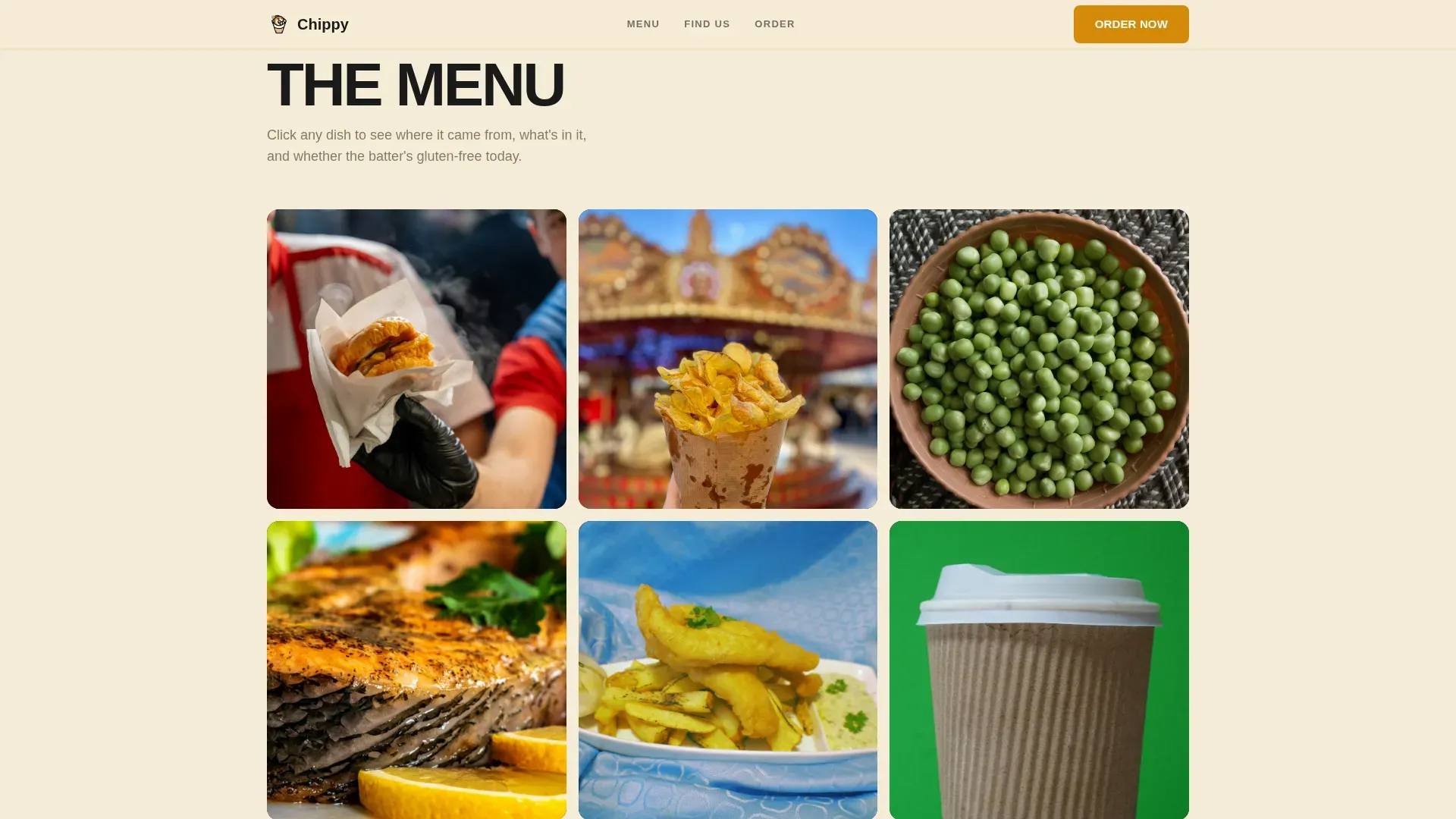
- A click-to-detail menu gallery highlighting each dish with ingredients, allergens, and catch origin
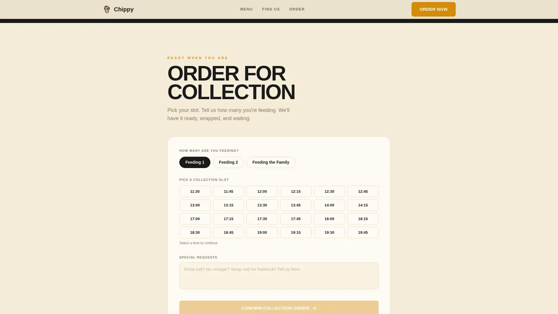
- A collection order form with a 15-minute time-slot picker, group-size toggle, and a secondary back-room booking path
Feature list
A retro style landing page is designed to showcase retro style products and convert visitors into customers. Chippy delivers that promise with built-in sections that move from food imagery to neighbourhood context to order capture, following a clear value proposition at every step.
Full-Bleed Hero with Film-Title Name Card
The hero is a tight counter photograph: paper-wrapped fish and chips mid-unwrap, steam rising, a wooden chip fork angled in. The restaurant name sits bottom-left in a heavy condensed typeface, like a film title card. A primary "Order for Collection" call to action appears above the fold.
Click-to-Detail Menu Gallery
A grid of overhead dish images shot on brown paper fills the menu section. Each image opens a detail panel showing ingredients, allergen information, and a short catch origin line. This approach to food content builds trust through transparency, highlighting the quality of each dish.
Neighbourhood Map Section
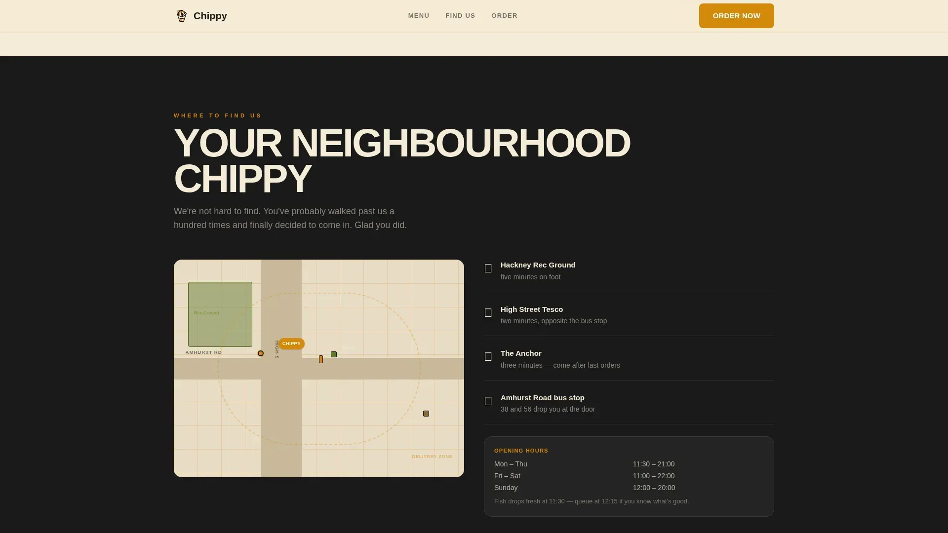
A full-width illustrated map shows the shop's delivery zone and nearby landmarks, written in chippy vernacular. This section builds familiarity and communicates the restaurant's local identity. It tells the visitor: this place already knows your street.
Collection Order Form with Time-Slot Picker
The order section includes a 15-minute interval time-slot picker, a group-size toggle (feeding 1, feeding 2, feeding the family), and a single text field for special requests. The form appears only after the food and neighbourhood sections, so visitors arrive ready to commit.
Back Room Booking Path
A secondary booking option sits below the main order form. It includes a date picker and headcount field for party reservations. This extends the restaurant's services beyond daily collection into private event bookings.
Sustainability and Allergen Badges
Green badges reading "GF Batter Available" and "Sustainably Sourced Cod" appear within gallery detail panels. Sustainability badges indicating responsible sourcing are increasingly important for UK diners, and these are baked directly into the dish information design.
Page sections overview
| Section | Purpose |
|---|---|
| Hero Counter Shot | Establishes food and place with a cinematic full-bleed photograph |
| Menu Gallery Grid | Presents dishes with click-to-detail panels for ingredients and allergens |
| Neighbourhood Map | Communicates local delivery zone and landmarks in chippy vernacular |
| Order for Collection | Captures collection bookings with time-slot picker and group toggle |
| Back Room Booking | Secondary path for party reservations with date picker and headcount |
| Footer Row | Single-row linear footer closing the page |
Design & branding system
The design system channels a 1970s chippy menu card, browned at the edges and bold in type, but reproduced on heavy matte stock with modern photography. Heritage-inspired typography mixes heavy condensed sans-serifs with editorial serif accents for improved readability. The neo-retro aesthetic combines bold type with a clean, structured layout so the food always reads first.
- Fire and Earth colour palette: chip-fat amber (#D4890A) for buttons and hovers, deep fryer black (#1A1A1A) for headers, mushy pea green (#7A9A3A) for badges, and tile-grout cream (#F5ECD7) across backgrounds
- A structured colour palette in neo-retro design places vibrant retro-cool tones against modern layout grids, making the food imagery pop without visual noise
- A fish and chip shop can modernise its brand identity while honouring traditional elements, and every design choice here reflects that balance
Mobile & speed optimization
Mobile-first design is critical for fast casual dining restaurants because most visitors check menus and place orders on their phones, often mid-queue or on a lunch break. This template is built with that behaviour in mind, ensuring easy navigation on small screens throughout.
- The hero, gallery, and order form are all optimised for thumb-friendly interaction on mobile devices
- Images are lazy-loaded with the hero prioritised, keeping the page responsive from the first scroll
- Static page sections are structured to load efficiently, so the food is visible before visitors lose patience
How this template helps you convert
Conversion on a fast casual restaurant landing page depends on sequencing, clarity, and trust. Visual hierarchy guides the eye from the headline through the food imagery and neighbourhood context to the call to action, following the proven awareness-to-action path.
- The hero section places the primary "Order for Collection" call to action above the fold, alongside a warm-toned photograph of the signature fish and chips dish. Prominent calls to action appear again near the gallery and at the order form.
- The gallery detail panels show allergen information and catch origin lines per dish. This transparency acts as social proof, telling visitors the food is fresh and the restaurant is honest about what goes into it.
- The order form is the final step, appearing only after the visitor has seen the food, read the neighbourhood section, and already decided they want chips. A single primary action keeps conversion focused.
Other information about this template
This is the chippy neo retro British fast casual landing page template, designed for UK-based fish and chip shops that blend traditional heritage with contemporary aesthetics. The overall design covers every traffic source a neighbourhood chippy is likely to reach: search, social, and direct local referral. Below are additional details worth knowing before you build.
- The template supports placeholder images and videos for shop atmosphere, dish close-ups, and behind-the-counter content; visual content including images and videos that showcase retro offerings is essential to making this design land
- Retro fish and chip photography captures the nostalgic essence of British culinary culture; classic fish and chips imagery with vintage shop settings and classic fish presentation suits this template's visual language perfectly
- The brand identity system works across digital pages and can inform physical touchpoints like packaging and signage, supporting a cohesive brand identity beyond the screen
- Typical conversion rate benchmarks vary by traffic source and offer type; the template's sequenced layout is designed to support strong conversion regardless of where visitors arrive from
- Classic fish dish pages perform well when images are warm-toned and copy is specific; the detail panel format reinforces this by giving each classic fish portion its own origin story
- French fries and their British equivalent, twice-fried chips, are presented with the same care as the fish, with fries content handled in gallery panels just like every other food item
Theme
Neo-Retro
Creative direction
Local & Neighborhood
Color system
Fire & Earth
Style
Gallery + Detail
Direction
Booking/Scheduling
Page Sections
Full-bleed Hero with Order Call to Action
Click-to-detail Menu Gallery
Illustrated Neighbourhood Map Section
Minute Collection Order Form
Back Room Booking Path
Sustainability and Allergen Badge System
Related questions
Can I adapt this template for a restaurant that serves more than fish and chips?
Does the template include the illustrated neighbourhood map artwork?
How does the collection order form work within the template?
Is this template suitable for a restaurant with a back room or private dining space?
Can the green sustainability badges be edited or turned off?



