Basketball Trainer & Skills Camp Website Template
Crossover is a single-page landing page template built for basketball trainers who sell results, not promises. It pairs a live countdown timer and scarcity-driven copy with a modular card grid that leads every block with hard stats. The Fire and Earth color system, looping video background, and sticky checkout bar work together to turn court-side credibility into direct sales.
by Rocket studio
Quick summary
Crossover is a direct-sales landing page template for elite basketball training programs. The full-viewport countdown timer creates immediate urgency, while a stats-first card grid stacks player proof until doubt disappears. Molten orange calls to action, volcanic black backgrounds, and a streamlined three-tier checkout turn training interest into confirmed spots.
Who this template is for
This template is built for basketball trainers and coaches who already have a proven program and need a page that sells it with the same intensity they bring to the court.
- Skill trainers running group cohorts or private sessions for high school and club-level players
- AAU coaches and independent trainers marketing directly to parents managing recruitment timelines
- Adult league coaches or ex-college players offering structured skill-development programs to competitive adult players
What problem this template solves
Most training program pages bury the proof and lead with a generic hero image. Visitors leave before they see the stats that would have convinced them. Crossover flips that sequence entirely, hitting visitors with data before they have time to scroll away.
- Coaches lose sign-ups because urgency is missing and spots feel unlimited until they are gone
- Stat-heavy programs have no visual structure to present before-and-after metrics in a credible, scannable way
- Trainers offering multiple price tiers struggle to present pricing clearly without a dedicated checkout flow
What you get with this template
You get a high-pressure, data-forward landing page with every section pre-built for a training program that sells through scarcity and proof. The layout is modular, so card rows can be reordered or expanded without breaking the visual system.
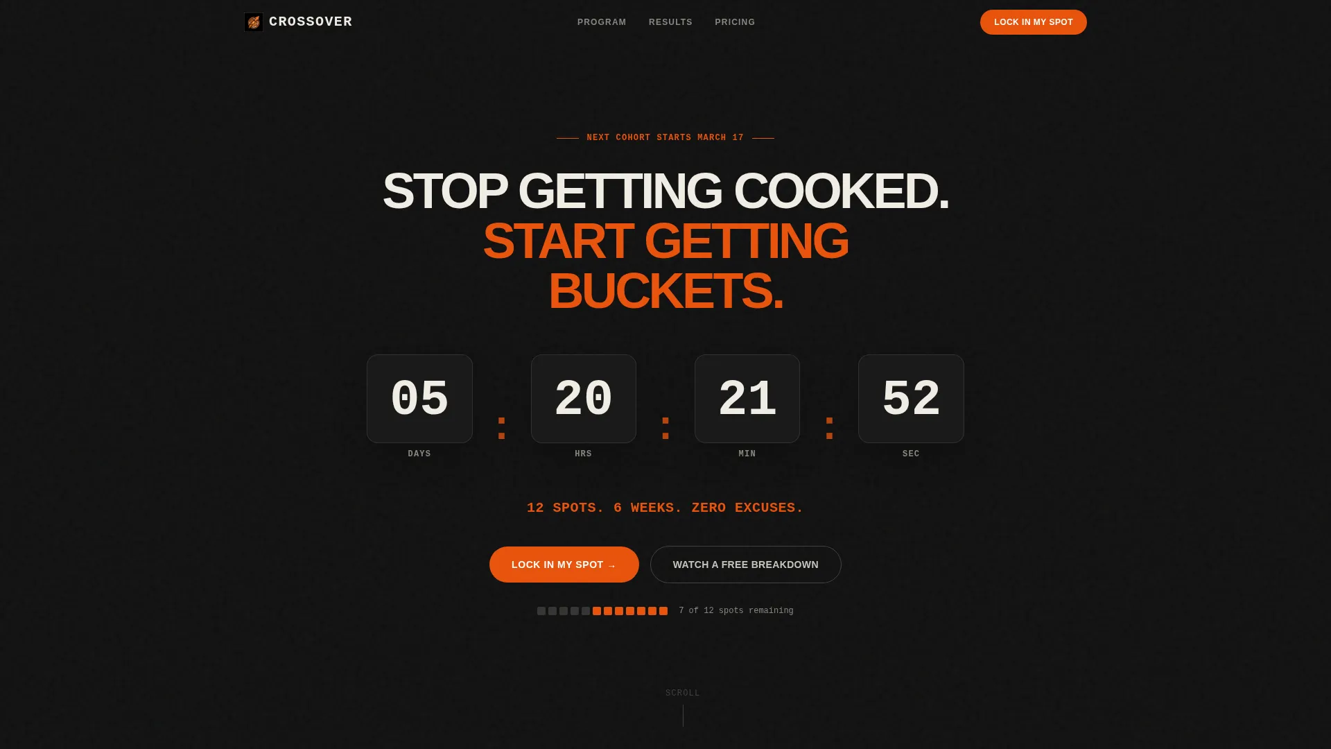
- A full-viewport countdown timer header with a looping video background that fades in after two seconds
- A modular card grid showing program stats, individual player transformation cards, and video proof clips
- A three-tier pricing section with a streamlined checkout flow and a secondary email-capture path
Feature list
This section covers the built-in components and layout capabilities included in the Crossover template.
Full-Viewport Countdown Timer Header
The header fills the entire screen with stark white digits ticking down against volcanic black. A single molten orange line reads "12 Spots. 6 Weeks. Zero Excuses." The primary call-to-action button appears here first, so high-intent visitors can convert without scrolling.
Looping Background Video Layer
After a two-second delay, a looping video fades in at 40% opacity behind the countdown. The footage shows close-up dribbling through cones, court cuts, and sweat hitting hardwood. The video adds motion and atmosphere without competing with the timer or the headline.
Stats-First Modular Card Grid
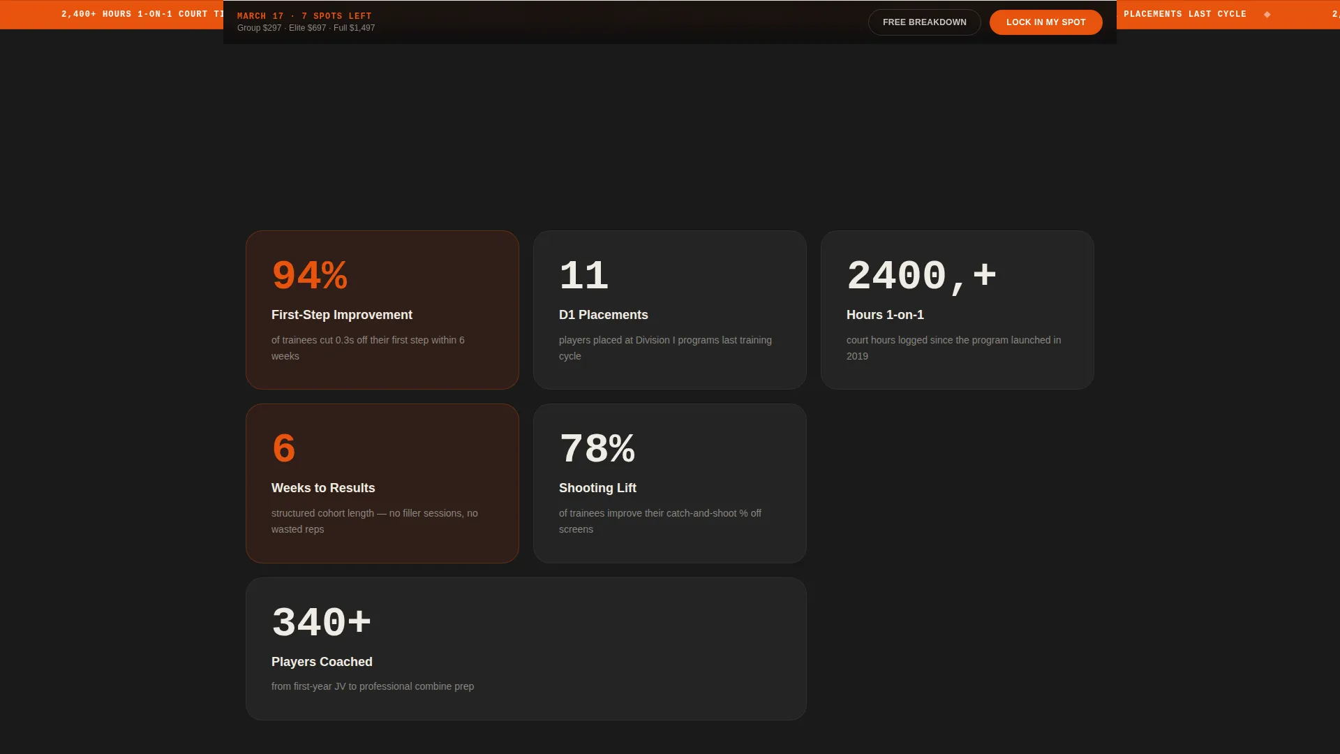
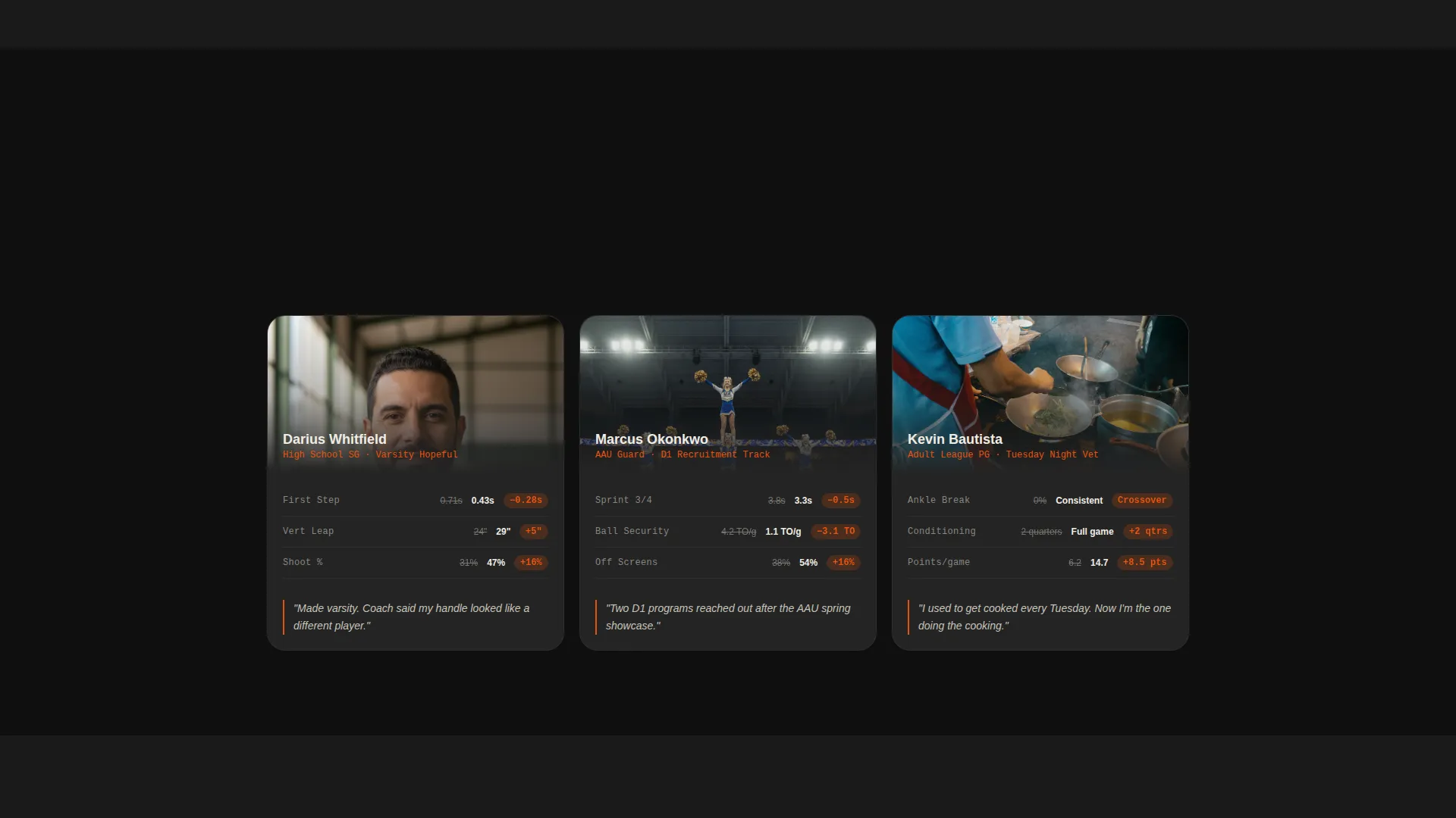
The first card row opens like a box score: sprint improvement percentages, Division I placement numbers, and total court hours logged. Deeper rows shift to individual player transformation cards showing before-and-after metrics for vertical leap, sprint time, and shooting percentage. The orange accent highlights every improvement delta.
Three-Tier Pricing and Checkout
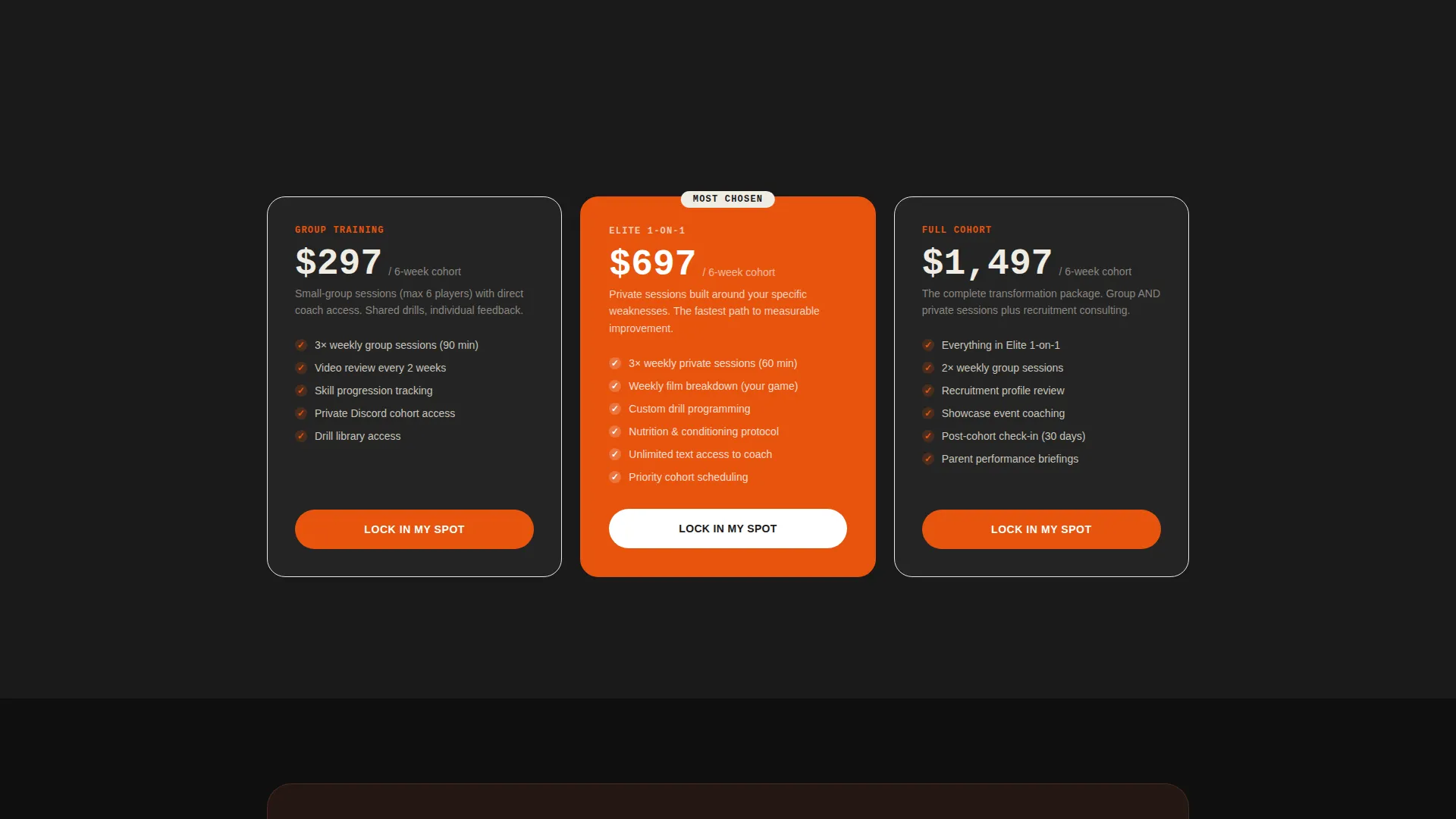
Visitors can select Group Training, Elite one-on-one, or Full Cohort directly from the pricing cards. Each tier shows the price, picks a start date, and moves straight to payment entry. The layout keeps friction minimal and the decision clear.
Sticky Bottom Conversion Bar
After the second scroll, a fixed bottom bar appears carrying the "Lock In My Spot" call-to-action in molten orange. It stays visible through every section, ensuring the primary conversion path is always one tap away regardless of how far a visitor scrolls.
Secondary Email Capture Path
A "Watch a Free Breakdown" button routes visitors who are not yet ready to buy into an email-capture flow tied to a free film session clip. This secondary path nurtures interest and keeps warm leads inside the program's audience.
Page sections overview
| Section | Purpose |
|---|---|
| Countdown Timer Header | Drives urgency with a live clock, scarcity line, and primary call to action |
| Looping Video Background | Adds atmospheric motion behind the countdown header |
| Stats Impact Row | Leads the card grid with program-level proof numbers |
| Player Transformation Cards | Shows before-and-after metrics per individual trainee |
| Video Proof Clips | Breaks up data rows with emotional, on-court footage |
| Pricing Tier Cards | Presents three training options with inline checkout |
| Sticky Conversion Bar | Keeps the primary call to action visible through every scroll depth |
| Email Capture Section | Captures leads via free film session clip offer |
Design & branding system
The Fire and Earth color system positions the page somewhere between a blacktop court at golden hour and a shot-clock moment that is running out. Every color choice has a functional role, not just a visual one.
- Volcanic black (#1A1A1A) covers all primary backgrounds, keeping focus on content cards and the countdown timer
- Molten orange (#E8530E) activates every call-to-action, stat highlight, and improvement delta that demands the visitor's eye
- Scorched clay (#A0522D) grounds testimonial and credential cards, adding warmth without softening the competitive tone
- Ash white (#F0ECE3) carries all body text and open space, ensuring data-heavy cards stay breathable and readable
Mobile & speed optimization
The modular card grid is structured so that multi-column rows reflow cleanly into a single-column stack on smaller screens. The countdown timer and sticky bottom bar are both designed for touch interaction from the first tap.
- The looping video layer is built to fade in after the primary content loads, keeping the initial paint fast on mobile connections
- Sticky bottom conversion bar stays accessible at thumb reach on portrait mobile layouts
- Pricing tier cards restack vertically on small screens so all three options remain fully readable without horizontal scrolling
How this template helps you convert
The page is built around a closing sequence, not a brochure layout. Every design decision moves a visitor one step closer to clicking "Lock In My Spot."
- The countdown timer creates immediate loss aversion before a visitor reads a single word of body copy, making scarcity felt rather than stated
- The stats-first card grid removes doubt progressively, shifting the visitor's internal question from "does this work" to "when do I start" by the time they reach the pricing section
- The sticky conversion bar and three-tier checkout eliminate the friction of hunting for a sign-up form, keeping the path to purchase always visible and always one click away
Other information about this template
This template lives inside the Sports and Recreation category, aligned to the Basketball Leagues and Basketball Amateur and Club subcategory and niche. It suits training businesses operating at the intersection of skill development and direct-to-consumer sales.
- The Dynamic Motion theme is expressed through the flipping countdown digits and the fading video layer, both of which create a sense of time passing and opportunity closing
- The template follows a Dark and Single Accent header concept, pairing volcanic black with a single molten orange focal point to maximize contrast and urgency
- The card-grid layout is modular, meaning individual rows or cards can be duplicated, reordered, or replaced without rebuilding the page structure from scratch
- The secondary email-capture path makes this template suitable for trainers running both direct purchase and lead-nurture campaigns from the same page
Theme
Futuristic Neon
Creative direction
Community Gallery
Color system
Fire & Earth
Style
Hero-Dominant (90/10)
Direction
Direct Sales
Page Sections
Full-viewport Countdown Timer Header
Looping Background Video Layer
Stats-first Modular Card Grid
Three-tier Pricing and Checkout
Sticky Bottom Conversion Bar
Secondary Email Capture Path
Related questions
Who is this template designed for?
Can I change the countdown timer to match my next cohort start date?
How does the three-tier pricing section work?
What is the secondary email capture path used for?
Can I add or remove cards from the modular grid?