Dental Practice Team Stats & Clinician Profiles Website Template
Chairside is a dental practice team landing page built on a Tech Glass visual identity and a Stats-First creative direction. Individual clinician cards expand into data tiles showing credentials, specialty, and procedure counts. A pinned "Book a Free Scan Consultation" bar and an email-gated insurance report give analytical and anxious visitors two clear paths forward.
by Rocket studio
Quick summary
Chairside is a single-page dental team landing page designed for high-technology practices. It opens with a near-black, glow-lit header showcasing individual clinician portraits, then flows through data-driven staff cards, video philosophy snippets, and outcome metrics. Two conversion paths sit ready: a pinned consultation booking bar and a downloadable insurance compatibility report.
Who this template is for
This template suits modern dental practices that want their website to feel as precise as their equipment. It works best when a practice has multiple specialists, visible credentials, and strong procedure volume worth displaying.
- Multi-specialty dental offices that want each clinician to own a distinct data-rich profile card
- Practices targeting analytical patients who research before booking and respond better to evidence than to testimonials alone
- Dental marketing teams looking for a polished, ready-to-customize team page with a built-in conversion flow
What problem this template solves
Many dental team pages are static photo grids with short bios. They give anxious or research-driven patients nothing to act on and nothing to trust. Chairside closes that gap.
- Patients who cancel repeatedly need quantitative proof of competence before they commit; the data tile format delivers exactly that
- Midnight researchers comparing sedation options or implant costs need a clear secondary path that does not force an immediate phone call
- Practices lose potential patients when their team page has no conversion layer; the pinned booking bar and gated report fix this directly
What you get with this template
You get a fully designed, single-page landing layout that combines clinical precision with structured conversion logic. Every visual and functional element described below is part of the template as delivered.
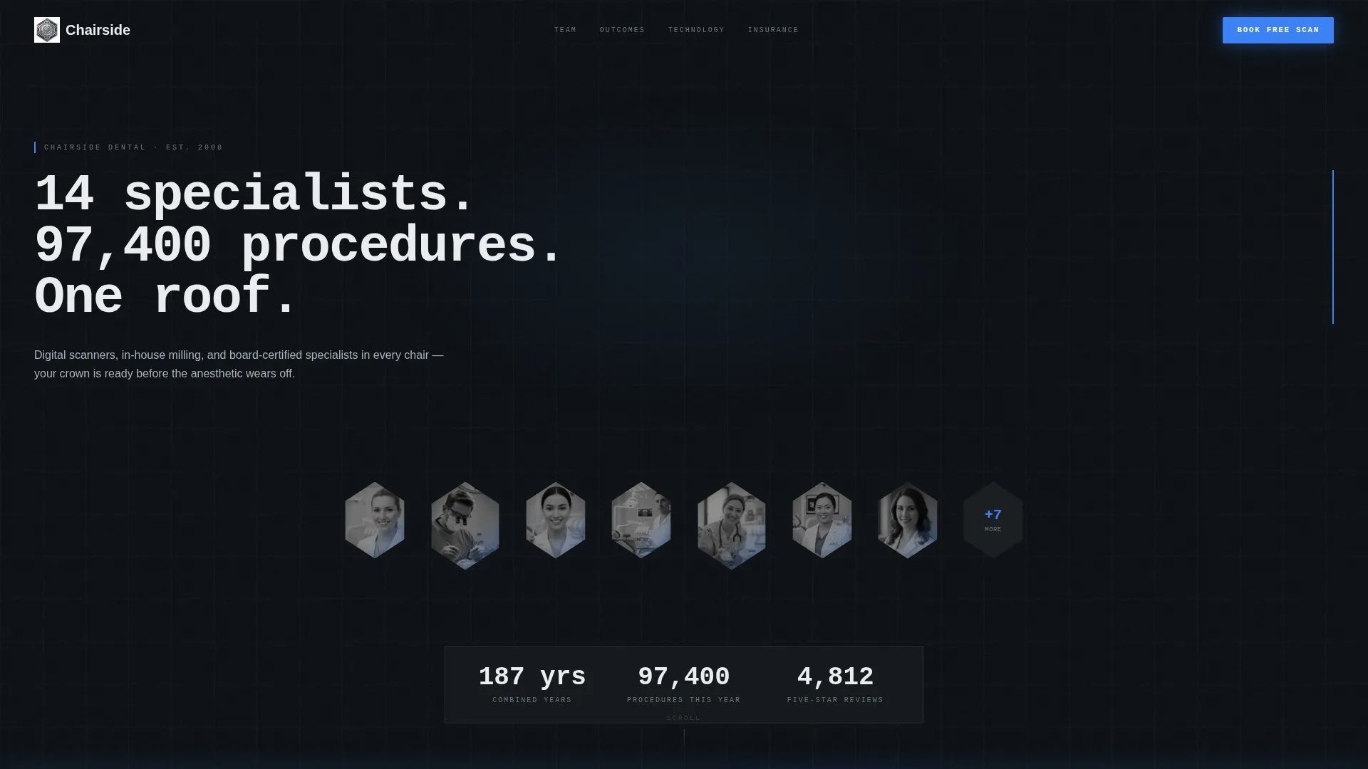
- A dark full-bleed header with individual hexagonal portrait frames, a typing headline, and auto-incrementing stat counters
- Expandable personnel data tiles showing credentials, specialty, procedures per year, and continuing education hours
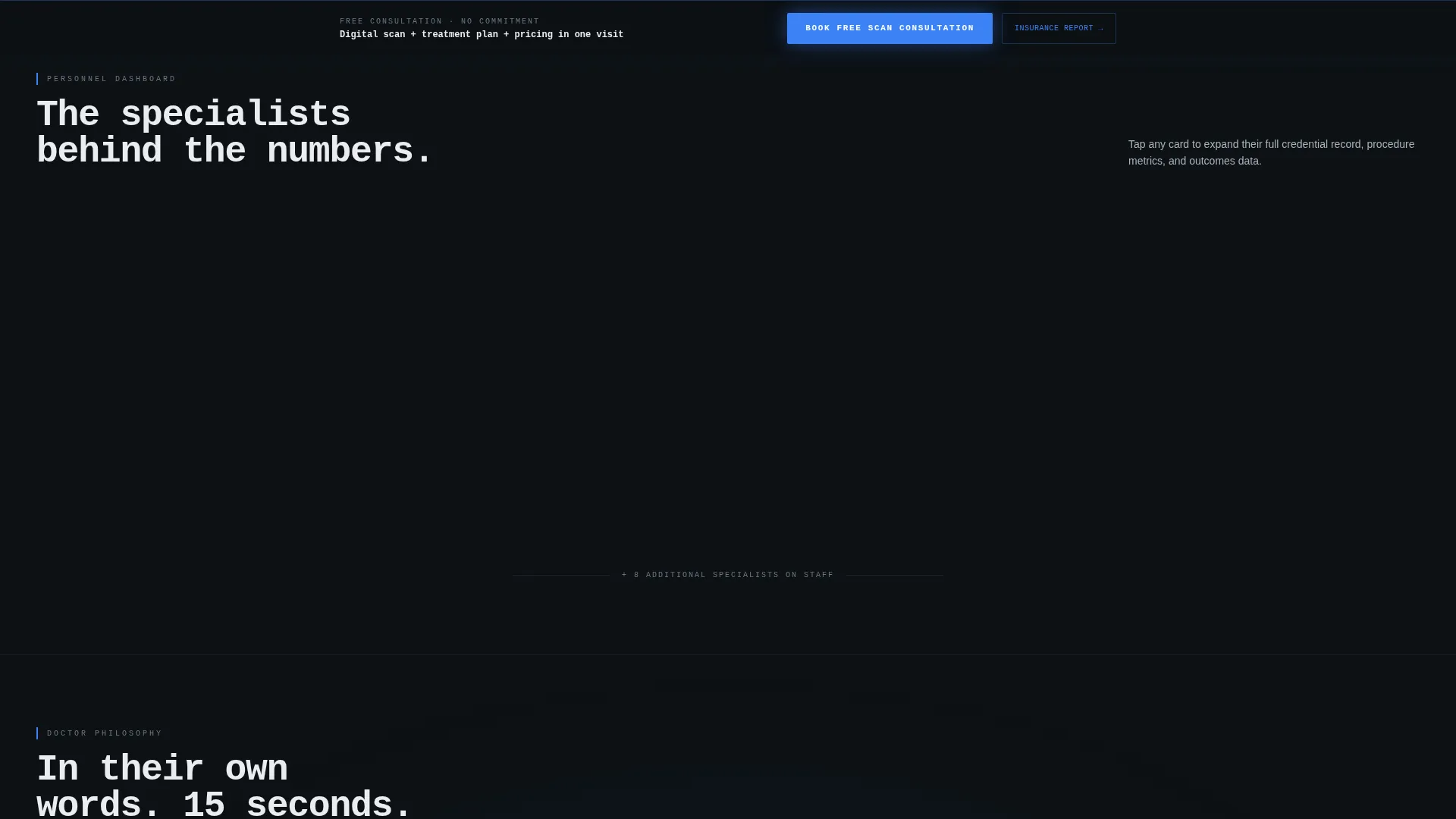
- A pinned glowing bottom bar with a multi-step booking form and a secondary email-gated insurance compatibility report path
Feature list
This section describes the specific built-in components and layout capabilities included in the Chairside template.
Hexagonal Portrait Grid with Edge-Light Effect
Each team member appears in an individual hexagonal frame that emerges from a near-black background. A clinical-blue edge light traces the portrait's jawline and collar. Frames are arranged in a staggered grid and pulse faintly on hover, giving the header a living, instrument-panel quality.
Auto-Incrementing Stat Counter Bar
Three practice-wide statistics sit beneath the hero headline: combined years of practice, procedures completed this year, and five-star reviews. Each number auto-increments as it enters the viewport. The effect anchors first-time visitors with evidence before they scroll any further.
Monospaced Typing Headline
The hero headline renders in a monospaced typeface and types itself character by character on load. The default text reads: "14 specialists. 97,400 procedures. One roof." This single line sets the quantitative tone for the entire page.
Expandable Personnel Data Tiles
Each clinician card expands into a structured data tile. The tile surface displays credentials, specialty focus, procedures completed per year, and continuing education hours logged. The layout mirrors a personnel dashboard, making it easy for analytical visitors to compare doctors side by side.
Fifteen-Second Doctor Philosophy Videos
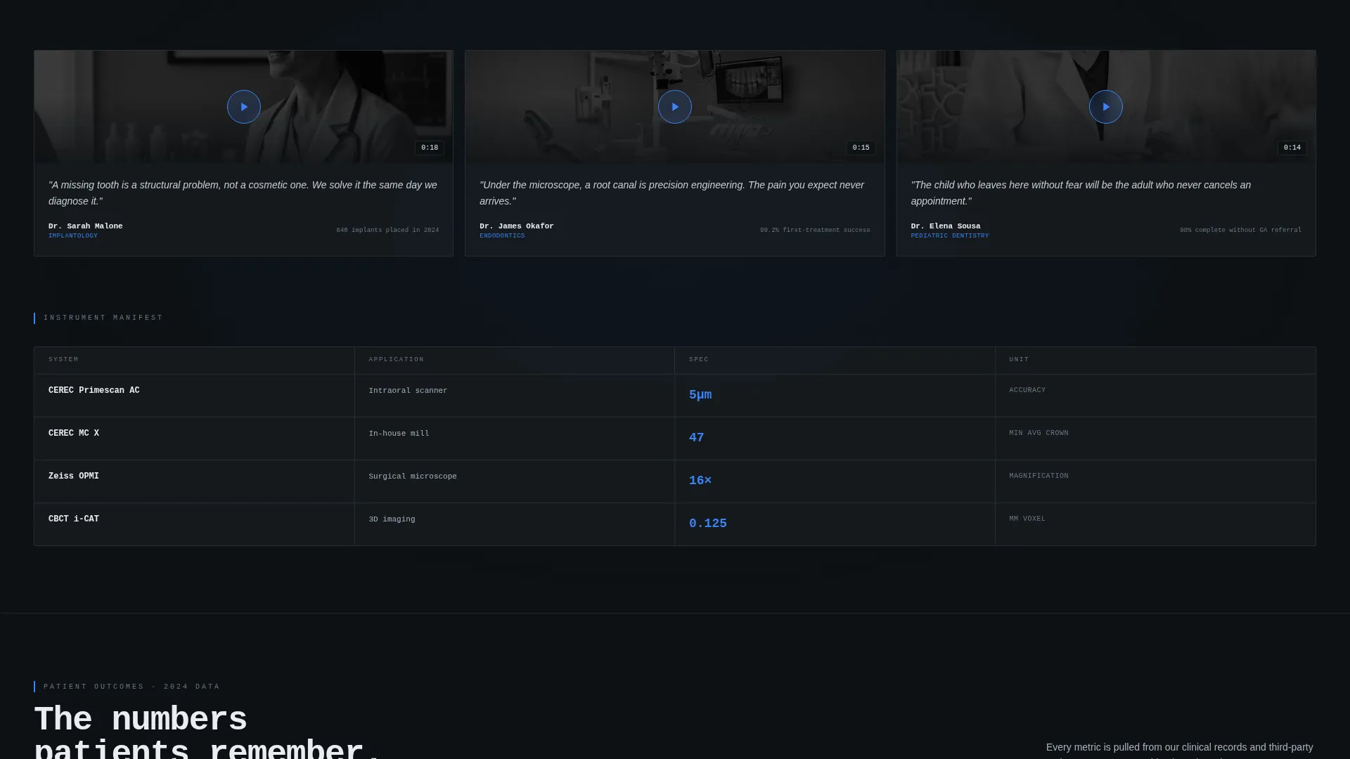
As the visitor scrolls past the data tiles, short video snippets of each doctor explaining their approach appear inline. These segments warm the tone after the quantitative opening, giving anxious patients a human voice alongside the clinical metrics.
Pinned Booking Bar with Multi-Step Form
A glowing blue bottom bar appears after the visitor passes the second scroll fold. The form collects concern type first (pain, cosmetic, routine, or second opinion), then preferred doctor or a "match me" option, then a preferred date range. The stepped structure lowers form friction and keeps the conversion path simple.
Page sections overview
| Section | Purpose |
|---|---|
| Dark Hero Header | Introduces the team with edge-lit portraits, a typing headline, and live stat counters |
| Stat Counter Strip | Displays combined experience, annual procedures, and review count as auto-incrementing numbers |
| Personnel Data Grid | Shows expandable clinician tiles with credentials, specialty, and procedure volume |
| Video Philosophy Row | Delivers fifteen-second doctor introduction clips to warm the analytical-first tone |
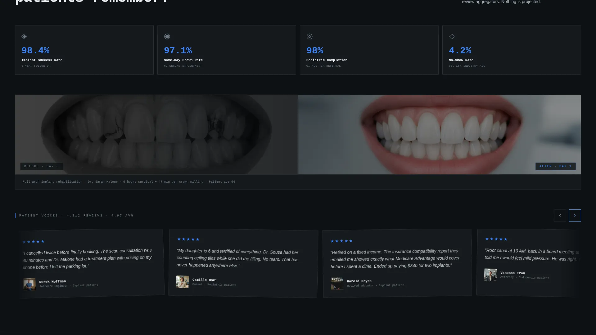
| Outcome Metrics Panel | Pairs patient outcome statistics with before-and-after clinical photography |
| Pinned Booking Bar | Presents the multi-step "Book a Free Scan Consultation" form in a fixed glowing footer |
| Insurance Report Gate | Offers an email-gated PDF to pre-qualify coverage and capture midnight researchers |
Design & branding system
The visual identity uses a Tech Glass theme built entirely on a Monochrome Steel palette. Every color choice reinforces clinical precision and restrained authority.
- Core palette: surgical-grade charcoal (#1B1F23) for backgrounds, instrument tray silver (#A8B2BC) for secondary surfaces, autoclave white (#EAECEF) for readable text blocks, and UV-cure blue (#3B82F6) reserved exclusively for interactive states, hover pulses, and the pinned call to action bar
- Typography: a monospaced typeface anchors the hero headline; body text stays clean and legible against dark and light surface layers
- Visual language: frosted glass card surfaces, chrome-reflective tile borders, and a single thin blue-light accent running through interactive elements create the effect of peering through a sterilization room door
Mobile & speed optimization
The layout is structured to translate cleanly from desktop to smaller screens without losing the data-dense character of the design.
- The staggered hexagonal portrait grid reflows into a single-column stack on narrow viewports, keeping each portrait and its hover state intact
- Expandable data tiles collapse gracefully on touch devices, presenting key credentials at a glance with a tap-to-expand interaction
- The pinned booking bar scales to full-width on mobile, keeping the primary call to action visible without obscuring the content behind it
How this template helps you convert
The conversion architecture in Chairside is built for two distinct visitor types: the analytical patient who needs proof and the anxious patient who needs reassurance. Both paths are baked into the page structure.
- The stat counter and data tile sequence delivers quantitative credibility early, so research-driven visitors trust the practice before they reach any form
- The multi-step pinned booking form lowers commitment friction by asking about the visitor's concern type before asking for personal details, which matches how real patients think about scheduling
- The email-gated insurance compatibility report captures visitors who are not ready to book, converts them into an identifiable lead, and addresses the coverage question that causes most last-minute cancellations
Other information about this template
Chairside is designed as a standalone dental practice team landing page rather than a full multi-page website. It is built to slot into an existing practice site or operate as a focused campaign page.
- The template style is Dashboard/Data Grid, meaning the layout prioritizes structured data presentation over decorative storytelling
- The creative direction is Stats-First Impact: the page leads with numbers and credentials, then introduces human warmth through video and photography
- The landing page direction is Freemium/Trial, meaning the primary call to action is a no-cost entry point (a free scan consultation) rather than a direct purchase prompt
- The header concept is Dark Full-Bleed+Glow, a design pattern where the full viewport is occupied by a near-black field with selective lighting rather than a traditional banner image
- Customization scope covers portrait swaps, stat figure updates, credential text, video embed replacements, color accent adjustments within the Monochrome Steel system, and form field label edits
Theme
Tech Glass
Creative direction
Stats-First Impact
Color system
Monochrome Steel
Style
Dashboard/Data Grid
Direction
Freemium/Trial
Page Sections
Hexagonal Portrait Grid with Edge-light Effect
Auto-incrementing Stat Counters
Expandable Personnel Data Tiles
Pinned Multi-step Booking Bar
Email-gated Insurance Report Path
Fifteen-second Philosophy Video Row
Related questions
Can I use this template for a solo dental practice rather than a multi-specialist team?
What does the insurance compatibility report section actually include?
How does the pinned booking bar appear during scrolling?
Is this template suitable for a campaign page rather than a full practice website?
Can the fifteen-second video slots be replaced with static content?



