Regional & Specialty Restaurant Professional Website Template
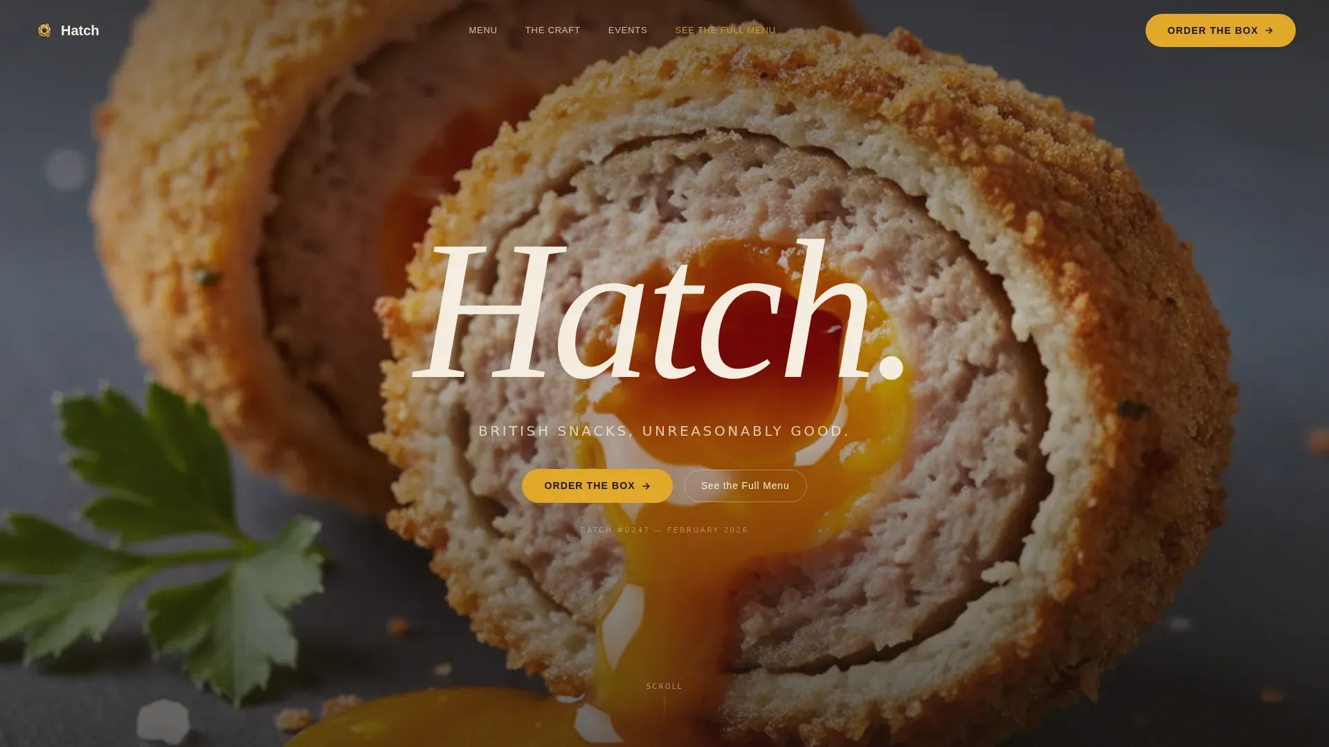
The Hatch landing page template is a full-width immersive experience built for artisan British snack brands selling premium hand-rolled scotch eggs. It combines a full-screen hero video, scroll-driven Before/After product reveals, and a warm Fire and Earth colour system to build visceral hunger and drive clicks to checkout. Craft storytelling and bold visual design carry every section.
by Rocket studio
Quick summary
Hatch is a full-width immersive landing page template designed for artisan British snack brands. It opens with a slow-motion overhead hero video, guides visitors through a Before/After product reveal with a draggable slider, and closes every product section with a direct call to action. The Fire and Earth colour palette and Luxe Minimal design style make the food look as good as it tastes.
Who this template is for
This template is built for food brands where craft and visual impact are the whole point. If your product deserves more than a plain product grid, this layout gives it room to breathe and perform.
- Artisan scotch egg and British snack producers selling direct to consumers, whether through an online store, a market stall, or a catering offering
- Independent food entrepreneurs and small-batch kitchen brands targeting London office workers, weekend market wanderers, and event planners who source conversation-starting canapés
- Food brand founders who want a landing page that communicates obsessive craft without relying on discount codes or urgency timers to earn the sale
What problem this template solves
Most food brand landing pages fall flat because they lead with a product grid and hope the visitor connects the dots. The real challenge is building appetite before the buy button ever appears. That is a genuinely hard problem, and most generic templates do not solve it.
- Visitors land on a food brand page, see a static image and a price, feel nothing, and leave. This template replaces that passive scroll with an active, sensory-driven journey from raw ingredient to golden finished snack
- Event planners and office managers who source premium snacks need social proof and a clear catering pitch before they commit. This template includes a dedicated Events and Social Proof section with named testimonials and a real queue metric from Borough Market
- Small-batch producers struggle to communicate why their food costs more than a supermarket alternative. The Before/After reveal, yolk timer, and breadcrumb close-ups do that work visually, so the copy does not have to carry it alone
What you get with this template
You get a complete, single-page landing experience that leads visitors from first impression to checkout click in one unbroken scroll. Every section is purposeful and sequenced to build appetite and trust in the right order.
- A full-screen hero video section with a slow-motion scotch egg reveal, a fading word reveal for the brand name, and a tagline line, followed immediately by the primary call to action button
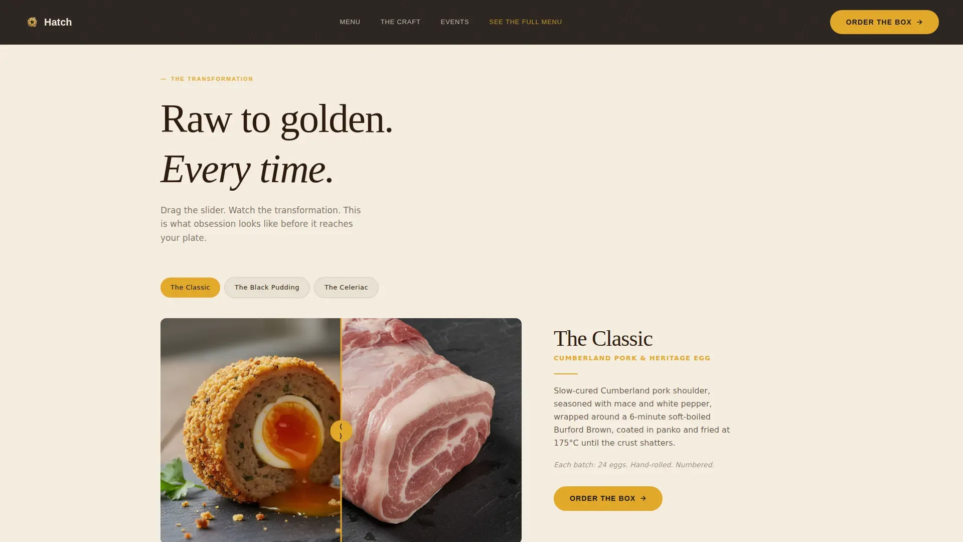
- Three scroll-driven Before/After product reveal sections using a draggable slider, each covering a different product variant, plus a dedicated Craft section showing spice blending, breadcrumb close-ups, and a yolk timer counter
- A Product Range section with three stock-keeping units, batch numbers, and per-product calls to action, followed by an Events and Social Proof section and a linear single-row footer
Feature list
This template is engineered around one idea: make the food impossible to ignore. Every feature serves that goal directly, and nothing is included for decoration alone.
Full-Screen Hero Video with Word Reveal
The landing page opens with a single, unbroken overhead video shot of a scotch egg being sliced in slow motion. The breadcrumb crust fractures, the yolk pools outward across a matte black slate, and a single word fades in after the yolk runs. The amplified crunch sound design and scroll-blur animation on the hero video create a first-time sensory experience that holds attention from the first second. This concept sets the appetite before a single word of copy appears.
Draggable Before/After Product Slider
Three scroll sections each feature a draggable slider separating raw heritage ingredients on one side from the finished golden snack on the other. The Classic, Black Pudding, and Celeriac variants each get their own reveal. Visitors drag the divider and watch Cumberland pork shoulder and soft-yolked heritage eggs transform into the finished sphere. This interactive format communicates craft more effectively than any static image could.
GSAP ScrollTrigger Animation System
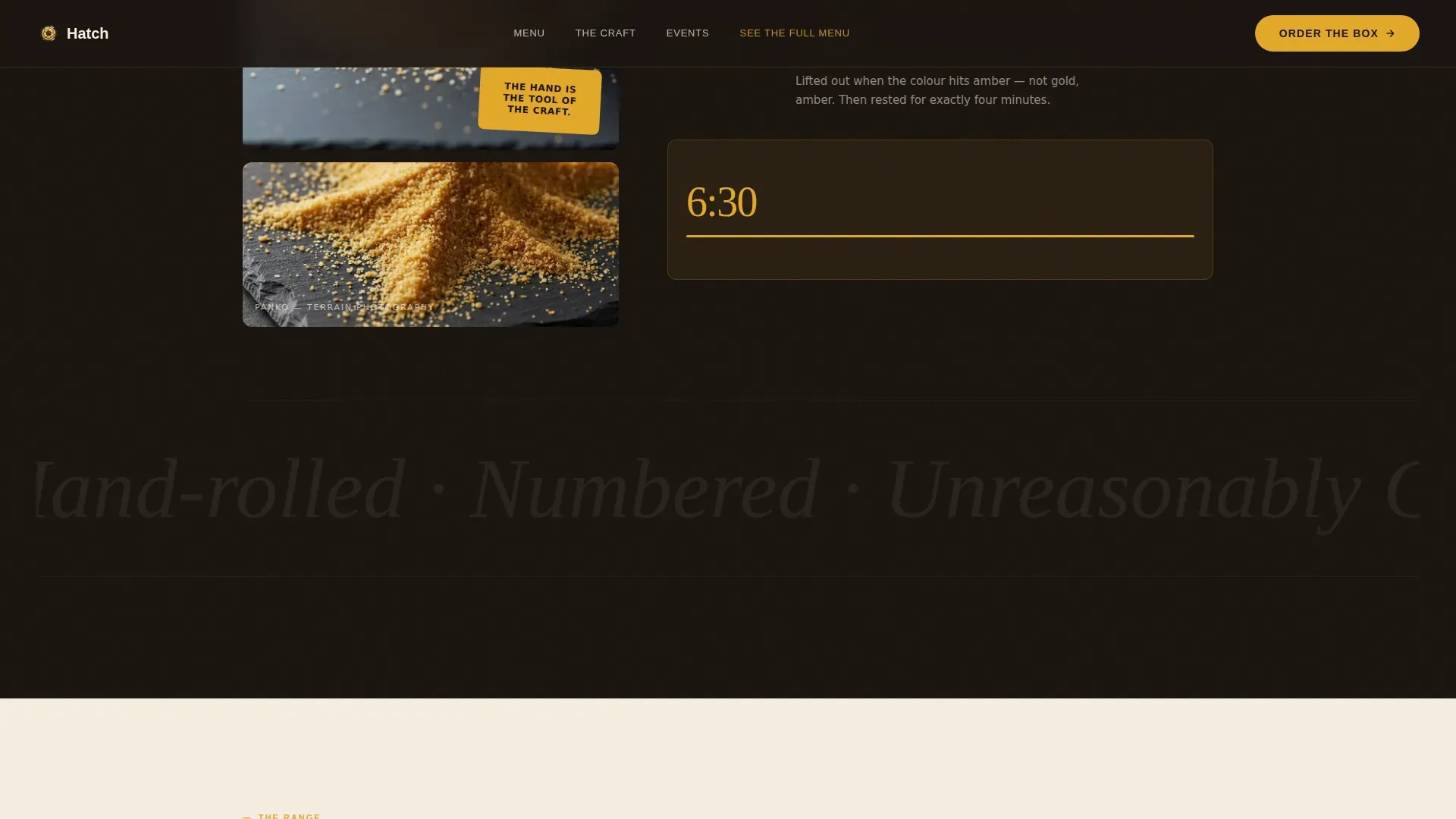
The entire landing page runs on GSAP ScrollTrigger animations. Sections stagger into view as the visitor scrolls. The hero video blurs on scroll, product reveals animate in sequence, and the yolk timer counter ticks up in real time to show the exact seconds of the soft boil. This level of animation depth is rare in food brand landing pages and makes the cooking process feel live.
Yolk Timer and Craft Detail Sections
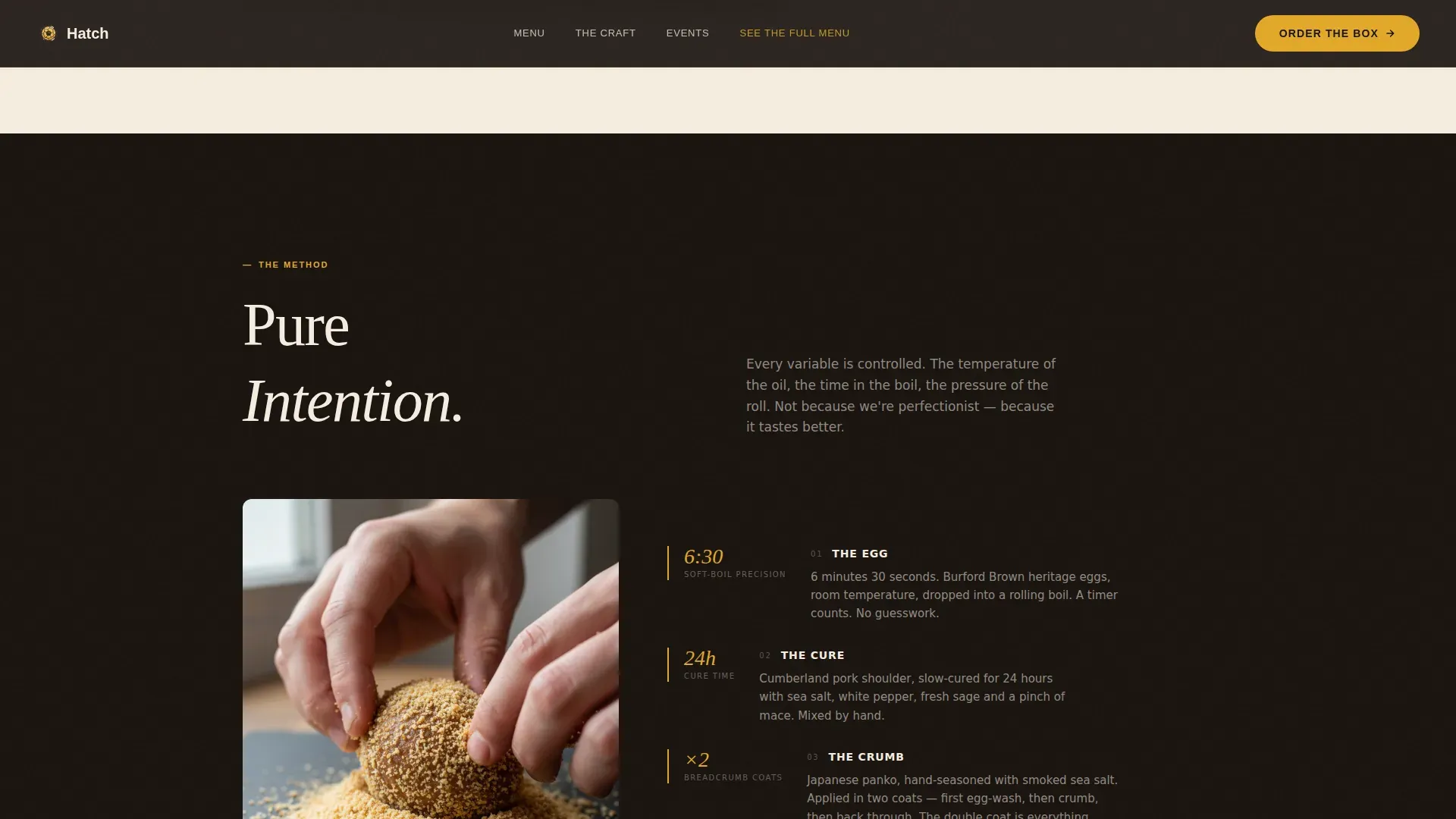
The Craft section goes deeper than ingredient lists. It shows the spice blending process, presents breadcrumb close-ups that read like terrain photography, and runs a live counter tracking the soft-boil duration. This section exists to answer the silent question every quality-conscious buyer has: why does this food cost what it costs? The answer is visible, measurable, and visceral.
Anchored Call to Action with Persistent Navigation Link
The primary call to action, reading "Order the Box," appears first immediately after the hero video and then again anchored at the bottom of each product reveal section. A secondary link, "See the Full Menu," floats as a persistent text link in the top navigation throughout the entire page. This structure means the conversion opportunity is always one scroll or one glance away, without feeling pushy.
Events and Social Proof Section
The landing page includes a dedicated section for canapé catering, built to speak directly to event planners and office managers. Named testimonials from London office and event clients sit alongside a real crowd-validation metric: an average 23-minute queue at Borough Market. This section transforms social proof from a passive trust signal into an active part of the sales argument.
Page sections overview
| Section | Purpose |
|---|---|
| Hero Video Header | Opens with slow-motion scotch egg reveal and brand word fade-in |
| Before/After Classic | Draggable slider showing raw Cumberland pork to finished classic sphere |
| Before/After Black Pudding | Slider reveal for the black pudding variant with ingredient contrast |
| Before/After Celeriac | Slider reveal for the vegetarian celeriac version |
| The Craft Detail | Shows spice blending, breadcrumb close-ups, and live yolk timer counter |
| Product Range | Three SKUs with descriptions, batch numbers, and Order the Box calls to action |
| Events and Social Proof | Canapé catering pitch with named testimonials and queue metric |
| Single-Row Footer | Linear footer with navigation and brand identity close |
Design & branding system
The visual identity follows a Luxe Minimal editorial direction built entirely around a Fire and Earth colour system. Every colour decision has a specific role, and the palette as a whole reads like a cast-iron pan still warm after the fry.
- The four-colour system uses deep allotment soil at hex code 2C1A0E for primary typography, runny yolk amber at E2A829 for buttons and hover states, charred crust black at 1A1410 to frame photography, and clotted cream at F5EDE0 as the dominant background that creates open space between sections
- Typography pairs Fraunces, a warm editorial serif, for display headings with DM Sans for all body text, creating a contrast between craft heritage and clean modern legibility
- Photography framing uses crust black as a burnt-edge border around food images, reinforcing the sense that every shot has been pulled directly from the kitchen rather than a studio
Mobile & speed optimization
Although the template is designed desktop-first to serve London office workers browsing on lunch breaks, the layout adapts cleanly for mobile discovery at weekend markets and on the go. Performance decisions across the template are consistent with best practice for immersive food landing pages.
- The hero video runs autoplay and muted, and images across the page are lazy-loaded so the initial page load stays light even with high-density visual assets
- GPU-accelerated transforms power the GSAP ScrollTrigger animations, keeping scroll performance smooth on modern devices without taxing the browser's main thread
- The draggable Before/After slider, hover states, and anchored call to action buttons are all sized and positioned for comfortable use on both desktop and mobile screen sizes
How this template helps you convert
This landing page is built around a single conversion goal: get the visitor to click "Order the Box." Every design and content decision is in service of that one action. There are no distractions, no competing offers, and no layout noise.
- The hero video creates immediate appetite before any product claim is made, so by the time the first call to action appears the visitor is already leaning forward. The scroll journey through the Before/After reveals, Craft section, and product range then deepens that appetite layer by layer until the click feels like the only natural response.
- Social proof is placed strategically in the Events and Social Proof section after the product range, which means trust is confirmed at exactly the moment a buyer might hesitate. Named testimonials from real London office and event clients, combined with the Borough Market queue metric, remove the final point of friction before the decision.
Other information about this template
The Hatch artisan British snack brand landing page template sits at an interesting intersection of food culture, craft storytelling, and conversion design. Understanding its broader context helps buyers use it to full effect.
- This template is relevant to a wide range of snack food contexts beyond the scotch egg brief. A small-batch bakery selling seasonal baked goods, a farm-to-table brand selling cured meats, or a coffee roaster presenting single-origin products could all adapt the Before/After scroll concept and Fire and Earth palette for their own food world. The concept is flexible wherever craft and ingredient provenance matter.
- Engaging content creation is essential for snack brands to connect with their target audience, and this template is built around that principle. Visual content, including high-quality video and close-up food photography, is crucial for attracting attention in the snack industry. The template gives food brands a scaffold for exactly this kind of content-forward landing page design.
- Snack brands should focus on storytelling to create emotional connections with consumers. This template structures that storytelling as a visual scroll journey rather than as a wall of copy, which is far more effective for food audiences browsing quickly. User-generated content, seasonal themes, and social media links can all be woven into the Events and Social Proof section to extend this storytelling approach.
- British artisan snacks often emphasize high-quality, locally sourced ingredients that appeal to consumers seeking authenticity. Ingredient transparency is one of the strongest marketing tools available to artisan food brands, and this template supports that through the Craft section where process detail, ingredient close-ups, and the yolk timer make sourcing decisions visible and credible. Icons or short infographics highlighting attributes like locally sourced or small-batch production can be added within that section.
- Artisan snack foods are increasingly popular due to their perceived quality and unique flavors. Across England and the wider country, consumers are gravitating toward snacks made with natural ingredients and fewer preservatives. The snack food market is shifting, with more adults opting for indulgent yet considered food choices. This template speaks directly to that desire by making quality visible rather than simply claiming it.
- The landing page design reflects colour psychology principles. Yolk amber ignites buttons and hover states because warm amber tones are associated with appetite and energy. Deep soil and crust black ground the photography in seriousness and craft. Clotted cream creates the open space that lets the food images breathe, preventing the page from feeling cluttered. These colour choices influence how visitors feel about the food before they read a single word.
- Snack brands can benefit from collaborating with local producers and events to enhance visibility and reach. The Events and Social Proof section in this template is already structured for that kind of community and event-led marketing. It can support canapé catering pitches at corporate events, summer market appearances, school fundraiser food stalls, and farm open days where different groups of adults, families, and young food lovers gather.
- From a practical build perspective, this template is designed for use by food entrepreneurs who want a premium landing page found online without starting from a blank canvas. It comes with all sections pre-built and ready to populate with your own video footage, food photography, product descriptions, batch numbers, and testimonials. Several months of custom design work have been compressed into a ready-to-launch structure.
- The common complaint from food brand founders about generic templates is that they look fine at first glance but lack the depth to communicate craft. This template addresses that directly. One of the more challenging aspects of selling premium snacks online is that the food cannot speak for itself the way it would at a market stall. The Before/After slider and yolk timer exist specifically to solve that challenge, giving the visitor a sense of the craft and process that a price tag alone can never communicate.
- Successful snack brand websites often highlight their unique selling propositions to differentiate themselves from competitors. The unique selling proposition here is explicitly defined: obsessively crafted, numbered-batch scotch eggs made from heritage ingredients, sold without discounts, justified entirely by visible craft. The landing page earns the price point through immersive content rather than promotional mechanics, which is a noble goal for any artisan food brand.
- A soft spot for premium food exists across many overlapping audiences. Young professionals, market-going families, mothers organising catering for school events, and adults planning corporate lunches all share the desire for food that feels considered rather than convenient. This template reaches all of those groups through its layered structure: the hero speaks to immediate appetite, the product range speaks to repeat purchase, and the events section speaks to volume catering needs.
- From a wider society perspective, the snack and artisan food sector has seen consistent growth over the couple years following the pandemic. People who learned the joy and happiness of cooking at home during lockdown now bring that appetite for quality into how they shop and eat outside the house. This template is positioned to meet that shift head-on, giving artisan food brands a landing page that matches the elevated expectations of the modern food buyer.
- Responsive design is a key feature of successful snack brand websites, ensuring they are accessible on various devices. The landing page is structured desktop-first but adapts for mobile, which is important for market discovery moments where a potential customer hears about the brand from friends, notices a queue and looks it up, or finds the store link shared by classmates or colleagues in a group chat.
- A/B testing different elements of the landing page, such as the hero tagline, the call to action button text, or the order of the Before/After product variants, can help identify which version resonates best with your target audience. The clean section structure of this template makes such testing straightforward because each section is self-contained and does not depend on the others to function visually.
- Including social media links on the landing page can encourage visitors to engage with the brand on other platforms. The Events and Social Proof section and the footer are natural places to add those links, helping to extend the brand's reach into the digital communities where food lovers share discoveries and talking about their favourite snacks with friends.
- Trust matters for any food brand selling online. Trust badges for secure payments and certifications displayed near the final call to action help reduce purchase anxiety, particularly for first-time buyers who discovered the brand through social media rather than in person at a market. The template's call to action placement near social proof content already addresses much of this psychological challenge.
Theme
Luxe Minimal
Creative direction
Before/After Reveal
Color system
Fire & Earth
Style
Full-Width Immersive
Direction
Click-Through
Page Sections
Full-screen Hero Video with Word Reveal
Draggable Before/after Product Slider
GSAP Scrolltrigger Animation System
Live Yolk Timer and Craft Detail Section
Anchored Call to Action with Persistent Navigation
Events and Social Proof Section
Related questions
What types of food brands work best with this template?
Can this template support canapé catering and events marketing?
Does the template include a checkout or payment system?
How does the Before/After slider section work?
Is this landing page template suitable for mobile users?



